Procrastinated & Missed It: Rayman’s Sinclair Demolished

8000 South Laclede Station Road
St. Louis County, MO

As I drive around, I make mental notes of buildings to photograph. When they’re places passed on a regular basis, I guess I take them for granted as being part of the landscape – they’ll always be there when I get around to it.

Rayman’s Sinclair, at Heege and Laclede Station Roads has always been one of those “taken for granted” places. It was a full service Sinclair station in pristine condition, looking like a vintage postcard.


In 2010, there was a corporate shake-up that forced some Sinclair station owners to cease-and-desist with the brand name.  The last dinosaur riding into the sunset is covered here.

At that time, Rayman began removing any Sinclair signage and verbiage from his shop. He even got clever, creating a cartoon character that was the classic Sinclair green, and looking like a cross between an alligator and dinosaur. I appreciated his cheekiness. While driving through the intersection, I took the shot above, as he was in mid-transformation.

All the pictures I have of this place are hasty shots from the car while traversing this busy and slightly awkward intersection during rush hour traffic. And with every such shot came the mental note to come back, park and get good photos of the place that was built in 1958.

And here is my very last hasty shot of Rayman’s Auto Sales, Repair & Gas. According to the Affton-Shrewsbury Patch, it will become a new Courtesy Diner.

What I’m most disappointed with myself about is that the shop closed about 2 or 3 months ago. That should have been a red flag for me to photograph it, right? But I assumed someone else would move into the building, being in such great shape, conveniently located and all.

What is most ironic about a Courtesy Diner going in is that they do look like and/or try to evoke the very same porcelain tile facade of the Sinclair station they demolished. Here’s an example of the new-ish Courtesy on Hampton Ave. But I understand there’s issues with gas tanks underground and such, so I’ll let it pass… just like I did with all the opportunities to properly record it for photographic history.

There are two Sinclair stations, proper, that I know of. Above is the station at Chippewa and Giles Streets in South St. Louis, built in 1953.

And here is one at 1st Capitol Dr and South 5th Street in St. Charles. Note that both of them still have the round white neon clock still hanging in the window. Wonder if that was a corporate-issue item back in the day?

While researching all this, I ran across a new Sinclair corporate website, and it reports that there are about 140 Sinclair stations in Missouri, including the South St. Louis station. Was there another corporate shake-up and retail Sinclair was OK once again? Do we get the dinosaurs back? Their corporate history is fascinating, but dry (lots of great building photos, though), so who knows.

All I know is I blew it. Hopefully what happened to Rayman’s will be a positive photographic lesson I learn to act on.

Valentine’s Matchmaking

I just received the greatest Valentine in the mail, which begins with “You’re unmatched in my book,” and ends with two vintage matchbooks. One of them is above, for the Great Central Lumber Company in Rock Hill, MO. And look at the building drawing on the right!

The building still stands to this day, and Great Central Lumber remains, now as one of several tenants. I’ve always admired this building, and it seems the original owners did, as well, making the effort to put a line drawing of it on their promotional matches. Can you think of any recent new buildings that are matchbook-worthy? And will matchbooks one day be a thing of the past?

It first went up in 1966, and it’s shocking that it’s survived that stretch of Manchester Road for this long, in such unscathed condition.  Because the other Valentine’s matchbook* is for a drive-in that no longer exists in either of its locations.

Tobey’s Drive-In, “Home of the Happy Hamburger” lists 2 locations inside the matchbook cover: 9600 Highway 66 in Crestwood, MO and 9315 Manchester Road in Rock Hill, MO.

The Rock Hill Tobey’s was basically across the street from Great Central Lumber, and since 1999 there has been a god-awful ugly apartment complex on the land where the drive-in once was. The Crestwood Tobey’s was at 9600 Watson, and Plastic Football has the scoop on the building St. Louis County records say is from 1973.

So this building nerd is having a good Valentine’s Day. And Happy Valentine’s to you, too!

* It was manufactured by the Universal Match Corporation, St. Louis, another mid-century modern building that was demolished in 2010. Aside from losing a handsome building, it was also the long-time employer of a relative-by-marriage, who used to give me complete sets of matchbook series he helped produce. I especially remember a choice Bicentennial collection that helped me with my history homework far more than the school books did!

UPDATE

The man who sent the Valentine matchbooks wrote the following after reading this post:

“The building that was Tobey’s still stands.  It became Steak n Shake and is now Reid Vann (9331 Manchester).  My dad and uncles built it many years ago (1980) and it originally had a zig zag type roof, very similar to the one on the walkway at McGrath Elementary, corner of Litzsinger and St. Clair. When Steak n Shake took over the Rock Hill store they remodeled extensively to fit the corporate image and removed the roof.

When the Rock Hill Tobey’s was built, the Crestwood one already existed.  Mr Toberman planned to grow the franchise, but it never went above those two.  He told my dad, “I’m going to put McDonald’s out of business.”  The Crestwood store did not have the folded roof. “

MCM Remuddle: Alton East Elementary School

Alton East Elementary School
1035 Washington Avenue, Alton IL

There’s much to admire about this 1955 school building in Alton. I love how the series of saw tooth entry doors are echoed in the picture window to the left.  And the tri-colored tile work of the columns creates a pattern that feels both jaunty and whimsical.  I even love how they have retained the early 1970s-era trash containers, which creates a tableau of the school evolving over the decades.

It requires a certain administrative appreciation of the vintage architectural merits of a building to keep it  so perfectly intact and in tip-top maintenance.  I was happy to learn of the modern mechanical updates East Elementary was to receive as part of the Alton School District’s campaign to upgrade their schools, because it meant they would continue to use this fine building, rather than build something new and abandon this.

But I hadn’t completely thought through just exactly what would happen with modern mechanical updates. And it appears that whomever was in charge of replacement windows hadn’t really thought through the comprehensive design of the building. Turns out, those in charge simply went with the lowest bid for all renovations, and when it comes to fenestration, they’re getting what they paid for.

As the school building unwinds to the east of the grand front entrance, it introduces a rectangular grid of aluminum-frame windows abutting a block of brown marble tile, which is all the better to showcase the prerequisite mid-1950s stainless steel Helvetica letters. And the architects purposely chose a different window for this portion of the building than from the showcase sawteeth at the other end. Steel, brick and marble – it was all about creating motion and drama.

But not anymore. Today, they have committed to the same style of vinyl replacement window across the entire front facade.  I can kind of hear the new “designer” rationalizing….”The brown vinyl will blend nicely with the brick, and coordinate with the marble, making it look more contemporary, don’t you think?”

Before versus…

…after. Well, technically, this is during.

Here’s the secondary front entrance of East Elementary (and note there’s another of those retro trash containers!). Visualize what those silver doors will look like surrounded by large, chunky swatches of brown vinyl. Or maybe they will be kind and simply replace the doors, as well. I’d rather they have consistency than jarring inconsistency.

We head down a driveway to the back of the school, which magically grows into two stories of glass block and brick. My father, Richard Weiss, was a union glazier, and he installed the glass on this building in 1955. He told me that from the day after the school opened, those glass block walls might as well have been screens for all the hot and cold breezes they let pass through.  He said mid-century buildings like this were beautiful, but certainly never energy efficient. They didn’t have to be, because energy was cheap back then, plus central air was right around the corner.

After decades of students and teachers being uncomfortable for large chunks of the school year, they then hit the 21st century energy inflation crises, which is adding pauperism to misery. So there is no begrudging them wanting to be comfortable and use energy more efficiently. But why do the replacement windows have to be so god awful ugly? They don’t even work on this elevation!

It’s important to point out that a replacement window is only as good as its installation. The best quality window will fail if installed wrong, while a low-quality window can perform like a champ if installed correctly. It’s obvious that these windows are low-quality. Here’s hoping with all my heart that they’ve spent a little more money on properly installing them so they actually do get the energy efficiency they rightly deserve.

Before: beautiful to the eye of the beholder standing outside (and I bet it looked beautiful inside when the sun beamed through all that glass block), but not always a pleasure to the folks stuck inside on a bitterly cold and windy day in January.

Afterwards: the inhabitants will be comfortable and safe for roughly $1,000,000. Which is a fraction of what they’d have spent to build a brand new school. So I truly applaud their efforts at improving the school for everyone who uses it, and for continuing to use a perfectly good building.

I am fully aware that my whining about the murdered aesthetics misses the point of the greater good. But I do feel it’s important to document and acknowledge how handsome this building once was, and say a fond farewell.  And I want to take this chance to point out that something as seemingly trivial as choice of replacement windows can radically diminish the appearance of any type of building, so please choose carefully if you’re ever in this position.

Update on the Alton Mid-Century Bank

Here is the story of the gorgeous Alton Savings & Loan with photos of it in it’s (relatively) untouched state.

And here is the story that caused a pang of anxiety in the summer of 2011.

And above is what’s going on as of this winter of 2011-2012.

It is actually very good news that a Swiss company that manufactures and markets leading-edge ophthalmic diagnostic and surgical products is turning this building into its American headquarters. It is also good news that the Alton City Council thought it such a good idea to re-utilize this building that it gave the company a $300,000 TIF. But it was this part of the St. Louis Post-Dispatch story that caused many of us to blanche:

“We looked at others (buildings),” Braida said. “We looked all around the area. It’s beautiful. It needed someone to have a vision to update it and make it more appealing.”

Architect Dan Hurford of Hurford Architects Inc. in Glen Carbon described the building as “quite contemporary even 50 years later.” He said it is in excellent condition structurally and mechanically. Renovation plans call for adding windows to a side of the building that does not have any. Morrissey Construction Co. will be the general contractor. Braida said the work is expected to be completed later this year.

Technically, this side of the building does have windows – drive-up teller windows, to be precise. But they have punched new holes in the wall, and have neatly stacked up the undamaged black glazed brick (yes, I did take one. Sorry. Not sorry.). Do they plan to remove the teller windows and re-use the original brick? Or are they also having matching brick made?  Let’s cross our fingers until circulation cuts off that they will be sensitive to the original wall when filling in the lines around the renovations.

The new owners stated they love the building, so I’m hopeful they won’t cause too much damage to the original fabric. I peaked in all the windows and saw that original light and door fixtures in the front and back stairwells remain. And the construction crew has been extra careful about taping off doorways so construction debris doesn’t infest other areas. If they planned on wiping away all the original fabric in those areas, they wouldn’t be taking such care right now. So it appears they are carefully planning this in stages.

And here they are adding a huge picture window and/or door to the back side. Yes, it’s galling to see this being done. But I’m leaning on two positive angle:

#1. This particular part of the building is so massive and so dramatic, that adding one tiny rectangle color block to the bottom left is kind of like making an abstract painting. They picked an appealing spot to do this in, rather than carve it up willy nilly.

#2. Someone who really likes this building is spending over $1 million to keep it in use. So a little remuddling cannot dampen the true victory here.

Goodbye to Strike ‘N Spare Bowling Lanes

strike n spare lanes north lindbergh st louis mo photo by toby weiss

Strike ‘N Spare Lanes
Schuetz Road & North Lindbergh
St. Louis County, MO

I awoke Thanksgiving morning to an email that the Strike ‘N Spare Lanes building and land was up for lease. Here’s a copy of the St. Louis Post-Dispatch story.  I didn’t even know it had closed, reportedly on this past Labor Day weekend.

The property is – and always has been – owned by the Jewish Community Center, which is located right behind this property. AMF has been leasing the building for the past 10 years or so, though it has operated as Strike ‘N Spare since the building opened in late 1961/early 1962.

strike n spare bowling lanes north lindbergh st louis mo photo by toby weiss

The article states that the 5.3 acres of land and 49,887 s.f. building is being offered at $19,166 a month rent, and that it’s also “being marketed as a site for a new bowling alley or a site of multiple uses, including a bank, convenience store or gas station.”

From a real estate point of view, this intersection in an unincorporated bit of northwest St. Louis County – nestled between Overland and Creve Coeur – would be a prime property. But topographically, it’s far from ideal for something as traffic-dependent as a convenience store or gas station.

Take a look at the photo above; I am only half way down the hill this bowling alley sits atop of. It’s a very steep incline, a feature the original designers of this building took advantage of. Because as you whizz by down below on Lindbergh, your eye is caught by a bright loop-dee-loop seemingly floating atop a mountain.  I think we all understand the psychology of drivers, and if you are at all familiar with this stretch of road, can you imagine the average driver making the trek up the hill from Lindbergh to get some gas and Beef Jerky? Would they consider that truly convenient?

strike n spare bowling lanes north lindbergh st louis mo photo by toby weiss

Because of the lay of the land, whatever goes in the existing building or new structures that may appear must be a distinct destination.  A commenter in an August 21st post of Berger’s Beat types confident that apartments or condos will be on that property within a year. That makes complete sense, as everything in the immediate area behind this property is either apartments, commercial or industrial.

But it would be so much better for someone to re-use this building, don’t you think?  Another bowling alley would be excellent, but what about a church? Today’s modern congregations seem to favor more s.f. for socializing and entertainment than they do a chapel. I’d also like to see it be an Ikea….. just had to throw that in there.

strike n spare bowling lanes north lindbergh st louis mo photo by toby weiss

When I took these photos in the summer of 2006, I was worried then that something bad was happening to the place because of the yellow “do not cross” tape. But it turns out they were pouring new sidewalks, and doing some exterior repairs and upkeep. AMF took good care of this building, and it’s only been vacant for a few months, so it’s safe to say it’s still sound.

And it sure is, um, striking, with classic mid-century modern lines and materials. And let’s not overlook the glamor of that Googie roof line. And it’s those very features that give it a 50/50 chance for survival. That means the glass is half full, and let’s hope for the best.

Inside the Top of Tower Restaurant

Chambers Road & Hwy 367
Moline Acres, MO

This post about Top of the Tower Restaurant from October 2007 is by far the most-commented entry I’ve ever done. Within the comments, we hear from the granddaughter of Tower’s developer Bud Dallavis, as well as several people who worked there over the years. We learn that it did NOT spin (people confuse it with the former Stouffer’s restaurant in Downtown St. Louis), and a few people share the recipe for Rizzo’s famous Spinning Salad.

A post comment from the end of July 2011 set off alarm bells:  Michael Collins went on an adventure inside the Top of the Tower building, and made it all the way to the top and inside the long-vacant Rizzo’s Top of the Tower. He even took pictures!  I pounced on him like a puppy to a chew toy, and he gladly consented to share his photos on Facebook so they could be shared on B.E.L.T. All of the photos you will see here were taken by Michael with his cell phone.

The elevator in the Tower lobby no longer goes up to the top floor, but the stairs do. When Michael got to the top, the door to the restaurant was wide open, “and there were no signs stating no trespassing, although I’m sure they don’t really want anyone up there. I don’t really recommend going up there for your own safety.” He told of some strange encounters with questionable people (and dogs) during his time in the building, so I’m heeding his advice, and very grateful that he chanced it, took these photos and shares them to add to the history of a beloved North County restaurant that continues to be held warmly in the hearts of all who went there.

After the adrenalin high of sifting through his photos, I was feeling like Peggy Lee asking “Is that all there is?” This is what the mythical place actually looked like? Really.

My overall impression of Rizzo’s interior is what I call Spanish Bachelor. It’s a term I use to describe a late 60s/early 70s design plague in swingin’ suburbia. It was a hearty embrace of EZ Brick, Chianti bottles with candles stuck in ’em, blackened wrought iron (real or fake), dark distressed wood, masculine-colored velvets, corduroy pillows and macrame plant holders. It was a look favored by heterosexual single men, and we’d have to ask one of the survivors of this faux-rustic 16th Century Spanish matador design decision what it was meant to convey.

I never imagined that the penthouse showcase of the magnificent mid-century modern tower – all pink metal tubular sleekness – would look like this. In the photo above, the wood paneling on the window columns feels right for a place that opened in 1964.

I’m assuming the ceiling was originally white so that the coffers radiating out from circle center met up with the paneled columns to create a starburst effect.

But the rest of this….?
OK, the place has been vacant for a long time, but we can overlook the neglect to get a sense of what was. And I’m getting the impression that lots of remodeling went on over the years. Or that there was one major sweep of a re-do in 1975…

…because this wallpaper IS 1975 personified. And it has held up rather well, don’t you think?

There is the fantasies that those of us who weren’t alive/participating in that era have, and then there’s reality. My fantasy for Top of the Tower might look a bit more like this series of photos. And maybe it did back in the day.  Remodeling and updates happen organically over time, and restaurants – particularly – have to stay somewhat current and fresh to remain open. So we see a wide hodge podge of design fads piled atop one another.

Obviously, the restaurant conveyed differently with furniture and lighting. Have you ever seen your favorite bar during the day, exposed to natural and overhead light? Then you know there’s a real magic to low lighting at night. Cocktails help everything along, of course.

But in all the memories that have been shared about Rizzo’s Top of the Tower, it was never about the decor (though the views were a major treat). It was the people who worked there, the excellent customer service, the superior quality of the food, and the sense of specialness all of these things combined created for everyone who went there.  We’re now looking at what remains of a place long separated from its magic.

A major batch of thank you goes to Michael Collins for making these photos available to us.

And for all of you who once worked there or ate there on a regular basis, could you please tell us about how the place looked over the years? What did it look like when it opened? What kind of changes were made over the years?

Maybe seeing these photos will spark you memories and you’ll share in the comments as copiously as you did previously. If you have photos to share, that would be excellent, too.

Once Hated It, Like It Now

9974 Old Olive Street Road
St. Louis County, MO

This building went up in 1964 as the headquarters for Theta XI Fraternity. They have since moved to a bigger and somewhat newer building on Craig Road. It has housed many companies over the decades, and is currently vacant, though realtor sites indicate it’s not currently available to purchase, so maybe someone has bought this 4,500 s.f. office building.

I spent the ’70s, ’80s and most of the ’90s deeply disliking this building. I also used to deeply dislike vegetables. But now I get concerned if I don’t have some every day, and I genuinely like them. And I now genuinely like this little building.

I like its compact cubism, which is only interrupted by the entry tail. If you’ve ever walked up to a post-modern office building wondering where the entrance is (and then thought “is that all there is?” once you spotted it), having an architect go out of the way to designate where to enter is a polite and delightful thing to not take for granted.

The repetition of only 4 materials – concrete, glass, metal and stone – gives it a sleek efficiency. But the one thing that makes it swanky is the type of stone. Surely there is a more correct name for it, but I’ve always referred to it as lava rock. And even though I now like this building, I still hate lava rock.

Lava rock was a cladding that became ubiquitous in the late ’60s and early ’70s. Picture 1970s-era Steak & Shakes; large chunks of matte black lava that stuck out from the building so far you could scrape an arm if you passed too close. Still not sure what was being conveyed by the use of lava rock – Rusticity? Neanderthal-ism? Flintstone-ism? Or maybe it wasn’t any message other than some quarries had tons of this rock for dirt cheap, so dig in and save some budget money on materials?

But this building is from 1964, a bit before the lava ubiquity curve, so they embedded the stone to create a flat surface. Overall, it has a giraffe pelt feel about it, and lends some whimsy to an otherwise strict geometric plan. So another reason I now like this building is because it created a loophole in my lava rock hatred. And carrying around a little less hate is always good for the soul.

What buildings had you always hated but now like? Please do share in the comments so we can put a little love in our hearts.

Saved: the “Ackerman” Buick Sign

Last time I visited at the end of August, the Ackerman Buick site was about 55% percent demolished.  Here’s the Ackerman Buick back-story.

At this time, the neon sign (above) was the only thing standing that was still relatively intact, and I worried for it.  Then the other day I got an email with this photo attached:

After closing my gaping jaw, I read the e-mail from Dean Wieneke, who wrote:

“Saw your article about the Ackerman dealership neon sign after I bought it from the wrecking company Spirtas. We started on it Friday, and just removed the neon and the bulbs and the cover up or add-on of “Ackerman Buick Inc” portion.  Now it looks TOTALLY different, for the better I may add. It now says “Dickerson Motors Inc. Used Car Dept.” We’ll be finishing the removal sometime this weekend.”

I immediately replied to my new hero for more details, which he supplied, in spades:

“I’ve always been a big fan of this sign, being an old sign junkie. It has everything: it’s porcelain, it’s old, it’s large, it has a great font, it’s die cut across the top,  it’s NEON, and it even has chaser lights at the bottom.  Lets face it, this is a classic, one-of-a-kind, Americana old school sign from when thought was actually put in to signage, and not just something that corporate pumped out, like today’s boring dealership signs.  I couldn’t let this have the same fate as the buildings did.

“I contacted Spirtas (who were/are great to work with) and within a day or so was told I could purchase it.  So last Friday my brother, Joe, and my father, Jim, and I started in on this on one of the hottest days of the year and got it to the point you see now. We shall return this weekend with more wasp spray!

“The sign is 50 feet long and the sign portion is 8 foot high, had probably a hundred feet of neon on it and 144 lights across the bottom.

“What am I going to do with it…? Good Question! My beautiful and patient wife is wondering the same thing and is about ready to choke me over the whole ordeal.  Hell, I don’t even know what I’m going to do with it really, but I just could NOT let it be destroyed by the wrecking claw! More than likely I’ll trailer it up and haul it to my house and store it until I can find a suitable place for it.  It may end up on display in my Dads pole barn, but that seems to be a waste of a “local land mark,” so if someone has a better idea let me (and my wife, ha!) know.”

From left to right: Joe Wieneke, my hero Dean Wieneke, and their father, Jim.

Since Dean has done such a great public service in the name of recent past preservation (and shared these 2 photos), let’s help him out if we can. There’s 2 things he wants to know:

• Does anyone have any knowledge about Dickerson Motors, Inc. ?

• Any do-able ideas for what to do with the sign so that the public can keep gazing upon it?

My first thought for the second question is the Antique Warehouse. Here’s some of the other neon signs they have safely stored away. But I know you all have way more brilliant ideas (and astounding recall of St. Louis history), so help a hero out, will ya?

Hampton Avenue Mid-Century Modern

1118 Hampton Avenue photo by Toby Weiss

One of the most interesting chapters of how St. Louis City developed can be read with a drive along the entire stretch of Hampton Avenue. Starting at Interstate 64/Hwy 40 and heading south 4 miles to just past Loughborough Avenue, check you will find an even balance of original buildings from both before and after World War 2.

1130 Hampton Avenue South St Louis photo by Toby Weiss

The emphasis is on “original” because there was little need along Hampton to tear down old buildings to make room for bright, more about shiny New Frontier buildings because large chunks of Hampton remained vacant land awaiting development at the close of WWII.

1300 Hampton Avenue South St Louis photo by Toby Weiss

2150 Hampton Avenue, building by Schwarz & Van Hoefen

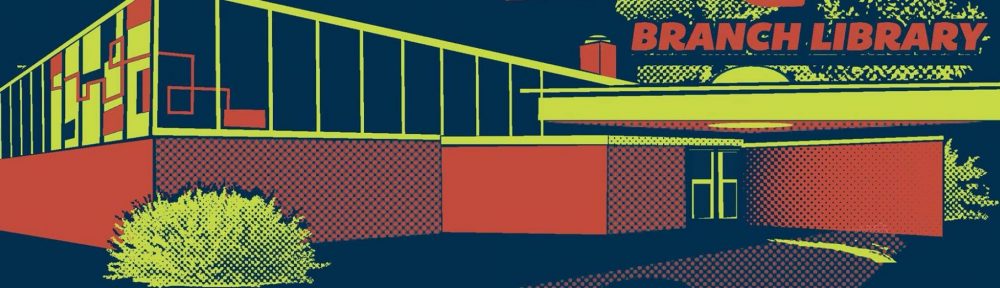
I did not know this until I began researching the origin of Hampton’s mid-century modern buildings, ampoule and was stunned to learn from the 1940 City Directory that there was NOTHING on Hampton between today’s Highway 44 and Arsenal. In 1940! Or that they didn’t have to knock down a single building to develop the intersection of Hampton and Eichelberger (home of the fabulous Buder Library building) because even as late as 1948 there was still no Directory listing for anything on that stretch of road.

2185 Hampton Avenue in South St. Louis photo by Toby Weiss2301 Hampton Avenue in South St. Louis photo by Toby Weiss

The St. Louis history of post-WW2 mid-century modern always focuses on the flight from City to County, or how old City buildings were demolished to make way for Urban Renewal. But along large swaths of Hampton Avenue, the mid-century modern buildings ARE the original buildings, and to think this happened within the City bounds at such a late date proves how the City of St. Louis is both so ancient and so young. This just adds to the schizophrenically endearing nature of our City, and highlights the importance of preserving and celebrating the historical and architectural uniqueness Hampton Mid-Century Modernism.

2330 Hampton Avenue in South St. Louis photo by Toby Weiss2340 Hampton Avenue, South Hampton Professional Building photo by Toby Weiss

Hampton Avenue is close to the western city limits, and to a growing City that took from 1850 to 1900 to seriously expand west from Grand Boulevard to Kingshighway, Hampton would have been considered “out in the boonies.” According to the St. Louis Street Index, the name Hampton didn’t appear on a map until 1913, and only earned its top northern section between Manchester and Oakland avenues in 1921.

2525-31 Hampton Avenue, Castelli Tuxedos, photo by Toby Weiss2634 Hampton Avenue art deco photo by Toby WeissWhile there was continual residential development from the 1850s onward in the neighborhoods that surround Hampton Avenue (Oakland, Clifton, The Hill and Southwest neighborhoods), other than small pockets of commercial storefronts dating from the 1920s to the early 1940s, the bulk of Hampton Avenue appears to have been built up in earnest during and after World War 2. Meaning, once St. Louisans strengthened their commitment to the automobile, Hampton suddenly seemed much closer than before and worthy of commercial development.

2727 Hampton Avenue, South Hampton Place Apartments photo by Toby Weiss3433 Hampton Avenue South St. Louis photo by Toby Weiss

This would also mean that the density of MCM buildings on Hampton were designed and sited with the idea that people would reach them by foot, bus, streetcar and automobile. So this wasn’t a case of slotting new modern buildings into a pre-established urban grid (as was the case with Lindell Boulevard modern in-fill), but rather a blank canvas to paint with both the old and new colors available to planners, developers and architects in the mid-century.

3701 Hampton Avenue Police Officers Association photo by Toby Weiss3810 Hampton Avenue, since demolished photo by Toby Weiss

Since about 2002, I have been photographing the MCM on Hampton; some of the photos in this study are of a building in a younger or less-molested state. From the summers of 2010 to 2011, I purposely photographed 107 buildings, and spent way too much time pouring over physical City Directories at the St. Louis County Library headquarters, and on-line with Geo St. Louis. There are plenty of discrepancies between the two; I often had to rely on 1958 and 1971 aerial maps of Hampton to clear up confusion, or talking to an architect (Richard Hemi), a glazier (my father, Richard Weiss) who worked on a building in question, or asking older St. Louisans to dust off their memory caps and picture what used to be.  So, I know there will be plenty of inaccuracies of info that will be discovered, but now is the time for everyone to join in and share what they know.

4647 Hampton Ave in South St. Louis photo by Toby Weiss4651-53 Hampton Avenue in St Louis Hills photo by Toby Weiss

More on this building.

For the sake of space, only 30 of 80 buildings could be included here.

See all 80 Hampton MCM buildings and their history here.

4650 Hampton Avenue South St. Louis, now loft apartments photo by Toby Weiss4705-21 Hampton Avenue in St. Louis HIlls photo by Toby Weiss

Of the 107 Hampton buildings that I photographed and researched, 46 were built between 1950 – 1959, and 29 were built from 1960 – 1969. Of the remaining 32 buildings, most were built between 1932 – 1949, with 5 of them going up between 1970 – 1976.  Some of the older buildings were given a modern facelift to keep up with the Joneses, and if there was a building in the path of what would become an interstate they were demolished. One example is:

This grand palace at 2065 Hampton (at Wilson Avenue) opened in 1952 as Ollie Auto Top. Darren Snow found this photo as part of a display ad in the 1959 City Directory. The address was listed as vacant by 1969, and then Hwy 44 came through. A Steak ‘n Shake that sat at 2055 Hampton for about only 15 years also bit the 44 dust.

5013-25 Hampton Avenue, Hampton House of Liquors, photo by Toby Weiss5220 Hampton Avenue, Dippel Plumbing, photo by Toby Weiss

My research turned up a steady and over-abundant stream of liquor stores and bars all along Hampton, especially along the stretch running through St. Louis Hills. For instance, 5918 Hampton is today Area IV, and that storefront is carrying on a long tradition of housing only taverns, which began in 1936 with Robert Werges’ joint. Sometimes a retail block would begin and end with a liquor store; so no one ever had to walk too far for a brew? As the elders have said, all the smoking and drinking in Mad Men is not an exaggeration, and Hampton Avenue from 1936 – 1970 was the living proof!

5320 Hampton Avenue, former Buder Branch Libray now Record Exchange in St. Louis Hills, photo by Toby Weiss

More on this building here and here.

After liquor, beauty and ice cream shops were the most popular along Hampton, followed closely by filling stations, which verifies how much more auto-centric Hampton was when compared to the other thoroughfares further east.

5333 Hampton Avenue in St. Louis Hills photo by toby Weiss5400-08 Hampton Avenue, Porter Paints photo by toby Weiss

More on this building here.

There were businesses that moved just blocks away to get into newer buildings (like Charles of Yorkshire beauty shop or Gassen’s Rexall Drug Store), and lots of realty companies opened shop for a short time, reflecting how the neighborhoods around Hampton were still building up in the 1950s-60s. But there was always another business ready to move into a vacated storefront, and that still happens today. No stretch of Hampton has yet experienced the kind of rot that affects other parts of the city and their main thoroughfares.

5411-25 Hampton Avenue in St. Louis Hills, South Hampton barber shop photo by Toby Weiss5600 Hampton Avenue in South Hampton St Louis photo by Toby Weiss

There are roughly 8 companies and institutions that still remain in the building first erected for them, including: Bayer’s Garden Shop whose building went up in 1948 as O.E. Bayer’s Garden, Furniture & Novelities; Porter Paints at 5400 Hampton, who set up shop in the new building in 1959; AB Dick Products still resides in their 1960 building at 2121 Hampton. Wise Speed Shop at 5819 Hampton moved into their new building in 1969, and only very recently did they close up shop and put the building up for sale.

6425-31 hampton Avenue in St Louis Hills photo by Toby Weiss

There have been some demolitions for something new like a highway (as mentioned above), or taking down a small house or filling station to accommodate a larger building. For instance, Stein Brothers Bowling was on the northwest corner of the Hampton/Chippewa intersection in 1965, but it was torn down to make way for what became Lindell Bank & Trust (which looks MCM but really isn’t). But in general, buildings get remodeled rather than demolished, and even when they are remuddled unrecognizable, it’s preferable to demolition.

7001 Hampton Avenue, St. Louis Hills Veterinary Clinic photo by toby Weiss

Two of the buildings in this survey are currently in the hot seat for demolition, which highlights why a study of the mid-century modern building stock on Hampton deserves a spotlight. This is a unique stretch of commerce in St. Louis City, an area that developed in tandem with St. Louis County, receiving the same kind of care and enthusiasm as shown to inner-ring suburbs like Ferguson, Jennings, Affton or Lemay.

7047 Hampton Avenue in St. Louis HIlls photo by Toby Weiss

I invite you to

see a total of 80 Hampton MCM buildings at this link.

And then travel this great street with new eyes – maybe even find some new ones that I overlooked due to being overwhelmed with the treasure chest that is Hampton Avenue!

RELATED
South Side Copies
“Bldg To Be Razed” on Hampton

Save Our Saucer Rally & a Talk with Its Architect

Want to show some love for The Saucer? Then show up Wednesday, July 6th at 6 PM at South Grand and Forest Park Parkway.

Bring signs, posters and other items to show how much you love the Spaceship. Hear some knowledgeable folks share their love of the building and voice ideas for other uses for it.  There will even be limited edition Saucer T-shirts available!

Let’s all come together to show the Board of Aldermen (who have their final vote on its fate Friday, July 8th) how beloved this building is and why it would be a tragedy to tear it down for unspecified plans.

“There may be plenty of interest in reusing that awesome saucer if it is marketed properly! The building has the ability to be remodeled, adapted, or expanded to meet the needs of a new tenant or tenants,” says local architect Paul Hohmann. “We’ve been in touch with a number of local businesses, who may be interested in saving that iconic building, and we love it so much, we’re working with anyone interested to connect them with the opportunity to preserve it!”

As it stands on public record, the developer sounds adamant that he only wants a new building in its place, and is stubbornly opposed to re-using, remodeling or adding on to the existing building. This seems like a narrowly-focused and short-sighted view point from a developer who has shown creative thinking on so many other St. Louis City projects.  Maybe if we all did the work of delivering a new tenant to him, he’d change his mind?

I just got off the phone with recently retired architect Richard Henmi, who was the Associate and Chief Designer for Council Plaza – and the Saucer, specifically – while he was a member of the architectural firm Schwarz & Van Hoefen. He has been closely following all the media coverage about the Saucer (I met him when he commented on my previous post about The Saucer) , saying “I’ve never seen so much coverage for such a tiny building!”

He drove by the building this past Sunday and said, “The 6-inch solid concrete roof has held up very well, though it should be checked thoroughly before doing any work on it.”

What would Henmi like to seen done with the building he designed? He is aware that the developer would like more square footage for more paying tenants, and says that one could add onto the north and east sides of the building while maintaining the integrity of the roof. “It would need to be done carefully, but it could be done.” Henmi also envisions how the roof overhang would make for a pleasant outdoor dining patio, especially by adding low walls and landscaping around it.

He has seen the proposed adaptation on the blog What Should Be,  and while he does not agree with the concept, he loves that people’s imaginations have been fired up about the building, and would love to see it become a “Wash U. sketch problem” for the next semester of architectural students at Washington University (where he graduated from in 1947).

Henmi cannot make tomorrow night’s love-in because he is attending a family reunion in California, but once he returns, he said he will do all he can to save the building, as he’s already experienced the sadness of seeing 2 other of his buildings demolished in the past. And he will work with us to go through his drawings he donated to the Missouri Historical Society in 1989, so soon we should have copies of original drawings of The Saucer as designed for its original use as a Phillips 66 in 1967.

See you tomorrow night at the rally to Save Our Saucer. Here’s the Facebook invite for more info. And please remember – this is a positive event about our love for this unique and endearing building, so let’s share only our love and ideas for its future.