 VIDEO “Recent Linear Landscapes” by Finn’s Motel
The astronaut is Thomas Crone.
The Indian is me.
The clown is Joe Thebeau, the leader of Finn’s Motel.
REALTED
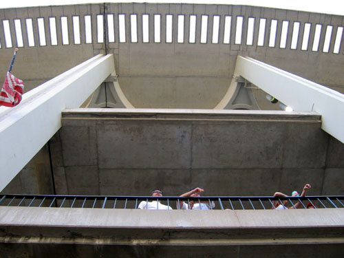
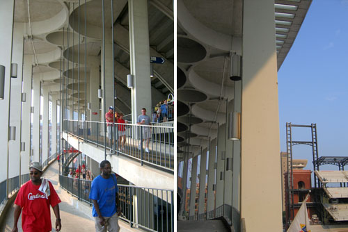
The Gateway Arch
VIDEO “Recent Linear Landscapes” by Finn’s Motel
The astronaut is Thomas Crone.
The Indian is me.
The clown is Joe Thebeau, the leader of Finn’s Motel.
REALTED
The Gateway Arch
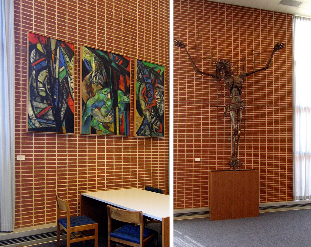
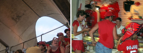
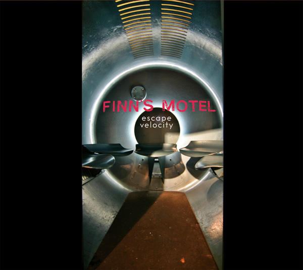 The Arch has been a continually reoccurring theme in my life, lately. I was commissioned to photograph interior pieces of it for CD art work. That’s one of my photos on the cover, above. I even got to sing with Joe Thebeau on the track “Eero Saarinen,” which is about the metaphorical and philosophical meanings of The Arch.
Finn’s Motel Escape Velocity releases on September 19, on Scat Records. They play their first show on August 25th, at Off Broadway, and will continue to tour all parts of the country the rest of the year. I’ll refrain from raving about how absolutely brilliant this record is because you need only listen to tracks available on-line to hear that for yourself.
Then, the other night I went to the Fox Theater for the debut screening of The Gateway Arch: A Reflection of America, a new documentary from Civil Pictures. It’s a professional and lively trek through all the important historical points of Arch conception and execution. Of great interest were current interviews with a few of the men who helped build the structure. We see footage of them inches away from death high above the riverfront, and then watch them chat about this experience as if it’s no bigger deal than buying a Big Gulp. Their presence in this documentary makes it worth the price of admission.
For an hour, I’m thoroughly engrossed in the film; the final triangle piece is inserted, and The Arch is complete and then… the movie’s over! What? How can this be? There’s much more to this story: the controversial revision to Saarinen’s plans for the grounds surrounding the Arch, the development of the museum, and how they finally got around to lighting the sucker at night. Just these 3 topics alone would make for a worthy half hour.
But I realize that when making a documentary time is money, and sticking to an hour probably makes it easier for television stations across the globe to program it. The filmmakers never claimed to be offering up a definitive documentary on The Arch, just a compelling, updated one. This they do deliver. Good job, and the field is still wide open for someone to dig deeper for the entire story…
A few hours before the documentary, I saw this man moving furniture on Lindell Boulevard:
 That’s the coolest tattoo ever! If he hadn’t been so busy, I’d have chatted him up for the, er, back-story. But at that moment, I was thrilled with what I figured would be the opening act for the Arch documentary. In retrospect, the documentary was the scholarly footnote to the impassioned, inked headliner.
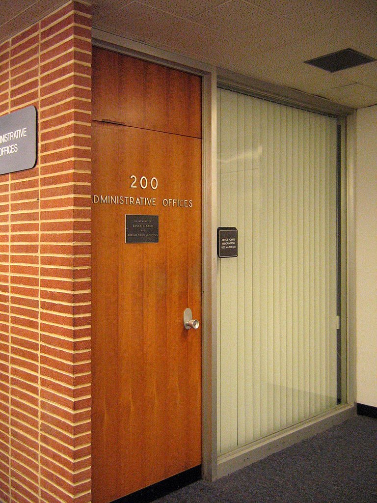
 3650 Lindell Blvd., St. Louis University Campus
St. Louis City, MO
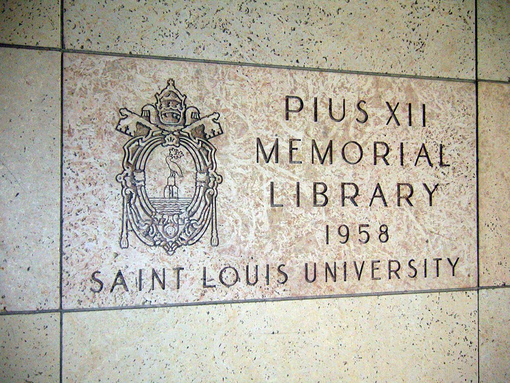
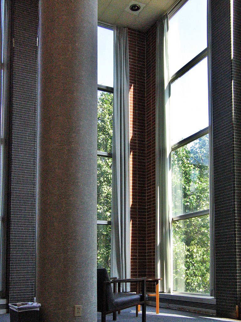
The Pius XII Memorial Library is something I’d have never known about if not for Claire Nowak-Boyd getting a job there, and taking us for an all-access tour of the building.
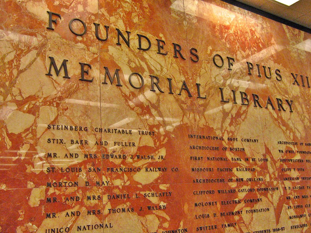 Though it has a vintage of 1958, my jaundice eye caused by self-absorbed SLU built-environment activities expected a bunch of bland nothingness. Upon entering, I first saw the Founder’s Wall (above). While impressive with both the name dropping (the by-gone days of Stix, Baer & Fuller, Granite City Steel Corporation) and immense sheets of arresting marble, I still only registered a typical collegiate vibe.
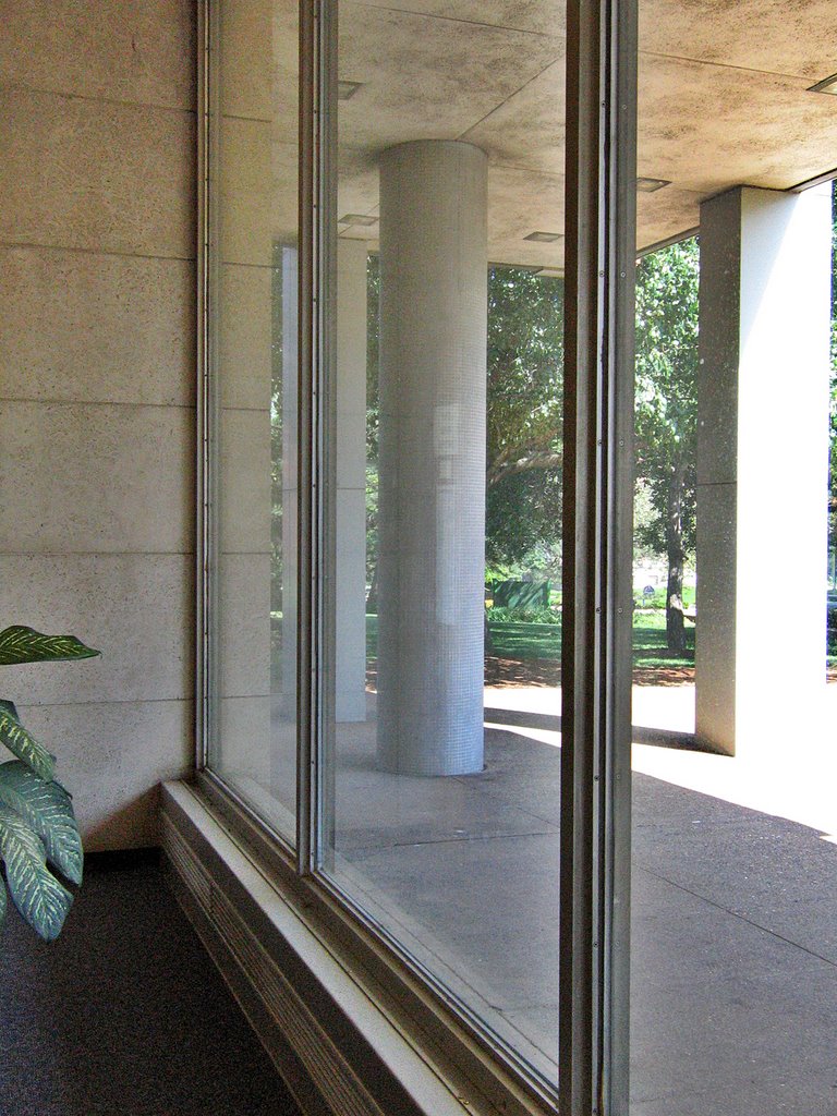 The ground floor southern wall of the library is nothing but glass (above), creating that wispy hint of a wall idea that was so novel, so liberating in late ’50s architecture. A librarian came over to chat with Claire, and wound up giving us an instant history lesson of the place.
The middle of this glass wall used to be the main entrance when there was an actual street running in front of it. Once SLU reconfigured the street grid for campus greenery, the entrance was glassed in, and one now enters only from Lindell.
He also confirmed what was becoming apparent; this building’s interior remains virtually untouched since it opened in 1958. It’s rare that anything on this campus remains untouched. It was hinted that some remodeling may be in its future.
 Behind the ground floor’s main room are some offices and amenities. The black and gold marble (above) against a modern take on stained glass has a curious tension to it.
 Then I look at the wall opposite (above) and I’m transported back to the set of The Apartment. This is just like a hallway at C.C. Baxter’s place of employment, Consolidated Life, all sleek and generously stretched, professional and showy at the same time.
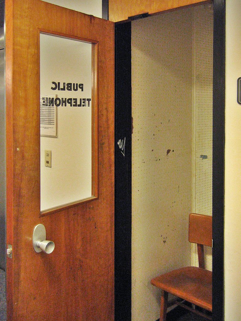 Come off the elevator on the 2nd floor, and it’s instant nostalgia for a time never personally experienced, but man, did it look great. Seemed so much more civilized to use a phone booth (above). The remaining ones should be rechristened Cell Booths, and those who scream into their cells should be strongly encouraged to use them.
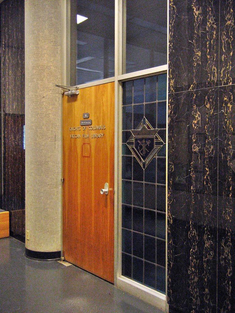
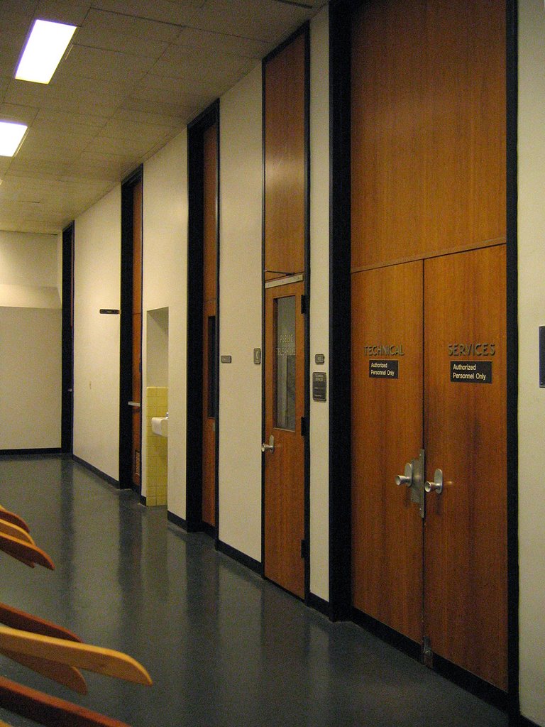
The black metal, thick wood doors (note the subtle offset of the knob to the key plate) and ceiling-to-floor reach is carried throughout the entire building, never missing a step. The same font (a heavier Lever House) is used to label every door (even the janitor’s closet). This consistency of detail lends an air of authority and grace.
 Turn the corner (above) and some new elements are added to the palette . A slab wall of narrow-course brick tilts up against the uniform door, and a wall of glass completes the frame. Further down this brick wall, the rose-colored marble from the ground floor rejoins the concert in progress. With a subtle touch, the mood went from Manhattan to Los Angeles. I saw The Beverly Hillbillies Mr. Drysdale striding out the door.
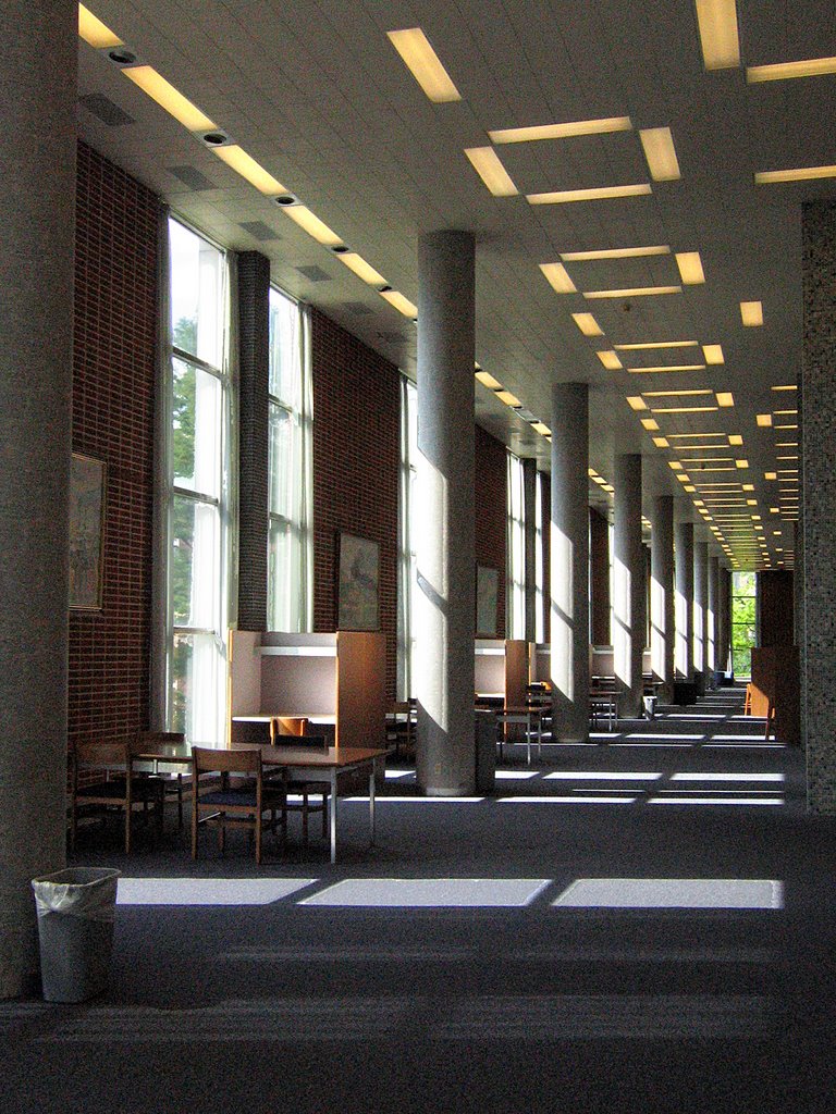 After leaving the office areas, one is hit with the vertical immensity of the main library space (above). A perfectly Grecian line of columns rings all perimeter walls, with slender windows matching them foot-for-foot. The brick hinted at outside Mr. Drysdale office makes its own chain of columns. Note the patterns of the lights recessed into the metal acoustical tile; it holds throughout the entire building and adds a whimsical touch to what could be a cold, austere space. All that height! And the “room” is just as wide as it is tall – just vast and airy. But it feels warm.
 The copious amounts of natural light streaming through banks of simple white sheers create warmth, as do endless rows of what the building was made for: books.
 Endless volume is bisected with a 3rd floor balcony within the center of the space. Stainless steel banisters top a platform that serves as ceiling for below, a floor for above, and also conveniently houses duct work, using the air vents as a decorative element. The rows of books are in a low-slung cozy space under the platform. The study of those books takes place in the surrounding gallery of light and air.
Note Claire in the above photo. Note what she’s sitting on. Know that most all of the furniture and fixtures are the original late ’50s vintage. Know that I almost passed out from too much bliss.
 Here’s where the study gallery turned into the set of a Doris Day movie!
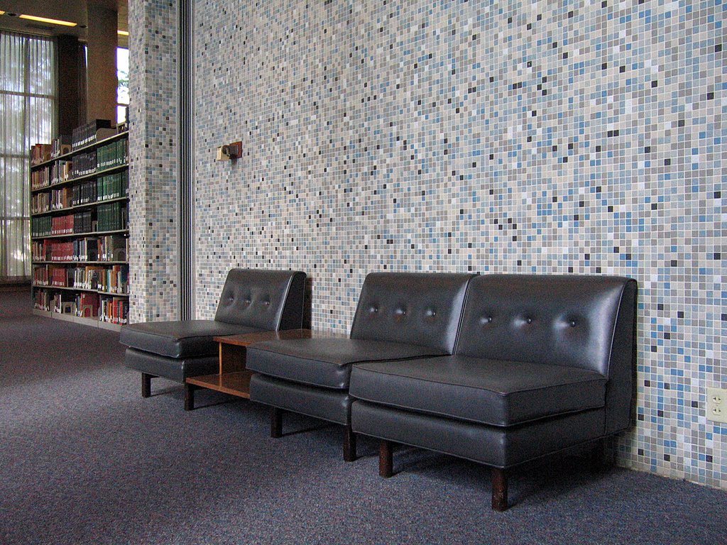
The 1″x1″ wall of tiles (various blues, with beige, white & black accents) is repeated throughout the entire building. It is like the grass from which all elements grow. Up against a completely uninterrupted wall of this, steel blue-gray leather slipper chairs and a simple, bi-level coffee table float above the blue-gray carpet. It literally looks like something Doris Day’s interior decorator character in Pillow Talk would have pulled off for a corporate client.
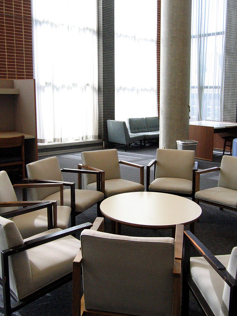 This is, literally, a round table meeting. A spontaneous circle among the rectangles was a nice touch, as are the blue cloth-covered slipper chairs in the far-ground (above). Again, it must be noted that all of this original furniture is in exquisite condition. Considering it’s a campus library in service for almost 50 years, there’s nowhere near the amount of use-marks that would be expected. Does it not get used as much as I think it should? Or have all generations of SLU students been overly respectful to the chairs and tables? But I’m so grateful for this oddity.
 Private study stalls (above) have matching display cases throughout the building. Danish Modern in shape, they also share a wood grain with all the office doors, which once again shows the scope of repetitive detail. The designers considered every inch of this building, and treated them all with a subtle hand.
 Still on the second floor, the periodical section (above) takes on a slightly different flavor. The wood chairs are positively Eames-like; the tilted wood counter is Amish Modern.
 Massive, modern artwork (above, left & right) hangs from the brick column walls, and from the look of it, it was all created and procured within 5 years of the building’s erection. That’s artwork placed…
 …and then there’s artwork found. Peering over the edge of the 3rd floor balcony (above), the banks of file cabinets and card catalogs are a 3-D cubist painting.
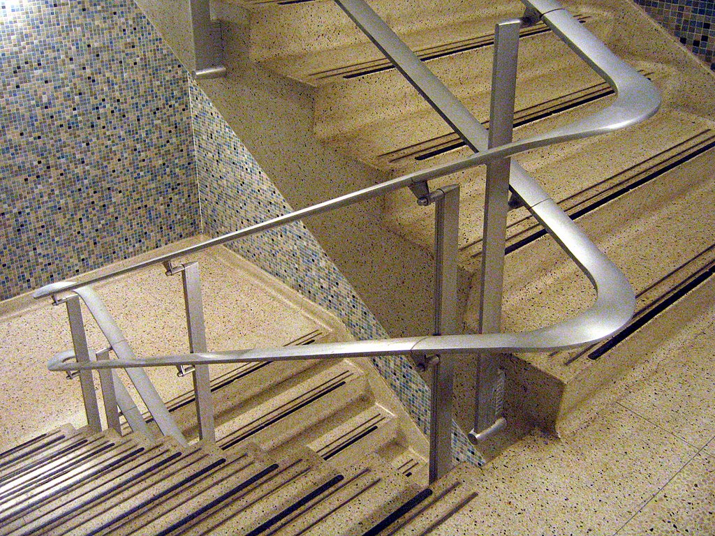 Even the utility stairwells are a work of art. That same tile covers all of the stairwell walls, and taffy-pulled steel rails and banisters snake above white, granite-look tile flooring. These stairwells feels like an upscale dining room in a 1950s downtown department store; the kind of restaurant where Ladies Who Lunched had cucumber finger sandwiches and extra dry martinis while a water fountain trickled seductively in the middle of the room. This may be the only stairwell to ever evoke such strong images in my head, and I could happily camp on these landings for days.
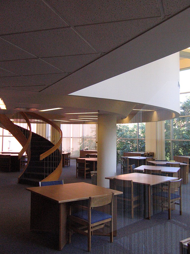 New sections were added to the library in the early 1980s, and while the materials were downgraded to drywall and pine, they stayed true to the sparseness of line and the generosity of scale. The dramatic circular staircase (above) disappearing into a circular mass is a particularly cool touch. On first glance, I assumed it was original, but it’s part of the new additions. A round of applause goes to the remodeling architects for such a sensitive homage to the rest of the building.
 Every single bathroom in the building has a completely different color scheme. The men’s room shown above is all Playboy Club bright, while other versions (of either gender) have powder blue, coral or burgundy stalls against complimentary shades of wall tile. I imagine the original designers having to storyboard all the bathrooms, to make sure they didn’t repeat themselves, and that commitment to that level of detail brings a tear to my eye.
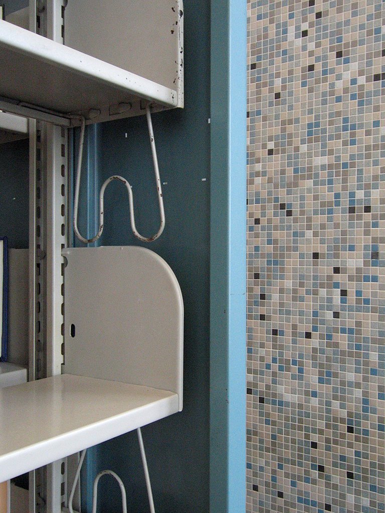 No matter where your eye lands, there are underplayed but sophisticated details that have remained largely undisturbed. It was built on a grand scale, but pays attention to how humans will use it, right down to the countless vintage hand-crank pencil sharpeners that blend in to the surfaces. The sky blue metal bookshelf (above) is utilitarian, but has details that harmonize with its immediate surroundings. The entire space is a symphony.
 As strange as this may sound, the above space reminded me of a Palladio villa; the scale, the symmetry, the quiet quality of light and sound harnessed by a soaring column. It’s both classic and modern. This library building is a jewel, and I pray to the architectural gods that Father Biondi overlooks this gem for several more years.
 Kienlen Ave & Dr. Martin Luther King Dr.
Wellston, MO
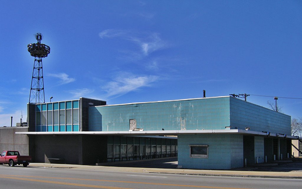
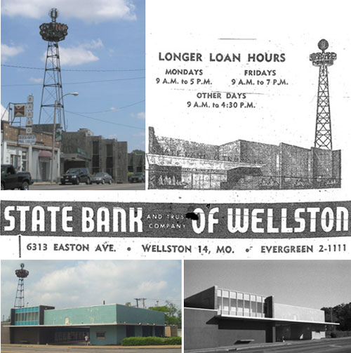
Every few months I visit Wellston, just to keep track of what’s going on. There’s been a lot of activity in the area over the last few years, with a considerable amount of new home construction and a handful of new commercial buildings. While it’s heartening to see activity in the community, I worry about the conspicuous lack of rehab and preservation, and specifically, the fate of the former State Bank of Wellston.
 Sited a mere 1.5 blocks northwest of the St. Louis City Limit, the State Bank of Wellston was a flashy focal point of Wellston’s welcome mat status in the post-WW2 suburban migration.
 Erected in the late 1940s, the bank’s lighted advertising tower (above) was/is a notorious landmark. It looks like a cross between the old RKO Pictures Studio logo and a hipster alien spacecraft, which is also an apt description of the role Wellston played in the urban-to-suburban evolution of the St. Louis Metropolitan area.
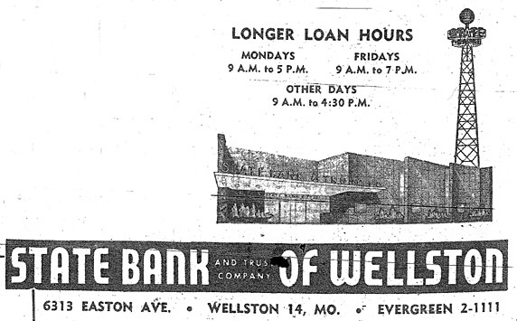 The advertising tower touts Sky Bank, which is was until the early 1950s when a new granite facade lent the importance required of an upgrade to State Bank. The 1955 St. Louis Directory ad (above) reminds us that Easton Avenue was long the original name of Dr. Martin Luther King Dr. That moniker peters out less than a mile from this intersection, when it becomes St. Charles Rock Road.
 When trying to recreate the 1955 directory shot, I couldn’t help but notice that liberties had been taken with the tower placement. But surprisingly, most everything else remains the same.
 In the early 1960s, the bank expanded and embraced the supremacy of car culture by adding an aqua supreme drive-thru-banking addition. With the light fixtures that indicated open lanes long gone (above), I love that what remains looks like hubcaps. It’s both a sad and fitting commentary of what birthed and killed this now-abandoned drive-thru.
 It is now a Regions Bank, and every time I photograph it, a security guard eventually comes out to kindly shoo me away. On this visit, the guard told me that the building had been sold in the late fall of 2005. Regions would build a new, larger structure across the street on Kienlen. I mused aloud to the security guard: While it’s nice that they decided to stay in this community, why do they need a bigger building when most banks are physically shrinking due to ATM- and on-line-banking? And who bought this building? And what will become of it? The security guard merely shrugged and made it clear I needed to stop taking pictures and just leave.
 Mindful of all the new activity, Landmarks has made steps towards an historical survey of Wellston, in hopes of making its city hall and developers aware of Wellston’s varied historical fabric. My hope is that rather than concentrating on the earlier era of this municipality, all decades of its story will be represented, with this bank being a beautiful example of mid-century city-to-county aspirations.
Since it will no longer be a bank, it’s time to think about what else it could become: A bookstore or library (with drive-thru drop off book return!); a restaurant and bar (imagine the drive-thru area as the coolest outdoor dining area)? If Wellston were as sleepy as it once was, this soon-to-be-empty building could sit undisturbed for decades until a bright-minded person decided to bring it back to life. But Wellston’s on the move, and chances are this building will be demolished, because that’s what happens in St. Louis. Plus, people have yet to be alarmed about the cavalier destruction of our mid-century architectural heritage. This bank is a choice example of such.
 RELATED To Wellston
Last Season at Busch Stadium
Downtown St. Louis, MO
Breaking down the elements into outline form, I aesthetically love the current Busch Stadium because it lends a delicate airiness to the Lego blocks of the downtown skyline. The beginnings of the new (to the left, above) juxtaposed with the old stadium highlights Chunky vs. Sleek, and considering how huge our bodies, cars and houses are, a chunky new stadium makes perfect sense.
In the Spring of 2003, I was part of a small committee who tried to save Busch Stadium. A new stadium was going to be built, but we came up with alternate uses for the existing stadium, in hopes of keeping it and incorporating it into “Stadium Village” (any more word on that promise?). If the owners had situated the new place just a few blocks further south, the existing place could have served as St. Louis’ version of the Roman Coliseum. History preserved and reutilized for all manner of public events, retail and restaurant establishments, and a natural meeting and hanging place. The owners could have saved millions on demolition costs, and still made money from rental fees.
During this same time, I had a marketing job interview with a downtown architecture firm. Half way through the interview, it was revealed that the firm was part of the stadium demolition team, and thrilled to be partnered with the powerhouse HOK because of it. My gut reaction was “I’m staring into the eyes of Beelzebub,” and I mentally shut down, purposely steering the interview into the ground. Even though I was desperately unemployed, I didn’t want to be considered for the job.
I’ve never been down with the concept of allowing sports and retail profits to dictate civic and community evolution. Old vs. new, this story is filled with truth, propaganda and sentimentality. It was the sentimental angle that brought me to the ball park on Saturday night to visit the place one last time, take tons of photos, and say goodbye.
I choked up quite a few times while reflecting on both my personal past with the stadium, and the glorious baseball history that’s soaked into the concrete walls. I got lost in the sad poetry of crudely painted RedBirds (above left) and historic home run spots (above right) that won’t – and can’t -make it to the new stadium.
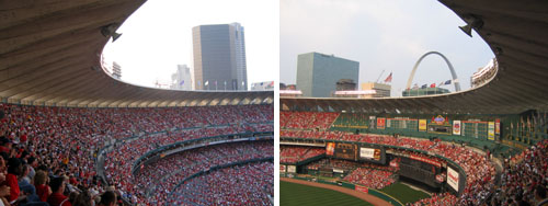
And I’ve never taken for granted these views from the stadium. No matter the decade, it’s always thrilled, even when a particular game didn’t. The arc, the Arch, the sweep and swirl of energy, and all the pieces that combine to turn a structure into the nucleus of a proud and glamorous era.
I don’t want to give this up.
Why are we giving this up?
Yes, I know the truth, the propaganda and the spreadsheets, and I resent the owners’ tugging on this city’s raging sentimental streak as they milk this season’s long goodbye. But I suppose there’s money to be made from that, too.
Speaking of money, I highly doubt that I will ever pay to see a game in the new stadium because A) I won’t be able to afford it, and B) I refuse to put my money in their coffers because C) we all originally voted against this idea. If someone pays my way, I’ll visit the Retro Brick Theme Park, and stare wistfully off into the distance where the last graceful cookie cutter stood, remembering how much I loved the old place… It’s going to be a long, mournful summer, and a bittersweet fall (since the Cards will go the distance).
Martin Luther King Dr. & North Kinshighway
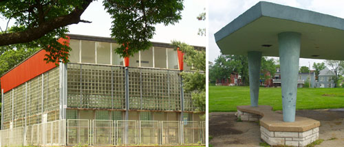
St. Louis has racial divide in its DNA, and the history of St. Louis County is also the tale of White Flight. After WW2, the new world of tomorrow sprang up, and the architecture was as modern and adventurous as the future promised to be. On both sides of the city/county line, sleek samples of progress ushered folks into the suburban frontier, and all our inner-ring suburbs – especially on the north side – retain amazing examples of that promise because they were abandoned soon after they were built by Whites leapfrogging over Blacks on their way to deep county. Wellston is a perfect example of progress-to-stagnation Caucasian-Modern architecture.
Start with this excellent site, then motor west on Martin Luther King Dr. from downtown. In the mid-1950s, Sherman Park was given some future polish with googie pavillions for the sports field and the Wohl Community Center moved from across the street and into the park proper. The center still features an indoor pool wing, with sliding glass doors at ground level to let in fresh air, and massive expanses of glass block above that. In person, it’s an overwhelming sight.
Martin Luther King Dr. between Hamilton & Hodiamont
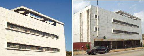
Right before the county line at Hodiamont is the remains of the JC Penney’s, which closed around 1975. My father was a glazier, and remembers installing mirrors in the building in 1950, and at that time it was still an old-fashioned department store. So, the “Le Corbu” facade was tacked on sometime in the mid-1950s, at the height of the Wellston Shopping District’s popularity.
This building is still space-age triumphant in its decay, and while photographing it in 2003, I talked with a man who claimed to own it. He said the building was still in good condition, with only minor water damage on the top floor, and he’d like to turn it into a black history museum.
Evergreen & Martin Luther King Dr.
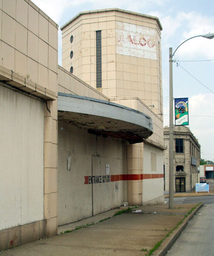
Another case of an old building getting a post-war face lift, in this case a streamlined deco in the late 1940s. This was the first Central Hardware in the county, just a block and a half past the city line. Its last incarnation was as Aalco Plumbing Supply.
Kienlen & Martin Luther King
Right as Skinker becomes Kienlen and city becomes county, banking becomes dramatic.
The advertising tower was there when it was tiny, old-fashioned Sky Bank. In the early 1950s, a brown and black granite facade was added to the (then) Easton side and it became State Bank. Automobiles strangled the street cars, so the glorious turquoise tile drive-thru addition was added in the early 1960s.
I was so smitten with the car-culture aqua-ness of it all, that I didn’t notice the sophisticated geometry of the addition until I shot it in black & white. I adore this building, and it’s at the point where the security guards (it’s now a Regions Bank) ignore me as I document every fine detail of the defunct drive-thru aisles.
And I document this because I know it will all come down. New buildings have been slowly going up around the Wellston Hub, and there is a grand plan. Historic preservation being what it currently is, if any saving gets done, it will be only of buildings retaining any of their pre-WW1 architecture. But this entire district was all about progress and commerce, and the old buildings sporting their mid-century makeovers say more about our former aspirations and dreams than any old wives tales a This Old House rehab would spin. I think it’s important to tell all of the story, and Wellston is a particularly juicy chapter.