Eero Saarinen: Shaping The Future

eero-03

The Kemper Art Museum is my new favorite place for wallowing in mid-century splendor. Their new exhibit on Eero Saarinen is even better than Birth of the Cool, and it is an embarrassment of riches to be able to say that.

As always, taking pictures (or leaning) in the Kemper is strictly forbidden and studiously enforced, so I can only share with you these crappy cell phone shots.  Shown above are architectural models of the TWA Terminal and Dulles International airports! Below, a color rendering Eero did of one of the TWA lounges!! And this is what is in just one corner of one room!!!

eero-01

The exhibit is very thorough without being ponderous, and displayed so that one can skim lightly and take away useful tidbits (Eero could write with both hands at the same time and write backwards) or really dig in and start to feel what it was like to work with him as he created and refined an idea.

Everything the man touched conjured a new design reality, and this energy reverberated well past him to affect and elevate those who brought his creations to life.   Look at the photos of the TWA Terminal or the Ingalls Hockey Rink during construction and be blown away by the intricate wood forms the men built to mold the concrete.  Marvel at new fabrication tricks invented to create structural panels for the IBM Research Center building.

There are original sketches of his iconic tulip chairs within one room dedicated solely to his furniture designs.  There’s an 18-minute documentary about Eero’s life and work created just for the exhibit.  It is easy to get lost for hours in this exhibit, but luckily it is in residence until April 27, so there’s plenty of opportunities to do it piecemeal, or just keep gorging on this architectural buffet.  Kemper is open most all times you need them to be open, so there’s no excuse to miss it.

Need more convincing?

Here’s a quick blast of photos from the exhibit.

Here’s a short video about the exhibit.

My Favorite Walgreens

watson-walgreens-013

My favorite Walgreens no longer exists, and this is a highly ironic story.

watson-walgreens-021

In South St. Louis City, we’re used to them tearing down bowling alleys so they can build a Walgreens. But in this case, in 2003, they tore down a Walgreens to build another Walgreens! It’s all true.

watson-walgreens-031

This mid-century fabulous Walgreens was on Watson, just a scootch east of the intersection of Rock Hill/Elm. This one stayed open while they built a brand new one right at the intersection proper. Once it opened, they tore this one down, and now a short strip mall with a Blockbuster Video stands in its place.

watson-walgreens-041

To this day, I still see a phantom image of it as I pass by. It’s roof reminded me of the Flying Nun’s head gear as she was airborn.  And it’s still a weird feeling to miss a Walgreens… know what I mean?

American Look 1958

american-look-1958

This clip is billed as “The definitive Populuxe film on 1950s automotive, cheap industrial, viagra dosage interior and architectural design.”

Highlights
At the 4:05 mark is a setting that looks like every 1960s Elvis Presley movie.
5:27 – bowling!!
5:54 begins the parade of residential and public architecture.

This clip is billed as “The definitive Populuxe film on 1950s automotive, recipe industrial, interior and architectural design.”

Highlights
At the 4:05 mark is a setting that looks like every 1960s Elvis Presley movie.
5:27 – bowling!!
5:54 begins the parade of residential and public architecture.

Click to see the clip.

Central West End "Progress"

A “Special Progress Section” was included in the May 7, 1961 edition of the St. Louis Post-Dispatch. These 3 examples shown boasted about the progress on Lindell Boulevard in the Central West End, like the Optimist building.

They also touted the new building for the Engineer’s Club, which is by the same architecture firm as the Optimist building, Schwarz & Van Hoefen.

And then there was the new chancery office for the Catholic Archdiocese, which was under construction at the time of publication. By clicking on the above photo to read the caption, one finds this quote:

The Catholic Church has been a bulwark in the fight against decay, providing assistance for the Central West End Association and other neighborhood groups.

Ironically, the same Catholic Church that championed progress on this block of Lindell now wants to tear down one of those progressive buildings they helped usher in.
Learn more about the push to save the San Luis here.

It was a sweet justification to find this “Special Progress Section,” because it supports what I’ve been trying to say about the Central West End and Lindell Boulevard, in particular: all chapters of its story are important and vital. And it is highly irresponsible and short- sighted to begin destroying buildings that were considered the desirable solution to older buildings they felt needed to be destroyed. The cycle has got to stop! We can no longer (literally) afford to squander our history and resources. There must be real understanding of past and present, and a practical plan and vision for the future based on the realities and aspirations of the entire community.

You can see how these 3 buildings look today by clicking here.

Mid-Century Modern on The Hill

Like a fly trapped in prehistoric amber, a house for sale in The Hill neighborhood of South St. Louis city is eerily preserved. You can buy the house and get the furnishings, or buy the furnishings and get a house. Either way, it’s a fascinating concept.

See the house here.

Learn the entire story here.

Crestwood Remuddle: Creston Center

Creston Center, Watson & Grant Intersection
Crestwood, MO
The Creston Center, Before. It was a simple and spare 2-level shopping plaza built in 1961. Note the snappy vertical sign to the left, in the auto-centric spirit of this stretch of Route 66. To its right is another 3-sided sign that spun around so 3 major tenants could have equal billing. And a tiny out-building sat close to the corner, making the most of every square foot of land.

The Creston Center, After. The ginchy Creston sign topples, as does the out building, and the remodel is a hot mess.

Now, I’m not saying the original was an important piece of design worth preserving intact. It was very appropriate and utilitarian retail design for the time, and the cantilevered balcony that created covered parking for the lower level is a nice mid-century modern touch. Its simplicity kept it under the radar in the 21st century, but in a bid to jazz up the place and get a full tenant load, the owners paid for a remodel that is just… a steaming hot mess.

In December 2002, when the above photo was taken, the place was about 65% rented. Today, the place is now about 50% rented, so remodeling to make it more attractive to tenants didn’t really play out as intended.

And “more attractive” is obviously in the eye of the beholder. Minimal lines and a flat roof are anathema to current day retailers; they want more “there” there to catch the eye of modern shoppers.

So they put bulky caps on the slender metal poles and went to town on the roof. They gave that roof a height and heft and flash which creates the feeling that the cantilevered balcony is just going to collpase under all that rigamorale.

Why the mixture of shingle mansard and pup-tent standing seam metal? I would have loved to hear the “designers” rationale for this absurd combination, especially because the addition of standing-seam boosted the budget for no good reason. Did they claim that this over-scaled mish-mash would create a dynamic energy so crucial for luring shoppers? Or that the mansards would indicate the prime locations in the building? Or was the rationale as mundane as the metal would ease the cost of re-shingling in the future?

Whatever the case may have been, the Creston Center was an overlooked and unassuming retail center that became a 3-ring circus of hubris and bad taste. I cringe every time I pass it and feel bad that their remuddle became a huge waste of money and intentions.

Reminder: The Julius Shulman Film

Visual Acoustics: The Modernism of Julius Shulman
Saturday, November 22nd, 6:15 pm, Tivoli Theater
The man who took the picture above has finally been honored with a documentary film about his work, vision and contributions to the worlds of art, architecture and photography. Visual Acoustics will be shown this Saturday as part of the St. Louis Intentional Film Festival.

The tickets are only $10, and can be bought on-line here. If you need convincing, take a quick overview of why this man matters. Then go see Birth of the Cool as a warm-up. Then watch the film’s trailer.

See you this Saturday, and it should be easy to spot me: that one weeping silent tears of joy for 83 minutes. Come say hello and spot me a tissue!

POST-SCRIPT Hopes and expectations were high and the documentary met and exceeded them. A towering achievement on so many levels. It allows us to know the man behind the photos, and he is just as fascinating and singular as his work. My only complaint is that, at 83 minutes, it’s too short!

Director Eric Bricker took questions afterwards, and I asked: will there be DVD distribution of this film, and will there be more footage shared as DVD extras? Yes, we will be able to own a copy, most likely before 2009 ends, and yes, there is more footage, but exactly what has yet to be decided.

Owning a copy is important so one can pause it and contemplate the photos. I have had the good fortune of being able to see many of Shulman’s prints in person (both in St. Louis and Palm Springs), and countless prints in books. Visual Acoustics offers up large handfuls of photos I’ve never seen, and that will be worth the price of purchasing the DVD, no matter what the cost!

Thank you to Bricker and his crew for this labor of love. The film brought me to tears three times. It educated and inspired all of us in attendance, and I want to see it again right now!

Mid-Century Apartments on the Border

Geneva Apartments
Southwest St. Louis City, MO
This sleek bit of mid-century cool is hiding in plain sight in southwest St. Louis city. Most probably miss it because it’s tucked into the hills and valleys of the city/county border, along the River Des Peres, a road we race down to get someplace else. Some people know the distinctive Geneva logo on the brick side of the building, a saucy and sexy script font made of stainless steel.

Or maybe it gets overlooked because it’s a fading beauty? The Geneva Apartments were built in 1958, and just imagine how audacious this place must have seemed at the time, all linear pink and white, hinting that if this apartment were in Los Angeles, Kim Novak would stay here, you just know it.

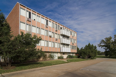
Today, the pink has faded to salmon, some inappropriate replacement patio doors mar the lines, some water-damaged plaster flaps in the breeze and ground floor doors and windows that were once transparent are now blocked off. But I love that renters are required to have white window coverings, which keeps the aesthetics in line and that no significant remuddling has been done. Sit tight, and in just a little while, the Geneva’s retro appearance will become its prime calling card. Well, that, and its ultra prime location by the Metrolink station.

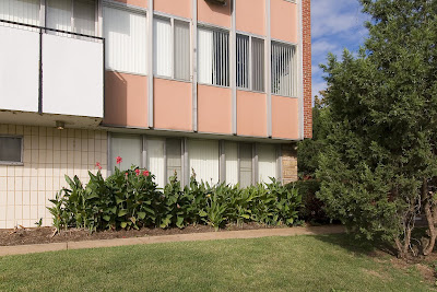
I love the deft use of all the touchstone MCM building materials: metal, ceramic, stone and glass. I love that in the detail shot above, it could well be a picture from Southern California, but it’s St. Louis. I love this place lit up at night, the spotlights casting arches across the entrance. I don’t love the overgrown landscaping because it hides some of the building’s beauty.

Sneak around the corner and push through the trees and find this secret side courtyard. In the center is a former fountain or planter, to the left is a sliding patio door, so imagine the lucky soul who lives in that apartment.

If I had to give up home ownership and move into an apartment, the Geneva would be the place. Checking out their website, the rates are reasonable, the square footage of the floor plans is do-able and the building and the site are fantastically unique. The Geneva’s location is ideal, as it flirts with the county border; the city claims it as the western edge of the Lindenwood Park area. If you’re car-less, this is certainly the place to be, and probably explains why I see so many elderly living here.

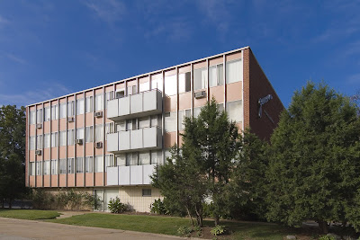
The Geneva is a long apartment building with 2 distinct faces: its Mies-ian public front, and a main elevation that is all minimal brick geometry punctuated by the same white balcony “cubes” on the front elevation. The owners of the building obviously prefer this elevation, as it’s the side shown to potential renters in the photo tour at this site. It is an impressive view, as the building lazily crawls up a hill. With all the mature greenery, it looks and feels like Frank Lloyd Wright’s Unsonian concept successfully transferred to multiple-family residential.

By the late 1950s, the city of St. Louis was pretty much filled up, and The Geneva found a way to wedge into the very last unbuilt acerage at the edge, and then stood alone as an oasis for modern renting for about 3 years until…

…the first building of the Park Val apartment complex went up in 1962, followed by 5 more separate buildings in 1964. Each one is clad in brick that is proudly pink, with taupe-colored brick used as accent around window wells and vertical punctuation on windowless elevations.

This complex had to be planned around some serious hills and valleys (which may be why this property sat undeveloped for so long?), creating all kinds of odd occurrences in siting and access. For instance, to reach the rental office near Weil Avenue, you have to cross a long foot bridge 1-story off the ground. Stand in certain spots and all the bridges and stairs can start to look like an M.C. Escher drawing!

As you can see from this photo tour, the place is nicely groomed and landscaped. They have the quintessential MCM kidney-shaped pool, and a charming bit of personality: each main entrance of each building has a name etched in limestone. The main office building is “Brian.” Walk around and see Terri, Kathy and Sandra. Do they refer to each building by name rather than address? I certainly do, because it’s much easier that way.

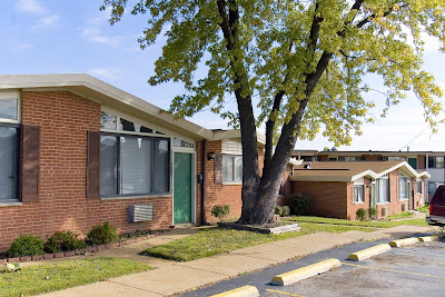
Walk just a little further up Weil Avenue and you come to Florinda’s Court apartments, built in 1961. This complex sits at the very edge of Shrewsbury (across from the Shrewsbury Bowl and Shop ‘n Save), and are a classic example of garden apartments. There are 3 distinct styles of buildings surrounding the interior courtyard: 2-story building with scroll-work balconies giving off a vauge seaside tourist vibe, the motor court two-family “flats” shown above, and the plain brick box shown to the left below. But in the case of the last two types, they added angular roof lines for a bit of jaunty hipness.

How the utterly useless plastic shutters got into the picture is a complete misery, er, mystery. The original designers would have had no aesthetic need for them, and if subsequent owners thought tacking those brown Bandaids alongside the windows would soften the modern look of the place, they were blind and wrong.

These 3 apartment complexes are a poignant snapshot of a unique time in the mid-century history of city to county living, of home ownership vs. renters, of cars vs. pedestrians. I love that all 3 places are still going strong and are now even better positioned to be viable and useful in this era of escalating gas and energy prices, and they look fabulous doing so.

Must See: Birth of the Cool

Birth of the Cool: California Art, Design & Culture at Midcentury
Mildred Lane Kemper Art Museum
Washington University Campus until January 5, 2009
Birth of the Cool is an absolutely amazing exhibit about the heart of MCM. For fans and connoisseurs of the style, it is longings come to life, iconic images in books and magazines standing before you more breathtaking than imagined.

For the unknowing, it is a concise and compelling text book. For the unconvinced, it is casual persuasion of respect for the style. In keeping with the economy of shape and form that is MCM, the exhibit is not an overload of things but rather an economical gathering of precise items for maximum impact.

Within 6 galleries, music, design, art, culture, housing, furniture and politics mingle to create understanding of why the style evolved and why it endures as a romantic American ideal. I could gush on for paragraphs about the contents (like the above chair display, in the only photograph I took before being told to stop), but I’ll spare you the frenzied adjectives and cut right to the most extraordinary part.

Julius Shulman is a photographic god who still walks and shoots on this earth. Birth of the Cool has a heaping tablespoon of his black & white and color prints. The only reason this is not the personal highlight is because I have had the humble privilege of seeing most of these prints at exhibits in St. Louis and Palm Springs, California. But in the spirit of “it’s not what you got but how you use it”…

One gallery is all about Pierre Koenig’s Case Study House #22. In the middle of the room, encased in glass is a wooden architectural model of the home (gasp). Along the walls are Shulman’s omnipotent photos of such, images I’ve seen countless times. But when they are gathered in one place and put in context with a 3D replica, the effect is the most awe-inspiring feeling to have short of being invited into the actual house. The curator achieves maximum impact with a minimum of objects, exemplifying the aesthetic with two architectural artists who embodied it.

The ultimate moment of this exhibit will come on November 22nd, 2008 with a screening of the new documentary Visual Acoustics: The Modernism of Julius Shulman. Watching the trailer gets me misty eyed, so I’ll save this topic for a date closer to the event. But do mark it on your calendar.

From an interest level of passing curiosity through to full blown fanatic, Birth of the Cool is a must-see. The gallery is easily accessible (location and time-wise), and it is free. There are no excuses, only priceless results.