In recognition of Black Friday and the holiday shopping season, may we suggest Frank Lloyd Wright’s Falling Water done up Lego-style? Because it’s plastic, you could suspend the finished product over running water and not face the water management issues the real-life version has.
The Guggenheim is also available, at a much cheaper price. Lego also offers up the Empire State Building, the Space Needle and other architectural gems. Very cool gift idea for building-minded folks of all ages.
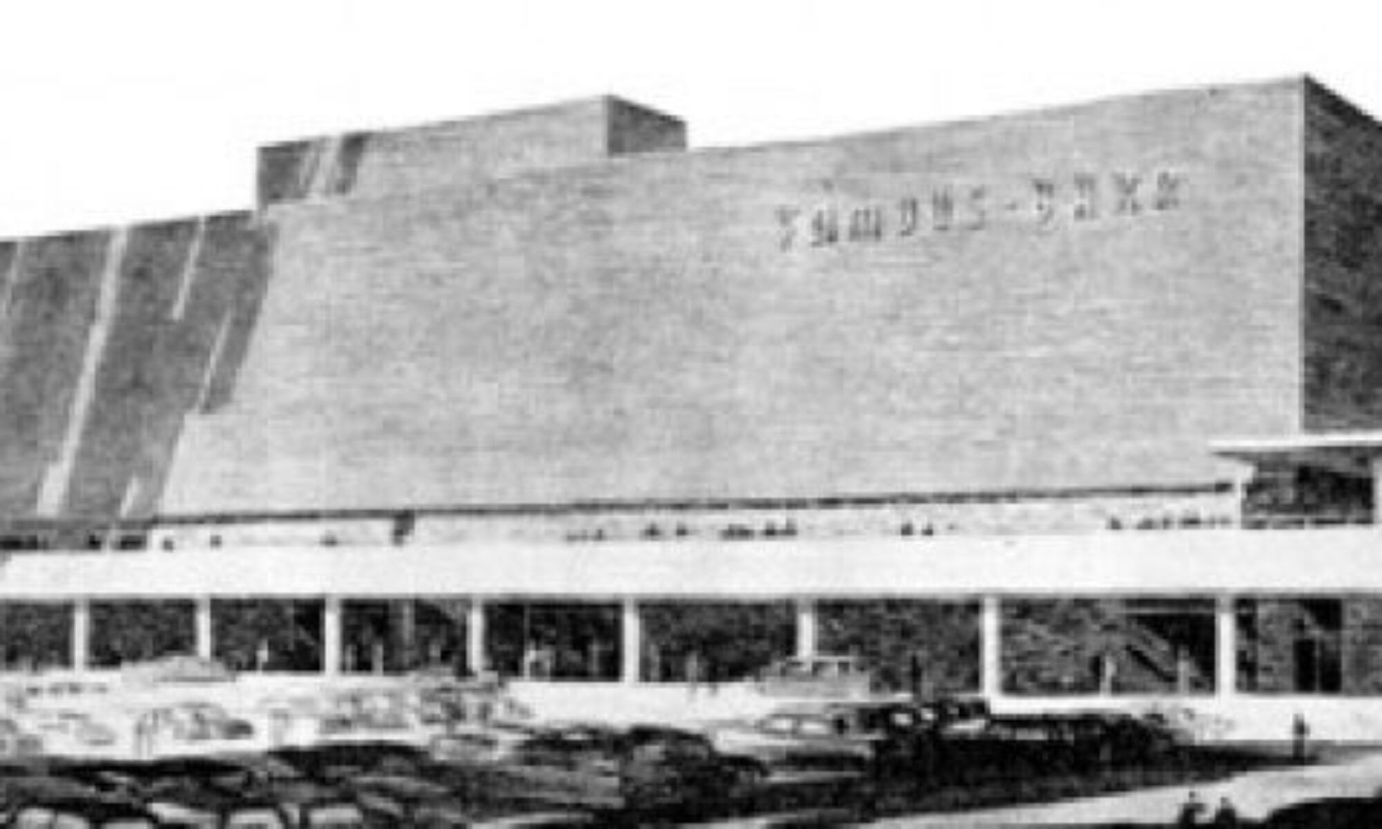
I ran across this picture in a 1964 issue of LIFE magazine, and gasped with pleasure. Click to enlarge it and see Harris Armstrong, George Kassabaum and Hari Van Hoefen floating above downtown St. Louis. The swooning teenage-girl thrill I got from finding this photo reminded me of the first time I saw this:
Here’s David Bowie, Iggy Pop and Lou Reed in a moment overloaded with rock power. They have given the world some of its most awesome music.
The Rock Star Architects gave St. Louis some of its most awesome buildings.
A Hari Van Hoefen greatest hits package would include Northland Shopping Center. The George Kassabaum best of (on the HOK label) would include the Planetarium, and Harris Armstrong already has a box set highlighting his best known hits and B-side rarities.
The music of Bowie, Pop and Reed is treasured and re-mastered and re-released because it matters very much. I hope that soon – very soon – St. Louis will learn to do the same with the works of Armstrong, Kassabaum and Van Hoefen.
On November 5th, 2009, City Affair took a tour of Nine North, the modern new condos on Euclid Avenue in the Central West End.
Rather than gush on about how much I truly loved the 4 models they graciously opened up for us to romp around in, I’ll share the video. This way, you can decide for yourself.
Because it was nighttime, I was not able to properly film the exterior aspects of Nine North. Some of the balcony configurations create sublime spaces that I’m longing to see at different times of day and seasons. And the way all of the condos face onto a swanky pool/hot tub outdoor courtyard is very Melrose Place, in the best possible way.
If Downtown Clayton is like a jewelry box of full of mid-century modern architectural gems, the Clayton-Forsythe Building could very well be the most beloved piece. It opened in 1954, and still broadcasts a clear Beverly Hills/West Hollywood glamour signal.
The best way to experience the allure of this 3-story building is by driving up Forsyth toward Maryland, and deep in the curve this beauty extends a languid hand to pull you in for a shoulder hug and air kisses. And the movie star buzz continues with a design that flows with the bend in the road, siting that sidles seductively into an incline, and adding an “e” to the last name it shares with the street it graces.
When it first opened, the prow of the ship shown above, was Colony Children’s Clothing, and a stroll down its geometric promenade took you past the Lazy Susan Restaurant, the Clayshire House of Beauty (which remained until 1985) and Gold’s Pharmacy, among others. All of these shops have a front, street-level entrance plus a back entrance accessed via a flight of stairs from the parking lot. Again, the designers were smart about the siting, putting the parking in the rear valley of the property, and as you drive down the ramp it feels like the building grows before your eyes.
As seen from the Forsyth street-level, the lobby remains as it was when it opened 55 years ago: understated California cool. It’s all about the blend of materials, sparse lines and abundant natural lighting, and that the public areas have remained unscathed for this long is a major miracle worthy of major gratitude.
From 1955 – 1963, the basement and top floors were occupied by physicians and dentists, and an unusually large number of architects and artists, which makes sense when you consider the freewheelin’ vibe of the building. By 1968, some intrigue entered the scene when all but one architect left and the Shane & Assoc. detective agency took over 3 rooms of the top floor.
Because of its location, the Clayton-Forsythe appears to have had no problems attracting tenants. The 21st century has shown the highest rate of sustained vacancies, and I wonder if this might have something to do with owners more concerned with the financial potential of a new building on this site rather than maintaining the building they already have.
There was talk in January 2008 of this building being torn down and replaced with a retail/condominium development, which was conveniently timed to the news of new office buildings going up in this block. But preservation’s best friend – a crappy economy – came to town, and it looks like those plans are on hold for the moment. In the meantime, even though the building’s management firm advertises it as an “enviable place to call home for your business,” they are doing as little as possible to protect their investment. Minor water damage is starting to appear and regular maintenance is being deferred, which is a classic way to repel new tenants and make the case for demolition due to deterioration.
I’m hoping the greed and laziness of a tear-down mentality is something that expires along with our country’s false prosperity. Quantity (of assumed equity for massive square footage) over quality has brought economic trauma to our country (i.e., the mortgage crises), and it goes hand-in-hand with how we now view real estate and architecture. It has resulted in the warped notion that buildings can never be as valuable as the land it stands on, so why bother with preserving or creating worthwhile architecture when one theoretically stands to gain by knocking down a building to optimize the worth of the land? But with that house of cards taken out by a few stiff breezes, maybe there will be a more realistic appraisal on the value of tangible commodities that already exist, like the Clayton-Forsyth Building.
From the late 1940s to the 70s, Downtown Clayton usurped Downtown St. Louis by creating a brand new urban density in the shortest time imaginable. It is the classic example of mid-century modern architecture symbolizing the sleek new power structures. Block after block, the Clayton business district epitomizes the strength, optimism and prosperity our country experienced after World War 2. It is the historical text book of The Good Life Through Modern Living, and that seems worthy of preserving for future generations. American cities finally saw their way clear to preserving previous high points of our evolution (in Missouri we call it the Historic Tax Credits), so there’s no reason to overlook our last best chapters, right?
Downtown Clayton has enough fiscal options that it can seriously consider holding on to some of the finer examples of its mid-century history, and time has shown that concerted preservation brings tourism dollars because Americans love their history. The Clayton History Society gets what I’m saying, as they include many important MCM buildings (both dead and alive) as an integral part of the Clayton story, so I’m not making this up, I’m just thinking ahead.
The Claytonian debate over short-sighted gain vs. long-term value could begin with the Clayton-Forsythe Building. It is too fine an example of the worth of this place and this type of architecture to be blithely dismissed. Long live this most enviable building!
2024 UPDATE: This building was demolished in 2023. The site is currently under construction for 38 luxury condos slated to open in 2025. The design of the new building copies the former in following the curve of the road.
As you tool past it, this building gives the best optical illusions.
In the small sliver of space it occupies, it is both translucent and opaque, reflective and absorptive, grounded yet floating. It has always struck me as passively menacing, which pretty much sums up how I feel about finance, so it’s appropriate architecture for a bank.
This building went up in 1978 for United Postal Savings, and remains a bank to this day. As you can see from this aerial view, the architect had to work with the odd angle of Dale Avenue and a small lot. The building itself is only 3,228 square feet, which is small for a modern commercial building. But it packs a lot of style and attitude into a tight spot.
The brown brick creating soft curves for the lobby entrance is the only relief from the severity of the right triangle, and it feels as if they had to design a less-threatening entrance just so people could work up the nerve to enter the building.
As with so many of the mirror-glass wall buildings of the post-modern architecture style, the inhabitants tend to feel uncomfortable with being exposed and ruin the aesthetic intent with yards of metal blinds. In this case, the vertical blinds add a consistent texture that slightly reduces the ominousness, but also hampers the effect of reflective transparency. Then again, people have to use buildings, so the function should be given as much weight as the visual impact.
But blinds cannot take away from the architectural editorial on the fine point of this building. Depending on the angle, it looks like a cut-throat straight razor or a plunging stiletto. No matter the era, finance cuts like a knife.
Finn’s Motel and The Blind Eyes are two St. Louis rock bands that have something in common that makes this building geek deeply happy: a propulsive, uplifting song specifically about architecture.
Joe Thebeau was responsible for one of the very best albums of 2006, Escape Velocity. It is an engrossing and far-reaching concept album about being a 40-year old family man and corporate drone who can’t escape the feeling that there’s something else waiting for him just beyond the horizon; how do you get to that place and what happens once you do?
Among the 17 songs that tell the tale is a piece that addresses the Gateway Arch as a metaphor for high and/or dashed expectations, “Eero Saarinen”:
Eero
Arching
Westward over my city
Stainless and brilliant
Eero
Arching
Skyward into the universe
Expanding
Expansive possibilities
The kind of vision I can look up to
Arching over
Into a future we couldn’t hope to
Live up to
Eero
For the sake of full disclosure, Joe Thebeau asked me to sing with him on the song, but trust that it has nothing to do with why I love it. It’s definitely a case of him inviting me because I loved the simple and emotional geometry of his sentiment. It made me look at the Arch – something most of us in this city tend to take for granted – in a whole new and personal way, which was also reflected in the CD cover shot and other photos of the Arch he sent me out to capture.
Atop that, the song just frickin’ rocks! It’s 1:32 minutes of rapid heart beat and laser point precision. Architecture has been described as frozen music, and I’d always “heard” the Arch as a wistful symphonic piece. Thanks to Thebeau’s artistic vision, I will forever “hear” the Arch as the Red Bull energy required to be the eternal Gateway to the West.
Finn’s Motel is playing at Off Broadway on Saturday, August 22, 2009. Do go check them out, and ask them to play this song.
I have been listening to The Blind Eyes debut record for 7 days straight, and the brilliance of it multiplies with repetition. During the first couple of listens – wherein I don’t pay attetion to lyrics, just overall sonics – I assumed from the chorus of “Brasil, 1957” (“We could only make it on the plane, on a plane”) that the song was about The Mile High Club.
On the third listen I finally heard:
Moving westward up the river
Steel and concrete to deliver
Out of nothing springs a city
Monument to modernity
Holy crap, these guys are singing about the building of Brasilia, and by association, architect Oscar Niemeyer! And – duh! – the T-shirt design (above) featuring Niemeyer’s National Congress building has way more significance than using it simply because Niemeyer is the coolest (and oldest) living architect. Oh, and double duh, this also references/inspired the title of the record.
I’m not normally this slow on the uptake, and in defense it should be pointed out: how often do we hear a song that concisely and poetically sums up the construction of a mid-century modern capitol? Previous to this, never!
The chorus of this ingenious song now takes on an extra layer of clever: is it “plain” or “plane”? Because both of them work. The city of Brasilia was purposely built far inland on an empty plain. Aerial views confirm that the city was purposely laid out in the shape of a plane.
What inspired them to tackle this as a song topic? Is one of them a fellow architecture geek? Until answers appear, I’m just impressed and thankful that it – and the entire record – exists. And I’m so proud that two St. Louis bands decided that songs about architecture should rock mightily.
Question
Aside from these two towering St. Louis musical achievements, what other rock or pop songs are specifically about an architect or a building? The only other song that comes to mind is “Alec Eiffel” by The Pixies.
If you think of others, do let me know, and if enough of them exist, it could turn into the rare case of a second B.E.L.T. entry about architecture rock.
“One of these things is not like the others/Tell me can you guess which one?”
In 1996, a house was demolished in this South Side neighborhood west of Kingshighway. A tad over 10 years later, someone bought the vacant lot and erected this striking, thoroughly-modern replacement.
In-fill housing in St. Louis City doesn’t happen as often as it should, and then when it does it is too often inappropriate for the area. Technically, this house is stylistically inappropriate for the neighborhood. Then again, this part of town has residential styles easily spanning a 60-year period, and this stretch of the street is the perfect example of that. So, in essence, this new home is following the tradition of this North Hampton neighborhood.
The newest member of this block respects the scale and set-back of its neighbors and is designed in the 21st century casual manner I call “Dwell Magazine Modern.” It is certainly different, but it’s not startling, and I think it’s a very handsome addition to the streetscape.
I love how they carried the materials and aesthetic to the alley; this garage is amazing! And it brings up a dozen questions, including: how do the neighbors feel about it? how hard was it to get a loan for such a different design in this neighborhood? who is the architect? how cool is the interior?
If anyone knows the story of this new house, please do share! And thank you to architect Geoff Crowley who discovered the house while driving around and let me know about it.
Julius Shulman, photo by Catherine Ledner for Dwell.
Upon the death of Julius Shulman, there have been several fine remembrances of his work and its impact, and the imminent release of the amazing documentary Visual Acousticsto DVD takes on a heightened significance. As the media takes notes of his towering artistic contributions, I think about personal gratitude to Julius Shulman for altering the path of my life.
Having always loved buildings, I thought that designing them would be the best way to consummate the relationship, so I headed down the Architectural Planning degree path. I liked drafting floor plans and designing spaces, but it was during an Architectural History class assignment to photographically illustrate various types of architecture using local buildings that the light bulb went off: I love interpreting the buildings that other people made.
I thought of all the alluring black and white images of mid-century modern architecture that haunted my imagination, and realized those were the true inspirations. Then I realized that those photographs were all taken by the same man, Julius Shulman! His work was consistently inspiring, so I put the drafting board on ice, pulled the old Minolta X-7A out of storage and changed my major to Photography.
Shortly thereafter, I came across the 2000 re-issue of the 1962 book Photographing Architecture and Interiors by Julius Shulman. Several knowledgeable and passionate teachers taught me the science of the camera and the art of printmaking, but it was Shulman who taught me about composition, and that the dedication of time can bring clarity of vision.
“All photography is a matter of timing.” – JS
People might assume architectural photography is easy because the subject doesn’t move, but as Julius pointed out, “The subject is moving because the earth is rotating, and we must carefully observe the position of the sun.” The best shot of a building requires working with Mother Nature, which requires patience, and sitting under a tree waiting for the perfect moment instilled in me a sense of peace, contentment and the supreme luxury of taking the time. Shulman’s enduring adoration of nature was taught by example, and architectural photography is my form of meditation.
“As a part of our environment the design of buildings is of paramount importance. It affects the lives of all people at all times, physically, psychologically and sociologically.” – JS
Shulman’s mission was to translate the 3D art of modernist architects into a 2-dimensional format that the layman could understand, admire and desire. As he wrote in his book, “Although architectural photography can be defined as a physical recording of the image of design, the photographer can develop the ability to transcend the mere physical recording. The photograph can then become instrumental in evoking empathy with the design. (It) enhances awareness of an already-familiar environment. It prepares for the actual experience of being at or in a building. It substitutes for the experience until it occurs, if it ever does.” This is the guiding vision and mission of BELT.
“Put your camera down. Don’t act like a photographer; act like a human being…” – JS
Shulman wanted to convey the personal satisfaction felt by the owners of modern homes he photographed. At times, he battled for his photos to show the comfort and pleasure of the designs, rather than the stark aestheticism preferred by some of his architect clients. An architect designs, but we are the ones who live with them every day, and the emotions that a building conjures dictates its legacy, for better or worse.
“A façade or elevation of a building may be shown in any number of ways but it must be clearly understandable to the viewer of the photograph.” – JS
Shulman's map of a photo shoot from his book Photographing Architecture and Interiors.
In one remarkable chapter of his book, Shulman shows the interior and exterior plan of a home in Bel Air, California, annotated with the exact location and direction of his camera for the 33 shots he took of it for the July 1961 issue of House & Garden. He then shows you all 33 photos and explains why he composed as he did, and the emphasis is always on making the house understandable to the layman.
You get a personal map of the artist visually stalking the project in a vaguely counter-clockwise direction. Sometimes he shoots the same scene from opposite angles, while other times he shoots the same scene from different distances. In a couple of cases, he merely moved the camera a few inches to the left of the previous shot, but there’s a vast difference in the message.
Multiple times throughout the book, he shows you his photographs of the same building from the same angle taken with different cameras, lenses, filters and time of day, and he explains the merits of each application and why the shot he ultimately chose was the best representation. In a couple of cases, he even shows you the photo as it was shot compared to the tricks he employed in the darkroom to make it more dramatic. He even illustrates how he employed a “portable garden” or a neighbor’s flower bed to add landscape drama to an otherwise-barren new home.
Shulman setting up a shot through his "portable garden."And the finished print.
Shulman’s complete honesty about how he achieved such successful results does not reduce the final impact, it merely reveals the generosity of his spirit and his unceasing need to educate and inspire others. A true artist does not need to hide behind illusions of grandeur, because they know that even when giving you the exact recipe, results will vary, and this is the art of beauty and possibility. I am grateful to Shulman for every personal and photographic adventure he’s led me to, and am comforted in knowing his work will continue to inspire so many others, forever and ever.
“Every man must make his contribution to society. The architectural photographer makes his by helping to improve the environment of his community.” – JS
Entrance to Shulman's home. Photo by David Laslie.
My friend David Laslie is a gifted architect and landscaper, and he kindly shares with us his photographs of Julius Shulman’s home and personal memories of the man:
In the Spring of 1995, I was fresh to Los Angeles and a little more than impressionable. Architect John Lautner had recently died and a tour was organized of some of his iconic homes in the Hollywood Hills. At the end of the tour, there was the opportunity to meet Lautner’s biographer, Frank Escher, and purchase his book. Two lines formed in a parking lot, filing toward two folding tables. I knew the one line was for book purchases; what was the other line for?
I looked over at the other table and immediately recognized why the other line was so much longer than the one in which I stood. Sitting at the table was a little old man with the biggest grin on his face, signing autographs, posing for pictures, and of course, telling stories. It was Julius Shulman, and he was having the time of his life. I was excited to buy the Lautner book and go to the end of the other line so I could get it signed by the great master whose photos told the story of John’s genius (his photos composed about 90% of the illustrations in the book). By the time I got to the front of the line they had run out of books, so I was forced to settle for a rain check. I did notice, however, that they were selling little postcards of Shulman images as well, so I bought one of the Malin house, (a.k.a. the “Chemosphere” ) and asked Julius to sign it. He didn’t care if you bought the book vs. the postcard; I think he would have willingly signed on the back of your hand or your shirt tail, given the chance – anything to talk to one more person and to give a little bit more of himself.
Julius’ generosity is what I will remember most about him. He would give generously – almost wastefully – of himself, and nothing made him happier than the opportunity to do so. His wife Olga was the same way. Truly, they were one of the happiest couples I’ve ever known, and together the exuded love and generosity.
The patio of Shulman's home. Photo by David Laslie.
I had the pleasure of witnessing this on several occasions in the Spring of 1998. While studying architecture at the University of Southern California, I had the opportunity to take an elective course in architectural photography taught by none other than Julius Shulman. No one knew exactly how the class would work, as USC had never done anything like it before. As we were participating in something new and different, perhaps even historically significant, I was asked by the dean to drag the school’s video camera to class every time and record each session for posterity.
Every Tuesday, we’d drive up the 101 into the Cahuenga pass and negotiate twisted Woodrow Wilson Drive up to Julius’ house. I remember not being impressed by the house, designed by architect Raphael Soriano, and didn’t really buy Soriano’s explanation of how the subtleties in proportioning were meant to remind one of a Bach fugue. When you first approach Julius’ house, it looks like an arrangement of two very plain boxes, but once you cross the threshold, however, you’ve entered Julius’ realm, a place of beauty, comfort, and light. The studio was cluttered with matted photographs, some small as snapshots, others tall as a person. There were no clear surfaces; walking into that studio was like walking into his mind. This man had literally seen it all.
The rest of the home was nothing like the studio; it was immaculate. Every object was arranged and ordered, but it was not a modern showcase, though. There were no Barcelona chairs or Eileen Gray end tables. The furniture was not there to reinforce the lines of the architecture, it was there to use.
Hallway of Shulman's home. Photo by David Laslie.
Julius told us a story about one of the fights he got into with architect Richard Neutra over furniture. They arrived to photograph a home the architect had just completed, and Neutra was absolutely livid about the furniture the owners brought into the house. He employed Shulman to help him take all of the owners’ furniture out of the house and replace it with modern designer furniture for the purpose of staging perfect photos. They spent quite some time setting the scene and arranging things to Neutra’s satisfaction – simple, sparse, and modern. When Neutra left, Shulman removed all the new furniture from the house and brought all the owners’ furniture back in and arranged it how it had been arranged previously. Then he got his shots. Neutra was supposedly quite pleased with the photos and didn’t realize that the furnishings were not those which he had brought in.
Julius taught us that our environments should be livable, and that this should be our primary concern, above clean lines and fugue-like proportions. His photos exude a richness and fullness of life because that was more important to him than anything. He said Soriano criticized him for having such a messy studio, and having such pedestrian furniture in his house, and for growing a jungle so thick it obscured the house. But Julius pointed out that whatever you do, it should support quality of life. If you are going to plant a garden, make it a jungle. If you are going to furnish a home, make it comfortable. If you are going to take a picture, make it alive.
View to the front door of Shulman's home. Photo by David Laslie.
I think this desire for quality of life provided him with the perfect foundation upon which to build a generosity of spirit. Because he made the effort, he was blessed with richness and fullness in abundance. He was generous with himself, was rewarded by the fruits of that generosity, and was then able to give generously of himself to the world at large.
We can all learn a lot from this man’s work, but we can learn a lot more from his life. He used to say that taking a great picture is not about what kind of camera you use, or what kind of film you use, or what kind of filter you use, but is instead about how you see and compose the shot. Similarly, life is not about the lines, or the proportions, or the furniture. Life is about how you live it. And did he ever live it.
The July/August issue of St. Louis At Home lists an LV Home for sale in… South County? How odd, but very cool. Even cooler: it’s the only LV Home built in the St. Louis area and one of the few to be built atop a full basement (the majority are built atop concrete slab on grade), which doubles the size of this kit home to nearly 3,000 square feet. I exceeded all speed limits in a hurry to see an LV so close to home.
Summer 2004 is when I originally saw the LV display home in Perryville, MO, on assignment for a now-defunct design magazine to interview the LV creator and architect Rocio Romero. After a scenic drive through deep rural country, it was pleasantly jarring to see an ultra-modern metal box standing alone at the start of a farmer’s field. It appeared to be floating over a random, ironic site, and this urban/rural juxtaposition created a light tension.
Inside, the house felt spacious, sturdy and serene. The back wall of the house was a continuous series of floor-to-ceiling windows, which flooded the spaces with glorious amounts of natural light. The display home was the perfect size for two people, but the kits can be built to any custom size, so the possibilities for accommodating a family of any size was immediately apparent. The LV was sophisticated, casual and enchanting. The architect was passionate, industrious and detail-oriented. Altogether, it was a great concept cleverly executed and it was easy to understand why sales of the kits were on the upswing. Over the years, a cover feature in dwell helped spread the word, and it’s exciting to imagine this design dotting landscapes all over America.
Most everyone I know who has toured the LV display shares this observation: all the windows are great, and it makes total sense on an isolated lot, but could you insert it into a typical urban or suburban lot and keep a decent level of privacy? Would you wind up ruining the aesthetic by covering most of the windows with drapes to keep neighbors on 3 sides from knowing your business?
This is why I needed to see the South St. Louis County LV: how does it function in established suburbia?
It functions very well. Yes, it does immediately stand out from its surroundings, but within the context of the neighborhood it’s surprising rather than jarring. Plus, the homes along this stretch of Theiss Road come in a wide variety of architectural styles, so the LV is just another flavor. The galvanized aluminum can make it a bright flavor at certain times of day, but it’s not fussy or flashy. Initially, the immediate neighbors were skeptical as they watched it going up, but now they love and accept it as a normal part of the landscape, so the LV adapts very well to denser surroundings.
I learned this important piece of information because the homeowners – Joe and Jeanne Marie Spezia – were kind enough to give me a tour. They love their home and are rightfully proud of it, and are comfortable with the attention it brings. Their decision to build one was included in a cover feature about Romero in a 2007 issue of At Home, and in June 2009 was featured in both St. Louis Homes & Lifestyles and on the front page of South County Times newspaper.
Because the Spezia’s love living here, the home is not officially for sale, but if someone were to come along and pay the right price, they’d seriously consider it. Until then, the LV has become the unique template for expressing who they are and how they choose to live.
The place expresses an immediate and vibrant personality courtesy of the creative mind of Jeanne Marie, whose re-purposing aesthetic and mosaic art punctuates every room of the house. Her studio is in the basement, and you can see more of her work here, as well as in these pictures of their home.
The couple designed a unique back patio, whose half-wall is made of metal roofing straight off the Lowe’s shelves. Actually, many significant features of the home come from Lowe’s (like the foyer light fixture, below), which proves two things:
1. It’s not what you use, but how you use it
2. Limited budgets create imaginative solutions
And budget rapidly became a huge issue for the homeowners. Their house-building adventure wound up costing far more than anticipated because of an endless string of complications. But most everyone who has been through a custom home build has a similar list of complaints and complications without achieving such a spectacular end result.
Joe Spezia enthusiasticly pointed out every structural aspect of the house that makes it so exceptional: money-saving energy efficiency, 12″ thick vertical steel beams that make the place earthquake-proof (he jumped hard on the living room floor to illustrate that there is no vibrations, no movement), perfectly plumb surfaces and extra-thick walls and floors that effectively soundproof the house from the outside as well as create privacy inside.
For instance, Joe is a licensed massage therapist with a huge and relaxing studio space for his practice in the basement of this home. He recalls a time when, after clients had left, his wife asked if working in her studio next door with the TV on had bothered them. Joe replied that they heard nothing and he didn’t even realize she was down there. That’s how thick and insulated all the walls are.
The large master bedroom (above) has an equally large bathroom with the most gorgeous clear, green glass tile walls, a bathtub you could swim laps in and a walk-in closet bigger than most bathrooms!
The entire home is about natural flow of space creating instinctive comfort, and even more so than experiencing the original LV display home, it conjured within me the intense desire to live in this home, exactly as it is. But the mercurial mind of an artist like Jeanne Marie is constantly changing things up and she is seriously considering removing the metal siding on the exterior of the home and replacing it with cedar.
Initially, I was a bit shocked at this idea, but then I saw this photo of another LV Home that went with wood instead of metal, and it looks great. Which just goes to show two things:
1. Artists “see” things that the rest of us can’t
2. The very nature of the LV allows one to exactly create the home you see in your head.
This was the Future: Mid-Century Modern Architecture on Lindell Blvd.
10:00 a.m. Begin inside the Chase Park Plaza Cinema, 212 N. Kingshighway
Have a mid-century modern morning in May! A screening of the new short documentary San Luis: This Was the Future tells the story of the threatened San Luis Apartments. After the 10 minute film, Toby Weiss of beltstl.com and Michael Allen (ecology of absence) will lead a walking tour of the many mid-century treasurers along Lindell Boulevard, where modern design flourished between World War II and the 1970s. The walk will run from the Chase Park Plaza Hotel to Vandeventer and back, so be prepared for serious walking.
See a free movie, take a free tour, get a little exercise, get a lot of knowledge… there are worse ways to spend a Sunday morning! Please do join us Sunday if you can. Michael is the brains of the outfit, I’ll be the “little song, little dance, a little seltzer down the pants.” It promises to be a good time.