Eero Saarinen: Shaping The Future

eero-03

The Kemper Art Museum is my new favorite place for wallowing in mid-century splendor. Their new exhibit on Eero Saarinen is even better than Birth of the Cool, and it is an embarrassment of riches to be able to say that.

As always, taking pictures (or leaning) in the Kemper is strictly forbidden and studiously enforced, so I can only share with you these crappy cell phone shots.  Shown above are architectural models of the TWA Terminal and Dulles International airports! Below, a color rendering Eero did of one of the TWA lounges!! And this is what is in just one corner of one room!!!

eero-01

The exhibit is very thorough without being ponderous, and displayed so that one can skim lightly and take away useful tidbits (Eero could write with both hands at the same time and write backwards) or really dig in and start to feel what it was like to work with him as he created and refined an idea.

Everything the man touched conjured a new design reality, and this energy reverberated well past him to affect and elevate those who brought his creations to life.   Look at the photos of the TWA Terminal or the Ingalls Hockey Rink during construction and be blown away by the intricate wood forms the men built to mold the concrete.  Marvel at new fabrication tricks invented to create structural panels for the IBM Research Center building.

There are original sketches of his iconic tulip chairs within one room dedicated solely to his furniture designs.  There’s an 18-minute documentary about Eero’s life and work created just for the exhibit.  It is easy to get lost for hours in this exhibit, but luckily it is in residence until April 27, so there’s plenty of opportunities to do it piecemeal, or just keep gorging on this architectural buffet.  Kemper is open most all times you need them to be open, so there’s no excuse to miss it.

Need more convincing?

Here’s a quick blast of photos from the exhibit.

Here’s a short video about the exhibit.

Central West End "Progress"

A “Special Progress Section” was included in the May 7, 1961 edition of the St. Louis Post-Dispatch. These 3 examples shown boasted about the progress on Lindell Boulevard in the Central West End, like the Optimist building.

They also touted the new building for the Engineer’s Club, which is by the same architecture firm as the Optimist building, Schwarz & Van Hoefen.

And then there was the new chancery office for the Catholic Archdiocese, which was under construction at the time of publication. By clicking on the above photo to read the caption, one finds this quote:

The Catholic Church has been a bulwark in the fight against decay, providing assistance for the Central West End Association and other neighborhood groups.

Ironically, the same Catholic Church that championed progress on this block of Lindell now wants to tear down one of those progressive buildings they helped usher in.
Learn more about the push to save the San Luis here.

It was a sweet justification to find this “Special Progress Section,” because it supports what I’ve been trying to say about the Central West End and Lindell Boulevard, in particular: all chapters of its story are important and vital. And it is highly irresponsible and short- sighted to begin destroying buildings that were considered the desirable solution to older buildings they felt needed to be destroyed. The cycle has got to stop! We can no longer (literally) afford to squander our history and resources. There must be real understanding of past and present, and a practical plan and vision for the future based on the realities and aspirations of the entire community.

You can see how these 3 buildings look today by clicking here.

SLU Cloister Walk, Best In Show

St. Louis University Cloister Walk
Grand & Chouteau, St. Louis City, MO
Some people are highly attuned and obsessive about the built environment while others pay little attention because their fascinations lie elsewhere. This is as it should be, because the diversity of human experiences is what makes our lives such a compelling journey.

There are a heaping handful of people in my world who exactly share my passion for buildings, while many others kindly tolerate my comments, exclamations and head swivels (and near crashes from not paying attention to the road) as we drive around. Most fall in the middle of these two extremes.

But there is one new-ish feature on our city landscape that everyone has a comment on – all of them favorable – and that is such a rare occurrence that it must be noted.

The Joan & Joseph Lipic Cloister Walk on the campus of the Edward A. Doisy Research Center at St. Louis University gets most everyone’s attention. The Research Center itself is the star attraction (see pages 4-6 of this pdf), as its tall, shiny and unique. It has a prime location, LEEDs certification and the best of intentions. I like the building, though I enjoyed watching it go up more than the final result. But in my opinion, it causes no harm or embarrassment, and entertains me in an Off-Broadway musical kind of way.

But its the brick “tail” of the building, snaking diagonally to the southeast across the campus, that thrills me the most. And it is this promenade connector that has elicited positive comments from everyone I’ve been with as we passed by. I’m talking unsolicited and unprompted comments by people who normally don’t notice these types of things, especially when it’s a low-lying, secondary feature of a major building situated far from the street. One has to make the slightest of efforts to notice it, and when they do, they instantly love it!

There definitely exists a snobbish line of thought among architects and designers that if the uninformed masses like something, it must be intentionally pandering to the cheap seats. This imperious manner is sometimes worn as a protective shield by those who design buildings and objects, and the fewer number of people who “get it” confirms its success to the creator.

I can buy into that aesthetic, but I also firmly believe that when it comes to buildings, the context, the purpose and the people it was created for deeply matters, and when the uninformed masses react apathetically or negatively to a new building it is because the creators failed on one or more of these fronts.

For instance, a Frank Gehry building is a dramatic and dynamic thing, but when it sends snow and ice flows crashing onto heads or blinds the neighbors on a sunny day, then form murdered function. The benefactors’ got a glorious trophy building while the inhabitants in and around it got shafted.

So, the Cloister Walk gets the attention and admiration of the St. Louis masses. The form pleases every eye. It looks intriguing but how does it function? It was time to investigate up close.

The Research Center comes courtesy of Cannon Design, and because the Cloister Walk shows up in their concept drawings, I’m assuming they designed it as well, even though no one has bothered to single out that fact. Again, the Research Center is the star, while the Walk is a bit player used to advance the plot, a way to get from one point to another in a formal and protective way.

It is a true pleasure to walk near and in this place. It mimics and facilitates movement in a low key manner, which is quite the accomplishment when it has so much going on. A Zen garden, and wild vegetation and babbling brooks go on in and around it, but it works as intended. The flanking rows of arcing ellipses create frames for the ever-changing scenes as you walk on, so the experience is both peaceful and invigorating. Its form is thoroughly modern urban, its intent is old fashioned and the result is a friendly addition to time and space.

The Walk is a private structure intended for people using the Research Center and the medical school complex it connects to, but no signs or efforts indicate that the public is not allowed to experience it. Because of where it’s situated, one does have to make a concerted effort to drive into and navigate the complex, which is full of paid parking lots and pass-only parking garages. But there’s free street parking to be found, and those who have business there truly don’t seem to mind the presence of those who don’t.

People were using it constantly, with folks even lounging on the benches and soaking up the sun by the fountain at the southern end of the Walk (which resolves a bit awkwardly; it evokes a hippo or dragon). So its function is good: it facilitates, accommodates and inspires additional uses.

It’s form looks good and feels even better, to the eye and the soul. I can see this becoming a popular place for photography students, especially for black & white assignments; it just keeps on giving and creating arresting still lifes, with intense plays of light and shadow.

It is joyous to have something that has captured so many’s attention from afar be even better up close. And it feels odd (but good) to finally be able to thank St. Louis University for a truly worthy and enjoyable architectural contribution in the 21st century.

SIDE NOTE One of the greatest views from this campus is the old Peveley complex across the intersection. I love all the contrasts of the Research tower against the Peveley smokestack, the boldly modern in concert with the contentedly industrial. The Pevely building is now for sale, and as the article points out, it is a significant plot of land in a prime city location. Which is why I’m worried. Please, oh please, let it find a new use that allows it to remain essentially intact. Fingers crossed.

Reminder: The Julius Shulman Film

Visual Acoustics: The Modernism of Julius Shulman
Saturday, November 22nd, 6:15 pm, Tivoli Theater
The man who took the picture above has finally been honored with a documentary film about his work, vision and contributions to the worlds of art, architecture and photography. Visual Acoustics will be shown this Saturday as part of the St. Louis Intentional Film Festival.

The tickets are only $10, and can be bought on-line here. If you need convincing, take a quick overview of why this man matters. Then go see Birth of the Cool as a warm-up. Then watch the film’s trailer.

See you this Saturday, and it should be easy to spot me: that one weeping silent tears of joy for 83 minutes. Come say hello and spot me a tissue!

POST-SCRIPT Hopes and expectations were high and the documentary met and exceeded them. A towering achievement on so many levels. It allows us to know the man behind the photos, and he is just as fascinating and singular as his work. My only complaint is that, at 83 minutes, it’s too short!

Director Eric Bricker took questions afterwards, and I asked: will there be DVD distribution of this film, and will there be more footage shared as DVD extras? Yes, we will be able to own a copy, most likely before 2009 ends, and yes, there is more footage, but exactly what has yet to be decided.

Owning a copy is important so one can pause it and contemplate the photos. I have had the good fortune of being able to see many of Shulman’s prints in person (both in St. Louis and Palm Springs), and countless prints in books. Visual Acoustics offers up large handfuls of photos I’ve never seen, and that will be worth the price of purchasing the DVD, no matter what the cost!

Thank you to Bricker and his crew for this labor of love. The film brought me to tears three times. It educated and inspired all of us in attendance, and I want to see it again right now!

Alton Mid-Century Bank

620 East 3rd Street Downtown Alton, IL
Look at this thing! It’s absolutely fabulous. How did so many decades go by without my seeing it?

Since 1972, I’ve had family living in and around Alton, Illinois. All those years, all those trips through downtown Alton, and never once had I veered right at the “Y” intersection, never went up that hill. Even when hearing talk of a fabulous MCM building in downtown Alton, I never wandered down streets untraveled.

Over Labor Day weekend, my visiting pal Rob Powers suggested a side trip to Alton to get better pictures of a modern building he’d seen once before. Climbing up the steep hill of 3rd street, I saw it just as Rob pointed it out, and before the car came to a complete stop, I was in love.

From the 2 drive-thru windows on the west side of the building, it’s obvious the place was originally a bank. Yeah, the swankiest bank ever! The gold window frames and grill work on the front curtain wall and the aqua metal panels add the kind of flash not usually associated with the serious institutions of finance. But hey, it was JFK’s Camelot where a fresh Jackie breeze awakened the senses, so why not a bank that can moonlight as a Playboy Club?

So, the main question: exactly when was it built? Courtesy of Plastic Football, we know it was ragingly fabulous in 1962, as the Alton Savings & Loan. It’s remarkable how little the building has changed from that simple rendering. But to find out the exact age, I called my father who – as a union glazier – either worked on every other MCM building in the region, or knows who did. And sure enough, he knew what building I meant as soon as I said “veer right up 3rd street…”

“That bank building went up in 1960. PPG did the glass, and even though I wasn’t the foreman on that job I remember what went in. That was Solex glass in an 82X curtain wall with gold trim.” He then went on to describe a few other modern buildings nearby that went up earlier than this one, but I can handle only just so much fabulous-ness during a 3-day weekend.

By current standards, the entire building is rather small, but its siting into the hill, massing and use of contrasting black and white materials gives it a “living large” feel.

The shiny, glazed black brick mass is only 2 stories tall, but unbroken by fenestration, it appears much taller. That, and the very steep descent to the drive-up windows through a lane that may not accommodate a Hummer gives it a delightfully unsettling fun house feel.

Even the back side of the cube – which repeats the stone from the 3-story tower on the front – eschews windows for the grandeur of sheer mass. And dig how they wrapped a row of black brick right around the corner to create a tailored detail.

From the rear parking lot, it’s a long flight of stairs down to the ground floor entrance. Overhead, 5 thin slabs of white concrete, lightly pierced by black poles, float down with you. The play of light between the stacked and hovering planes is a treat. The dichotomy of heavy levitation is sweet.

The remaining exterior signage reveals it was last a medical building, with owners that didn’t feel the need of a major remodel? Knock me over with a concrete feather! Other than the horrid, plastic lattice work stapled to the railing of the front tower stairs (which you just know went up after someone – busy eating a donut or such – sidestepped and wrenched an ankle), everything is original and in pristine condition.

Folks are now paying huge money to replicate the type of interior shown above (though you’d be hard pressed to find red metal light fixtures like those in the stairwell!), while it sits unscathed and waiting in Alton. I don’t know how long the building has been vacant. The white (yes, they kept it color coordinated and neat) craft paper in the windows looks fresh, the grounds are precisely trimmed and there’s new white paint on all the sculptural shapes of the parking lot. Even the bright yellow curbs are freshly painted.

The building is in such immaculate condition that it feels like someone plopped down a Banking Barbie playhouse (Barbie Mustang sold separately) into the middle of this old River City. Here’s hoping the Alton Savings & Loan is being gussied up to lure new tenants, and only the truly fabulous need apply.

Unnerving Florissant Modern

Halls Ferry Medical Arts Building
Florissant, MO
As a kid, this building scared me. As an adult, it both repulses and attracts. It hovers and squats, begs you to look at it yet wants you to stay away. The complete lack of windows makes it seem unfriendly to those outside and inside.

Thanks to Live Search Maps, I now know that daylight does reach the inhabitants through a center light well. So I no longer need worry about the people inside. But the exterior impression is still unnerving in the same way as Donald Trump’s comb over: Yes, it’s grotesque but I can’t stop trying to dissect it.

It opened in 1973, so it’s in that muffled time period after mid-century modernism but before the carnival sideshow buildings of post-modernism. It sits directly north behind Interstate 270, near the intersection of New Halls Ferry and Dunn Road, tucked oddly into the site. You only see it from New Halls Ferry when driving toward the highway, so it feels like it’s in hiding, waiting to crush you if you happen to walk to close by (though this is deep suburbia, so there are no sidewalks).

When parts of the building are in full sun, it can be striking, like a graceful alien mothership. The stark minimalism of the base – punctured only by double glass doors in the front and back – is audacious in scale. The second story “hat” with bowtie-shaped corners is overblown like a 3-can Red Bull buzz. But again, at the right time of day, it feels jovial… as long as you stay back several yard.

The building was rather popular in the early days. I knew lots of people who had doctors within, and they all seemed to come and go without harm. In the early 1980s, I was scheduled to go there for a blood test and blew it off because I just couldn’t bring myself to walk in the joint.

Under the newest ownership, the Medical Arts building has deteriorated. As seen above in December 2006, a stone aggregate panel had slipped off the frieze. Being able to see what was behind there blew my theory that those panels were originally intended to be windows until the budget ran out. Another look at the first photo shows they did repair it as cheaply as possible.

Mold runs rampant along the north side of the building, as do water stains on all sides. There is no sign of regular building maintenance, though, strangely enough, the landscaping that runs down both sides is always trim and tidy.

When recently talking about this building, a relative who had a doctor there in the mid-1970s said, “Oh, it had the nicest fountain inside the center court.” Which highlighted that one never truly knows a building until you’ve experienced all of it. So, maybe it was time to peak inside.

Going inside means facing this! It really does feel as oppressive as this view looks.

But when contemplating the rear entry up close, it’s not so bad, right? I love the simplicity of the glazing, and the sleek door handles. A defunct phone booth is a quaint touch. Plus, those are vintage plastic office chairs, all 1973 olive green, of course. So, I summoned the courage and darted inside for a quick peek.

This place has got it going on, chair-wise!
I was struck (and relieved) by how much daylight there was, and all the greenery in the atrium. Look through the glass and you can see part of the fountain. I’m guessing it’s not running at this late date, since the pool is now filled with rocks. I wasn’t able to gather details…

Usually, I photographically prowl around inside a building until I get the stink eye. But in this case, I saw no human beings, which creeped me out and made this a 2-frame/30-second sprint.

The sign is intriguing. It wanted to mimic the shape of the building but gave up, so instead uses some of same materials. But that script-like type face is misleading because it’s way friendlier than the building.

While it instinctively unnerves, the building also attracts me because it elicits such strong emotion. Sure, they’re generally negative emotions, but when living in landscapes hellbent on homogeny, a little Boo Radley in a building is a good thing.

Lewis & Clark Memorial Tower

Route 3 through Hartford, IL
Near the end of a Christmas visit in Brighton, Il, my father suggested that since the McKinley Bridge is now open, I should take Route 3 to the refurbished bridge, cutting my travel time to south St. Louis by 20 minutes. I took the route, but wound up adding that 20 minutes back on when I saw a strange sight in the distance.

Route 3 through East Alton and Hartford is a tad bedraggled and flat, but up on the right, I saw this shadowy sliver shooting up into the sky. Driving nearer, it kept changing shape, from a tower to an “H” to a twisted rod. What in the hell is this fabulous thing?!

An illegal U-turn at the next light took me back to signage welcoming the Lewis & Clark Memorial Tower. It is a 190-foot tall viewing tower overlooking the confluence of the Mississippi and Missouri Rivers. It was designed and overseen by Kennedy Associates, Inc in downtown St. Louis, who have an appropriately poetic explanation for its shape. But before learning all this afterwards, I was simply intrigued with its morphing simplicity.

I was so entranced that I jumped out into bitterly biting winter winds to take a few pictures. It reminds me of the Arch in the way that it is such a simple geometry, but with every inch you and the sun move, it shows a new face, each new face as compelling as the last one. And like the Arch, I want up in that thing, ASAP! Unlike the Arch, you’ll be able to walk out into the roaring winds…but only when it’s much warmer. I about got frostbite, so had to leave.

This memorial was supposed to commemorate the 2006 bicentennial of Lewis & Clark, but they obviously missed that anniversary. To the layman, it looks like they’re done with major construction on the towers, so maybe it can open by spring 2008? But even without being able to go up in it, it is worth a drive across the McKinley just to see it for yourself. You don’t need any further directions because you can’t miss it. Yet it’s not garish or embarrassing. This is a rather impressive new monument to add to our bi-state area.

Top of the Towers

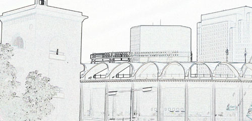
Chambers Road & Hwy 367
Moline Acres, MO
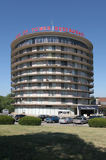
The Lewis & Clark Tower still stands as a slightly-raggedy reminder of the brief moment when North County was progressively modern and willing to create the image of glamorous new suburban frontiers. That’s the impression it still gives off to those of us who were stuck with a babysitter so our parents could party here, but childhood impressions are not always reality.

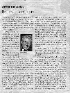
While reading the newspaper at the end of August, the picture of the man shown above caught my eye. He had a real Rat Pack “ring-a-ding-ding” air about him, so I read the obituary. Impression and reality heartily clinked martini glasses when revealed that this man, Bud Dallavis, was the developer of the Lewis & Clark Towers and its iconic, spinning Top of the Tower Restaurant.

Development is listed as beginning in 1963, county records put 1964 as the birth date of the complex, and in 1965 architect George J. Gaza is listed as the only full-time commercial resident. That he stayed until 1967 while the complex was completed begs the question: was he the Tower architect?

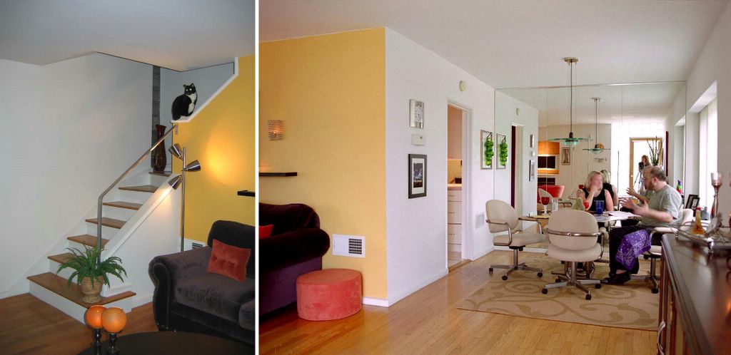
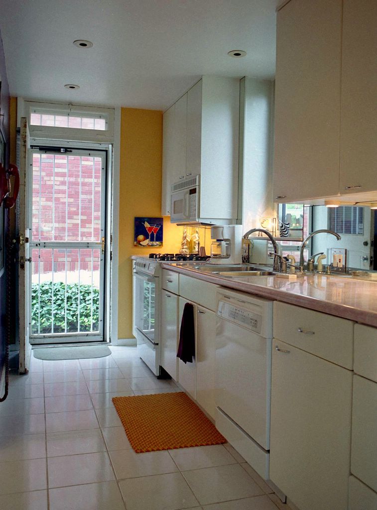
In 1966, the place was 100% jumping with at least 7 floors of wedge-shaped residential apartments (now condominiums,) each with two sliding doors out to the continuous balcony, with its own swimming pool and gym in the basement. Businesses on the first two floors of the Tower included Alpha Interior Designer, Donton & Sons Tile Co., Figure Trim Reducing, King’s Tower Pharmacy and a Missouri State License office.

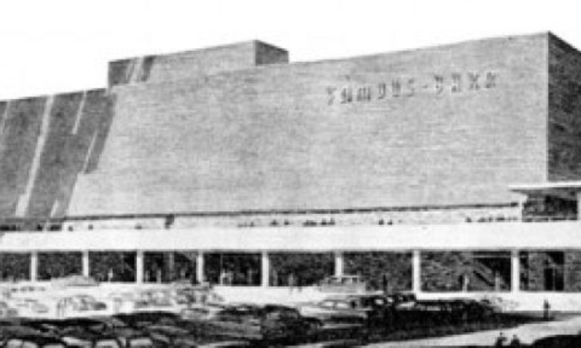
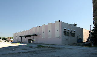
Shooting off the Tower is a strip of retail facing Hwy 367, long-anchored by Stelmacki Supermarket, a rare, independent grocer still unaffected by the continuous grocery wars. The site slopes down to the West, creating a lower 2nd level building which held the Towers Bowling Lanes and the Lewis & Clark Theater (shown below). Occupancy for the complex was robust for 10 years, with an influx of dentists and doctors filling tower spots when others moved out. The Courtesy Sandwich Shop even had a storefront for a bit. The Tower didn’t show any longterm vacancies until the late 1970s.

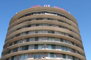
The remaining claim to fame of the Tower is the long-closed restaurant at its top, Rizzo’s Top of the Tower Restaurant, “the revolving restaurant… a landmark for many years where diners could view the downtown St. Louis and Clayton skylines, as well as the Alton river bluffs.” Considering how popular it once was, and how its myth still lingers, there’s surprisingly little information to be found about it. Internet searches only turned up a fuzzy photo of someone’s matchbook collection which includes a Rizzo’s cover, and entertainer Tony Viviano, who seems a natural to have performed in the joint.

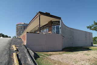
While visiting with my father, Rich and his wife, Ann, I asked if they ever ate at the Top of the Tower Restaurant, which became a rapid fire series of memories of the place, starting with Rich saying, “You know there were supposed to be 2 towers, right? Which is why it’s plural Towers.”

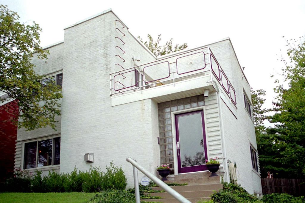
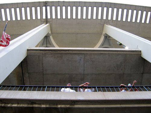
No, I didn’t know that, but that does explain why the building ends the way it does (shown above) and why the land closest to Chambers Road has remained vacant all these decades. So what happened to the other tower? Rich says that the company who originally owned it ran into some problems of partners stealing from each other, which left no money.

I tell him about the obituary for the developer whose name I couldn’t remember, and Rich asks, “Was it Bud Dallavis? He was the public face of the Towers, head of Quick Realty,” which the obit later confirmed as correct. I countered that the man pictured was really good looking, to which Rich says, “Yeah, that has to be him,” and to which Ann responds, “We were ALL really good looking at the time. We were a handsome group of people.”

She was not bragging, just stating fact. This was suburbia in the mid-1960s, post-JFK assassination, mid-Beatles revolution. Rich and Ann were a part of the World War 2 and Korean War vets who left North St. Louis city in the late 1950s for the greener (and whiter) lands of burgeoning North County. Watch Mad Men to know exactly how they dressed during the work day, how they gussied up for frequent evenings out.

And Rizzo’s Top of the Towers was a popular, happening spot for them. The restaurant was turned out in the finest china and table linens, the food good. Was it expensive? Indicative of the times, Ann responds, “I have no idea what the bill came to at the end of the night. Women never saw the bill because we never paid.”

To which Rich tells tales of the endless rounds of free cocktails courtesy of Dick Grace, the Towers bartender commonly called “Buttsey.” Buttsey had perfected a way to look like he was taking money and putting it in the cash register, but it usually went into his pockets, and lingering guilt led to lots of rounds of “on the house.” Mr. Grace was found dead in his bed in the Towers apartments in the mid-1980s, a fatal heart attack at the age of 49, all those cuisines, cocktails and cigarettes catching up to him. By that time, the Towers and surrounding area were pretty much ate up by neglect, with all the original pioneers heading ever-further away.

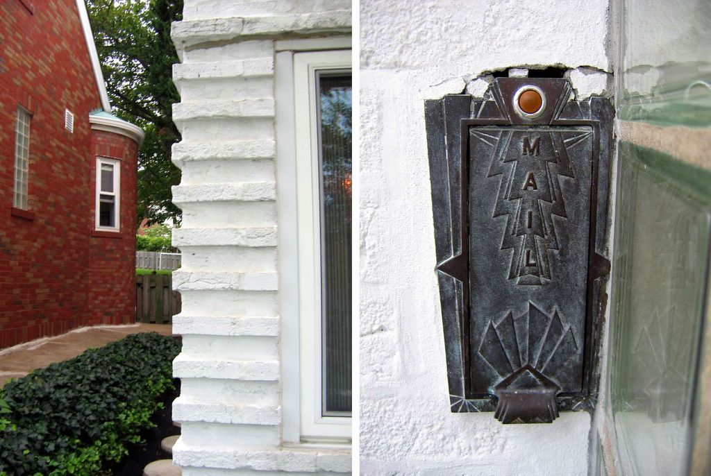
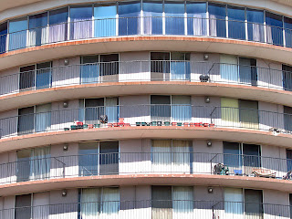
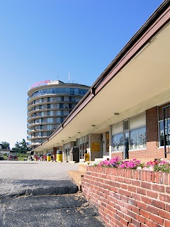
The rest of their memories just further cemented the vibe the building gives off to this day. Even though well-past its glory, it’s still in service. Most of the store fronts (shown above right) are occupied, and the Tower balconies are dotted with an endless series of satellite dishes, BBQ grills and plants. Heading out in any direction from the Tower reveals dozens of commercial buildings that followed its modern lead, now-shabby ghosts standing in the shadow of the Lewis & Clark Towers. May they all remain until the time they are brought back to life as proof that just once, for a short space in time, we had fabulous optimism for the future.

RELATED
North County Modern

Harris Armstrong, South Side

Because of this report, viagra I got to tour this house!

After posting photos and a review of an Armstrong house for sale in Kirkwood, the current owner of the above house simultaneously contacted BELT and architect Andrew Raimist. She invited us over for a delightful afternoon of architectural euphoria and info sharing.

Before processing any of my surroundings, I immediately ran up to the second floor and out onto the deck (below, left & right. Click on all photos for a larger view).

I’ve spent years gazing up at this house on the hill, imagining myself on that terrace, calmly gazing out at the city below me… And here I finally stood.
And it was good.
And I threw up my arms in victory, squealed, “Yessss!” and waved to any of the people driving down Chippewa who just might have glanced up and noticed a deliriously happy gal dancing atop the house.


(Above, left & right) The backyard of the former Deffaa Residence (where the tombstone of their beloved pet Nuki still resides) is surprisingly large and lush, with the newest owner adding copious greenery accented with whimsical details throughout. There’s even a secret gate at the end of the yard that lets you walk down to the public sidewalk below.

Most all of its original details remain in place (above, right).
While the house is wildly different in style than its neighbors (above left), it gracefully fits in, serving as an exclamation point for the immediate neighborhood.

And one of those neighbors was the gal who now lives inside. Living down the street, she had long coveted the house, and the minute a For Sale sign went up, she knocked on the door to ask for a tour. The owner let her inside, and as she stood in the entry quickly surveying the first floor, she said, “I want to make an offer.”
The owner said, “Uh, don’t you want to see the rest of the place, first?”
Of course, she did, but she already knew she wanted it.
Before financial common sense could kick in, she turned in contracts to the realtor. Immediately after that, major panic set in. But her architectural destiny was this house, and she’s deliriously happy as the Lady Of The House (LOTH).

The top level of the house is the master and 2nd bedroom (above, left & right, respectively), and both have doors that lead onto the outdoor terrace. There is a generous amount of light pouring in because of all the windows, and trees frame every view from the house. The view from the upstairs bathroom window is especially sweet, as it peeks down into the riot of green in the backyard. Note, also, that the master bedroom windows will be mirrored in the exact position on the first floor (coming up, below).

By today’s standards, the bedrooms would be considered small. But, respectfully, I disagree with today’s square footage standards. How big does a bedroom really need to be? If a bedroom also serves as a home gym, office and closet wing, then I suppose it needs to be huge. But if you merely wish to store your clothing and sleep, then a bedroom doesn’t require excessive s.f. The Deffaa House bedrooms are filled with LOTH’s essentials without any sense of clutter or cramp; both rooms feel comfortable and airy, due to all the windows, the wood floors and access to the deck. In the end, how a room feels and functions is much more important than s.f. stats.

The stairwell (above) leading down to ground level is simply breathtaking. So much drama and light in a transitory space.
Every facet of the 68 year old house is in exceptional condition because LOTH has taken great pains to restore and improve as needed. The stairs are a delicious golden honey shade, and a work of fine sculpture in and of themselves.


The front entry (above) summarizes the theme of yards of glass welcoming in the daylight. We arrived in the late afternoon of a cloudy day, and without a single light on, the entire first floor was bathed in light from all sides.

The living room (above) features a gas fireplace recently installed into a space that was formerly a recessed bookcase. Upon reviewing Armstrong’s original floor plans, Raimist discovered that a fireplace was always intended to go in that spot. Meaning, LOTH has an intuitive sense of what’s right for the space!

When experiencing modern homes, it goes one of 3 ways:
#1: The owners stay so authentic to the original aesthetic that the place becomes a sterile museum.
#2: Their inappropriate furnishings have nothing to do with the surroundings and it becomes a tragic waste of space.
#3: They find a way to balance appropriate aesthetics and their lifestyle without breaking the bank or their comfort.
LOTH has achieved #3 in a large way. She told of her previous home’s gothic furnishing not working in the new place, and of her adventures in whittling down, trading over and incorporating old favorites into a new mix. She has the utmost respect and understanding of the lines and feel of the home, but she has not compromised her comfort or personality. The raw physicality of the house has geometric grace and light built in, but the owner – through color, texture and intelligence – has transformed it into a wholly inviting home. Everything about the place feels exactly right.

The stairwell leading up to the 2nd story (above, left) and the dining room as viewed from the entry (above, right). I was pleasantly surprised to find my original portrait of the house on the dining room window sill. Much like sending a fan letter to your favorite star, I mailed a letter with an extra print to the previous owners, just because. They had sent me a thank you card and invited me over for a tour, but it never came about.

Turns out that person had started a scrapbook on the house, which was passed on to LOTH. My original fan letter and photo are part of the contents, which includes a 1986 Suburban Journal article, brief histories of the architect and snapshots of the house throughout the decades and seasons (the house is locally renowned for the simplicity of a lit tree on its balcony at Christmas time). Raimist – who is working on a book about Armstrong – gave LOTH a poster-size print of the house at the time it was built, as well as mountains of detailed information to add to the evolving history of the house.

The galley kitchen (above) is pristine and highly efficient, with another gorgeous view to the backyard. Across from the sink is an entry that leads to the garage and basement. The finished basement contains a laundry, bath and guest bedroom, as well as a small office space. So, in effect, it’s a 3-story house, working efficient square footage in a gorgeous, modern package.
For years, I yearned to see this house, and it was more awesome and inspiring than imagined. Both the owner and the house are a South Side jewel.

Busch Stadium Farewell


Last Season at Busch Stadium
Downtown St. Louis, MO
Breaking down the elements into outline form, I aesthetically love the current Busch Stadium because it lends a delicate airiness to the Lego blocks of the downtown skyline. The beginnings of the new (to the left, above) juxtaposed with the old stadium highlights Chunky vs. Sleek, and considering how huge our bodies, cars and houses are, a chunky new stadium makes perfect sense.


In the Spring of 2003, I was part of a small committee who tried to save Busch Stadium. A new stadium was going to be built, but we came up with alternate uses for the existing stadium, in hopes of keeping it and incorporating it into “Stadium Village” (any more word on that promise?). If the owners had situated the new place just a few blocks further south, the existing place could have served as St. Louis’ version of the Roman Coliseum. History preserved and reutilized for all manner of public events, retail and restaurant establishments, and a natural meeting and hanging place. The owners could have saved millions on demolition costs, and still made money from rental fees.

During this same time, I had a marketing job interview with a downtown architecture firm. Half way through the interview, it was revealed that the firm was part of the stadium demolition team, and thrilled to be partnered with the powerhouse HOK because of it. My gut reaction was “I’m staring into the eyes of Beelzebub,” and I mentally shut down, purposely steering the interview into the ground. Even though I was desperately unemployed, I didn’t want to be considered for the job.

I’ve never been down with the concept of allowing sports and retail profits to dictate civic and community evolution. Old vs. new, this story is filled with truth, propaganda and sentimentality. It was the sentimental angle that brought me to the ball park on Saturday night to visit the place one last time, take tons of photos, and say goodbye.

I choked up quite a few times while reflecting on both my personal past with the stadium, and the glorious baseball history that’s soaked into the concrete walls. I got lost in the sad poetry of crudely painted RedBirds (above left) and historic home run spots (above right) that won’t – and can’t -make it to the new stadium.


And I’ve never taken for granted these views from the stadium. No matter the decade, it’s always thrilled, even when a particular game didn’t. The arc, the Arch, the sweep and swirl of energy, and all the pieces that combine to turn a structure into the nucleus of a proud and glamorous era.
I don’t want to give this up.
Why are we giving this up?
Yes, I know the truth, the propaganda and the spreadsheets, and I resent the owners’ tugging on this city’s raging sentimental streak as they milk this season’s long goodbye. But I suppose there’s money to be made from that, too.

Speaking of money, I highly doubt that I will ever pay to see a game in the new stadium because A) I won’t be able to afford it, and B) I refuse to put my money in their coffers because C) we all originally voted against this idea. If someone pays my way, I’ll visit the Retro Brick Theme Park, and stare wistfully off into the distance where the last graceful cookie cutter stood, remembering how much I loved the old place… It’s going to be a long, mournful summer, and a bittersweet fall (since the Cards will go the distance).