The coloring book for the Coloring STL exhibit at the Missouri History Museum. You need this in your life!
The Coloring STL exhibit at the Missouri History Museum is the most amazing thing! St. Louis architecture becomes living, interactive history for everyone. No daunting architectural academia – it’s hands-on colors, shapes and memories of our shared city.
Among all that building goodness, Andrew Wanko, Public Historian, and The Missouri Historical Society invited me to be a part of it!

The “Funeral for a Shopping Mall” wall at the Coloring STL exhibit. It’s the capsule story and artifacts of Northland Shopping Center. I’m still stunned that this even happened!
I’m still gleefully stunned that obsessive documentation of the demise of Northland Shopping Center in 2005 culminates in 2022 as a wall inside Coloring STL.
This is the Northland story that put me on the museum’s radar.

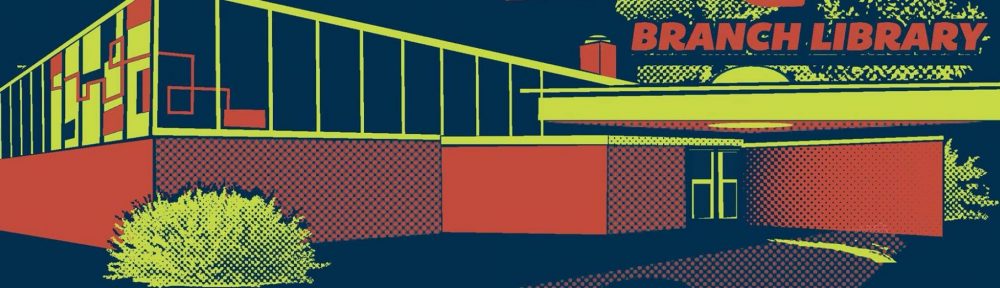
The Coloring STL display of tiles that were once on the Stix, Baer & Fuller building at River Roads Mall in Jennings, MO. So gorgeous!
They also became interested in my pieces from the Stix. Baer & Fuller building at the late River Roads Shopping Center.
A story of the River Roads Mall artifacts.

Thank you to Gina Dill-Thebeau for this photo of me and the River Roads building tiles. They are even more gorgeous all cleaned up and polished by the Missouri Historical Society team. Thank you!
A pair of Jennings, Missouri mid-century modern shopping malls were extinct and expendable in less than 50 years’ time. During their demolition, preserving pieces of these discarded buildings resonated with a handful of fellow St. Louis MCM architecture superfans. But why would anyone else care about these dead malls – retail is not history, right?
Turns out, Northland & River Roads are historically worthy! What seemed like a personal and emotional architectural project has bigger significance. I am thankful and gobsmacked.
Want to know more about this improbable, fantastical journey the Missouri Historical Society took me on? Then read on.
“Wondering If You Had Any Artifacts?”

June 2021: Andrew and Emily are in the backyard taking measurements and photos of the Northland & River Roads pieces they want to use for the upcoming Coloring STL exhibit.
MARCH 2021 – an email arrives from Andrew Wanko, who reveals he and his team are working on a new museum exhibit that:
“…will be a celebration and exploration of St. Louis architecture, with the main draw being that we’ll have huge expanses of dry erase wallpaper with factoid-heavy illustrations of more than 50 local buildings that people can color. We’ll also be featuring more than 50 local architectural artifacts ranging from a 10-foot-tall set of 1870s doors from the riverfront’s Merchant’s Exchange Building to original Louis Sullivan terra cotta, to early 1900s residential stained glass.
“We’re currently trying to find a couple more artifacts to help expand the story of our architectural heritage… to get some midcentury modern pieces included on display as well. I was wondering if you happened to have any artifacts that you might be willing to loan for display?”
I pitched Andrew my artifacts from Northland Shopping Center and River Roads. The reply email included links to B.E.L.T. posts about them, snapshots of the pieces still in my possession, and hi-res photos of where they originally “lived “ before the demolition separation.
JUNE 2021 – after much enthusiastic back and forth, Andrew and museum designer Emily came out to measure and photograph the Northland and River Roads pieces they potentially wanted for display in the Coloring STL exhibit.
At this moment, I was fresh off 6 months of hospice care, ushering two parents onto the great beyond. So Andrew and Emily in the backyard all enthusiastic and scientific about these sentimental pieces dragged out of demolition sites 15+ years ago was life-affirming therapy.
Turns out, Andrew kinda already knew what artifacts I had because he had been a reader of B.E.L.T. since his college years. Turns out he was a fan of all of us first-generation St. Louis architecture bloggers from the 2000s, like Ecology of Absence, Urban Review Saint Louis, Vanishing StL and Saint Louis Patina. He genuinely loved and devoured all this information and was now able to turn that architectural passion into an adventurous and unique exhibit on St. Louis architecture history.
As Andrew and I gushed about StL architecture and the upcoming St. Louis Sound exhibit, Emily photographed and measured all these dirty, dusty building pieces I’d been carting around since 2005. I felt bad about all the cobwebs and soil she had to work around.
It was a great day in so many ways but it also felt surreal. While elated it was happening, I could not wrap my head around any of these things being something the museum-going population would want to see. But they obviously have a higher vision, so let’s look in that direction with them.

December 2021: Emily and Carrie, from the Missouri Historical Society, come back to take final inventory of the pieces they will use. A very surreal experience.
DECEMBER 2021 – An email comes from Carlie, Exhibits Registrar of the Missouri History Museum. They’d like to schedule a date to pick up the Northland and River Roads pieces, “so our mount maker can begin fabricating exhibit mounts for the artifacts.” Whoa!
She also asked if I’d like them to bring packing materials.
That question made me chuckle. The stuff was still sitting in a metal garden shed, still dusty and dirty. They’d been schlepped around in milk crates and car trunks for over a decade, and she’s asking about protective packing materials? Wow!

As they lovingly packed and left with my architectural salvage, the waterworks unleashed. It was overwhelming that 18 years later, these pieces mattered to official historians! I’m still wrapping my head around it.
Carlie and Emily arrive, they take inventory, and then methodically, lovingly pack and load my Northland and River Roads pieces into the Missouri Historical Society van. That photo above is the precise moment tears started rolling down my face.
Like a film montage, I saw images of myself in 2005 and 2007, illegally climbing up, over, and into demolition sites to take photos and carting off what I could manage so there was something to remember them by. One particularly memorable day: Standing atop the rubble of Northland Shopping Center that only made it to 50 years old on the day of my 40th birthday. Thinking to myself: “American obsolescence grows ever shorter…” and then arriving at a surprise birthday party covered in Northland demolition dust.
It was a memorable and heartfelt pleasure when someone joined and helped me on these adventures (some of them documented here). But I was determined to document the demise weekly, so it was mostly my haunted ass crawling through rubble with a few tools and a camera, without a phone or safety plan. Today I marvel at how risky my younger self was, and how lucky I was not to wind up in a Richard Nickel situation.
These scavenger adventures would become blog posts, like when the River Roads pieces were re-purposed as garden borders. That’s all there was to keep those places “alive.” I also understood that in the big scheme of things, my infatuation with dead MCM malls was a sidebar for a select audience, which was cool while it lasted.
UNTIL THIS MOMENT, when the Missouri frickin’ History Museum is lovingly packing them up for an exhibit?!?!?! I never BELIEVED these things would have any importance even though I WISHED they would. And suddenly, they did? This is why tears of gratitude and disbelief were rollin’ as the History Ladies packed up and drove away with Northland and River Roads in their van.
Coloring STL is Awesome!

Thank you to Amy Burger for this photo of myself completely overwhelmed and grateful in front of the Northland Shopping Center portion of the Coloring STL exhibit.
AUGUST 2022 – 8 months after the artifacts left, the museum staff created Coloring STL magic. The mid-August night we got a sneak preview of the exhibit was way too much fun. And way too overwhelming once I saw “A Funeral for a Shopping Mall.”
18 years after documenting and salvaging some of the history of a shopping center, it sits in a museum. After all the years of thinking it didn’t matter, it somehow does. Based on comments overheard from people who stopped to look at the Northland wall, it was a “town square” gathering spot. A sense of place is conjured when they look at things as simple as parking reminders or Bakers Shoes’ door handles. Generations of us had this one place in common, and even though it’s gone, a few tangible pieces can bring it back for just a moment.

It was a touching surprise that they included a selfie of me holding a Kresge’s piece that was a bear to yank off the wall. Even lost my favorite flat-head screwdriver because of it. Kresge’s was my childhood heaven and I’m grateful to have tangible reminders of a perfect place in time.
Andrew Wako and his supremely talented team found contextual meaning in Northland Shopping Center and crafted a handsome way to convey it. I was always too emotional about the topic, while they have big, historian/artisan brains and know how to tell a long tale with many chapters. I am overwhelmed and deeply honored they spent time and effort to tell a Northland story.
And their idea on how to display the River Roads artifacts?! The cleaned and polished pieces pop out in 3D from a whimsical re-creation of the ground they once were part of. That’s some creative genius, right there, and I adore them for it!

The Flying Saucer is one of the 50 illustrations by Rori! that we can color. And it’s a special thrill that this building is still with us, thanks to all the mid-century modern preservation efforts.
Which now brings us to the rest of the Coloring STL exhibit!
50 illustrations by Rori, blown up large on dry-erase walls (or that coloring book – grab one!). 16 dry-erase marker colors to choose from. And best of all, no one is shy! People of all ages and backgrounds are coloring on the buildings, adding notes, thoughts, and personal remembrances in the most clever and impressive ways. I know the staff has to erase these walls on a regular basis, but I wish there were a way to keep a record of everything we felt and expressed while communing with markers on a beloved structure.
The exhibit covers a broad time span of St. Louis architecture in a precise and compelling way. But what I love the most about Coloring STL is how they bring HUMANITY and JOY to architecture education and admiration.

I spent 12 glorious years inside the Railway Exchange building with the Famous-Barr advertising department. So it was cool to add my 2cents to the coloring wall.
Among the 50 buildings for your coloring enjoyment, you will surely find one that pulls at sentimental, emotional strings. You may feel compelled to add a color or a thought to it, and you must. It feels GREAT!
Coloring STL is the perfect illustration of how architecture is, ultimately, about the buildings people use. What is the point of making a structure if not to be used? In the end, how people feel about and remember these buildings carries on longer than some of them existed.

It is heartwarming and hilarious to see what notes and memories people add to the building illustrations. Like with the gone but never forgotten Arena, folks noting their favorite shows? Priceless!
Personally, there is something very familiar about the SPIRIT of this exhibit. From the B.E.L.T. “About” page:
“You don’t need an architecture degree to know the built environment, just a set of eyes to observe with.
We live in and use the built environment every day, yet we’re too often hesitant to speak up lest we sound stupid…. to architectural academics who don’t live in your world? Please.
Let’s talk about buildings and spaces in a language we all understand. Let’s really see what’s around us rather than look. Let’s accidentally pick up some useful information along the way.”
Coloring STL invites you to pick up a marker and add your story to St. Louis history. Accidentally or intentionally, you will walk away with a new and scintillating perspective on how unique and inspiring our city is.
I send my deepest thanks and admiration to everyone on the Coloring STL team who included my artifacts as a small part of a greater story. I am honored and jazzed to be included. Your exhibit is totally kick-ass!