
I swear I don’t like this building anywhere near as much as it would seem from as much as I write about it. The building actually unnerves me and lots of other folks who grew up in Florissant. Read the original BELT entry about the Halls Ferry Medical Building.
In Summer 2008, water damage was causing the hat band cornice to crumble and get all gray and yucky, which just added to the building’s macabre allure. Then a tad over a year later, new owners were correcting the problems. Read how the monster building rose from the grave.

Another tad over a year later, and they’ve painted the raised cornice panels a shade of biscuit? Beige? Tan?
Why?
Are they thinking this will make the building seem warmer, more friendly? And does it? This is not a rhetorical question; I have yet to form an opinion other than “paint it all white, maybe?”
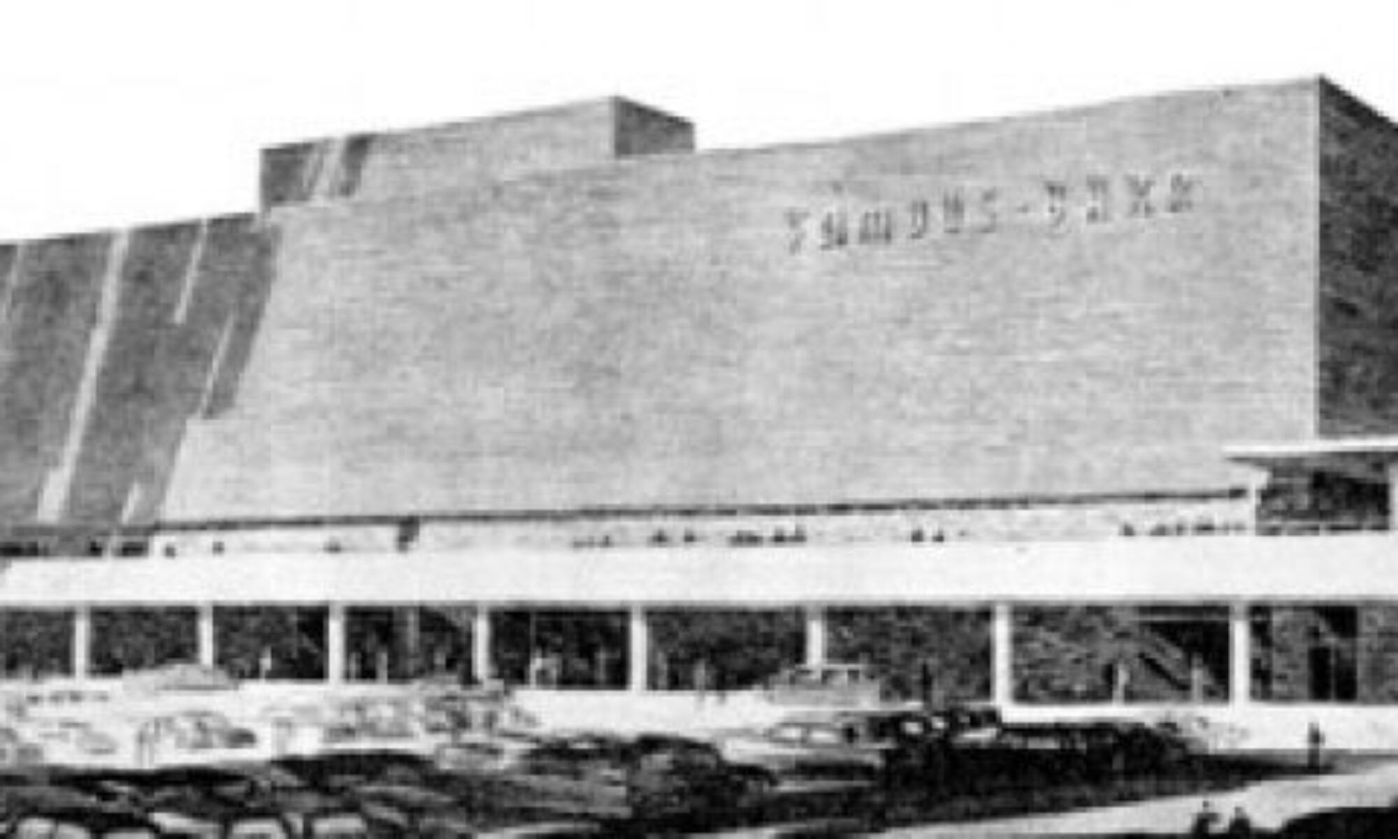
They are doing work to the bedraggled parking lot, and had to re-do the original sign to flaunt all their new tenants:

This is nowhere near as cool as the original signage, which was the only friendly thing about the building…

…but I’d rather see a full building than a cool sign on a dead building.
I remain mystified by, and grateful to the new owners who are putting (curious color) thought and money into making this building useful once again. Every new tenant is tax money for Florissant, and I love that they are re-using an existing building (no matter how unnerving) rather than demolishing and building new. And let’s be frank: to have left this building sitting vacant and rotting would have traumatized a new generation of children in ways far worse than it did us. So, a round of applause to the new owners, and if they want to take it up a friendlier notch or two and paint the place pink and aqua, I’m on board with it!
WOW! My pediatrician was in that building. Doctor Gerst! I remember hating to go to that scary building with no windows… and get shots!
Not a fan of the beige, but it would look better with another coat. Right now it looks like a paint job in need of a paint job!
PS: I’ve peeked at the related thread w/ pre-reno pix, and actually Duh Beige-ery, though banal, does take the Brutal-ity down a tad… but, still… fargin’ hideous on the whole… making little kids navigate all those nightmares to reach the minor consolation of the atrium… lawdy.
Any idea if only sketchy cut-rate docs and “pain clinics” are seeking tenancy here? Doesn’t sound like the interior qualifies as “Class A” med-office space any longer.
I suppose it could serve as a “Don’t Let This Happen To YOUR Town” cautionary tale. ;’)
Tragicomic example of where laudable MCM veered off disastrously into 70s BRUTALism. I’ve never researched how/why this happened… glass shortage, perchance?
The very worst examples are to be found on college campuses across N. America. While the architects of such anti-human Soviet-esque atrocities deserve to be flogged, then released to repent, those regents/faculty/etc. who appropriated OTHER PEOPLES’ MONEY to actually build them should be pilloried for a month in the town square, THEN incarcerated for life in supermax… have to discourage the corrupters, do we not? ;’)
Just say No to Faux!… and to Brutalism.
That tan-ish orange-beige color makes the building look more abandoned than it looked when it was abandoned. And the sign is terrible. They should have left the original lettering. However, after all that complaining, I’m glad someone is bringing it back to life.
I saw the title of this post before I even saw the picture and immediately believed you were referring to the Medical Arts building. Alas, I was right! My horrible memories of this place have to do with my pediatrician. His name was Dr. Ebel, but as a child, I swore it was Dr. Evil. Imagine why I hated the place *and still do* to this day! To make matters worse, as an adult I lived directly behind it in the apartments at Sugar Pines for two years and had to stare at it out my living room window! Talk about torture!
samizdat: makes one nostalgic for the po-mo jokey stores SITE did for Best in the late 70’s/early 80’s
I think the bleh-ge color is de riguer these days. Look at nearly every strip mall, hotel, Home Depot, built over the last 5-10 years. The built environment is being homogenized into a boring shade of yech. Branding/marketing/PR(opaganda) and the making of a Lowest Common Denominator Nation. Don’t look or think differently has come to a store or commercial building near you.
I swear when I first glanced at the picture, I thought the panels were a plywood board up job. There’s a joke about someone being so dull their favorite color was beige.
I had to take a pre-employment drug screening there about eight years ago and I got stuck in the dilapidated elevator for 20 minutes.
It’s only a two level building, if I remember correctly… I should have just taken the stairs!