UPDATE: Boulevard Heights
 Here’s where we were with this story shortly after Christmas.
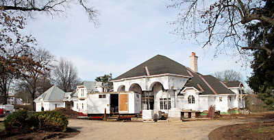
And above is the next chapter. The first houses are going in on the west end of the property, and I was relieved with what I saw for a couple of reasons.
#1. The front of the house is facing out to the street, just like all the other houses in the area.
#2. The distance between the front of the house and the street is just about the same as all the other homes front yards. That does leave room for a sidewalk, so there’s no excuse not to have them.
There’s no way of yet knowing what these structures will be clad with. The website for Rowles still hasn’t updated even though they want us to keep checking back soon.
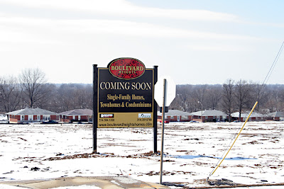 The website address given on the sign above is not yet ready for business, either, claiming to be under construction. It’s a tad suspicious when the contractor is actually building while the folks on the selling end are slumbering. Then again, this is a privately funded housing venture; Rowles is not getting, or asking for, any money from the city. Which makes them a very rare breed, indeed: a developer who feels the risk of building in the city is small enough to forego tax breaks, TIFs and special favors. They are willing to gamble at fair market rates. Because independent, self-sustained financing is such a ballsy move into today’s city development climate, I’m willing to suspend disbelief and cut them a lot of slack.
OK, I did get a little pissed when they pulled the scorched earth maneuver, and plowed over all the mature trees on the acreage. In hopes that understanding would calm the anger, I checked in with a construction estimator pal of mine on why 99.9% of housing developers shave the trees. His thoughts, paraphrased:
They need a clean slate for configuring the maximum number of units onto a plot of land, and trees just complicate the math. Plus, no one can accurately predict how far the roots of these trees have traveled. Unknowingly destroying a major root could cause a slow death resulting in the tree toppling over sometime in the future, or roots could eventually worm their way into brand new sewer and plumbing lines. Both of these root scenarios can translate into future lawsuits, and that costs the developer money. Yes, it’s always about the money, and it’s cheaper to just bulldoze the trees over and plant some grass than it is to rearrange an entire project for several trees.
So I don’t like the answer, but it is an answer. Having things explained is always better than the dead silence of “you’ll take what we give you.”
UPDATE: South Warson Road
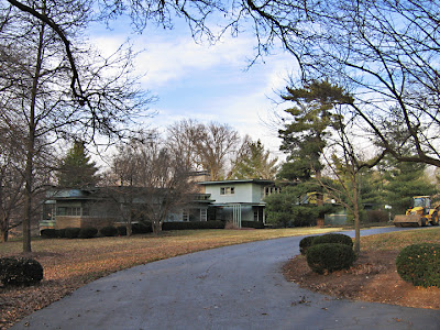 Here is a photographically detailed story of the house shown above.
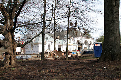 And here is what is being erected in its place. This thing is beyond massive! As many times as I drive by it, I still haven’t seen all of it, or even half begun to figure out what it’s all about, Alfie.
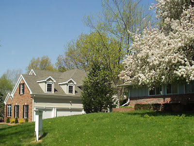
 Let’s review the house across the street from Villa Supersize (above). It’s fairly representative of most of the houses in this immediate neighborhood, even of some of the remaining original homes in the general area: low slung and sprawling among the greenery.
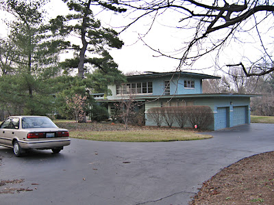 ABOVE: Not only is the house gone, but so is that car!
Teardowns are a controversial and heated topic. Private property rights should prevail, so whatever someone chooses to do with property they’ve purchased is fair by law. Then again, muncipalities have created an awful lot of laws to govern the aspect of Fitting In With The Joneses.
I have a propensity for favoring mid-century modern architecture, so will always be broken hearted when someone demolishes a worthy example just to replace it with a Steroid Palace. But I also accept, and truly appreciate, that everyone has different tastes. There’s room enough on this planet for endless variety, and people wouldn’t spend that many millions on custom home building unless they really, truly loved the design.
Bearing all this in mind, what is the fundamental problem I have with the typical structure that replaces a teardown?
 The typical teardown replacement structure flaunts an arrogant disregard of its surroundings. It’s a new homeowner willfully ignoring what’s around them in pursuit of what they want. Fundamentally, it’s the selfishness of intent that makes me boil.
When one buys into a neighborhood, that means there are other people living in other houses all around you. That’s what constitutes a neighborhood. Most neighborhoods – even brand new ones – are built with a similar look, a similar scale, a prevailing theme in mind. We usually choose where we want to live based on those physical factors (well, along with what we can afford), and those physical factors dictate the feel and distinction of each area.
When someone builds a new house totally out of scale to the rest of the neighborhood, it automatically sends the wrong signal to the neighbors: I could care less about what’s around me; it’s all about all the square footage I want. That kind of disregard is mighty un-neighborly, especially when some of these neighborhoods are desirable because of their friendliness and sense of community.
 To plop down an inappropriately scaled house among appropriately scaled existing homes is truly the equivalent of blockbusting. Evidence of that is when the first McMansion goes up, others soon follow. And how are people able to buy up those adjacent properties? Because the original neighbors hightail it out…”there goes the neighborhood.”
Not so long ago, it used to be the first black family moving into a white block that caused neighbors to flee. Nowadays, it’s square footage. All that square footage is not a measure of success; it’s just wasted space with the potential to erode established communities. Big new homes may increase property tax dollars, but those dollars don’t watch your house while you’re on vacation or shovel half your sidewalk when it snows. A disdain of the human factor is what riles me up about teardown replacements.
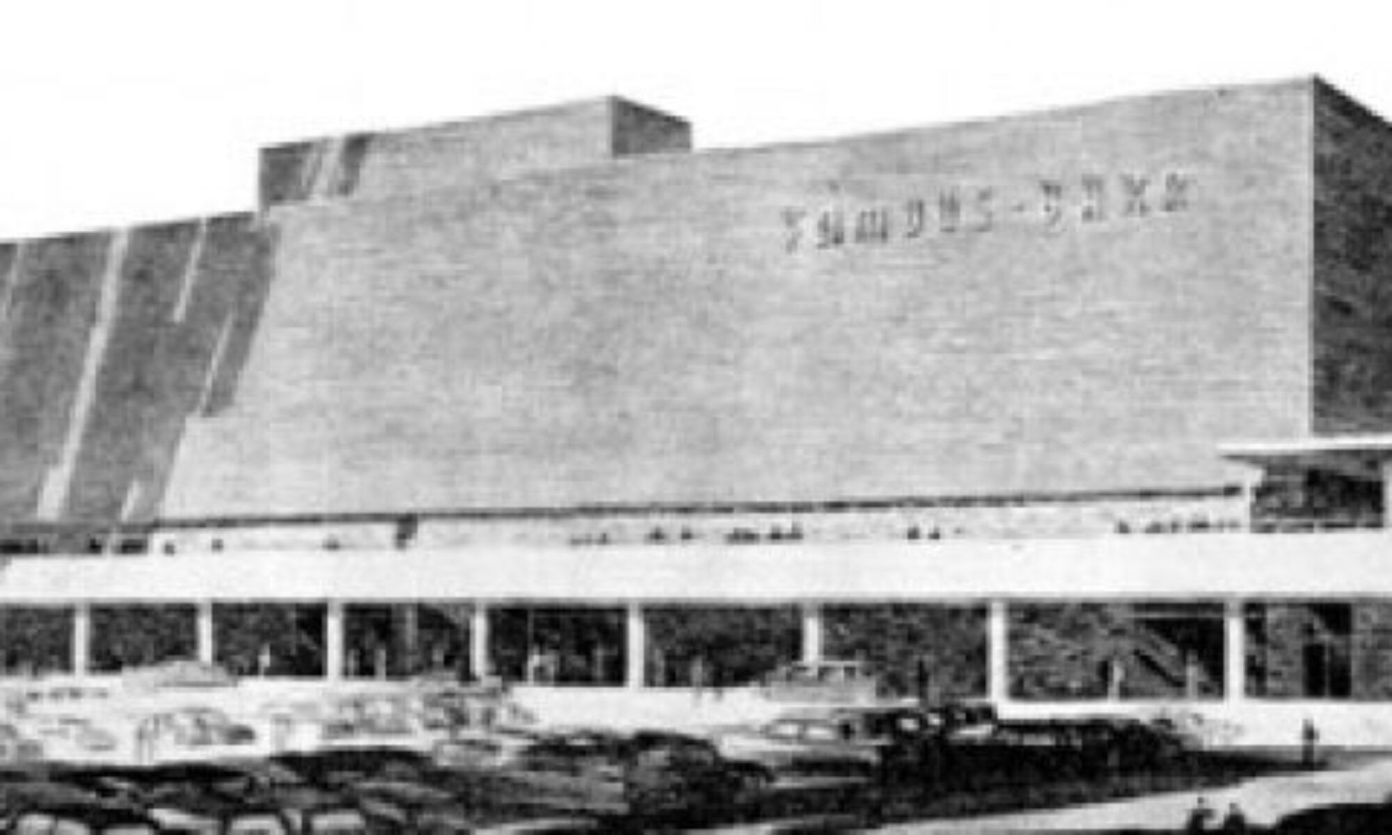
 Oh man, do I love this?


