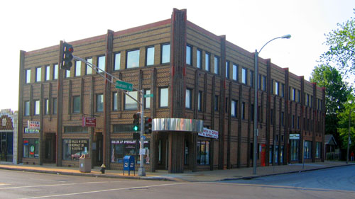
The Fountain at The Vedder

On Nottingham in St. Louis Hills stands The Vedder apartment building. To some, it’s known as The Eddie Vedder, but to anyone who sees it, it’s magnificent.

And it just got even better. Take a look!

For the first time since I’ve known the building, the fountain is on! And with lights!

There is a For Sale sign in the front yard, which may explain the improvements. And what a seriously smart move – who can resist the Vedder with a working fountain?

Backstory on The Vedder
Vedder history via Esley Hamilton

Similar South Side Deco

Oak Hill & Potomac
South St. Louis City

It was with great happiness that I read this post on St. Louis Investment about the building shown above.  In short, this 12-unit apartment building, built in 1939, is currently being renovated into 6 units.

When I took these pictures of the place in Spring 2007, two men who said they were the newest owners of the building chatted with me about their plans, pending final analysis from their building inspector. They were hoping it was in better shape than it looked. Guess it wasn’t…and so it continued to sit vacant and exposed to the elements.

But not any longer, which is a huge relief.  I’ve always liked this building because it comprises 1/3 of what I mentally refer to as the Blonde Deco Trio.

Chippewa & Gustine
South St. Louis City

Here’s another member of the clan, a few miles away in Dutchtown. It’s the oldest of the trio, going up in 1937.

And like the previous one, it is 3 stories tall with 12 apartments, same two-toned brick and wrap-around corner windows…

…and the entrances get a grand vertical treatment, highlighted by glass block.  This is my favorite of the three because its burnt sienna brick detailing is plentiful, yet so compact and precise.

Wilmington & Marwinette
South St. Louis City

The youngest of the 3 is from 1941, and resides in the Holly Hills neighborhood.

Of the 3, it’s the least exuberant, almost as if the builder was coming to a natural conclusion on the repetition of this model. Or maybe they’d exhausted their supply of burnt sienna bricks?

It is in the best shape of the trio, and even works nicely with a bit of porch flourish added to both of the entrances (though that colonial eagle has got to go).

So, both of these occupied Blonde Decos serve as excellent role models for the Oak Hill renovation, and it will be pleasure to have the triumvirate alive and well.

Are there other models of this building lurking about St. Louis? If so, please do let me know where they are.

South Big Bend Art Deco

1200 South Big Bend at Warner Avenue
Richmond Heights, MO
I would call this a truly iconic modern building in St. Louis. Because of its hillside location at Big Bend and Hwy 40, it can’t help but be seen. On a sunny day, it’s a beacon of light. And the look of the building seems to please everyone of any design bent.

For those who know of this architect’s work, it’s assumed to be a building by Harris Armstrong. The building above is from 1938, originally built for Dr. Samuel A Bassett. During that same time period, Armstrong was doing medical offices with this precise look.

But it’s not an Armstrong; it was designed by Edouard Mutrux, prior to forming his partnership with William A. Bernoudy (thank you to Kyrle Boldt for the info). But I do enjoy the vision of Dr. Bassett wanting a Missouri International Style Armstrong office, balking at the price (or maybe that Harris hit on his wife?) and finding someone willing to do an homage. Pure speculation, understand.

Until the 1980s, this workaday deco palace remained devoted to medical pursuits. By 1943, Dr. Bassett turned the building over to six different doctors’ offices, and considering how the large building crawls and expands up the hillside, there would have been plenty of room for everyone. But Bassett came back in 1949, kicked everyone out and went solo again until 1953 he partnered with Dr. Thomas A. Coates to form the Bassett – Coates Medical Clinic. Dr. Coates shared the building off and on until it was turned over to a now-defunct marketing firm called Money Marbles & Chalk. Currently it is filled with various lawyers and CPAs. Strange coincidence is that since 2000, the building is owned by Bassett Properties, sharing a surname with the doctor who originally had the place built.

From the angle shown above, the broadly curved front piece with its glass block windshield seems like a later addition to the adamant stack of rectangles.

But when seen from its parking lot on the Warner Avenue side, that protuberance is really an indicator of more curves to come. The double wiggle behind the main entry (above left) is a cheeky echo of its momma butting into the sidewalk below, which is actually a ship’s bow.

Because seeing the entirety of it’s north facade reveals a nautical theme lurking around the edges. This place has a lot going on, almost too much, yet it somehow finds a balance that keeps the eye enthralled. And by contemporary standards, it must be rather large and functional since it’s been in constant use and proper upkeep since inception.

1500 South Big Bend at Lindbergh Drive
Richmond Heights, MO
Oddly enough, just about a mile south of the deco ship is another fine example of a building unsullied and functional since birth. Built in 1952, it was a bit past the deco commercial trend, and the blond brick structure is all rectangles. But it was given the whimsical flourish of curving eaves with stainless steel fascia, which was just enough to earn it points for fluid grace.

The original sole occupant was G. H. Reich, Inc. a plumbing company that still exists in a modified current form right down the street. By 1955, the General Binding Corporation was listed as the sole tenant until 1963 when Reich Plumbing came back in, along with 6 other companies, including the State Board of Probation and Parole.

The building obviously subdivides with ease. By 1974, a little elbow room came with 8 businesses going down to 4. By 1986, the (renamed) Missouri State Probation Offices took over the entire building, and a little before that is when I first became intimately acquainted with the handsomeness and flexibility of the place.

About every 4 weeks I was required to visit a probation officer, whose particle board office did have a window overlooking the steep parking lot that climbs up the building’s north side. It was on that very same parking lot that I was late to an appointment as I sat in my car, dumbstruck, at the news that David Lee Roth had left Van Halen to be replaced by… did he say Sammy Hagar? No way! Seriously?! By the look on my face, the probation officer was expecting the worst. Well, it was the worst news, just not what she was expecting.

Every time I pass this place, I think of that horrible moment in April 1985. And here we are some 22 years later: me with a ticket to the Van Halen reunion show and the building still just as handsome as ever, giving home to various health and beauty establishments. “And I say rock on!”

Ralph Clark Pharmacy, Overland MO

Above is a construction photo, circa 1945, of the building that still stands at Lackland & Brown Roads in Overland, Missouri. We see this photo now because a relative of the man responsible for this building saw this post, and shared some of her personal family treasures.

Other than new replacement windows on the second floor, the building remains remarkably unchanged and just as vital as the day it first opened for business.

Cerelle Bolon of Phoeniz, AZ sent me all the b&w photos shown here. Her late uncle Ralph Clark (shown below) was the owner/builder/pharmacist of his namesake building. Cerelle writes:

“I am his sister’s daughter, and we visited there every summer. It was great to see it still preserved and looking good! I mentioned this to my mother, Mildred Clark Bright, who will be 100 on October 28th, and she said that Uncle Ralph was so proud of that building and his profession. And rightly he should have been.

My mother and her six siblings were raised during the depression, and their father, who had started as a blacksmith, later took a job in a foundry in St. Louis. He rode two buses cross town from Wellston to work.

All of their children became well educated. Three of the brothers became pharmacists, and one brother, Glynn Clark, graduated from Washington University (as did I in 1959), became a Marine lt. Colonel and an educator. He eventually became president of Meramec Community College in Kirkwood. My mother was an elementary school teacher for 35 years.

“This is just to let you know how happy I am to share my pride in my family’s well-deserved accomplishments, and I am happy knowing that Uncle Ralph would have LOVED to know that you are still proud of his building.”

I adore the internet for 2 reasons.
#1: fine people like Cerelle can contribute their pieces of the larger puzzle because
#2: the built environment means something to all of us, and cyberspace gives the hoi polloi a place to share the joy.

It’s not just the privilege of architects, city planners, professors and developers, but is a part of all of us. We do not need to know text book architectural terms to know what is beautiful, useful and essential to us. We live and work in these buildings within our communities, and (to paraphrase Wilde) though all of us are in the gutter, some of us are looking at the brick work, fenestration and pride of place.
Thank you, Miss Cerelle!

Overland, MO Mid-Century Modern

Lately, Overland is notorious as the township with the deluded, egoistic mayor who refuses to relinquish the burning castle. Aside from City Hall ineptitudes that have inspired so many of its citizens to blog, Overland is a nice town; completely suburban, yet old enough to have been formed to urban standards. There is a formal downtown nucleus that spreads out into little tract homes, and at Christmas the main drags are festooned with the exact same lighted decorations decade after decade. Overland retains so much of its original fabric that it often feels like touring a museum of post-World War 2 Baby Boom suburban expansion. Yet the place is alive, feisty and curious in a low-key manner, which keeps it off the hipsters and aggressive developers radars.

These photos are a fair sampling of the commercial buildings along Lackland Road, right in the immediate vicinity of Skeeter’s Frozen Custard. Generally, they were all built between the end of World War 2 and 1955.

This particular building has changed hands many times (it was an upholstery shop for the longest time), with each new owner never feeling the need to radically alter its appearance. And I’ve noticed that about this entire stretch of road: the commercial buildings don’t stay vacant for very long and they seldom get radically remodeled. Some may say that a lack of apparent progress is the sign of a stagnant city, but I see Overland’s constant, gentle ripples as a city finely balanced.

One of my favorite examples of Overland being satisfied with its resources is the above service station. Walking onto the parking lot is like swooshing back in time, with that time being kept by the very same clock that’s graced the building since it went up in 1954.

The only major change the decades have wrought is the removal of the gas pumps. Other than that, it’s business as usual, utterly neat and tidy and friendly.

What year was this photo taken? The only thing that betrays 21st century is a package of blue M&Ms and Skittles in what is most likely the exact same vending machine the original owners plopped into that office 53 years ago.

Heading east on Lackland and crossing over Woodson Road (the city’s main drag), one can see the most curious of buildings. Some portion of the Knights of Columbus Hall was built in 1930, and dusty new additions have been plopped into the mix over the decades. The place is now massive, and appears dead to the world, but its ramshackle appearance always stays exactly the same (indicating regular upkeep), and its website shows a full roster of activities.

Just up the street, the YMCA sports the Deco Moderate look that was popular in new suburbs of the late 1940s. It gave new public buildings a sense of the modern urbanity but without all the drama. This style holds up well, as it never looks too dated (for those who require contemporary) or too radical (for those who like quaint). This YMCA building went up in 1948, is still in use, and still looks fabulous.

At the intersection of Lackland & Brown Road is this simple and handsome building, built in 1945. The curving corner, a ribbon of tiny windows and the dark brick pinstripes of the second floor give it a bit of a Steamliner Deco feel. There is always another business ready to take over any vacancies in this building, and it’s been this way since I first “met” the building in 1984. This intersection has businesses on 3 sides, but it’s a bit disconnected from the main commercial drags by houses. Meaning, it would have been a natural for this building – this intersection – to decay from natural suburban aging. But it hasn’t. What does Overland have going on that similar towns don’t?

Directly across the street is a building that always tickles me. I mentally refer to it as Googie Van Der Rohe because it looks like a Chicago Mies building accented with a Southern California roadside motel lobby. It was built in 1957 as a bank and remains so, and it looks like that!

The SoCal Googie looby was, obviously, the main entrance, meant to be accessed by foot, bus or car from the intersection. But in 1967 they moved the entrance to the opposite end of the building when they expanded that parking lot. The “new” entrance still has that afterthought look, and feels cramped because of the makeshift drive-through lanes crowding its scene.

I love that a bench was placed under the canopy, so that employees can lunch and smoke in Jetsons splendor, and that they have to walk quite a ways to get to it, as that door has a chain on it to make sure it stays shut.

So, the entrance is now useless as such, yet they’ve left it completely intact, with the “crazy man, crazy” light fixture hanging like it’s suspended in prehistoric amber. It’s such a queer thing to have so many different banks move in and out of this building, reconfiguring its guts and alley as banking needs change, yet they leave the essential Mod-ness of it alone. Is it a case of “out of sight, out of mind?” Or that no one bank is ever inside long enough to invest in remodeling the non-essential parts? Or does it cast some sort of 77 Sunset Strip spell over all inhabitants, rendering those who would vinyl side incapable of doing so?

By hanging a U-ey at Lackland & Brown, we drive back toward Woodson Road, hang a right and head straight into the thick of old fashioned Downtown Overland. And it really does seem to have gone out of its way to be old-fashioned from inception. County records show that most of this dense strip of buildings went up in the 10 years directly after WW2, so they built quickly during those last moments in time when pedestrian traffic still influenced how a commercial district was laid out.

The downtown strip has a few stalwart businesses, remainders from the old days. But, again, each time a storefront becomes available, it gets filled much quicker than these types of commercial districts usually do. And by quicker than usual, I mean that we can cruise the central commercial strips of, say, Normandy or Baden or Glasgow Village and see a chain of vacant storefronts. But not in Overland.

And they have never really had the room to renovate for expanded parking. Sure, they’ve taken down a building or 2 to squeeze in some blacktop spots, but overall, its street parking, and those spots are always filled and there’s always commerce taking place.

One of the liveliest spots in downtown is the diner, above. By keeping it tiny (572 square feet being a good definition of such) they were able to push the building up against the sidewalk and use the leftover space for parking, which was quickly becoming a bigger concern when the place was built in 1957.

Half of the building is decked out in Pseudo Deco, vaguely reminiscent of White Castles, while the other half is standard Corner Tavern Stone facade. That they were able to cram 2 distinct looks onto so little wall is most impressive.

And the interior has barely changed in 50 years.
What kills me is that one can easily walk from Paul Bros. service station (4th picture from the top of this entry) to this diner in about 10 minutes and somehow remain in a Leave It To Beaver world, untouched by the uglier aspects of modern time. And we’re not talking some retro homage; it’s the entire genuine article, unfussy and unconcerned that the diner reeks of decades worth of grease. It’s probably those ancient grease odors that makes the biscuits and gravey (spelled, my lord, with an “ey”) so damn great.

The Hacienda Mexican restaurant has long been a popular staple in the downtown strip, but it hasn’t always been this pink. It used to have a more traditional Northwest County Adobe look. I feel they updated the color to Flamingo Pink to better coordinate with the establishment behind it…

…which has spruced up its Lyndon B. Johnson congressional motel look with some hot sea foam green trim. Built in 1965, they were billed as “garden apartments,” for all doors faced into a central courtyard, much like in Southern California.

Every good downtown needs a dollop of seediness, so this place has become rather transient, in the most romantic sense of the word. The set-up is actually quite nice, but I couldn’t get in any closer for better shots, as the working girls crossing the tiny parking lot were real uptight about someone taking pictures of their place so early on a Saturday morning. I respect free enterprise, so I respectfully moved on.

Leaving downtown proper, we head back up Woodson Road, a couple of blocks south of Page Avenue, to one of my favorite buried MCM treasures. Overland is rather hilly, and note how this gem (above) plays with the topography by tapering a rectangle into the hillside. I love the feel of the windows melting into the ground, and the shades of blue springing out of green grass and blacktop.

This place was built in 1958, and it’s a perfect model of that year’s modern aesthetic. Tiny tiles of aquatic blues, the concrete block sun screen that throws polka dots amid the shadows, simple planes low to the ground, cool geometry in service to manufacturing prowess. If this building could have been erected next to the Googie Van Der Rohe bank, the story of 1950s American Progress would have been perfectly told in microcosm.

U.S Band & Orchestra Supplies now manufactures and wholesales instruments, and the building serves them well enough that they don’t think about it’s condition. This building needs some help. A good start would be to trim the hedges and kill the weeds, some waterproofing and paint on the faded surfaces.

Each time I pass this faded beauty, I have to fight the overwhelming urge to have at the tile with a bucket of Spic & Span and a water hose. Just imagine how those tiles gleam when clean, how this building must have impressed when it first came to the neighborhood. And it could do that once again, but the immediate commercial strip in which this building sits is heading toward the kind of decay that invites future developers to go for Big Box infiltration. Should this ever be the case, the one building that just might save the above gem is…

WOOFIE’S! Serving what has been called “the hot dog of the gods,” the building went up in 1955 and is only a dozen square feet bigger than the diner shown above. But this building was dedicated to the car from its inception, so the inside can now concentrate on being a tiny “shrine to the all-beef frankfurter.” It’s clean and bright, and on a brilliant sunny day, Woofie’s contrasted with my blue tile geo gem next door is a sight to break my heart. It speaks to me of all that’s good about America’s mid-century aspirations, and makes me proud that such a unique town like Overland is here for you and me.

The Dorsa, "The Ultimate in Mode Moderne"

The Dorsa Building
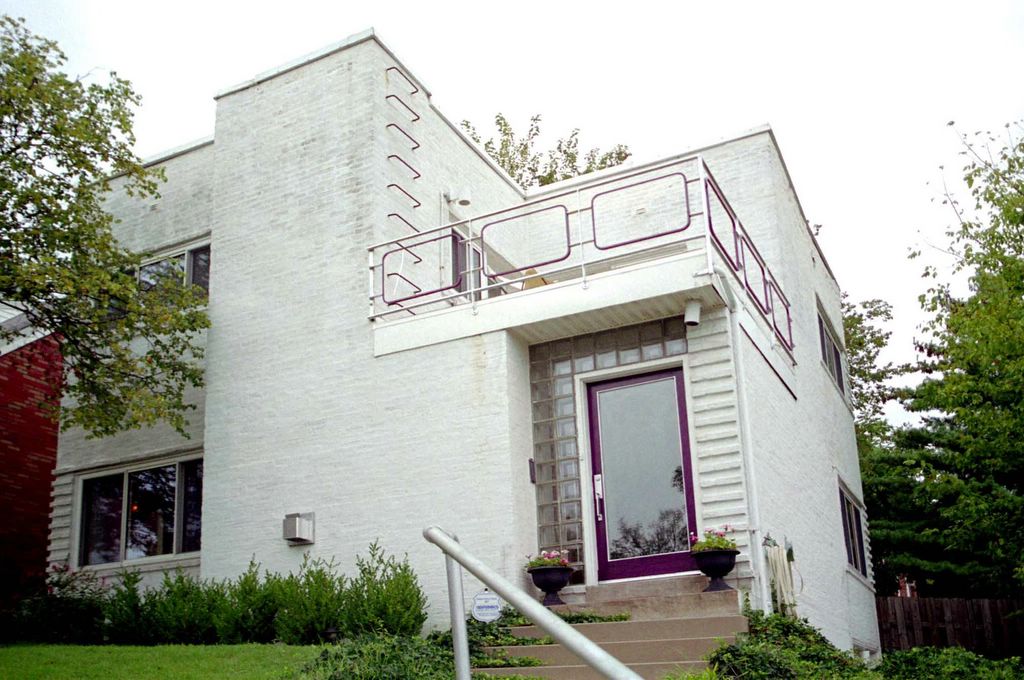
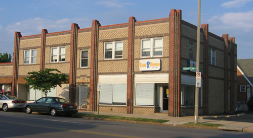
1007 Washington Avenue, St. Louis MO
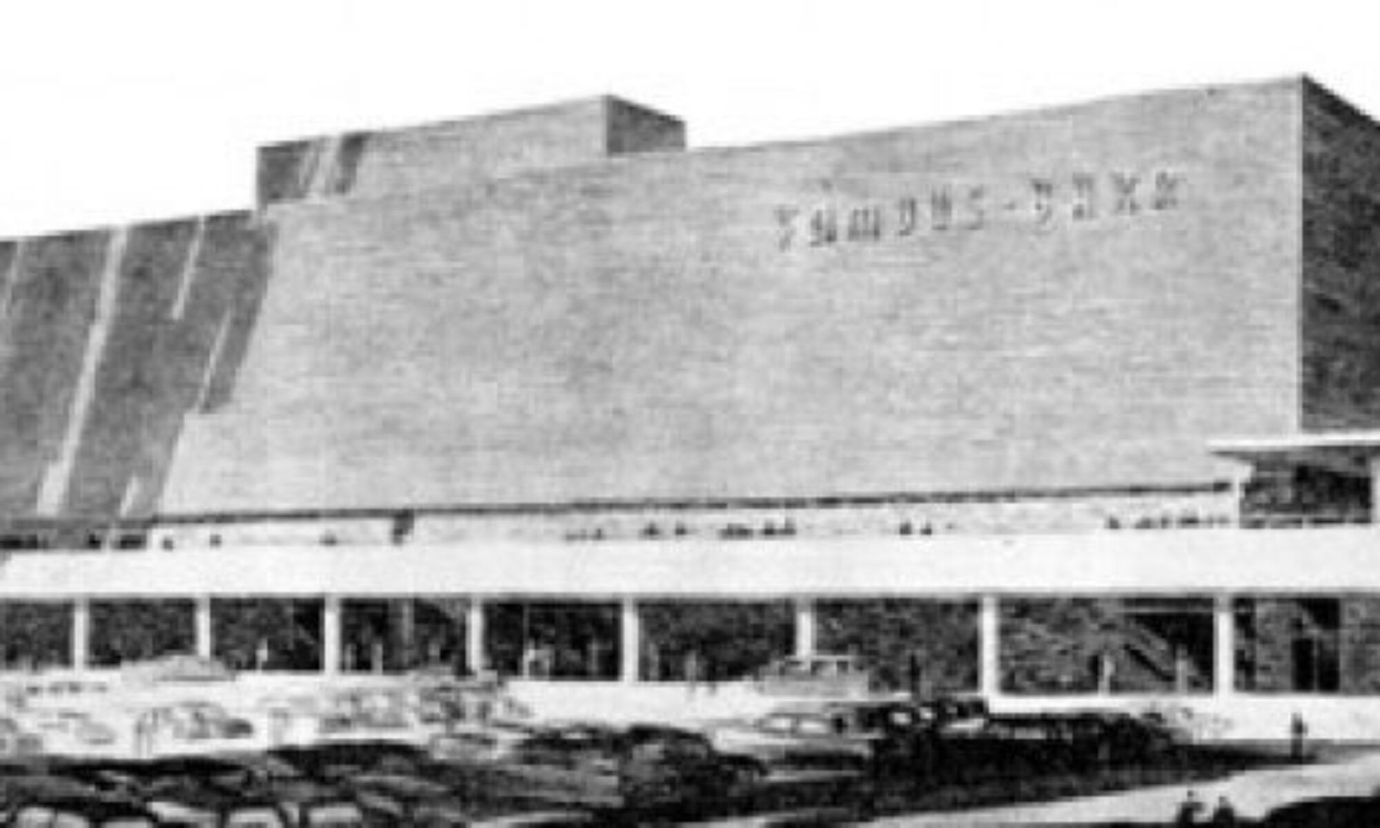
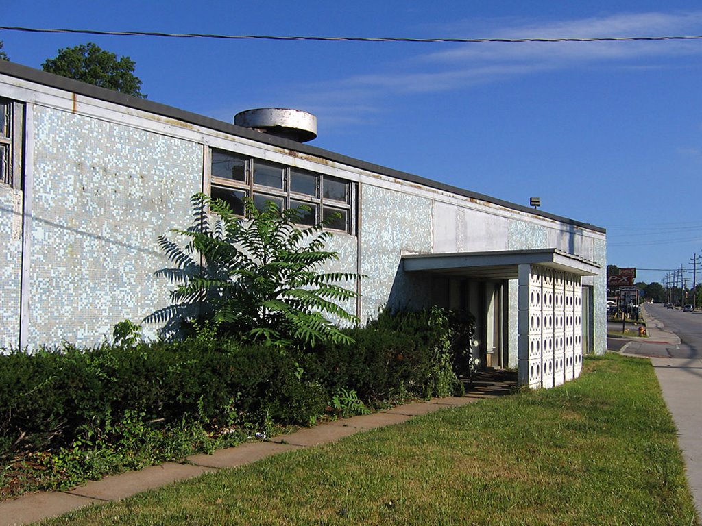
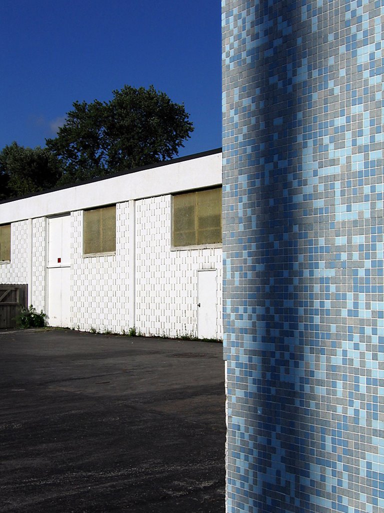
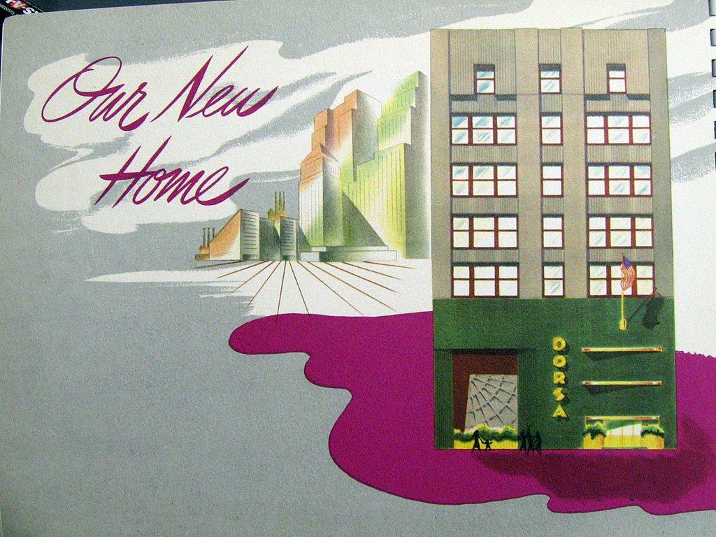
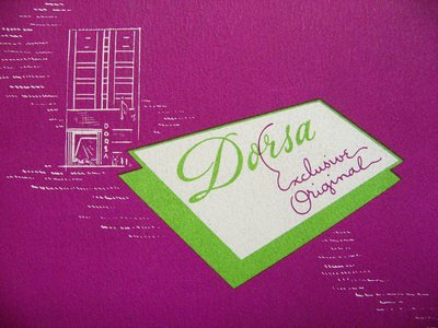
The firm of Eames & Young were, essentially, the City of St. Louis’ house architects, and with 2-dozen-plus buildings in a small area, they couldn’t all be spectacular. So, when the Dorsa Company (photo above) took over the building in 1946, no one objected to a face lift. And no one since has regretted the decision.

Even when Washington Avenue was at its shabbiest, The Dorsa was a bright spot so witty and sophisticated that even the thoughtless didn’t think of totally obliterating its essence. All the turn-of-the-century buildings around it sprung back to life, so it was merely a matter of time until the Dorsa was rehabbed. But would new owners restore it to 1902, or leave the Gotham Deco facade be?

The Pyramid Companies bought it, and the 1946 remodel qualifies for Missouri Historic Tax Credits. The upper floors of this building (and 1011 next door) are converting to lofts, and with only a few units remaining while the place is still under construction, it’s a wise move, to say the least. But what would become of the mythical ground floor of the Dorsa?

I say “mythical” because it felt like I needed a Willy Wonka Golden Ticket to experience the mothballed splendor behind the Emerald City facade. Photos of the magical mystery tour produced audible gasping and intense swooning. I longed to go to go inside, where “neon lights will shine for you, Xanadu.”

“And now, open your eyes and see, what we have made is real. We are in Xanadu.”

Paul Hohmann is principal architect for Pryamid Architects, as well as Kubla Khan, because he gave me an expansive Dorsa tour. Days before the blessed event, The Building Collector revealed he had an original, 1946 promotional brochure introducing Dorsa Clothing’s new home at the St. Louis Building Arts Foundation library. Hohman and I had yet to see it when this tour began, so the questions and observations had no answer yet. But it turns out that Hohmann has an instinctive understanding of the place, and an admiration that assures its protection.

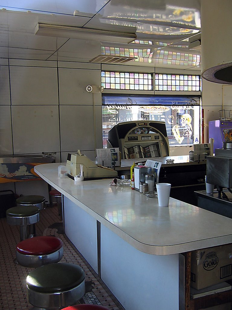
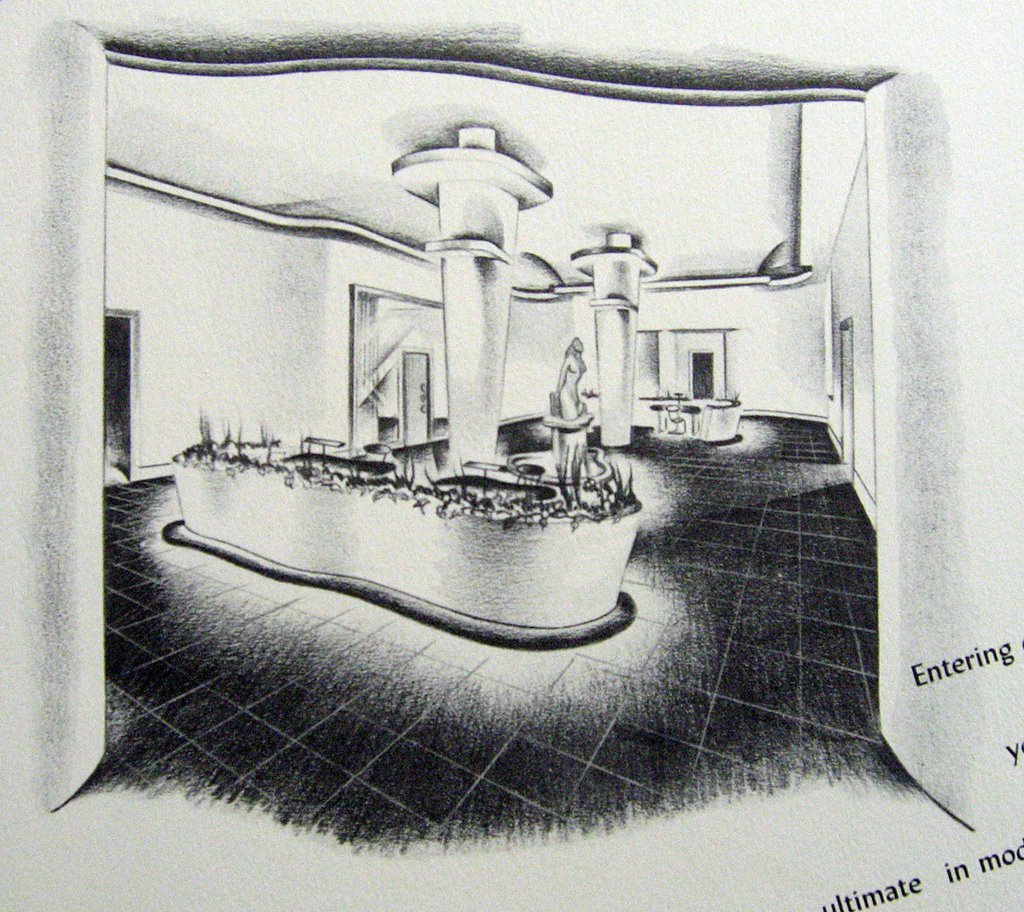
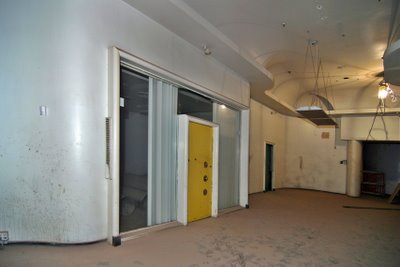
After entering from the Washington Avenue entrance , we enter the main sales floor area (photo above). It’s a riot of curvaceous plaster, idiosyncratic offices and alcoves, and a perfect time capsule of an odd moment in retail design.

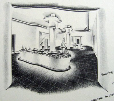
(Above) The brochure calls the Entree Floor “…the ultimate in mode moderne.” Note that aside from the undulating planters around the base of the columns, all the original features remain intact. Because of construction on the floors above, the entire space is covered in a deep layer of dirt and plaster dust, but Hohmann confirmed that the original terrazzo floor tile is still there and in fine shape.

Even in this dishabille state, I could see a Joan Crawford sales gal peddling accessories to Ladies Who Lunch, a Jean Harlow patron contemplating purchases in the lounge. It looks like a classic Hollywood movie set, a way to be a part of something that never really existed, yet in downtown St. Louis, it does exist!

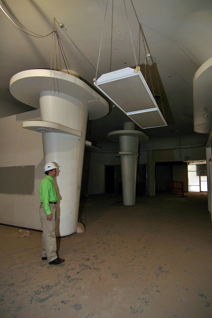
(Above, looking back towards the entrance) The pair of streamlined, aerodynamic columns are the most awe-inspiring feature of the room. Paul Hohmann is an average-size man, so he (unwittingly) gives you a sense of how colossal the columns are.

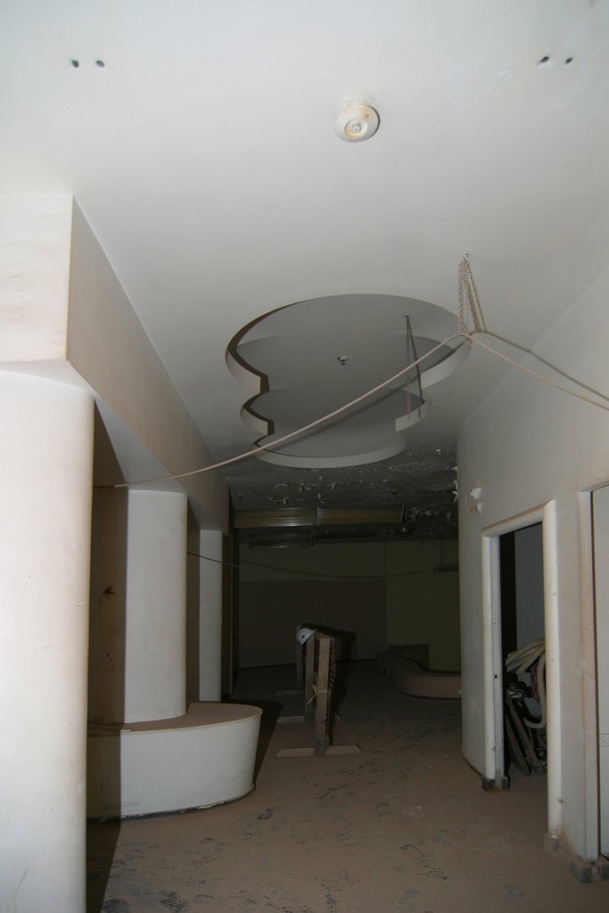
Dragging myself away from the The Entree, we come to a hallway featuring a squiggle cut-away in the plaster ceiling (above). All the original neon tube lighting still rests within all the ceiling recesses, and it’s easy to “see” the soft glow it gave to the Dorsa showroom. This type of cut-out, and this form of “moth to flame” lighting reminded me of the fabulous tricks employed by Morris Lapidus at the height of his retail design power.

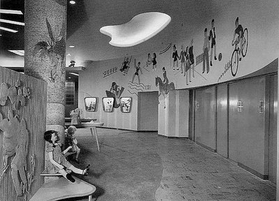
Sure enough, a book on Lapidus’ work revealed a 1945 kids’ showroom (above) using much the same features that triggered my initial comparison. This has me wondering how much Meyer Loomstein – the architect of the remodel – was influenced by the work of Lapidus.

I’ve yet to take a look at the 6 homes in Ladue, MO credited to Loomstein in the early 1950s, so I’m not sure what architectural style he preferred. But in the mid-1940s, Morris Lapidus was making huge design waves for his retail work in New York City. The Dorsa Clothing Co. president states in the brochure that they “cherished the ideal of design-ingenuity,” and uses the word “drama” a few times, so when Loomstein landed the commission, it’s easy to imagine him looking to Lapidus for inspiration. I also detect the influence of Hollywood art directors like Cedric Gibbons and Carroll Clark, which is an appropriate connection to make for the show room of a women’s clothing manufacturer.

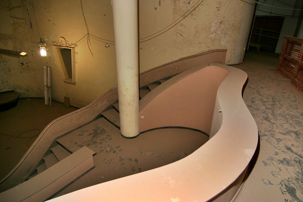
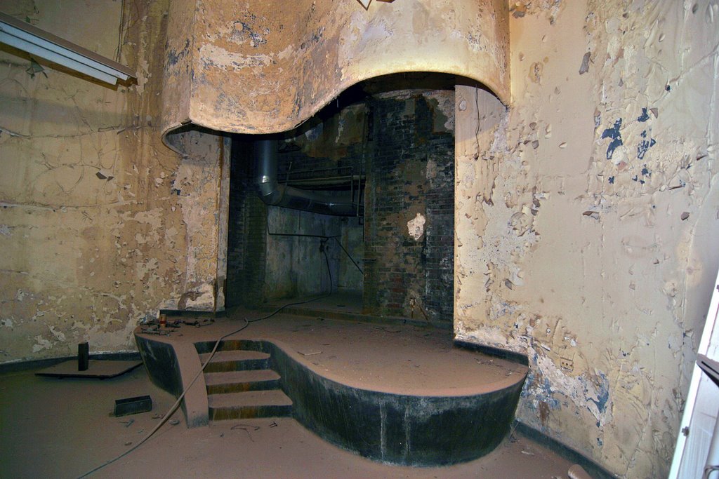
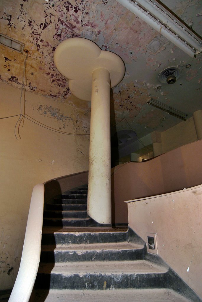
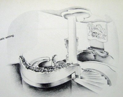
And now we move into The Salon (above), which is where Golden Hollywood deja vu really kicks into overdrive. 2 levels of capriciously careening stairs lead down to a clams-on-the-half shell stage. It is so over-the-top, that my brain can’t even process how fabulous it once was, how utterly alien it must have seemed in 1946. And I’m impressed with Dorsa having the guts to bring this kind of glamour to the St. Louis wholesale garment district.

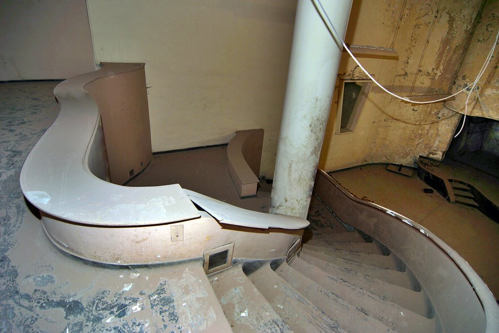
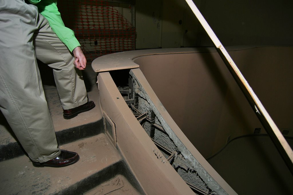
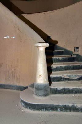
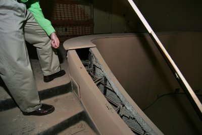
As I mentally glided down the stairs like a Ziegfeld Follies showgirl, Hohmann points out that the plywood covering the slithering stair banisters (above) are not original. The guts do not reveal any electrical fixtures, so he surmises they may have placed potted plants in them, to add another level of texture.

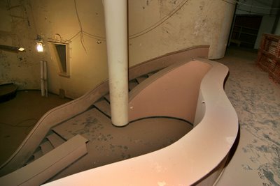
What seems a random pattern of swoops and swirls to the stage is actually a clever way of providing multiple levels of seating and endless niches to display items. And even though there’s much movement, it’s created by clean lines. When considering some of the exaggerated details of the spaces, this feature becomes the grace note within the dramatic tension.

And this, above, is the money shot, showing the overall effect of The Salon.

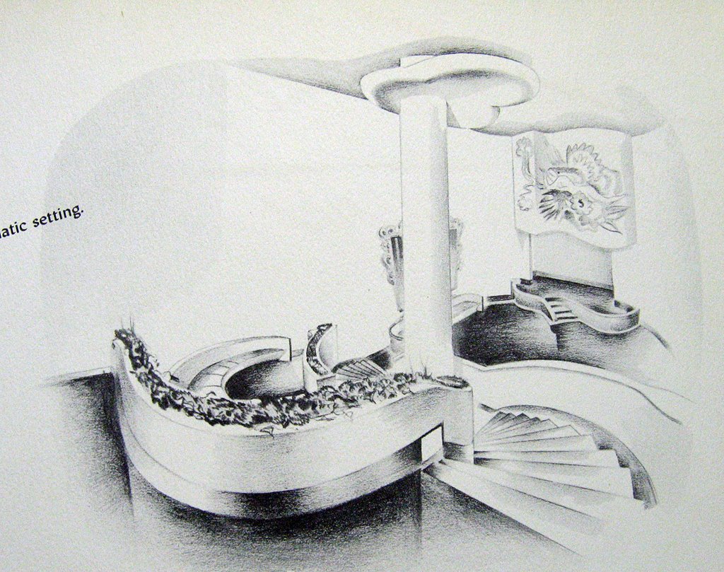
We see the brochure a few days later, and I’ll be damned, the brochure artist knew it was, too! And I’ll be damned, Hohmann correctly called the potted plant banister! The mural above the stage is gone. Was it bas relief, a mural painted on the plaster, or a painted canvas attached to the surface? Chipping away at the remains may provide some answers.

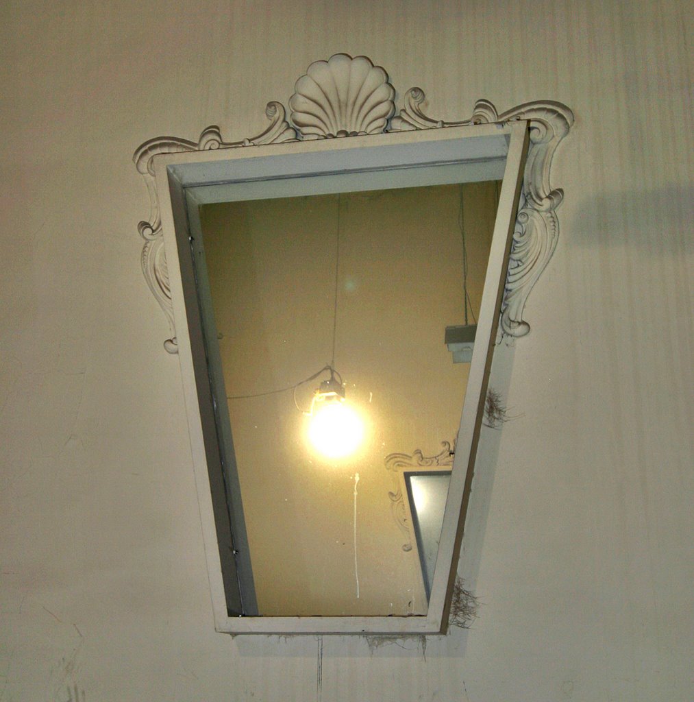
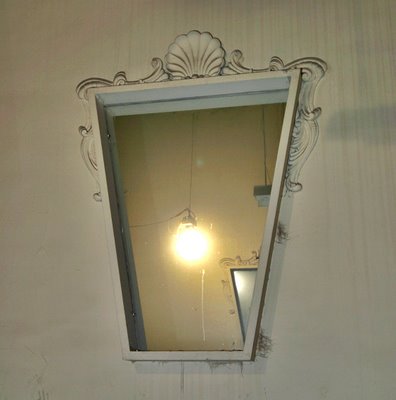
The fanciful, wood framed mirrors (above), partially shown in The Salon sketch, are still in place today.

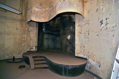
And here is The Stage (above). Once you’re up on it, it’s awfully tiny, but then a model didn’t really need all that much room to spin around in. Again, it’s about glamorous presentation, so drama is created with curves and height and color and….

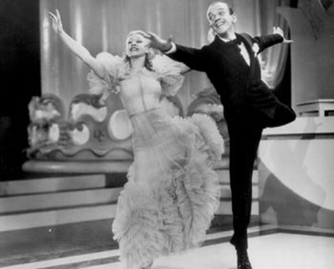
…movement. As I stared at the pirouetting stage, black & white images of Ginger Rogers & Fred Astaire gliding through the room ran through my head (there’s that Carroll Clark connection).

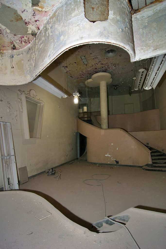
To stand on the stage and look out into the room (above) only encourages such celluloid fantasies. It’s such a seductive sight, all this Hollywood excess via burgeoning Midwest sophistication. It’s so fantastical that in the 60 years since its birth, no one has had the heart to destroy it. They may not have used it, but they couldn’t remove it. And that brings us to: What will become of this space?

While Pyramid has modernized the upper floors of the building for residential space, they are committed to keeping this retail space as is. It’s such a rare and alluring treasure, that to gut it out for the marketplace would be criminal.

There is approximately 7,000 square feet of space. That’s plenty of open space, plus 3 enclosed offices, a bathroom and a display window facing onto bustling Washington Avenue. The ultra unique fixtures and look of the space calls for a special kind of retail use. Ideas include:

Clothing Designer An independent clothing and accessories designer could carry on the legacy. Or imagine a collective of local designers sharing the space. As it’s divided into separate rooms, 3 different designers would have ample space for their wares, while all would be able to take advantage of the stage. Imagine the fashion show returning as a promotional staple, and imagine the customers flocking to this destination.

Wedding Planner Now that retirement has shuttered Blusteins Bride’s House, the downtown market is wide open for a wedding planner looking for a grand show and work room. All attendant accessories and services for wedding planning would have room for representation, and imagine the bride-to-be trying on gowns and standing for fittings on the stage.

Furniture Store The thought of modern furniture and home accessories scattered throughout the Moderne space is very appealing. There is ample wall space and plenty of niches and surfaces for display, and the possibilities for grouping furniture settings is endless. Plus, there’s a side staging and load-out area in the alley for furniture deliveries.

Supper Club The Entree Floor is ready-made for a bar and restaurant, while the auditorium is begging for multiple levels of intimate tables and chairs overlooking the stage. The stage is just big enough for a cabaret performer or small jazz ensemble. The facade and interior of the building already provides built-in atmosphere, making the marketing of the concept a breeze to execute.

Beauty Spa It’s a no-brainer to imagine a full-service beauty parlor and spa inside the Dorsa. Simply walking in the front door broadcasts beauty and fantasy. There are private rooms for massage, tanning and waxing, and plenty of spaces for hair, make-up and clothing. I’m thinking more the beauty salons of old, rather than today’s Zen centers. But spa owners would know better than I how the Dorsa could work for their intents. Plus, the large group of young ladies living downtown would make this an intriguing prospect.

Though dirty and worn, the retail areas are in great physical shape. Scrubbing, scraping, patching and painting would comprise the bulk of revitalization work. Pyramid is actively seeking a tenant wholly engaged in taking advantage of this extraordinary space. A personal tour of the space certainly gets your imagination working overtime, and check with them to see if a new retail venture would qualify for Missouri Historic Tax Credits. Give them a call if you’re curious.

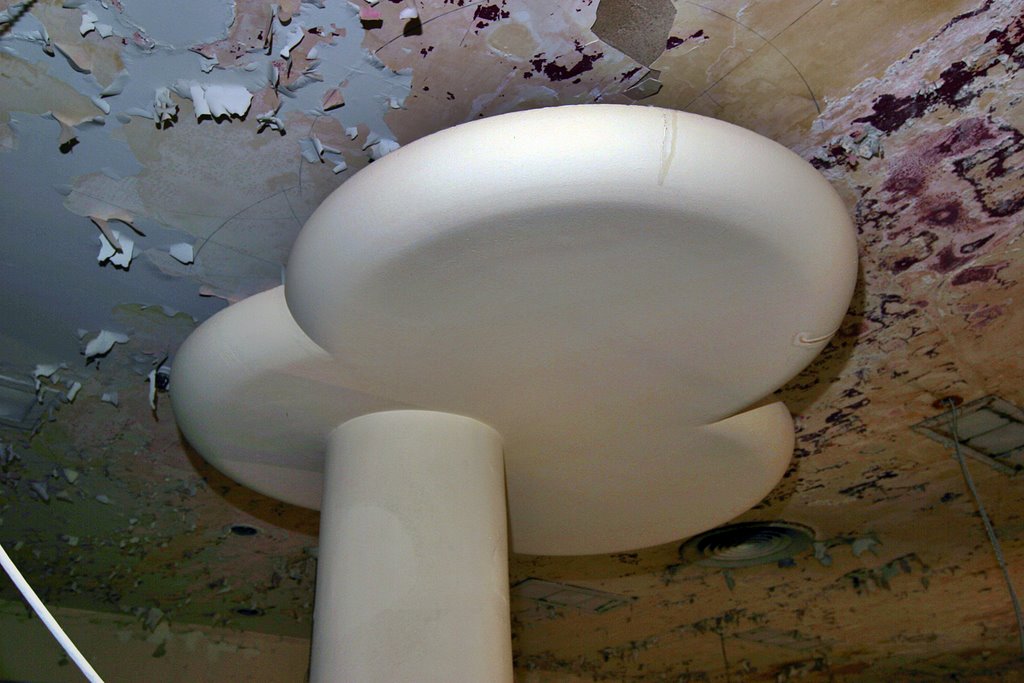
Last, but not least, is the puffy marshmallow cloud atop the auditorium column (above). This is where drama and whimsy meet, at the corner of Hollywood Boulevard and Washington Avenue.

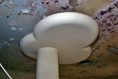
I noticed a dark magenta peeking through the layers of peeling paint on the ceiling, and a few days later it became clear. Looking at the brochure (and the original envelope it was to be mailed in) showed a brilliant magenta as the Dorsa color, and they simply carried that color from building to brochure. Just imagine that white plaster cloud popping out of a deep hued ceiling, and swoon yet again.

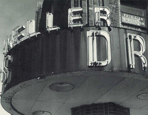
As for the outside of the building, Pyramid is preserving and restoring as much of it as possible. The letters spelling “DORSA” on the front facade were sold to a Chicago antique dealer several years ago. If the budget does not allow for re-purchasing them, exact replicas will return in their place. Some pieces of the terracotta “spider web” to the left of the entrance were found, but trying to recreate that feature is cost-prohibitive. Instead, that well will convert to display windows, which is an added bonus for the future retail tenant.

The dark orange metal window frames on the upper story were installed in the 1980s, but was that the original color? Pyramid research couldn’t locate a good color photo of the 1946 remodel, so they’re defaulting to black frames for the replacement windows. But Hohmann’s heart just isn’t with black frames; it feels like a disservice to the vibrancy of the facade.

And once again, that wondrous, highly-accurate brochure disclosed the facts! Of course the original windows were a red orange, because it perfectly compliments the 2-stories of green tile. The look of relief in Hohmann’s face was touching, and now let’s hope fabrication on the new windows has not yet begun so there’s a fighting chance of banishing the black.

Thanks goes to Paul Hohmann for the tour and his sincere dedication to The Dorsa; Larry Giles for providing a library where treasures like the Dorsa brochure can come to rest; and to Lynn Josse for scanning and enthusiastically sharing the brochure with all of us.

Harris Armstrong, South Side

Because of this report, viagra I got to tour this house!

After posting photos and a review of an Armstrong house for sale in Kirkwood, the current owner of the above house simultaneously contacted BELT and architect Andrew Raimist. She invited us over for a delightful afternoon of architectural euphoria and info sharing.

Before processing any of my surroundings, I immediately ran up to the second floor and out onto the deck (below, left & right. Click on all photos for a larger view).

I’ve spent years gazing up at this house on the hill, imagining myself on that terrace, calmly gazing out at the city below me… And here I finally stood.
And it was good.
And I threw up my arms in victory, squealed, “Yessss!” and waved to any of the people driving down Chippewa who just might have glanced up and noticed a deliriously happy gal dancing atop the house.


(Above, left & right) The backyard of the former Deffaa Residence (where the tombstone of their beloved pet Nuki still resides) is surprisingly large and lush, with the newest owner adding copious greenery accented with whimsical details throughout. There’s even a secret gate at the end of the yard that lets you walk down to the public sidewalk below.

Most all of its original details remain in place (above, right).
While the house is wildly different in style than its neighbors (above left), it gracefully fits in, serving as an exclamation point for the immediate neighborhood.

And one of those neighbors was the gal who now lives inside. Living down the street, she had long coveted the house, and the minute a For Sale sign went up, she knocked on the door to ask for a tour. The owner let her inside, and as she stood in the entry quickly surveying the first floor, she said, “I want to make an offer.”
The owner said, “Uh, don’t you want to see the rest of the place, first?”
Of course, she did, but she already knew she wanted it.
Before financial common sense could kick in, she turned in contracts to the realtor. Immediately after that, major panic set in. But her architectural destiny was this house, and she’s deliriously happy as the Lady Of The House (LOTH).

The top level of the house is the master and 2nd bedroom (above, left & right, respectively), and both have doors that lead onto the outdoor terrace. There is a generous amount of light pouring in because of all the windows, and trees frame every view from the house. The view from the upstairs bathroom window is especially sweet, as it peeks down into the riot of green in the backyard. Note, also, that the master bedroom windows will be mirrored in the exact position on the first floor (coming up, below).

By today’s standards, the bedrooms would be considered small. But, respectfully, I disagree with today’s square footage standards. How big does a bedroom really need to be? If a bedroom also serves as a home gym, office and closet wing, then I suppose it needs to be huge. But if you merely wish to store your clothing and sleep, then a bedroom doesn’t require excessive s.f. The Deffaa House bedrooms are filled with LOTH’s essentials without any sense of clutter or cramp; both rooms feel comfortable and airy, due to all the windows, the wood floors and access to the deck. In the end, how a room feels and functions is much more important than s.f. stats.

The stairwell (above) leading down to ground level is simply breathtaking. So much drama and light in a transitory space.
Every facet of the 68 year old house is in exceptional condition because LOTH has taken great pains to restore and improve as needed. The stairs are a delicious golden honey shade, and a work of fine sculpture in and of themselves.


The front entry (above) summarizes the theme of yards of glass welcoming in the daylight. We arrived in the late afternoon of a cloudy day, and without a single light on, the entire first floor was bathed in light from all sides.

The living room (above) features a gas fireplace recently installed into a space that was formerly a recessed bookcase. Upon reviewing Armstrong’s original floor plans, Raimist discovered that a fireplace was always intended to go in that spot. Meaning, LOTH has an intuitive sense of what’s right for the space!

When experiencing modern homes, it goes one of 3 ways:
#1: The owners stay so authentic to the original aesthetic that the place becomes a sterile museum.
#2: Their inappropriate furnishings have nothing to do with the surroundings and it becomes a tragic waste of space.
#3: They find a way to balance appropriate aesthetics and their lifestyle without breaking the bank or their comfort.
LOTH has achieved #3 in a large way. She told of her previous home’s gothic furnishing not working in the new place, and of her adventures in whittling down, trading over and incorporating old favorites into a new mix. She has the utmost respect and understanding of the lines and feel of the home, but she has not compromised her comfort or personality. The raw physicality of the house has geometric grace and light built in, but the owner – through color, texture and intelligence – has transformed it into a wholly inviting home. Everything about the place feels exactly right.

The stairwell leading up to the 2nd story (above, left) and the dining room as viewed from the entry (above, right). I was pleasantly surprised to find my original portrait of the house on the dining room window sill. Much like sending a fan letter to your favorite star, I mailed a letter with an extra print to the previous owners, just because. They had sent me a thank you card and invited me over for a tour, but it never came about.

Turns out that person had started a scrapbook on the house, which was passed on to LOTH. My original fan letter and photo are part of the contents, which includes a 1986 Suburban Journal article, brief histories of the architect and snapshots of the house throughout the decades and seasons (the house is locally renowned for the simplicity of a lit tree on its balcony at Christmas time). Raimist – who is working on a book about Armstrong – gave LOTH a poster-size print of the house at the time it was built, as well as mountains of detailed information to add to the evolving history of the house.

The galley kitchen (above) is pristine and highly efficient, with another gorgeous view to the backyard. Across from the sink is an entry that leads to the garage and basement. The finished basement contains a laundry, bath and guest bedroom, as well as a small office space. So, in effect, it’s a 3-story house, working efficient square footage in a gorgeous, modern package.
For years, I yearned to see this house, and it was more awesome and inspiring than imagined. Both the owner and the house are a South Side jewel.

Celebrate STL


Original Keller Drugs marquee
Photo by Ken Konchel
In a previous post, helpful commentators filled in the missing info on the Hardt Building, and I finally found the photo of the old sign. It’s from the postcard version of a print by my absolute favorite architectural photographer under the age of 90 (Julius Shulman being my favorite, and he’s about 93), Ken Konchel.
Big bear hugs to Mr. Konchel for gladly allowing me permission to run his photo.

the royale by toby weiss
The Royale
South Kingshighway @ Juniata, St. Louis, MO
They installed
the coolest bike rack!!!
It’s advertising and public art for the new tavern, and convenient for imbibing urban bikers. All this without being forced to do so by laws we don’t have. Well played, and much appreciated.

the st. louis planetarium by toby weiss
James S. McDonnell Planetarium
Forest Park, St. Louis, MO
It’s the first day of summer, and I’m all aquiver with excitement over Mother Nature’s promise, when the one thing that stopped me dead in my tracks was the man-made Planetarium. It’s such a pure shape, elegant in its simplicity.
To my mind, the STL Modern Troika is the Arch, the Planetarium and Busch Stadium. They represent a 5-year period where St. Louis made assured and cultured statements with its civic architecture. For a brief moment, our city was emboldened by the future, and on this gorgeous summer day, I saw this sight (above), and felt the same.

South Side Copies

art deco building at brannon and chippewa photo by Toby Weiss
NW Corner Chippewa & Brannon
South Side, St. Louis, MO
Elegant yet curious, a symphony of bricks explodes into deco. It’s often referred to as the Keller Building because of the Keller Apothecary still operating in the corner slot.

Frank Hardt Memorial Medical Building at Brannon and Chippewa, photo by Toby Weiss
Closer inspection reveals the building’s actual name, but hey, most everyone has a nickname. The round corner marquee was a burgundy and neon advert for Keller until it mysteriously disappeared a few years ago. At least the replacement was mindful of its surroundings and circles quietly. There are photos of it floating around. Once located – or contributed (hint) – they will be posted.
Art deco at Hampton Ave & Neosho photo by Toby Weiss
Hampton & Neosho
Less than a mile away is a muted, junior copy of the Frank Hardt building. Clearly, the same people were responsible for this building, but with only half the brick budget.