Frank Lloyd Wright: Crappy Architect, Great Artist

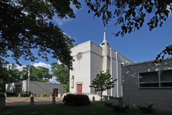
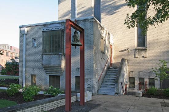
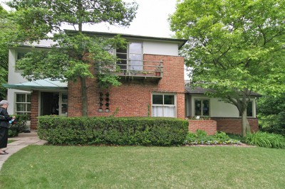
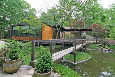
Frank Lloyd Wright Pappas House, St. Louis MO. Photo by Toby Weiss

Frank Lloyd Wright is an architectural giant. We all know as much about him as we want to, and even a disinterested person knows who he is and why he matters. But I think he matters for the wrong reason. I will conclude this piece with 5 points to make the case.

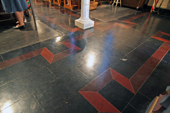
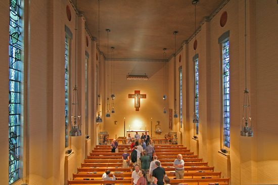
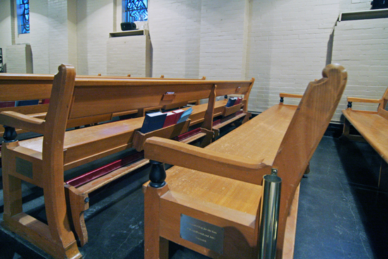
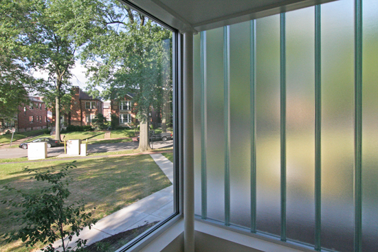
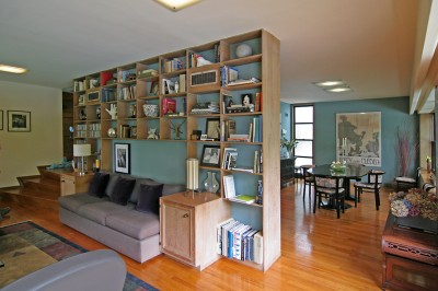
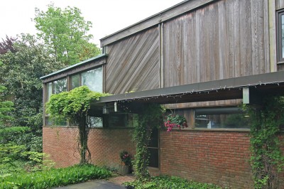
The following views were conjured by the Frank Lloyd Wright house currently for sale in St. Louis, MO. As I took these photos of the place, I felt kind of bad that the family is enmeshed in #4 of the 5 Points of Wright.

Evidence of a Crappy Architect

A Google search gives you more evidence of Wright being a crappy architect than you may have time to read. So let’s do just a few bullet points to verify this claim:

• Wright’s most acclaimed work is Falling Water, which the owner referred to as Rising Mildew. This piece neatly lays out some of the problems with the architect and the construction, which led to an $8 million restoration.

• From Architecture magazine, November 1989: “Leaks are a given in any Wright house. Indeed, the architect has been notorious not only for his leaks but his flippant dismissals of clients’ complaint. He reportedly asserted that, ‘If the roof doesn’t leak, the architect hasn’t been creative enough.’”

This is a good laundry list of 7 things Wright got wrong about design. Which concludes the same way as most articles about his architectural ineptitude do: “genius justified his design mistakes.”
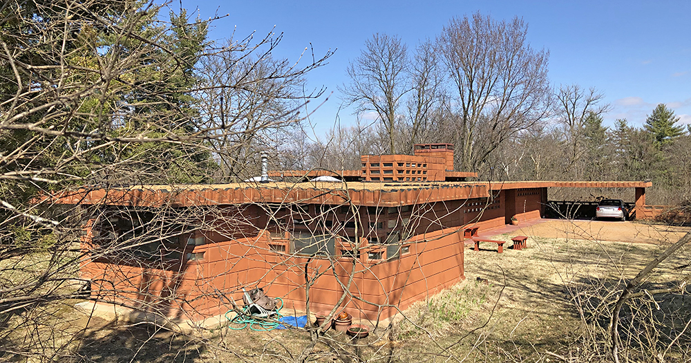
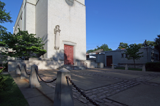
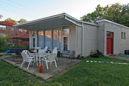
Pappas House in St. Louis MO by Frank Lloyd Wright

Evidence of a Pioneering Artiste

When reading about the engineering defects and customer complaints of Wright-designed residences, I can’t shake the image of a pretentious artiste abusing the largess of monied patrons who are willing to tolerate such behavior in hopes that their lives will reflect the golden light of artistic genius. This is a commonly accepted personality trait of Great Artists.

Architecture is most certainly an art, but one with inherent limitations because it’s about making structures that people use and depend on. The artistic aspirations of a building must successfully meld with the client’s intended function and the builders’ ability to construct it firmly and accurately (also known as the Vitruvian triad of beauty, commodity and firmness).

Creating a building is much like shooting a film with the architect as director. This cooperative concept was better described by the professor (and inspiring analytical thinker) Witold Rybczynski in his book Looking Around:

“…a building exists not solely as a vehicle for the skills or expression of the architect but as an object with a function… This prevents the architect from developing what is usually the hallmark of an artist: a consistent personal style. Or, at least it should.”

A large percentage of Wright’s visionary reputation centers on complete control of every design detail. The concerns and needs of his clients and builders were ignored and treated like the football a boy threatens to take back if his pals won’t let him be full-time quarterback.

His art was the most important concern and his contempt for the residents who would live in the piece was palpable. His patrons were hypnotized into overlooking the practical failings of their home for the sake of great art.

Wright achieved artistic perfection despite the pesky requirements of owners; he proved that architecture could exist as an uncompromised high art, divorced from the practicality that had previously accompanied it for centuries. This is a revolutionary, pioneering concept.

The architectural community tends to side with the artistic brilliance of Wright. His vision altered the celebrity and prestige of the profession. To subsequent generations of architects, his technical failings hardly matter because: artistic brilliance. Yet, every architect in his wake will never get away lawsuit-free with the structural crap that Wright pulled off because they don’t lean into the obvious: Frank Lloyd Wright was not an architect. He was a great artist.
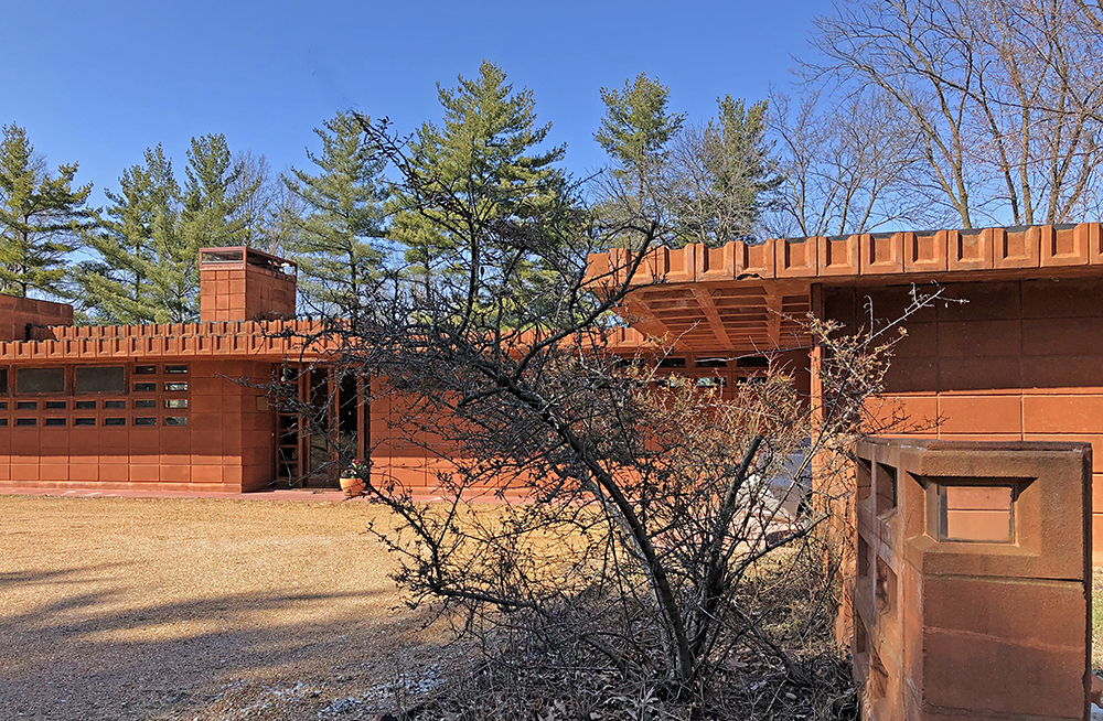
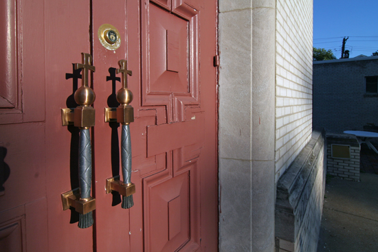
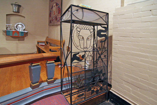
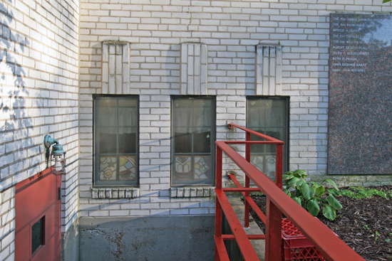
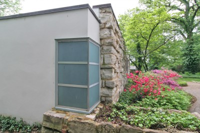
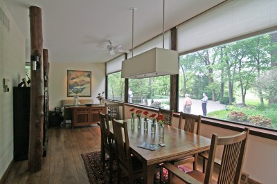
Detail of Frank Lloyd Wright Pappas House

5 Points of Wright: Crappy Architect, Brilliant Artist

With all humility (i.e., I don’t have an architectural or art degree!), I’m requesting a reclassification of Frank Lloyd Wright from Great Architect to The Greatest Artist of the 20th Century. My case is based on these 5 points:

1. He forever changed the rules and boundaries of a classical art form.

He didn’t let the limitations of the ancient craft of architecture reign in his creativity. The architecture was merely a springboard to hurl him over the boundaries and onto a new plain. If great art inspires others to explore further and forge new paths of expression, he qualifies just from the hordes of architects who have followed in his steps.

2. He created revolutionary art with new materials.

Rather than pencil, paint, stone or clay, he used life-sized three-dimensional building materials. Paper or canvas was not the proper place for realizing his ideals; only mixed media could bring his vision to light. The frames for his work measure thousands of square feet mounted directly to the earth, and no one since has been able to use his medium with such assurance and unrestricted creativity.

3. He designed and built his own art galleries.

Not only did he get funding to create amazing pieces that were arranged in powerful installations, but he also designed the perfect buildings to show them in. Many patrons pushed the bounds of propriety by living in his galleries, but they usually came to their senses and vacated before mussing the essence of his work.

4. His galleries become museums.

After removing their personal belongings, patrons usually transfer these galleries to foundations who turn them into museums dedicated to preserving his art for the delight and education of present and future generations. That we are able to view his works in their entirety, and that they continue to profoundly move us, proves the museum designations a sound decision. Also, 9 times out of 10, it’s impossible to treat these homes as a regular house sale. No realtor wants to deal with the consequences of social media outrage by letting a Wright be sold as a teardown.

5. The opportunity to own any of his works is increasingly rare and expensive.

Wright was insistent that every piece of his work remained as it was designed. To get rid of a table or a light fixture was akin to chopping a toe off Michelangelo’s David. People have accepted this as a wise artistic decision and break their bank accounts to leave everything intact. But when the foolish do let go of individual pieces, they are snapped up by wealthy people who covet them as exceptional works of art. That the pieces retain their beauty and power when removed from the original context is testament to his clarity of vision and mastery of design. A person who owns a Wright piece then displays them as one would any important fine art object. Company would never be allowed to sit in one of his chairs or walk across one of his rugs. That would be as preposterous as using the Mona Lisa as a bulletin board.

These are towering artistic achievements that make Andy Warhol’s pop culture statements look like birthday candles on a cupcake. Analyzing Frank Lloyd Wright from a fine art point of view places him firmly in the pantheon of centuries of great artists, and with no serious competition for title of The Greatest Artist of the 20th Century.

St. Louis Addendum

Frank Lloyd Wright did two homes in St. Louis, Missouri. One of them is already a museum. As of 2018, the other is technically for sale. But the details of point #4 above are in play; the effort is toward turning it into a museum.

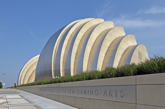
Witold & Me: Kauffman Center for the Performing Arts

Kauffman Center for the Performing Arts
Kansas City, MO

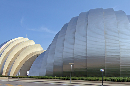
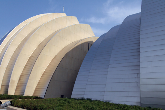
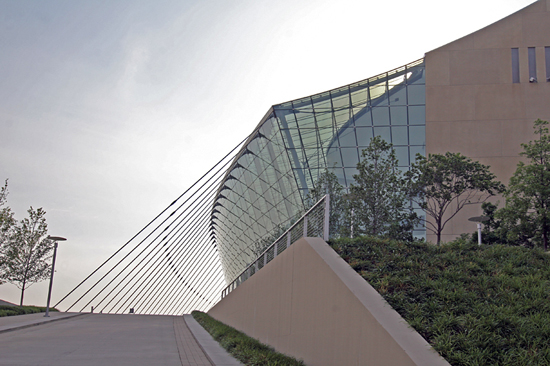
Over Memorial Day weekend 2012, I was part of a Kansas City, Missouri architecture adventure. The most towering experience was interacting with the Kauffman Center for the Performing Arts, which is the work of legendary architect Moshe Safdie.

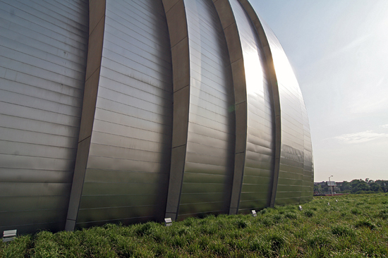
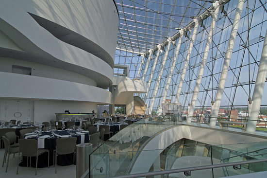
It’s obviously a “wow” building. I was struck by how the shape of the building conjured the images of how sound waves ripple out. And all of the materials feel as good to the touch as they look to the eye. Then we got to go inside, which was a whole other experience. There was a hostess who gave us the informational spiel, which had fascinating details about construction and methodology.

As she was sharing this information, I drifted away to something more personal: how author Witold Rybczynski writing about a building of Moshe Safdie’s changed my life.  If you are a regular or semi-regular reader of B.E.L.T., you are a recipient of how that sea change manifested itself. Everything I’ve done in the realm of architectural documentation is a direct and continual result of how inspiring Witold is. To stand in the building of a man who inspired (and hired) Witold was the convergence of so many layers of meaning as to be overwhelming. The meaning rippled out in waves much like the shape of the Kauffman Center.

In the very late 1990s, the first Witold Rybczynski I read was his book The Most Beautiful House in the World, a detailed chronicle of designing and building his very own home. Seeing Jackie O. read this book was a revelation! That led to his book Looking Around: A Journey Through Architecture, which was a compilation of previously published architectural critiques.

Everything else I was reading at this time (Architectural Record and Architect magazines plus the treatise of architects like Frank Lloyd Wright, Le Corbusier, etc. along with text books assigned in various architecture classes) was built on dense theories and opinions aimed at a select group of learned practitioners. I felt talked-down to, and even when deciphering what they possibly meant, I often disagreed with their views that felt dislocated from the real world where these buildings stood.

Rybczynski was like bumping into the only English-speaking person on a backpack tour of Romania. He spoke plainly and clearly with the engaged passion of a person who loves everything about every type of building, long after the architects and scholars have moved on to the next big thing.

He was clearly “one of them,” but intent on communicating with the people who didn’t have architectural degrees or command of theoretical jibber jab. A dialogue with people who actually used these buildings was more important to him than burnishing relations with architectural academia and press.  Reading about the built environment in layman’s terms removed any insecurities about my reaction to and interpretation of the buildings I encountered. Witold was like a mind-expanding drug –  he was liberation.

The most profound chapter, for me, of Looking Around was “Habitat Revisited.” Habitat is a Montreal, Canada apartment building by Moshe Safdie from 1967. Here’s what it looks like.  About 25 years after its groundbreaking debut, Witold went back to see how it was holding up. He made the point that when an important building is first introduced, it is photographed in its fresh, pristine state, but that what matters most is how it ages, and how it serves the function it was built for.

Spend any time studying architecture and you run across this landmark building. At the point I was at in my architectural journey, Habitat was instantly categorized as concrete Brutalism, and I just didn’t care. But Witold was discussing not only the patina of time on its facade and landscape, but how the people who live there made it their own, and how living there elevates the residents’ daily lives.

Suddenly, a building I dismissed as freaky and cold sprang to life in a language I understood: how it affects the people who use it. By that criteria, this was a successful building. The human element changed how I perceived Habitat’s aesthetic, and I quickly realized that Safdie’s intentions were not merely academic drivel, but rather his achieved goal.

And suddenly, the tenets of modernism made sense. But it only matters if it works for the people who have to use it. Which is where I part with accepted architectural theory, practice and preservation. But I was no longer alone in this enlightenment, for I had Witold Rybczynski holding aloft his guiding lantern.

I won’t go on about all his wonderful work (except to say his book about staying in Palladio villas to figure out why they’ve worked for centuries – The Perfect House: A Journey with the Renaissance Master Andrea Palladio – is a swooning Must Read) because you can decide for yourself. Witold has a blog, he’s on Twitter, and you can learn about him and his books here. If you love architecture, and don’t know Witold, this could be a major discovery for you.

So this is the back-story on why standing in a building of an architect who was the inspiration of a mind-expanding chapter in a Rybczynski book over-stimulated by mind and nostalgia.

Another thing I learned from Witold was that you will never truly understand a building until you’ve seen it, experienced it. Reading about it and looking at pictures of it is only an introduction. Unfortunately, most of us don’t have the resources or connections to experience all the great buildings. But it’s OK to start with the buildings around you everyday, and expand from there.

In the case of the Kauffman Center, I only experienced part of it.  It exists to house its theaters, and I didn’t even see those, much less experience how they work for an audience member. But the sections I saw are breathtaking, the ladies’ room was striking and efficient, and the building and its campus are as inviting as they are awe-inspiring.

Certainly those who have sat in the auditoriums or attended an event in the atrium would be a better judge of its worth as a performing arts center. It has captured the attention of KCers, who have lovingly documented every stage of its being. And I’d love to hear the thoughts of the crews who maintain the building (does winter-time ice come crashing down off those curves?). But in lieu of all that, I still loved being in and around the Kauffman Center. There was no denying it was a magnificent piece of architecture.

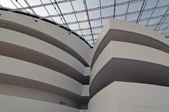
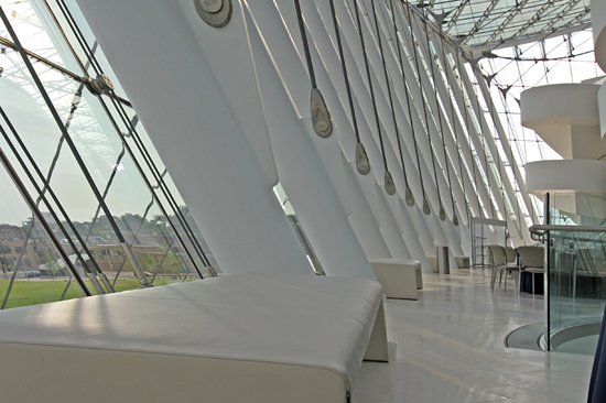
Here are extra photos from that visit.

The ripples of that day have lingered on, compelling me to pull out my Rybczynski books and re-visit what makes them so essential. I’m even reading his latest book, which is an engrossing story of client and architect creating an art museum. And another new shot of adrenalin was finding this video from April 2012 of Witold and Moshe reunited for a good chat about Safdie’s work. And here’s a Safdie quote from the video that perfectly sums up why Witold means so much to me:
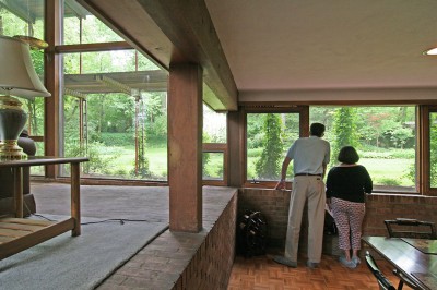
“I’ve always admired how Witold brings architecture down to earth. No pretentions, clear thinking, just the ability to focus on what architecture does to our lives. And to write about it in a way that relates to both architects and laymen.”


Introducing Modern StL

The Arch is the global icon of modernism, and it is the front door of St. Louis.  We have a glorious collection of mid-century modern buildings and neighborhoods, and we’re overdue in celebrating and protecting these assets.

This is why we have formed a new non-profit group – Modern StL. We strive for the identification, education, preservation and celebration of St. Louis Modernism. We have plans for many different types of events (how would you like a walking tour of Ridgewood with some words by its architect Ralph Fournier?) and seminars, and swag, and on-line forums and… the possibilities are endless.

The group met for the first time in June, and we’ve only recently incorporated with the state of Missouri. So we have a lot of work ahead of us to make everything official – including levels of membership and our first major event – but in the mean time, we invite you to explore our website in progress:

www.modern-stl.com

To stay in the loop, please follow us on Facebook and Twitter. And we look forward to connecting with all St. Louisans who love St. Louis’ fabulous mid-century modern treasures.

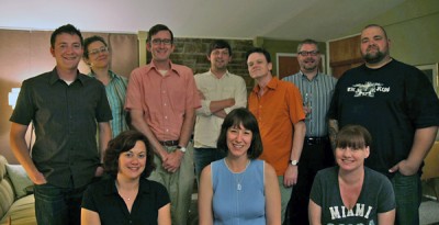
Modern StL Founders (l-r): top row - Nathan Wilbur, Lynn Josse, Michael Allen, Neil Chace, Darren Snow, Jeff King & Dan Semar. Bottom row - Amy Burger, Toby Weiss & Michelle Kodner

Touring & Talking St. Mark’s Church

St. Mark’s Church
4714 Clifton Avenue, St. Louis Hills, MO

On July 9, 2010, the St. Louis Beacon presented a tour of St. Mark’s Church which began with Eugene J. Mackey, III, FAIA sharing his thoughts on the 1939 church designed by Frederick Dunn and Charles Nagel, and ended with his presentation “St. Louis Modernism in the 1950s.”

Here is a good history of the church building, wherein they note it is one of the first “uncompromisingly modern churches built anywhere in the world before World War 2.” Another interesting point, for me, is that unlike most churches which are built on corner lots (especially in St. Louis Hills, known for its four corner churches surrounding Francis Park), St. Mark’s rests in the middle of a residential street. Eventually, the entire campus would encompass the northern half of the block, but the affect of a white brick tower rising up from a sea of brick bungalows never fails to surprise and delight.

Gene Mackey III, of Mackey Mitchell Architects, is the son of  the Eugene Mackey, of Murphy & Mackey, who were among the royalty of St. Louis mid-century modern architecture, giving us The Climatron, the Washington University Olin Library and a host of exceptional modern churches, including Resurrection in South St. Louis.  So, our current Mackey has modernism in his blood, and he grew up absorbing all the work, colleagues and friends of his father. Luckily, he has a great memory, an engaging way of imparting important historical information about our city’s modern architecture and the learned anecdotes to bring it all to life.

This is why I’ll let him talk about St. Mark’s, as recorded that night:

“(St. Mark’s co-architect) Frederick Dunn went to Yale, and was in school with Eero Saarinen. People don’t necessarily make that connection. Eero Saarinen was a powerhouse, even as a student, a very dynamic, powerful individual. Frederick Dunn was a counterpoint in school, more of a classicist in his approach to things. Also at the same time at Yale was (St. Mark’s co-architect) Charles Nagel, the man that – as an architect – became the director of the St. Louis Art Museum… and was also on the jury for the Jefferson National Expansion Memorial.”

“(Dunn) had an amazing whimsy.  … Anyone who’s an architect certainly knows about St. Mark’s, which was done in the late 30s. And think about that – in the late 30s! When you walk around it, think of the elements, the details, the attention, the imagination that he’s bringing to every element.”

“Bill Bowersox is with us today. As we passed from the sacristy to the rear addition of the church, I think we were all struck by the respect and dignity and proportion of that addition (his firm designed). I think that Fred Dunn would be very pleased. I compliment you for that.”

William Bowersox, architect of the St. Mark’s rear addition, is seen on the right, walking toward the rear entry.

“Looking at the way Dunn used masonry, I bet you – and I might be wrong – but I bet his original intention was to do this church in stone. Because you don’t see many buildings in white brick, and I don’ know if it can be documented, but it’s an interesting thought about the use of materials.”

Mackey’s presentation of Modernism in the 1950s was a series of photos of St. Louis structures to which he shared facts and observations. His introduction also summarized why these buildings still captivate:

“When you think about something being modern, it’s of the moment, it is what is contemporary. It has to do with looking forward and often tied in with technology. In this (1950s) era, to me in terms of design, its reflected in dynamic forms, a new way of thinking, not necessarily relying on tried and true, but exploring new things. Line – the power of line – the power of form, the dynamics of movement of the eye.”

A highlight reel of what he covered includes:

• A belief that the loss of Sportsman’s Park was one of the major contributors of the rapid decline of North St. Louis

• “The loss of the streetcar lines in the 60s also contributed to decline in the neighborhoods. Because of the streetcars, the small businessman on the corner could rely on a certain number of shoppers to get off the streetcar everyday to buy flowers or ice cream. There was a consistency there that was very critical. Of course, we had to get rid of them because they were in the way (of the cars).”

Levittown: “What they bought here was being totally tied to your automobile. Remember that in St. Louis in the 1950s, you could walk out your door, and walk down the street, or get on a streetcar and get everything you needed. Maybe even walk to work. That was impossible in Levittown.”

• Harris Armstrong’s former Magic Chef building:  “I consider that it’s in mothballs, and someday someone is going to buy this building and restore it to what it should be.”

• Revealed that there is a Paul Rudolph-designed home in Warson Woods!

Rear of the Rectory built in 1950-51 from a design by Frederick Dunn.

After the slideshow, Mackey took some questions from the audience, and it was fascinating because it was chiefly a conversation among architect peers. Someone asked what the biggest losses have been, building-wise (his answer: losing the buildings around the Wainwright Building detracts from its greatness because it’s isolated), but generally, Mackey sees it differently than those of us lamenting the mid-century modern losses.

Indicating the presentation he said, “We’re looking back 60 years, and fortunately, so many of these buildings still exist, telling so many different stories, playing so much different kinds of music. If you think of architecture as frozen music, think about the different melodies that are played by the buildings you just saw. It’s fantastic. It was a great era.”

And it was true that 95% of the structures he had presented ARE still standing, which is amazing! And we need to find ways to insure that these historically and aesthetically important buildings remain standing.

Gene Mackey, III, FAIA after his talk on St. Louis Modernism in the 1950s, inside the St. Mark’s Parish House.

The last bit before everyone broke for refreshments was the one that riveted me the most. Jamie Cannon asked for Mackey’s statement on new residential architecture, namely the bloated McMansions that spring up after tear downs. His thoughts should be a separate presentation all on its own:

“A certain amount of modesty is very appropriate. Look at this beautiful church; this is an iconic building, and it’s a modest building. It sits in a modest residential neighborhood. I think modesty is a good thing. Look at the Kraus house – it’s a modest house. Look at the Shank house – it’s a dynamic, powerful piece of sculpture on the side of the hill and that’s always going to be relevant.

“Every time somebody builds one of those monster houses, it has to do with people’s ambitions. People come into Ladue with (plans for) these monster houses, and we try to talk them out of it. And most of the people who build those monster houses don’t live in them for very long, for whatever reason. And then the community is stuck with them. They tore down Buster May’s house in Ladue and they’re building Versailles, and there’s nothing we can do about it. It wasn’t against the law.”

It’s hard and foolhardy to mess with personal property rights, which is why I think grassroots appreciation and education, combined with an appeal to trendy hearts (think Mad Men), is what will calm a good portion of the MCM tear down madness in Mid-County.  Or with our Recession (also known as The Great American Reset), maybe shaming folks into “a certain amount of modesty” would be a path to follow?

Touring Harris Armstrong Homes

On May 2, 2010, The Sheldon Art Galleries sponsored a benefit tour of four homes designed by St. Louis modernist architect Harris Armstrong. All four homes are within walking distance of each other in the St. Louis County suburb of Sappington, and their ages range from 1937 – 1951. 3 of the 4 homes were actually inhabited by Mr. Armstrong. The home shown above – #2 Sappintong Spur – is the only one of the 4 on the tour that was a commission for a client, the McClure family.

This home dates back to 1937 and is about 75% original fabric. There has been a large and lavish family room and deck added to the rear of the home, which looks great. The rest of the home – including the basement – looks even better.

Click for a Flickr photo tour of #2 Sappington Spur.

Harris Armstrong obviously fell in love with this private street because he designed this home for his family, right next door! From 1938, this is a split level home, and the exterior combines naturalism with the aesthetic of the burgeoning international modernist movement that was emerging on the West Coast at the time.

This home is spectacular, unfolding like a rose! The abundant fenestration, wood built-ins and main level flowing floor plans are clearly modern, while the feel is pure comfort, security and serenity.  This place is currently for sale, with an $800k asking price. It is fairly priced, that’s for sure. It’s gorgeous in every way, and fingers crossed till circulation cuts off that it finds a buyer who loves it just as it is. Especially the tribute to Isamu Noguchi on the ceiling of the master bedroom!

Another great feature while touring this home was finding architect and Armstrong scholar Andrew Raimist at work on his laptop in the den that was once Harris’ home office. He looked so perfectly at home and natural in this setting that I simply took in the scene for several moments before saying hello.

Click for a Flickr photo tour of #3 Sappington Spur.

Harris moved a short walk down the hill from #3 Sappington Spur to this 1951 residence. By now, he was the foremost mid-century modern architect in St. Louis with residential and public commissions galore, so he had earned the right to go architecturally hog wild on his new home. The exterior looks like the perfect halfway point between where his work had been and where it was heading, with the rear elevation resembling an elaborate fort made by neighborhood boys, a childhood fantasy writ large.

The interior is where things go fantastically bizarre in the best way possible. It’s a series of changing levels and cut outs that is overwhelmingly awesome to look at but begs the question: did any of his kids or guests ever injure themselves?  Turns out Harris’ kids were either full-grown and gone or in their late teens when they moved in, so we can assume no children were hurt in the making of this home. As a home one can live comfortably and productively in, #3 Sappington was the clear winner to my mind. But when it comes to jaw-dropping impressiveness, this one wins big!

Click for a Flickr photo tour of 200 South Sappington Road.

While working on the Magic Chef building, Harris’ home office at #3 Sappington Spur was cramping productivity, so it was time for a stand-alone architectural office, proper. In 1948, he moved into his Asian-inspired design, and talk about impressing clients!

Here is the original floor plan of the small office. The dining room shown above was once his drafting studio. When Armstrong retired in 1969, this office was sold and remodeled into a private home. Several wings were added, essentially quadrupling the size of the structure, and for this tour most all of those areas were closed to the public, but as seen from the outside, they blend and/or coordinate nicely with the original office cube.

Click for a Flickr photo tour of 934 Singlepath Lane.

RELATED
Rock Star Architects
Harris Armstrong Halloween
Harris Armstrong, South Side
Harris Armstrong For Sale

Julius Shulman Film Releasing on DVD

Guess what I just bought?
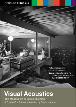
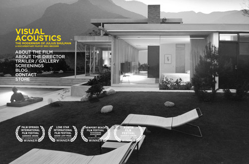
Yep, Visual Acoustics: The Modernism of Julius Shulman releases on DVD May 25th. It has extra footage and deleted scenes, just as Eric Bricker promised when it was first shown here in November of 2008.

You can pre-order the DVD from now until May 25th, and it’s $25 flat, shipping and handling included. You’ll receive it 2-3 days after the 25th. Here’s where I went to order it, just now!

Yeah, I’m geeking out. But I’ve waited a long time to own this and freeze-frame till the remote fries out.

RELATED
B.E.L.T. Julius Shulman Compendium

Paradowski Creative’s New Space

1928 Locust Street
St. Louis City, MO

On a rainy Saturday in April, Landmarks Association and Alex Paradowski gave a tour of the new space for his company, Paradowski Creative. Alex worked with Alan Nehring and HBD Contracting to breathe new life into this old building.

The oldest part of the building at 20th & Locust dates from 1892, and the entire complex was once Missouri Light & Power, the city’s first electric utility, and the precursor to what is now Ameren UE.  Read more about the building and its creation on their wesbite.

The creative agency has transformed the inside of a stately brick warehouse into a modern wonderland of colors, textures and shapes.  They have also repurposed many pieces of the building that were removed – or unearthed – during the design and construction process. It is these tangible pieces of the past that grounds the concept from floating away in a cloud of whimsy.

Shown above is Alex in one of 3 conference rooms that, with the flip of walls, transforms into one large meeting space.

The painting on the white glazed brick wall is of their previous home on Broadway in central downtown St. Louis.  I appreciate a firm that appreciates their past, but also get a special kick because I once worked for the design/build firm who did the renovation of that building. I like their new building much, much better.

The ground floor space is divided into multiple functions that are designated by varying colors, lighting and ceiling heights. Each area speaks its function with a casual energy that’s required for creative thinking and and inspiration.

Bathrooms on the 1st and 2nd floors are absolutely fabulous. Look in the mirrors, above, to see the stalls, which are much like the bathrooms in the Chase Park Plaza Theater lobby, but with one vast improvement: rather than knock or pull on a door to know if it’s available, these have tags that indicate vacant or occupied. It’s the details that matter most, really.

The main work room of the ground floor is gloriously open, with space ingeniously suggested by iron posts framing each cube. They are still in punch list phase, and this is a creative agency so things will continually change, but note the hanging space divider on the left side of the above photo.

We were all extremely taken with these plastic sheets of random letters, like a life size Seek & Spell.

There are endless spaces for spontaneous gathering and play, which are crucial for creatives, and often overlooked in offices of this type. Above is a library cove tucked under the mezzanine, which is made even more inviting by the natural light pouring through the gigantic windows, original to the building.

Another space we all fell in love with is the employee lunch room, which looks and functions more like a hip bistro in the Central West End.

An overhead door pops open to meld indoors and out.  All the brick in the above photo is repurposed from in and around the building, and the juxtaposition of original fiber against new modern fixtures feels wonderful.

There is a 2nd floor mezzanine level with more offices, work areas, lounges and meeting spaces (oh, and a pool table!).

The view from the mezzanine is pretty spectacular, giving one a sense of the immensity of the ground floor and the industrial art of the ceiling soaring above.

There’s much more to the new Paradowski offices than can be covered here (like the employee parking under the building, or the exercise and locker rooms), and the stories Alex shared of the rehab and renovation of the space are fascinating.  Especially the story of how Missouri’s Historic Tax Credit program made such a venture possible.

Alex’s excitement and love for the building is contagious and inspiring, and with NSI just up the street (in another repurposed historic building), this part of the city that was once automobile alley is becoming a creative alley. The beauty and possibility of the City of St. Louis is endless, and thanks to Paradowski Creative for underscoring the fact (and thanks for the tour!).

Updating the Public Face

Gravois Avenue & Hamburg
South St. Louis, MO

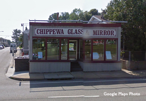
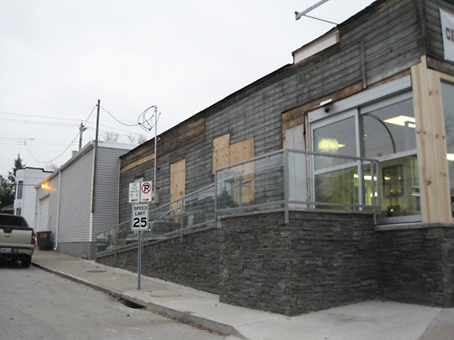
Just southwest of the River Des Peres is Chippewa Glass & Mirror. Not sure how long they’ve been around (though at least since the early 1980s when I used to file their invoices while temping at PPG, a glass wholesaler), but wouldn’t it seem they once used to be located on Chippewa, hence the name?

In Fall 2009, they began the remodeling work shown above. They added an ADA ramp and clad it in a handsome natural stone, which ran around to the front of the building and stopped abruptly, in mid-stream.

Actually, all work stopped for the longest time, leaving the building looking forlorn and undressed.  This building dates from 1908, an era of great modesty, so was probably embarrassed to be seen in its skivvies!

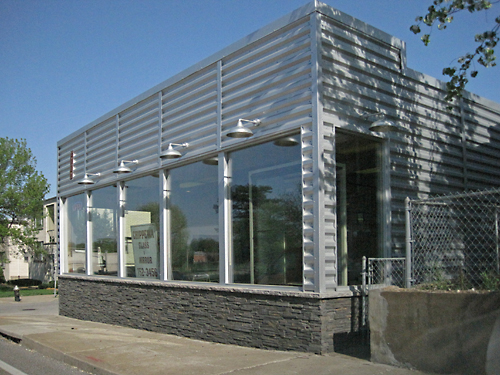
Come the change from winter to spring, they completed the remodel in rather quick fashion. All that remains to be done is a new sign. I love the clean, modern look of the place, all industrial and stone, which is a nice combo.  It is a radical new public face for a previously unassuming building, but rather than be a groaner of a remuddle, it’s well thought out, gutsy and spunky.

I also adore that they have reused and updated a long-standing building, giving it a whole new look for a new century rather than take the easy way out by either moving or demolishing to build new. This is a fine example of acting on “the greenest building is one already standing. A hearty round of B.E.L.T. applause to these business owners for improving their portion of the city streetscape!

See the Julius Shulman film January 30th

visualacoustics

Post-Script, After The Event
Thank you to everyone who left their warm homes to spend time in Julius Shulman’s world.  It was a an intelligent and enthusiastic crowd, and it was a true pleasure to personally meet so many of you.  And Marlene Bricker is a joy!  Here’s a few photos from the night.

Most interesting bit of news from the night is that Shulman’s home is for sale!  Within this link are some informative comments about the home, the realtor and its future prospects in a tear-down market.  Even better, this link has extensive photos of the home cleaned up for selling.  Looking at the shots of his studio made me tear up a bit – can you imagine living there?

Let’s hope the family makes sure the buyer is properly respectful. This is definitely a home worth preserving.

The Event

Visual Acoustics: The Modernism of Julius Shulman, a documentary by native St. Louisan Eric Bricker, makes a return engagement to the Moore Auditorium on the Webster University campus, January 29-31st, 2010.  Here’s details about the film series and admission.

I’m asking you to come see this glorious documentary on Saturday, January 30th at 7:30 pm because I will be part of a Q & A panel after the film, and would love the support of sympathetic B.E.L.T. readers!

Yes, Marlene Bricker – mother of the director – asked me to be on the panel, which is so cool and sweet of her.  But knowing that my adoration of Shulman could render me a blubbering gush of “wow,” I suggested that the best architectural photographer in St. Louis should also be on the panel, and luckily, Ken Konchel said yes!

So please do come out to see us this Saturday.  Admission is $6, the film is 83 minutes long, and the 3 of us will take questions directly after.

Here’s my farewell tribute to Shulman, who passed away only last year.

And here’s my 2008 review of the film we’re lucky enough to see again!

What Vintage Is This Lindell Bank?

lindell-bank-01

Hampton Avenue & Chippewa
South St. Louis, MO

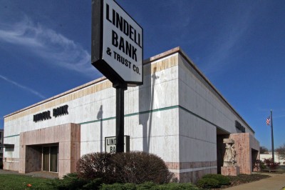
If you had to guess what year this building is from, what would you say?

You could look up the history of Lindell Bank, or know a little about the South St. Louis neighborhood it’s part of to make a guess.

lindell-bank-02

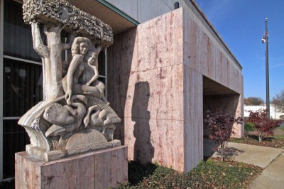
Folks are very familiar with this building because it’s on such a prominent, busy intersection.  I’ve heard people refer to it as “the statue bank,” or “the art bank,” because of the two sculptures flanking the Hampton Avenue entrance.   You could peek at the base of these pieces by Richard H. Ellis to get an important clue as to how old this building is, since the building doesn’t have a corner stone telling you its age.

lindell-bank-03

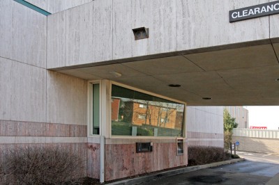
I’ve polled a whole lot of people about how old they think this building is, and everyone – including myself – places the design and construction somewhere in the early 1960s.  The details are what make this a solid guess.  5 different kinds of travertine creating visual language over a simple rectangle punctuated by mirror-images of entry cubes.  Above, note how the 2 bands of pink travertine – which is also used on the entry cubes – follow the bump-out of the drive up window, a subtle little detail not at all unusual on mid-century modern buildings of this vintage.  The scale, massing and materials of this building clearly make it a product of an architectural era long gone.

Except that this building went up in 1986.
Yes, 1986.

lindell-bank-aerial-map1

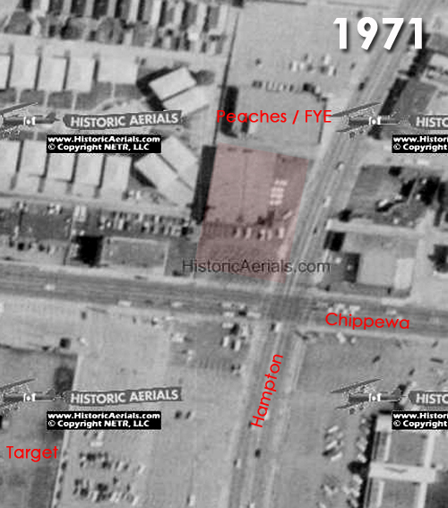
Here’s proof from a 1971 aerial map, which shows what some people remember to be an auto parts store that sat back on the property.  A 1958 aerial shot shows an even smaller building sitting diagonal even further back on the same property.  I’ve yet to run into anyone that knows what that older building was.

lindell-bank-04

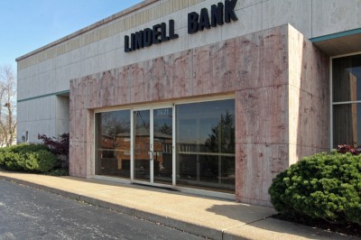
That means that the neighborhood had to wait until 1986 to get a building that moved up to the sidewalks and owned that corner in a formal way. Previously, that important corner was a parking lot.  Along with Lindell Bank, who are the people responsible for such a thoughtful and handsome building so late in the post-modern architectural malaise?

lindell-bank-05

If you have any information about the buildings previously on this site, and the design and construction of this Lindell Bank location, please do share with the rest of us, OK?