MCM Remuddle: Alton East Elementary School

Alton East Elementary School
1035 Washington Avenue, Alton IL

There’s much to admire about this 1955 school building in Alton. I love how the series of saw tooth entry doors are echoed in the picture window to the left.  And the tri-colored tile work of the columns creates a pattern that feels both jaunty and whimsical.  I even love how they have retained the early 1970s-era trash containers, which creates a tableau of the school evolving over the decades.

It requires a certain administrative appreciation of the vintage architectural merits of a building to keep it  so perfectly intact and in tip-top maintenance.  I was happy to learn of the modern mechanical updates East Elementary was to receive as part of the Alton School District’s campaign to upgrade their schools, because it meant they would continue to use this fine building, rather than build something new and abandon this.

But I hadn’t completely thought through just exactly what would happen with modern mechanical updates. And it appears that whomever was in charge of replacement windows hadn’t really thought through the comprehensive design of the building. Turns out, those in charge simply went with the lowest bid for all renovations, and when it comes to fenestration, they’re getting what they paid for.

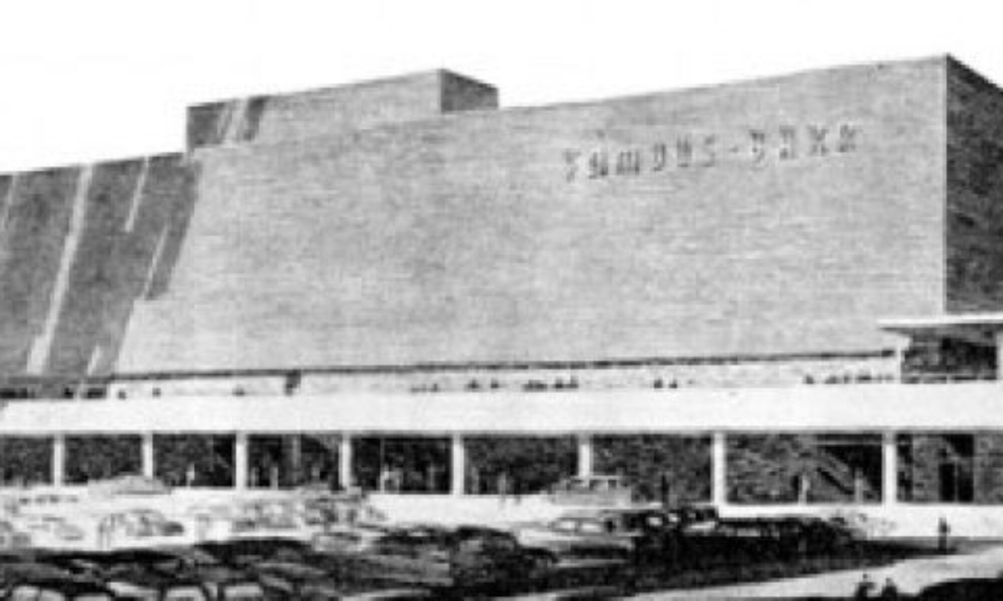
As the school building unwinds to the east of the grand front entrance, it introduces a rectangular grid of aluminum-frame windows abutting a block of brown marble tile, which is all the better to showcase the prerequisite mid-1950s stainless steel Helvetica letters. And the architects purposely chose a different window for this portion of the building than from the showcase sawteeth at the other end. Steel, brick and marble – it was all about creating motion and drama.

But not anymore. Today, they have committed to the same style of vinyl replacement window across the entire front facade.  I can kind of hear the new “designer” rationalizing….”The brown vinyl will blend nicely with the brick, and coordinate with the marble, making it look more contemporary, don’t you think?”

Before versus…

…after. Well, technically, this is during.

Here’s the secondary front entrance of East Elementary (and note there’s another of those retro trash containers!). Visualize what those silver doors will look like surrounded by large, chunky swatches of brown vinyl. Or maybe they will be kind and simply replace the doors, as well. I’d rather they have consistency than jarring inconsistency.

We head down a driveway to the back of the school, which magically grows into two stories of glass block and brick. My father, Richard Weiss, was a union glazier, and he installed the glass on this building in 1955. He told me that from the day after the school opened, those glass block walls might as well have been screens for all the hot and cold breezes they let pass through.  He said mid-century buildings like this were beautiful, but certainly never energy efficient. They didn’t have to be, because energy was cheap back then, plus central air was right around the corner.

After decades of students and teachers being uncomfortable for large chunks of the school year, they then hit the 21st century energy inflation crises, which is adding pauperism to misery. So there is no begrudging them wanting to be comfortable and use energy more efficiently. But why do the replacement windows have to be so god awful ugly? They don’t even work on this elevation!

It’s important to point out that a replacement window is only as good as its installation. The best quality window will fail if installed wrong, while a low-quality window can perform like a champ if installed correctly. It’s obvious that these windows are low-quality. Here’s hoping with all my heart that they’ve spent a little more money on properly installing them so they actually do get the energy efficiency they rightly deserve.

Before: beautiful to the eye of the beholder standing outside (and I bet it looked beautiful inside when the sun beamed through all that glass block), but not always a pleasure to the folks stuck inside on a bitterly cold and windy day in January.

Afterwards: the inhabitants will be comfortable and safe for roughly $1,000,000. Which is a fraction of what they’d have spent to build a brand new school. So I truly applaud their efforts at improving the school for everyone who uses it, and for continuing to use a perfectly good building.

I am fully aware that my whining about the murdered aesthetics misses the point of the greater good. But I do feel it’s important to document and acknowledge how handsome this building once was, and say a fond farewell.  And I want to take this chance to point out that something as seemingly trivial as choice of replacement windows can radically diminish the appearance of any type of building, so please choose carefully if you’re ever in this position.

Update on the Alton Mid-Century Bank

Here is the story of the gorgeous Alton Savings & Loan with photos of it in it’s (relatively) untouched state.

And here is the story that caused a pang of anxiety in the summer of 2011.

And above is what’s going on as of this winter of 2011-2012.

It is actually very good news that a Swiss company that manufactures and markets leading-edge ophthalmic diagnostic and surgical products is turning this building into its American headquarters. It is also good news that the Alton City Council thought it such a good idea to re-utilize this building that it gave the company a $300,000 TIF. But it was this part of the St. Louis Post-Dispatch story that caused many of us to blanche:

“We looked at others (buildings),” Braida said. “We looked all around the area. It’s beautiful. It needed someone to have a vision to update it and make it more appealing.”

Architect Dan Hurford of Hurford Architects Inc. in Glen Carbon described the building as “quite contemporary even 50 years later.” He said it is in excellent condition structurally and mechanically. Renovation plans call for adding windows to a side of the building that does not have any. Morrissey Construction Co. will be the general contractor. Braida said the work is expected to be completed later this year.

Technically, this side of the building does have windows – drive-up teller windows, to be precise. But they have punched new holes in the wall, and have neatly stacked up the undamaged black glazed brick (yes, I did take one. Sorry. Not sorry.). Do they plan to remove the teller windows and re-use the original brick? Or are they also having matching brick made?  Let’s cross our fingers until circulation cuts off that they will be sensitive to the original wall when filling in the lines around the renovations.

The new owners stated they love the building, so I’m hopeful they won’t cause too much damage to the original fabric. I peaked in all the windows and saw that original light and door fixtures in the front and back stairwells remain. And the construction crew has been extra careful about taping off doorways so construction debris doesn’t infest other areas. If they planned on wiping away all the original fabric in those areas, they wouldn’t be taking such care right now. So it appears they are carefully planning this in stages.

And here they are adding a huge picture window and/or door to the back side. Yes, it’s galling to see this being done. But I’m leaning on two positive angle:

#1. This particular part of the building is so massive and so dramatic, that adding one tiny rectangle color block to the bottom left is kind of like making an abstract painting. They picked an appealing spot to do this in, rather than carve it up willy nilly.

#2. Someone who really likes this building is spending over $1 million to keep it in use. So a little remuddling cannot dampen the true victory here.

Bad Mansard in Washington, MO

Tooling through a perfectly pleasant mid-century ranch neighborhood in Washington, MO, when a cul-de-sac popped up, anchored by this bad mansard.

Now, these homeowners have made this house as pleasant as possible, every detail is crisp, clean and well-thought out. But there’s no overlooking that everything is upstaged by that roof.

Seems some neighbors a few doors down with the exact same model were feeling overwhelmed by that roof, and found a solution:

Covered In Vinyl worked for Susan Cowsill, but for this house?  Yeah, not so much.

Barely There: St. Louis Hills Office Center Update

6500 Chippewa
South St. Louis, MO

In July 2010, I was hopeful and optimistic about the construction that had started on the St. Louis Hills Office Center. Read the report here.  Shy of a year later, it’s not a rebirth but a high-profile remuddle.

The new bits on the back of the building are blandly modern, all EFIS and glass grid, nothing to be excited about in either direction. But when the iconic green letters  and green metal panels (seen above) disappeared from the building, it was time to find out if they were coming back (maybe they took them down for a cleaning?) and what is intended to occupy the building when it’s done?

I contacted the owner of the building, Dan Stevens, who had given us a tour of the building in 2007. He made it clear that he is no longer involved in the development of the building, and because they have destroyed all the vintage architecture of the building, does not approve of what has been done to it.

The St. Louis Hills Office Center has been owned by the Stevens family since 1974, and was put under Dan’s primary care.  But in the last couple of years, more of the family has become legally and actively involved in the redevelopment, which creates group decisions with majority group votes. Dan does have experience with renovating old buildings (see the Ozark Theater in Webster Groves), but with this building, he says all of his input was outvoted.  He divorced himself from the project and is deeply distressed that it has become “a huge, architecturally meaningless white elephant.”

Dan does not know what the intended use is for the completed building that’s gone way over budget. 16th Ward alderwoman Donna Barringer said the plan is to rent each floor to a company when the building is completed.

With the back wing of the building long gone, there is now a generous surface parking lot to take care of future tenants. Keep this in mind as we walk down Chippewa to see the rest of the buildings they also own on this block.

For several years now, this handsome deco brick building has been the only occupied property on the block. Even as they’ve been renovating the buildings around it, the comic store was still holding down the fort in the best looking building of the bunch.

And now it is gone, sacrificed for a surface parking lot. This is a complete tragedy and a complete waste when you view all the parking that will be available behind the office building. I realize it’s impossible to have on-street parking in front of this retail strip, which is why all these buildings have long had parking in the back, which seemed to work out for several decades.  Will they be granted a curb-cut off Chippewa for this new lot? Or will patrons still have to access the alley to use it? Either answer still makes the loss of this building a deep shame.

The interior of the Office Center has been completely gutted for the new development, and the fabulous front stairwell has been exposed to the elements for several weeks now, which is disturbing. Does that mean it’s going too? Dan Stevens is taking this all so hard that I couldn’t bear to ask him.

He did say that he rescued the medical medallion that used to hang above the side door when he learned it was slated to be scrapped for its aluminum value.  Learning that, chances are real good that the vintage green lettering is now landfill (and thank you to a friend for checking the dumpsters the day he discovered them missing from the building). And I’ve got a sinking feeling in my gut about the stairwell.

It is desirable to re-use a building, rather than demolish it, always. But having spent several years watching this building whittle away to a shadow of its former glory, I have to ask: Would it have been emotionally easier and developmentally cheaper to just demolish it? At least that would have been like yanking the bandage off real fast to get it over with. Instead, it has become an excruciatingly slow peel-off that takes the scab with it.

I feel bad for the building because from day one, it’s had nothing but trouble over being what it wanted to be. From neighbors in the 1950s forcing it to be redesigned, to owners in the 2010s erasing the last of its grace, the St. Louis Hills Office Center was a mid-century modern swan long gliding across the wrong lake.

See the building before demolition and remuddle

See photos from the start of demolition in 2007

See the 2007 tour of the building

A Kirkwood Rainbow

kirkwood-bungalow-01

E. Clinton & S. Fillmore
Kirkwood, MO

Some remodeling work is being done to typical post-WW2 bungalow in Kirkwood.  While vinyl siding can – technically – be painted, it’s usually a short-lived solution.  So, I have the feeling the place is being spruced up to go up for sale.

I love that the paint crew left behind this rainbow display, and much like a real rainbow, it was a beautiful but fleeting thing. After a couple of peacock days, the siding is now 100% conservatively beige.

kirkwood-bungalow-02

There’s a Crayola box of vinyl siding colors available, but the vast majority go with white, off whites, grays and beiges. Considering that a certain type of new homes (that were) being built are nothing but a tall, plain box encased in vinyl (even the chimney – man that’s unattractive), why not add some much needed interest with multiple colors of vinyl? Imagine it: a white ground with different accent colors, decorative borders and flourishes?

One can drive through other parts of Kirkwood and see wood sided homes with this type of multi-coloring.  And this little guy shows how fun it can be in moderation.  Plus, the color of the vinyl does not change the price. So, a re-think on how to display vinyl siding would be a welcome sight.

Crestwood Remuddle: Creston Center

Creston Center, Watson & Grant Intersection
Crestwood, MO
The Creston Center, Before. It was a simple and spare 2-level shopping plaza built in 1961. Note the snappy vertical sign to the left, in the auto-centric spirit of this stretch of Route 66. To its right is another 3-sided sign that spun around so 3 major tenants could have equal billing. And a tiny out-building sat close to the corner, making the most of every square foot of land.

The Creston Center, After. The ginchy Creston sign topples, as does the out building, and the remodel is a hot mess.

Now, I’m not saying the original was an important piece of design worth preserving intact. It was very appropriate and utilitarian retail design for the time, and the cantilevered balcony that created covered parking for the lower level is a nice mid-century modern touch. Its simplicity kept it under the radar in the 21st century, but in a bid to jazz up the place and get a full tenant load, the owners paid for a remodel that is just… a steaming hot mess.

In December 2002, when the above photo was taken, the place was about 65% rented. Today, the place is now about 50% rented, so remodeling to make it more attractive to tenants didn’t really play out as intended.

And “more attractive” is obviously in the eye of the beholder. Minimal lines and a flat roof are anathema to current day retailers; they want more “there” there to catch the eye of modern shoppers.

So they put bulky caps on the slender metal poles and went to town on the roof. They gave that roof a height and heft and flash which creates the feeling that the cantilevered balcony is just going to collpase under all that rigamorale.

Why the mixture of shingle mansard and pup-tent standing seam metal? I would have loved to hear the “designers” rationale for this absurd combination, especially because the addition of standing-seam boosted the budget for no good reason. Did they claim that this over-scaled mish-mash would create a dynamic energy so crucial for luring shoppers? Or that the mansards would indicate the prime locations in the building? Or was the rationale as mundane as the metal would ease the cost of re-shingling in the future?

Whatever the case may have been, the Creston Center was an overlooked and unassuming retail center that became a 3-ring circus of hubris and bad taste. I cringe every time I pass it and feel bad that their remuddle became a huge waste of money and intentions.

Overland MCM Buried in EIFS

Woodson Road & Ridge Avenue
Overland, MO
Next door to the venerable Woofie’s hot dog stand was a pale reminder of former MCM fabulousness. But after a recent remodel, it now looks like an elongated KFC.

I covered this building as part of a previous post on Overland mid-century modern (scroll down to the 60% mark), wherein I wished it could get a good scrubbing and some repair TLC. Instead, I feared it would eventually just get torn down.

I drove by about a month ago and saw the beginnings of some construction work, and hoped for the best but expected the worst. And sure enough, its Low Rent Palm Springs aspirations have been covered over with tan and bland EIFS.

Aside from the application errors of EIFS, I’m going to make a safe guess that they did not correct any of the water and decay damage before covering it up. Just like they cover up old dirty brick in need of tuckpointing with vinyl siding on the rationale that “what you don’t see can’t hurt you,” it only masks the damage that continues under the new facade.

U.S. Band & Orchestra spent some good money on this renovation, so I hope it was done properly, for investment sake. But they covered up a lot of windows and that new entrance bit is just plain awful, and a big company sign would help with that dull expanse of boredom. One compliment: the warehouse portion still retains most of its original material and actually looks better defined with two tones.

Look, I understand that these improvements are a favorable thing for the company and the immediate area. I also understand that slapping on EIFS and some replacement windows is more cost effective then rehabbing a light manufacturing building that only I thought was cool. Status quo rules for a reason, and the new facade is considered “pleasing” by retail big box standards. But I miss its raggedy ass, and with each drive by, I will ponder all that tiny blue and gray tile forever preserved under synthetic stucco, and smile.

The Tackiest ATM Ever

Hwy 157 near Center Grove Road, Edwardsville, IL
This drive-thru carnival literally screamed at me from the highway, prompting a U-turn in the middle of the street to go back and verify that I truly saw what I thought I saw.

The stone bases and the ionic columns are already as preposterous to a drive-up ATM as marbleized stationary is to letter writing. But with its plastic and veneer references to ancient Greek architecture, certainly the bank is trying to denote class and strength and firmness. They carry on the classical column theme on their website.

Any visual clues to strength and firmness are completely obliterated from this angle. It looks like that roof is going to crack off and crush the roof of the next car through. It doesn’t take a structural engineer or architect to instinctively recognize that this pretentious and foolish ATM quickly conveys the exact opposite of what was intended by the financial institution it serves.

But let’s keep context in mind. This is a part of town that rapidly built-up around the edge of the SIUE campus. The university is the gravity of the area, thus street names copy the entire list of Old English and Ivy League university names. Citizens prize a new village, but a sense of antiquity is quickly needed to bolster the social class anxiety always under the surface in shiny penny new communities. That is why so many of the commercial buildings on this immediate strip slap on all manner of pediments, columns and dentil molding to the flat fronts of their simple brick boxes. The ATM is obediently following through on a hastily devised plan of gravitas through ornamentation.

Paul Fussell well-described this phenomenon in his book Class: A Guide Through the American Status System. He might as well of been speaking of this ATM when he wrote, “facade labors to extort respect, and it is thus one of the most pathetic artifacts, bespeaking the universal human need to claim dignity and high consequence… The middle-class longing for dignity frequently expresses itself in columns or pilasters arguing the impressive weight of edifice… The principle that curves are classier than straight lines operates with columns as understood by the aspirant. Square columns are the lowest; round ones the next highest; round and fluted highest of all.”

As I circled this freak show with the camera, I couldn’t stop chuckling at the layers of absurdity. I wondered about all the people involved with the design and construction of this… did they continually chuckle at how preposterous this concept is? Is there even one customer of this ATM who knows enough about structural basics to feel bemused every time they withdraw from under its lopsided portico? For all these reasons and more, I remain morbidly respectful of The Tackiest ATM Ever!

Absurd Mansard in Sunset Hills

Intersection of Gravois & South Lindbergh
Sunset Hills, MO
In the late 1960s through to the 1970s, suburban apartment architecture went crazy with a bastard form of the mansard roof. I lived in just such an apartment complex, so was ultra sensitive to their unseemly popularity. At this website, the author even refers to it as “revenge of the Mansard.”

So the building shown above really really grinds my teeth. It is nothing but mansard!

As seen from the rear, this was once a normal building. Built in 1960, it was originally a full-service gas station. Today it is a pool supply company. Not sure when it was decided that pulling the roof down to the pavement was a cool idea, but someone bears the karmic scars of this aesthetic assault.

Or maybe they just had a sly sense of humor, and erected an asphalt shingle monument to…

Cousin Itt. Seriously, don’t the two share a striking resemblance?

Berry Road Blunder

Berry Road Park, Glendale MO
The 2-story brick home shown above was built in 1940. You can see that a later addition went horribly, horribly wrong. I hope it was a D.I.Y. job so that no professional remodeling firm is responsible for this.

As it stands alone, this is a headshaker, but total bewilderment comes when seen in context to its neighbor directly in front of it.

A 1935 Harris Armstrong home is the calling card for this residential court. The developers even took their cues from the above when building the entry marker, below. The other homes on this street range in age from 1940 to 1951, and come in a small handful of varying contemporary styles. So, again, there is a stylistic context at play in this development… with one house that doesn’t play well with the others.