Creston Center, Watson & Grant Intersection
Crestwood, MO
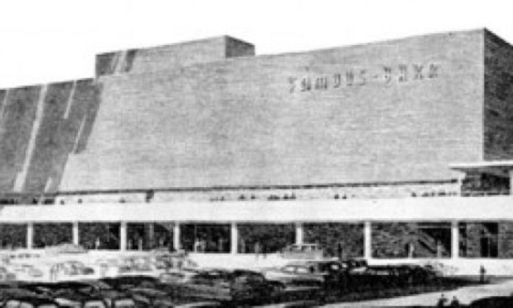
 The Creston Center, Before. It was a simple and spare 2-level shopping plaza built in 1961. Note the snappy vertical sign to the left, in the auto-centric spirit of this stretch of Route 66. To its right is another 3-sided sign that spun around so 3 major tenants could have equal billing. And a tiny out-building sat close to the corner, making the most of every square foot of land.
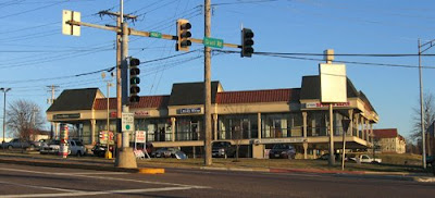 The Creston Center, After. The ginchy Creston sign topples, as does the out building, and the remodel is a hot mess.
Now, I’m not saying the original was an important piece of design worth preserving intact. It was very appropriate and utilitarian retail design for the time, and the cantilevered balcony that created covered parking for the lower level is a nice mid-century modern touch. Its simplicity kept it under the radar in the 21st century, but in a bid to jazz up the place and get a full tenant load, the owners paid for a remodel that is just… a steaming hot mess.
 In December 2002, when the above photo was taken, the place was about 65% rented. Today, the place is now about 50% rented, so remodeling to make it more attractive to tenants didn’t really play out as intended.
And “more attractive” is obviously in the eye of the beholder. Minimal lines and a flat roof are anathema to current day retailers; they want more “there” there to catch the eye of modern shoppers.
 So they put bulky caps on the slender metal poles and went to town on the roof. They gave that roof a height and heft and flash which creates the feeling that the cantilevered balcony is just going to collpase under all that rigamorale.
Why the mixture of shingle mansard and pup-tent standing seam metal? I would have loved to hear the “designers” rationale for this absurd combination, especially because the addition of standing-seam boosted the budget for no good reason. Did they claim that this over-scaled mish-mash would create a dynamic energy so crucial for luring shoppers? Or that the mansards would indicate the prime locations in the building? Or was the rationale as mundane as the metal would ease the cost of re-shingling in the future?
Whatever the case may have been, the Creston Center was an overlooked and unassuming retail center that became a 3-ring circus of hubris and bad taste. I cringe every time I pass it and feel bad that their remuddle became a huge waste of money and intentions.


 RELATED


