Childhood Memories of a Ladue MCM Teardown

01-zorensky-front

In Spring 2006, I documented the last days of a Ladue mid-century modern home that was tagged for teardown. It was built in 1950 for Louis and Mary Zorensky, and the undeniable beauty of this home, coupled with its sad fate, sparked a lot of posthumous anger and admiration.

See the departed Zorensky Residence here.

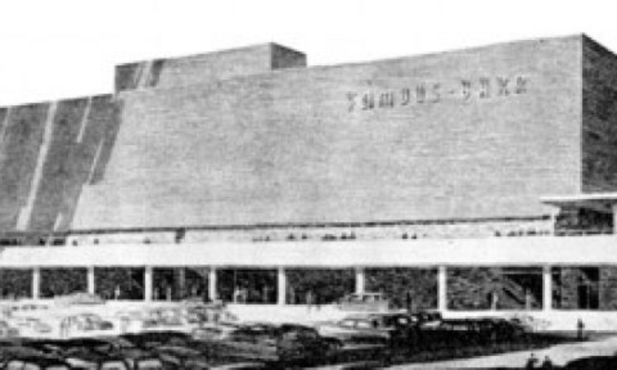
Learn more about what replaced it here (scroll down 30%).

A Google aerial shot of the Zorensky Residence.

A Google aerial shot of the Zorensky Residence.

Recently, one of the daughters of Louis Zorensky found the B.E.L.T. entry about her childhood home, wrote to say she was moved by the photos, and ask if it was possible to have copies of them.

I sent her a photo CD that included the published photos along with many unpublished extras. I consider it a duty to photographically preserve mid-century modern history, and an honor when some of those photos can preserve treasured family memories, as well.

The same space after the Zorensky Residence was torn down for redevelopment.

The same space after the Zorensky Residence was torn down for redevelopment.

Irene and her sister Doris were kind enough to share some of their memories of their life inside this dearly departed home, and I now share them with you. What touches me the most is that you can tear down a home, but love keeps it alive beyond the physical plain.

From Doris Zorensky Cheng

My brother, David, let me know about your website and its incredible pictures of our family home. When I pulled up the website, I was amazed at the photographs and how they captured the essence of its wonderful siting, daring 1950’s architecture, wall planes and roofing following the lay of the land and its modern detailing with lots of glass, overhangs and ins and outs.

Thank you so much for the wonderful comments on your website. My father would have hated to see the house demolished but he would have so appreciated those comments. He loved that house that he and Mom built and took such good care of. He also loved the old trees that had been part of a larger parcel of land that was an arboretum for a previous owner. He worked to preserve them. That some people so appreciated his house would have made him so happy.

I was 7 years old when we moved in. My schoolmates would tell me that they had seen our glass house on Warson Road and how different it was. One person actually told me that people living in glass houses should not throw stones.

04-zorensky-back

Another memory is of my brothers, sisters and me playing pretend in the tall pine tree grove at the front of our house. We also had fun rolling down the hill in the back, especially when there was snow. And then there was the fun modern furniture and the quirky details like the circular planter in the entry hall, the wood cabinet bar area and the radiant heated terrazzo floors that we sometimes sat on to get warm.

But as a child, I did not appreciate the house itself as I can now. Your wonderful photographs helped me see it with a fresh eye. I just wish another family that loved 50’s modern architecture could have bought and preserved it. I am grateful for having your pictures. Thank you so much.

05-zorensky-interior

From Irene Zorensky Fowle

Growing up in the Mayview home was an interesting experience. My parents always had a great appreciation for modernism, which was reflected not only in their home but in a remarkable contemporary art collection which they were able to showcase in that home. The large walls and high ceilings, the lovely angles of natural light, the neutral colors, and the overall openness of the home allowed the art to breathe and help define the space; there were no ornate moldings and lots of color to detract from the art.

Obviously, the very open floor plan was quite distinctive. My parents gravitated towards very neutral colors and natural materials .They had unpainted cabinets, natural wood doors, cork floors in the back hallway, beautiful earth-colored terrazzo floors (with delicious radiant heat–especially a treat after playing in the snow)–all avant garde then.  They had architecturally simple but very high quality matte chrome and nickel hardware – all of this in a time and geographic locale where shiny brass doorknobs and colonial design prevailed (and still does!!).

It looks like the subsequent owners painted one of the living room walls bright red, and obviously they painted the exterior gray-green covering up the natural brick, redwood trim, and rough limestone that my parents worked so hard to preserve.

My parents had window coverings and curtains that were frequently left wide open to allow the vistas of the trees and landscape to add color and definition to the home. The large, expansive windows also contributed to this openness – my Dad loved the outdoors, both working in his yard and enjoying the views from the house. The land had been an arboretum when my Dad bought it, so most of the large, incredible trees (many of them removed, sadly, for the new house)  were there when he bought the land and throughout the 40-plus years my parents lived there . As one of five kids, the three acres were great growing up as we had lots of space to run and sled on the magnificent hill and have hideouts under the great trees.

06-zorensky-exterior

It was interesting growing up in that house. I always felt different from my friends with their traditional cozier homes, but there was also an inherent pride in that differentness. My mother kept the house spotless and in magnificent condition, and you captured in your blog the found items that revealed my Dad’s habit of never throwing anything away. He kept so many of the original materials from the construction of the house. The archaeological finds you detail – bits of wallpaper, hardware, keys – was so characteristic of my dad.  Also, he participated in the architectural design of the home; as a real estate developer, he was also a frustrated architect and a part-time artist. He had a real vision in a time when it was rare to approach home design with such inherent purity and a sense of symbiosis with the land. Your touching photos really capture this! It sounds like the original bathrooms and the kitchen with its meticulous metal cabinets were there to the end, even with the 50’s colors of ceramic tile, etc. in tact.

Also, very striking was the lovely proportion of the house, not only in scale with the lot and the sweep of the land, but also relative to the lovely house across from it–I hope that home does not have the same demise!

I am so grateful that you captured the house. I thought about going in before it was torn down, but I was worried about  what the subsequent owners might have done to change the house that was my home, and also, afraid of how painful it might be. Your photo dialogue has really been a great gift to me and my siblings. I wish my mother were well enough to share it with her – she would be very honored and touched. You have made my late dad proud!!!

North St. Louis MCM: Norwood Square

norwood-square-a

Guess where the picture above was taken: Ballwin? Florissant? Mehlville?

When faced with low-slung, stylish 1960s ranch houses casually strewn amongst profuse greenery, these would be valid guesses. But instead, we are exploring Norwood Square in North St. Louis City.

norwood-square-c

Norwood Square is actually a court (as shown in the aerial photo above), a half block northeast of the intersection of Union Boulevard and St. Louis Avenue in the Arlington neighborhood. And it doesn’t take a bird’s eye view to get the feeling that a giant scoop of the city grid was whisked away by a mega melon baller.

norwood-square-b

On the ground, it is rather dramatic to see rows of deeply urban, 2-story brick residential buildings built between the 1890s – 1920s abruptly bisected by a swirl of deeply suburban, mid-century modern frosted sugar cookies. As you fleetingly catch glimpses of the original natives from inside Norwood Square, it feels like the ranch homes are circling the wagons ’round to protect their fabulousness from hostile forces.

norwood-square-d

This mirage of displaced MCM sweetness is cited as the last new housing built in this part of North St. Louis.  City record show that these 40-odd homes were built between 1961 – 1974, with the bulk of them going up between 1961 – 1966. They range from 982 – 1,888 square feet, with a median square footage of 1,450.

norwood-square-e

The circle that is Norwood Square is divided into East, West, North and South Norwood, which puts 4 of the houses (like the one above – which cleverly wraps its footprint around the curve) in the odd position of not knowing exactly which street they are on! Is their mailing address North Norwood or East Norwood, and how confusing is it to new mailmen on this beat?

norwood-square-g

So what’s the story with Norwood? Why was this exotic dollop dropped here, and what was torn down to make that so?

Having been told stories of Public Schools Stadium, I wondered if Norwood Square is what popped up in its place.  But the stadium was a block east of here, on Kingshighway, and when it was demolished in the late 1960s, most of Norwood Square was built and firmly inhabited.

norwood-square-f

Noticing that a few of the homes have some serious sink issues, I wondered if it was built atop the quarry that was supposedly shut down sometime in the 1940s because some kids accidentally died while playing there.  But no. The memories of some old school North St. Louisans’ remember the quarry at Kingshighway and Lexington, a good 2 blocks north east of here.

norwood-square-h

So, for now, the why it appeared and what disappeared to make it so remains a mystery.  Please do share any historical information you may have in exchange for the details I share with you here.  Like the snazzy tile work that graces this split-level, above.

norwood-square-i

Or the swanky pendant light fixture and concrete block screen of this entrance.

norwood-square-j

From quick visual inspections over the course of several years, most all of the homes are still in good condition, always the sign of well-liked buildings. Many of them (see above) are meticulously preserved and cared for, a heart-warming sign of intense pride in their ranch house alien. Only rarely have I seen for sale signs on the yards, so I wonder if there might still be a hefty amount of original owners in tow, or a lot of kids inheriting them from the folks.

norwood-square-k

This home is the equivalent of the half man/half woman Halloween costume!

To see more photos and details of Norwood Square, please visit the B.E.L.T. supplement at Flickr.

norwood-square-l

Facing out onto St. Louis Avenue, like sentries protecting their MCM turf,  is a short row of 2-family versions.

The chalk and cheese concept of Norwood Square is not wholly unique.  Something similar was done in South St. Louis with Marla Court.  Or there’s Darla Court in the inner-ring ‘burb of Jennings. So, it’s not uncommon, but it’s always a pleasant surprise, yes?

UPDATE

norwood-1958

Steve Patterson – who first told me about the subdivision several years ago – sent along this aerial map from 1958. Seems the street grid was long interrupted in this part of town, and look at all those mature trees! This would also bear out the info Rick Bonasch shared about the original site being a dump.

My Favorite Walgreens

watson-walgreens-013

My favorite Walgreens no longer exists, and this is a highly ironic story.

watson-walgreens-021

In South St. Louis City, we’re used to them tearing down bowling alleys so they can build a Walgreens. But in this case, in 2003, they tore down a Walgreens to build another Walgreens! It’s all true.

watson-walgreens-031

This mid-century fabulous Walgreens was on Watson, just a scootch east of the intersection of Rock Hill/Elm. This one stayed open while they built a brand new one right at the intersection proper. Once it opened, they tore this one down, and now a short strip mall with a Blockbuster Video stands in its place.

watson-walgreens-041

To this day, I still see a phantom image of it as I pass by. It’s roof reminded me of the Flying Nun’s head gear as she was airborn.  And it’s still a weird feeling to miss a Walgreens… know what I mean?

American Look 1958

american-look-1958

This clip is billed as “The definitive Populuxe film on 1950s automotive, cheap industrial, viagra dosage interior and architectural design.”

Highlights
At the 4:05 mark is a setting that looks like every 1960s Elvis Presley movie.
5:27 – bowling!!
5:54 begins the parade of residential and public architecture.

This clip is billed as “The definitive Populuxe film on 1950s automotive, recipe industrial, interior and architectural design.”

Highlights
At the 4:05 mark is a setting that looks like every 1960s Elvis Presley movie.
5:27 – bowling!!
5:54 begins the parade of residential and public architecture.

Click to see the clip.

Central West End "Progress"

A “Special Progress Section” was included in the May 7, 1961 edition of the St. Louis Post-Dispatch. These 3 examples shown boasted about the progress on Lindell Boulevard in the Central West End, like the Optimist building.

They also touted the new building for the Engineer’s Club, which is by the same architecture firm as the Optimist building, Schwarz & Van Hoefen.

And then there was the new chancery office for the Catholic Archdiocese, which was under construction at the time of publication. By clicking on the above photo to read the caption, one finds this quote:

The Catholic Church has been a bulwark in the fight against decay, providing assistance for the Central West End Association and other neighborhood groups.

Ironically, the same Catholic Church that championed progress on this block of Lindell now wants to tear down one of those progressive buildings they helped usher in.
Learn more about the push to save the San Luis here.

It was a sweet justification to find this “Special Progress Section,” because it supports what I’ve been trying to say about the Central West End and Lindell Boulevard, in particular: all chapters of its story are important and vital. And it is highly irresponsible and short- sighted to begin destroying buildings that were considered the desirable solution to older buildings they felt needed to be destroyed. The cycle has got to stop! We can no longer (literally) afford to squander our history and resources. There must be real understanding of past and present, and a practical plan and vision for the future based on the realities and aspirations of the entire community.

You can see how these 3 buildings look today by clicking here.

Mid-Century Modern on The Hill

Like a fly trapped in prehistoric amber, a house for sale in The Hill neighborhood of South St. Louis city is eerily preserved. You can buy the house and get the furnishings, or buy the furnishings and get a house. Either way, it’s a fascinating concept.

See the house here.

Learn the entire story here.

Crestwood Remuddle: Creston Center

Creston Center, Watson & Grant Intersection
Crestwood, MO
The Creston Center, Before. It was a simple and spare 2-level shopping plaza built in 1961. Note the snappy vertical sign to the left, in the auto-centric spirit of this stretch of Route 66. To its right is another 3-sided sign that spun around so 3 major tenants could have equal billing. And a tiny out-building sat close to the corner, making the most of every square foot of land.

The Creston Center, After. The ginchy Creston sign topples, as does the out building, and the remodel is a hot mess.

Now, I’m not saying the original was an important piece of design worth preserving intact. It was very appropriate and utilitarian retail design for the time, and the cantilevered balcony that created covered parking for the lower level is a nice mid-century modern touch. Its simplicity kept it under the radar in the 21st century, but in a bid to jazz up the place and get a full tenant load, the owners paid for a remodel that is just… a steaming hot mess.

In December 2002, when the above photo was taken, the place was about 65% rented. Today, the place is now about 50% rented, so remodeling to make it more attractive to tenants didn’t really play out as intended.

And “more attractive” is obviously in the eye of the beholder. Minimal lines and a flat roof are anathema to current day retailers; they want more “there” there to catch the eye of modern shoppers.

So they put bulky caps on the slender metal poles and went to town on the roof. They gave that roof a height and heft and flash which creates the feeling that the cantilevered balcony is just going to collpase under all that rigamorale.

Why the mixture of shingle mansard and pup-tent standing seam metal? I would have loved to hear the “designers” rationale for this absurd combination, especially because the addition of standing-seam boosted the budget for no good reason. Did they claim that this over-scaled mish-mash would create a dynamic energy so crucial for luring shoppers? Or that the mansards would indicate the prime locations in the building? Or was the rationale as mundane as the metal would ease the cost of re-shingling in the future?

Whatever the case may have been, the Creston Center was an overlooked and unassuming retail center that became a 3-ring circus of hubris and bad taste. I cringe every time I pass it and feel bad that their remuddle became a huge waste of money and intentions.

Mid-Century Apartments on the Border

Geneva Apartments
Southwest St. Louis City, MO
This sleek bit of mid-century cool is hiding in plain sight in southwest St. Louis city. Most probably miss it because it’s tucked into the hills and valleys of the city/county border, along the River Des Peres, a road we race down to get someplace else. Some people know the distinctive Geneva logo on the brick side of the building, a saucy and sexy script font made of stainless steel.

Or maybe it gets overlooked because it’s a fading beauty? The Geneva Apartments were built in 1958, and just imagine how audacious this place must have seemed at the time, all linear pink and white, hinting that if this apartment were in Los Angeles, Kim Novak would stay here, you just know it.

Today, the pink has faded to salmon, some inappropriate replacement patio doors mar the lines, some water-damaged plaster flaps in the breeze and ground floor doors and windows that were once transparent are now blocked off. But I love that renters are required to have white window coverings, which keeps the aesthetics in line and that no significant remuddling has been done. Sit tight, and in just a little while, the Geneva’s retro appearance will become its prime calling card. Well, that, and its ultra prime location by the Metrolink station.

I love the deft use of all the touchstone MCM building materials: metal, ceramic, stone and glass. I love that in the detail shot above, it could well be a picture from Southern California, but it’s St. Louis. I love this place lit up at night, the spotlights casting arches across the entrance. I don’t love the overgrown landscaping because it hides some of the building’s beauty.

Sneak around the corner and push through the trees and find this secret side courtyard. In the center is a former fountain or planter, to the left is a sliding patio door, so imagine the lucky soul who lives in that apartment.

If I had to give up home ownership and move into an apartment, the Geneva would be the place. Checking out their website, the rates are reasonable, the square footage of the floor plans is do-able and the building and the site are fantastically unique. The Geneva’s location is ideal, as it flirts with the county border; the city claims it as the western edge of the Lindenwood Park area. If you’re car-less, this is certainly the place to be, and probably explains why I see so many elderly living here.

The Geneva is a long apartment building with 2 distinct faces: its Mies-ian public front, and a main elevation that is all minimal brick geometry punctuated by the same white balcony “cubes” on the front elevation. The owners of the building obviously prefer this elevation, as it’s the side shown to potential renters in the photo tour at this site. It is an impressive view, as the building lazily crawls up a hill. With all the mature greenery, it looks and feels like Frank Lloyd Wright’s Unsonian concept successfully transferred to multiple-family residential.

By the late 1950s, the city of St. Louis was pretty much filled up, and The Geneva found a way to wedge into the very last unbuilt acerage at the edge, and then stood alone as an oasis for modern renting for about 3 years until…

…the first building of the Park Val apartment complex went up in 1962, followed by 5 more separate buildings in 1964. Each one is clad in brick that is proudly pink, with taupe-colored brick used as accent around window wells and vertical punctuation on windowless elevations.

This complex had to be planned around some serious hills and valleys (which may be why this property sat undeveloped for so long?), creating all kinds of odd occurrences in siting and access. For instance, to reach the rental office near Weil Avenue, you have to cross a long foot bridge 1-story off the ground. Stand in certain spots and all the bridges and stairs can start to look like an M.C. Escher drawing!

As you can see from this photo tour, the place is nicely groomed and landscaped. They have the quintessential MCM kidney-shaped pool, and a charming bit of personality: each main entrance of each building has a name etched in limestone. The main office building is “Brian.” Walk around and see Terri, Kathy and Sandra. Do they refer to each building by name rather than address? I certainly do, because it’s much easier that way.

Walk just a little further up Weil Avenue and you come to Florinda’s Court apartments, built in 1961. This complex sits at the very edge of Shrewsbury (across from the Shrewsbury Bowl and Shop ‘n Save), and are a classic example of garden apartments. There are 3 distinct styles of buildings surrounding the interior courtyard: 2-story building with scroll-work balconies giving off a vauge seaside tourist vibe, the motor court two-family “flats” shown above, and the plain brick box shown to the left below. But in the case of the last two types, they added angular roof lines for a bit of jaunty hipness.

How the utterly useless plastic shutters got into the picture is a complete misery, er, mystery. The original designers would have had no aesthetic need for them, and if subsequent owners thought tacking those brown Bandaids alongside the windows would soften the modern look of the place, they were blind and wrong.

These 3 apartment complexes are a poignant snapshot of a unique time in the mid-century history of city to county living, of home ownership vs. renters, of cars vs. pedestrians. I love that all 3 places are still going strong and are now even better positioned to be viable and useful in this era of escalating gas and energy prices, and they look fabulous doing so.

Craigwoods: A Kirkwood Mid-Century Subdivision

Craigwoods Subdivision, Kirkwood MO
While taking a new shortcut to Big Bend and Interstate 270, I looked down into a valley along Craig Road and saw a storybook village of mid-century ranch houses. Because it was the end of winter and the trees were bare, the houses were plainly visible. Once the trees are fully in bloom, the houses are hidden under a sylvan umbrella.

Craigwoods is a 4-street tract tucked into a bowl behind St. Josephs Hospital. Kirkwood is known for a large stock of picturesque historic homes, though it’s actually far more eclectic than popular notion. There are several decades worth of custom homes built in popular styles of the day, with quite a lot of mid-century and post-modern homes resting peacefully next to quintessential Kirkwood historic architecture.

This small but rambling subdivision was built from 1953 to 1955. Houses range from 1,300 – 3,000 s.f. Many of the homes still have the original owners living there, and when listings for them do appear, they sell quickly.

Lately, Kirkwood has been battling a teardown plague, but as of this writing, there are only 2 instances of new in-fill housing in Craigwoods. Both are large, multi-story jobs inappropriate to the horizontal neighborhood, but because the lots are large, hilly and tree-filled they don’t stick out as jarringly as is usually the case elsewhere.

Because the subdivision is so hilly, there are many split-level ranches, which then provides more opportunities for outdoor terraces, usually over the multi-car garage. One characteristic of the uniquely American ranch house style is the attached garage. But rather than the garage eating up half the facade, the ranch style originally found ways to discreetly tuck it into the design so it didn’t call too much attention to itself. Moving it to the backside of the house was a popular option, and made more sense for families. Since everyone was in the backyard anyway, all the stuff needed for outdoor living was neatly stacked into the garage.

That was the original beauty of the ranch style: a new, informal residential architecture that took into account how American families actually lived after World War 2.

Here’s a house in Craigwoods that’s undergoing renovation. So far, they appear to be staying true to the original feel of the house.

A good friend of mine is a buyer’s agent specializing in finding mid-century homes for those so aesthetically inclined. She has noticed that buyer’s have a tendency to become disenchanted with the houses she shows them because so many of them have been remuddled and would require remodeling to return them to their former glory. In general, most every new owner of an existing home has to do some form of renovation; that inevitable expense is usually factored into the overall cost of purchasing the house.

But for some strange reason, some who want an MCM ranch house hold onto the unrealistic expectation that they will easily find an untouched gem and simply move their stuff into a dwell dollhouse. I think this speaks more to a certain lifestyle mindset than the reality of buying any type of house over 20 years old.

The typical American ranch home is now – or very close to being – officially historic. One must put on their “historic rehab” thinking caps and undertake the adventure. Here’s a thoroughly illustrated example of a family who did just such a thing with just such a house.

I ran across a term new to me that describes Craigwoods: Contractor Modern. From Lester Walker’s indispensable book American Shelter:

Contractor Modern, Countrywide – 1955
This style has been called the true twentieth-century vernacular mode. Its compactness and simplicity and its use of many stylistic features dictated by the experience of builders and contractors made it the most commonly used style for the thousands of subdivision ranch houses being constructed all over America…. The contractors used (Frank Lloyd) Wright’s ideas but built expediently with factory-made, often synthetic, materials, such as imitation plastic stone, pressed fiber imitation wood siding, and metal shutters and siding.

From a fascinating New York Times article in 1982, suburban homeowners (who put style 9th on the list of important factors in choosing a house) chose the ranch as the third most popular option, perceiving it “as economical, modest and simple.” Fast-forward to the financially-and energy-challenged 21st century, and “economic, modest and simple” seems once again a virtue.

Marla Court

I was pedaling around a previously-unexplored section of South St. Louis, the very hilly part wedged in the area between Highway 55 and the St. Louis County line. A majority of the homes near the City/County border are the quickly-erected, simple tract homes necessitated by the baby boom. Sprinkled among them are 1920s & 30s brick bungalows, and a couple of much older homes in the “farm mansion” style.

I pedaled up Waddell, and on my right I saw a line of 5 houses that stuck out like a white rose in a red rose bouquet (see photo above). Simple, square homes with an abundance of glass and carports providing a sense of sweeping asymmetry. A glance down Comstock revealed an even longer line of the same houses. A pedal down the street revealed two courts full of variations on this theme!

As I stood at the entrance to Marla Court (map, above), memories of Darla Court rushed forth; Darla Court being a Jetsons duplex village I accidentally discovered in the bowels of Jennings, MO. Darla in the North… Marla in the South… freaking out, in a good way.

Above is a good example of a relatively untouched version of the homes in this little mid-century pocket. All of the homes in this style were built between 1957 and 1958. Each one was originally 952 square feet with one bathroom and central air. These small homes were given a bit of modern drama by treating the standard-height front rooms to 5 transom windows following the slope of the roof line. The steel tubes supporting the roof overhang and carport are placed at the jaunty angles which separated modern from traditional.

This being South St. Louis, tinkering with our homes is a pre-requisite, so of course there is some remodeling. “Stone” siding and shutters were an original cosmetic variation on the theme, while the boarding up of the transom windows and the curly-cue iron columns (above) feels like a form of beating back some of the peskier modern features.

Most of the homes have opted to cover the wood roof soffits with vinyl, which is a normal function of upkeep. But I was charmed by how most everyone kept the wide variety of colors when it came time to replace the siding (above).

All of the houses were the same, yet there is just enough original – and new – detail to make each one interesting in its own right. I was also pleased to see every home occupied and in pristine condition, with neighbors of all ages playing in the street and puttering around the yards. I wonder if being part of a slightly secluded neighborhood of similar houses contributes to the distinct community feel.

Check out the above drastic remodel. Not only did they change the orientation of the siding and the windows from horizontal to vertical, they also added a second story. I love that they went for such radical departures while still honoring the basic lines of the house, and thus the neighborhood. Also, it’s a bit shocking that they are the only house to add a 2nd story in order to gain some square footage.

In the court part of Comstock comes a variation on the basic architectural theme, what I refer to as the Flat Front Model. These homes went in later, from 1961 – 1965, and were slightly larger at 988 square feet and with 2 bathrooms. There was one of these models for sale at the time I took these pictures, and according to the realty listing, that house added a great room to the backside for more square footage, while leaving the front relatively untouched. It had a list price of $149,900.

The Flat Fronts are riper for renovation, with most of them converting carports into garages. Or in the case of the home directly above, the carport became a sunroom, and everything gets a rustic look with cedar siding. But in general, I am impressed with how much of the original stylistic intent remains among all the remodeling; it’s a testament to the flexibility of these homes that so much D.I.Y. can occur without altering the basic flavor of this one-off development.