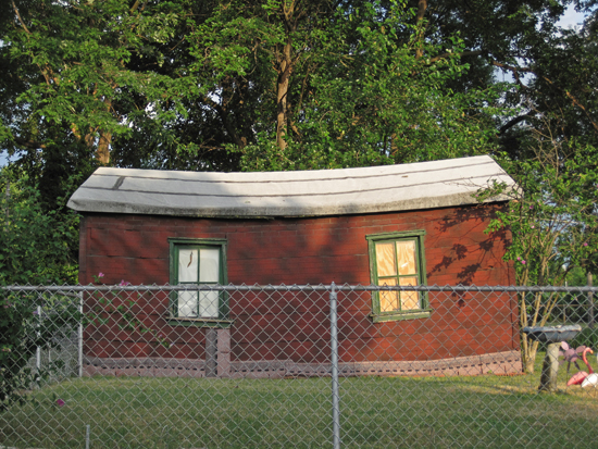
Needing a New Garage

Ohio Sreet
South St. Louis, MO

Man, and I thought my garage was bad!
Whew.

So many of the detached, one-car garages that populate the alleys of the City of St. Louis are well over 60 years old, and no matter how good the upkeep, they start to poop out. It’s an all too common story that city inspectors cite a garage for decay, and you must either fix it or demolish it.

If you’re going to the expense of fixing it, thoughts naturally turn toward enlarging it because what’s the cost of several more feet? But in these tight, fenced-off backyards, you can only go so wide. So many people opt to tear them down, or just stop using them all together.

Even though it’s tight quarters, I use mine. But the 70-year old concrete floor is in real bad shape, which has led to some moisture issues, so I spend a lot of time dreaming of a new garage (and the money that will magically appear to make it so). I don’t want another pitched roof version; a flat roof would be nice, but I’ve been told by carpenters and designers that I don’t want to do that.

OK, so how about a flat roof that slops down toward the backyard? Again, told no; to accommodate a car at the low end, the length of the roof and the angle would be ridiculous both visually and cost-wise.

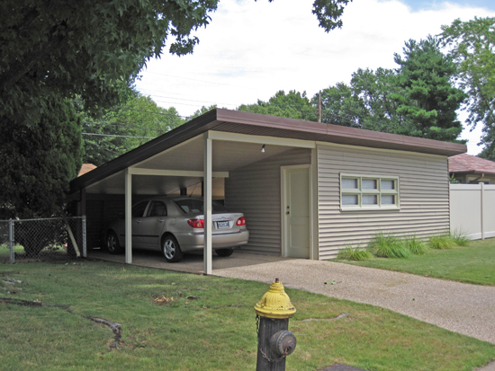
Well, lookey here!
Less than 2 miles from my house is a South Side garage (OK, carport and shed, but still) with exactly the roof and look I want. Well, maybe not clad in vinyl.
OK, I could only afford vinyl, but not narrow strips, and maybe vertical?

Anyway, this is the type of garage I want, and here’s proof that it’s possible in St. Louis City, both structurally- and permit-wise. Now, I need to take up a collection… if each of you sends a dollar, in a month I could have over $6,000, and would just need an architect and builders to do everything for that price. Let’s see a show of hands, shall we?

Shutters – Why?

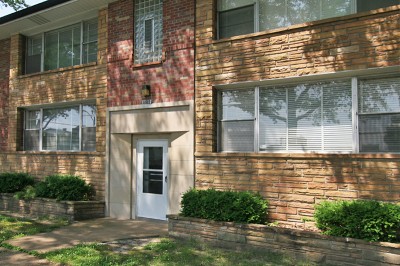
Here’s a typical scene in St. Louis Hills – a mid-century modern apartment building nicely appointed with various stone and brick textures to create a pleasing geometric palette.  I can imagine living here, with the generous fenestration that surely makes the rooms seem comfortably large. But then something horrible happened somewhere along the way.
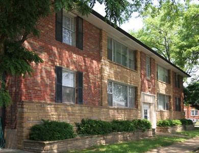
Some misguided landlord decided that the windows on the ends of the building needed cheap-ass plastic shutters! There’s obviously no understanding or appreciation of architectural aesthetics, just some primal urge to bolt plastic where it should not be. This was the final straw of my long-time confusion about – and hatred of – shutters.

There is a specific and finite need for shutters: to control light and air, and/or protection against strong wind, rains and hurricanes. 20th century indoor climate control has taken care of the former, and a finite number of dwellings in coastal areas still need it for the latter. After that, shutters are, basically, the proverbial mustache on the Mona Lisa. And when one insists upon using them as a minor exterior accessory, there is a right way and a wrong way to do it.
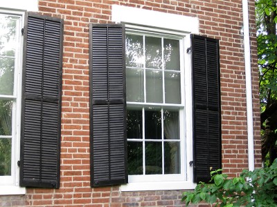
A recent article on Retro Renovation addresses this very topic. “Improve Your Home’s Curb Appeal With Shutters” is much more polite about the topic. The closest author Ted Cleary comes to rolling his eyes is when he writes: “Cheap shutters, which are so common that many people don’t even question the look, can give a flat, pasted-on appearance; authentic ones can make all the difference.” He is then very thorough in relaying the “cardinal rules” rules of proper shutters:
• They must be exactly half the width of the window
• They must convey the believable appearance of actually being usable
• The length must match the window’s length rather than standard lengths available at big box home improvement stores

As shown above on an historic home in Webster Groves, authentic shutters have hinges, and when closed they would completely cover the window. Originally, these shutters would have controlled sunlight while keeping air flowing through in the summer or blocking drafts in the winter, and during a storm they protected the windows from breaking. These shutters are cool because they are authentic.
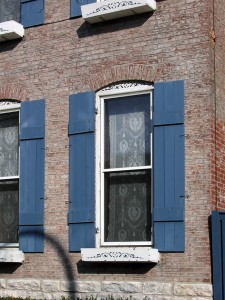
Same goes for these shutters on a Benton Park building. These even have the latches to hold the shutters against the building when not in use. Plus, they are real wood and painted a sumptuous shade of blue that contrasts nicely with the red brick. Well done.
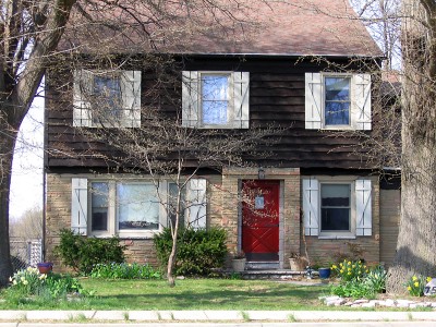
These shutters are not operable, so they are purely cosmetic. But they are the correct size, made of wood with a cute pattern, and their soft cream color serves as a wonderful accent to the overall rustic look of the home, much like the right accessories can really pop an outfit.
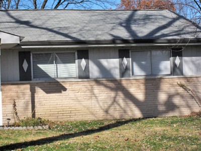
I feel exceptions can be made when shutters are truly thought of as a visual element that adds to the dialog of the home’s design, like these shutters (above and below) on standard-issue ranch homes in Florissant, MO. They are the right length, but certainly not the right width. But these shutters originally attached by the builder in the 1960s have an endless array of jaunty motifs that don’t pretend to be anything other than earrings for the windows. This playfulness is charming, and it was a clever way to address that there was no longer a need for shutters unless they could contribute meaningfully to the glossy modern era of suburban living.
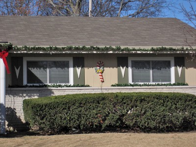
But after that, we have an endless chain of mindless shutter application. Somewhere along the way, shutter manufacturers devised a clever marketing campaign that has kept this product as a normal, accepted accoutrement for the average American home, and I’m guessing this campaign was waged during the post-WW2 building boom when it was becoming apparent they were no longer needed. But as millions of homes were being built across the land, the miracle of mass production created a landmine of financial opportunity for plastic shutter makers, and their marketplace savvy continues to this day. Shutters get slapped on new homes as mindlessly as we guzzle soft drinks, and we seldom stop to consider “why?”
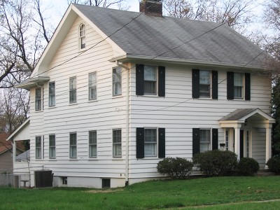
Here’s a common sight: shutters only on the front of the home. Granted, this application in Kirkwood is the proper size with hinges, but it appears they blew the shutter budget on the front, leaving the rest of the windows naked. Meaning, if the big storm comes, only the front windows will survive, and woe onto the rest of the fenestration!
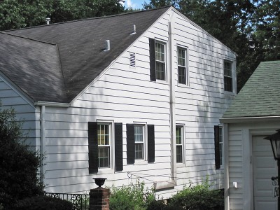
Or we have the mindless application of shutters for shutters’ sake.  Casing for electrical wires serves as a Mason-Dixon Line, though which is Union and which is Confederate is open to individual interpretation.  And this home also covers another common problem…
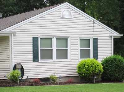
…fit. Proper shutters demand symmetry for operation, but the windows on modern homes don’t always allow for that. So the Pavlovian response of “must have shutters” creates all manner of remedial, lopsided configurations that we tend to accept as perfectly OK.

Sometimes the placement of a window on a modern home strictly forbids you to install shutters, like the left-hand window, above. To carry on the theme would require ordering custom shutters. Off-the-shelf vinyl shutters in standard sizes average $35-$50 a pair, so this homeowner was willing to spend, say, $90 to trim two windows, but they were not willing to spend custom dollars for that last window. This seems a wise decision when compared to…
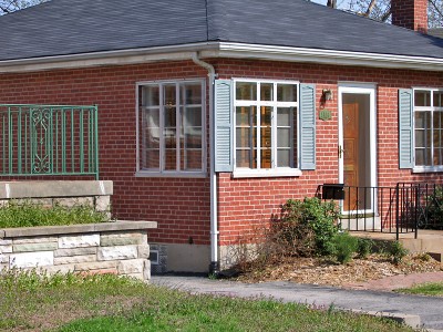
…this house down the street in the same Shrewsbury neighborhood. They purchased off-the-rack shutters and installed them with gusto until the “uh oh” moment. I like to imagine the day of installation, where he started installing on the right side of the house, and that moment of dread when he came to the last shutter on the left – dang, it overhangs! “But I can’t stop now! Screw it! Up it goes.” And now a small section of the downspout is protected from the harsh rays of the afternoon sun. Everything works, if you let it.

But I am also intrigued by that primal urge to shutter. They have somehow been instinctively ingrained into the homeowner psyche as something that must be done. From observing some homes, it’s obvious that no thought beyond “must shutter” has been “thunk,” and they had to create an excuse to smooth over an awkward situation. But it’s this mindlessness that fascinates me.

Come the deadly Midwest hurricane, at least one side of this bay window will be spared. Clearly, there is no room or need for shutters on the front of this cute little home, but they were compelled to do so. Which reminds me of a good deed done by a friend who works for a corporate home improvement retailer. This employee once stopped a man from committing mindless shuttering.

The customer had just spent money to have new vinyl siding installed, and so “needed” to replace the old shutters that had been removed during the project. He wanted some help in selecting new vinyl shutters. My friend applied the Socratic Method:
How does your house look with the new siding?
Great.
Even with the old shutters gone?
Yeah.
So if it looks nice without them, why puncture your new siding by putting up new shutters?

One could practically see the light bulb go off above his head as he mulled it over. He then said he needed to think about this, and left the store, shutter-less. Bravo! Score one for aesthetic logic!
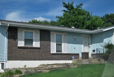
There is a series of ranch homes in the Affton area that have shutters enforced upon them. The original builder inset the windows in a way that created a need for shutters to complete the frame. One can only remove these shutters by investing in larger, custom-size windows to fill the void. Naturally, it’s cheaper to just buy new shutters. So the original financial agreement between the builder and the shutter vendor remains stronger than a homeowners free will to mold the house in their image.
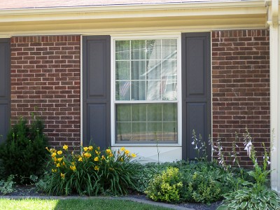
This homeowner stumbled into the rigidity of this design feature when it was time for replacement windows. For whatever reason, they went with a window shorter in length than the original, so had to create new in-fill at the bottom, and it’s not all that bad. But the new shutters still echo the length of the original window; enthusiasm for jerry-rigging goes only so far?

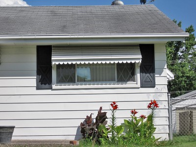
My favorite category of shutter atrocities is epitomized in this glorious example, above: suspenders and a belt!  This one also evokes the feeling of socks worn with sandals.
Imagine if car manufacturers included mud flaps as a standard feature on all motor vehicles. Yes, mud flaps do serve an actual purpose on a specific type of vehicle, and mud flaps on a Mini Cooper would cause no harm. But it would ruin the line. And they would require some maintenance. And they would get mangy after awhile. While a large majority of new car buyers would motor on without a second thought about the mudflaps, it’s fair to say that maybe a Jaguar owner would step back one day and realize that the mud flaps muss the essence of their refined car, and yank them off, wondering why they left them on for so long. At that moment, mud flap emancipation would feel so sweet!

Shutters are mud flaps.  If they serve no true purpose, yank ’em off, and see if the house looks better without ’em.
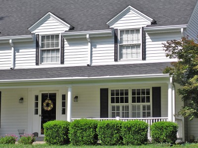
Here’s my Number One With A Bullet favorite shutter catastrophe.  On the second level, much money was spent to create and install vertical versions of the John Waters mustache!
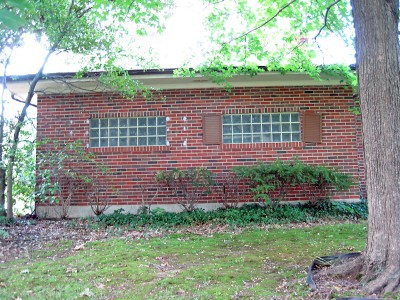
And here’s a good example of comically inappropriate shutters vs. no shutters. Are these homeowners purposely breaking free of the shutter shackles? I’d like to think so, but considering the ramshackle state of the rest of this Webster Groves modern ranch (shutters are hanging loose all over), it appears to be that the house itself is lancing the boils, yearning to return to its original shutterless state.

In the early 20s, I worked for a high-end design build firm who were remodeling a Ladue ranch home whose overt Frank Lloyd Wright design had been buried under several remuddles. The new owners wanted that Wright-ness returned. As I was taking before photos, the man told me about the debate he and his wife were having over the shutters: he wanted them removed because they weren’t original while she wanted to replace them with more appropriate versions. He asked for my opinion. I said, “Why pay hundreds of thousands of dollars to restore this home only to mar it with shutters that were never intended?”  It was silent for a few beats and he replied, “Yeah. Maybe if I agree to buying some Stickley antiques, she’ll back off on the shutters. It’s worth a shot.”

This man is my hero. We need more like him.

Mid-Century Fetish: Down With Love

down-with-love-011
Down With Love, released in 2003, is a homage to classic Doris Day & Rock Hudson films of the 1960s, starring Ewan McGregor and Renee Zellweger. It works as both a tongue-in-cheek commentary and earnest love letter to that style of romantic comedy film.

down-with-love-02
Critics buried the film, and basically no one but me and my Mother saw it in the theaters. But two crew members did get nominated for a few independent film awards, and rightly so, because they were the meat and potatoes of this venture.

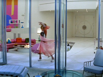
Costume designer Daniel Orlandi totally nailed the spirit of a typical Doris Day wardrobe, which was fabulous! Production designer Andrew Laws studied the sets of the original Day-Hudson films, then injected them with the revival of mid-century modern design that was foaming to a head, and thus created the ultimate fetishistic object for MCM design fans.

down-with-love-03

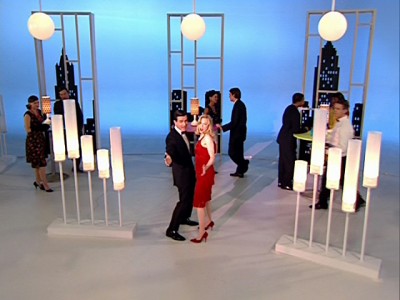
The lobby of Know magazine

Over the years, I have seen Pillow Talk – where Doris Day plays an interior decorator – easily 40 times. The sets are just as important as the actors and the plot and, for the last 10 years or so, I watch the backgrounds more than the foreground. So when Down With Love set decorator Don Diers said their sets were intended to be a “distinct character in the film,” my applause is deafening for a goal perfectly achieved. As with Pillow Talk, I can watch this film with the sound down and still be wildly entertained.

down-with-love-04

Catcher Block's office

The movie begins with this narration:
The place: New York City
The time: now – 1962. And there’s no time or place like it.

Diers confirmed this by saying, “Our New York exteriors existed in the back lot world of Universal. We made a concerted effort to recreate a 1963 Hollywood New York, as opposed to anything that might have been mistaken for reality. Through Fox Research, we searched a lot of old movie stills for just the right tone.”

down-with-love-05

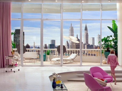
Barbara Novak's Manhattan penthouse apartment

This level of fantasy detail is supremely delightful. Bringing to life idealized versions of what 1962 surely looked like is thoroughly satisfying and can be a time-consuming hobby.

down-with-love-06

Here’s a piece on how to re-create the Barbie doll feel of Barbara Novak’s penthouse apartment.

down-with-love-07

down-with-love-08

The bachelor pad of Catcher Block

The bachelor pad of Catcher Block

And here’s a piece on how to get that “woman’s man, man’s man, man about town” look for your bachelor pad.

Another view of Cathcer's apartment

Another view of Catcher's apartment

Catcher's fireplace and vintage stewardess

Catcher's fireplace and vintage stewardess

As much as I genuinely love and strive to document real-world examples of mid-century modern architecture and design, I do get uneasy about the fetish aspect of it. The definitions of “fetish” succinctly explain my uneasy feelings:

1. an object regarded with awe as being the embodiment or habitation of a potent spirit or as having magical potency

2. Any object, idea, etc. eliciting unquestioning reverence, respect or devotion

3. Any object or nongenital part of the body that causes a habitual erotic response or fixation

Cubicles of secretarial pool at Know magazine

Finding evidence of a design time period and collecting the items and/or trying to recreate that look is a time-honored tradition. Early American architecture was founded on the revival of most every European building style of most every century. So, reverential recreation of mid-20th century design is a natural progression, and may be the only thing that finally preserves the best examples of such for future generations.

Lobby of Novak's Now magazine

Lobby of Novak's Now magazine

But there does exist unrealistic expectations among those cultivating a mid-century way of living. The most intriguing example comes from the stories of a realtor friend who specializes in finding St. Louis MCM homes for her clients.

Coming into Barbara Novak's office

Coming into Barbara Novak's office

In a nutshell, some folks want to live in subdivisions with homes like these, but they want it to look exactly as it did when first built. They look at what 40+ years of inhabitant’s remodeling did to the place and just don’t want to deal with the effort required to restore it to that original state.

Novak's office

Novak's office

Remodeling industry figures show that the average homeowner remodels at least the kitchen and bathroom every 10 years, and that when someone moves into a pre-existing home, some form of remodeling will take place. This is a psychological, aesthetic and functional desire to erase previous footprints and mold the home to your wants and needs.

Waiting area at Now magazine

Waiting area at Now magazine

If the house is over 25 years old, it’s going to automatically need upgrades to systems, roofs and exterior finishes. Maintenance is an on-going chore for a house of any age.

It is easily understood that the purchase of a period home is going to require a lot of work. Whether wanting to totally modernize it or restore it to its original state, it is the equivalent of a second full-time job until the job is done. Wait, the job is never truly done, so scratch that. It’s more like raising a child.

The Pan Am building is real, the rest is Hollywood

The Pan Am building is real, the rest is Hollywood

A house built in the 1950s or 60s is now, technically, a period home. Aside from the maintenance and repairs it will require, if you want to take it back to the original form, it requires remodeling. Many homeowners – especially first-time buyers – understandably don’t want to deal with this much work and expense. If that’s their mindset, then walking into a 1960s ranch that only looks like that from the outside is a major bubble pop, and disillusionment thwaps hard upside the head.

But what is it about mid-century architecture that makes it harder for us to accept the remodeling realities of a place that has been normally remuddled over the decades? Why do we expect these period homes to be like a perfectly preserved dollhouse?

Set for the closing credit musical number

Set for the closing credit musical number

Maybe it’s because it is the recent past. The second half of the 20th century went by at lightening speed; 25 years can feel like only 5 years gone, and how much can you mess up something in that short period of time? A home built in 1912 is an antiquated beast requiring massive work to bring it to current standards. But a 1950s ranch has central air conditioning and drywall, so we recognize it as “of our time.”

Then we see something like Down With Love, where they wave a magic Hollywood wand and create a mid-century Xanadu. Target lets us take home credible recreations of that era. Dwell shows regular people living in that world. It’s as easy as populating a dollhouse, right?

If only.

down-with-love-20

American Look 1958

american-look-1958

This clip is billed as “The definitive Populuxe film on 1950s automotive, cheap industrial, viagra dosage interior and architectural design.”

Highlights
At the 4:05 mark is a setting that looks like every 1960s Elvis Presley movie.
5:27 – bowling!!
5:54 begins the parade of residential and public architecture.

This clip is billed as “The definitive Populuxe film on 1950s automotive, recipe industrial, interior and architectural design.”

Highlights
At the 4:05 mark is a setting that looks like every 1960s Elvis Presley movie.
5:27 – bowling!!
5:54 begins the parade of residential and public architecture.

Click to see the clip.

Dork Art and the Board of Education Building

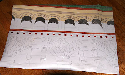
While digging in the basement for something that’s still missing, I found the artifact shown above. It is a detail of the former Board of Education Building in downtown St. Louis from a photo I took in the mid-1990s. It is rendered in acrylics on a sheet of linoleum 30″ x 22″. It was to be a floor mat for the kitchen.

Yes, a floor mat.
Yes, it’s OK to laugh.
I remember that it was because of everyone’s laughter that I abandoned the project in the first place. This is why it has remained hidden for well over 10 years. Enough time has passed that I now, too, find it hilariously dorky.

But I am not embarrassed at how inspiring this building has always been for me. The shapes, the colors and the textures of this 1893 building by architect Issac Taylor make my heart sing. Learn a little more about it here.

In the days when downtown St. Louis was on life support and my daily lunch walks felt like traipsing through a graveyard, this building always appeared optimistic, as if it knew better days were coming.

The elaborate art deco store front on the Locust Street side was always a special thrill, especially when the Board of Education was still actually in residence. As seen above, kids’ art work in the gracefully curved display windows was disgustingly charming, and just added to the impulse to paint a portrait of the building…. so I could walk on it?

In 2005, the Roberts Brothers erected a few signs promising a new life for the building, and my heart fluttered. But because it stood in the shadow of the scars of the Century Building (to the left in the photo above), cynicism and worry trampled on hope.

But all is now well. The building – now called Roberts Lofts on the Plaza – is fully rehabbed and renovated and nearly full. The art deco store front is even safe and sound. The Roberts Brothers are truly knights in shining armor for rescuing so many worthy buildings and creating new ones, and my heartfelt thanks goes out to them for keeping the Board of Education building forever fabulous.

I wonder if they’d be interested in a commemorative floor mat for the lobby…

Crestwood Remuddle: Creston Center

Creston Center, Watson & Grant Intersection
Crestwood, MO
The Creston Center, Before. It was a simple and spare 2-level shopping plaza built in 1961. Note the snappy vertical sign to the left, in the auto-centric spirit of this stretch of Route 66. To its right is another 3-sided sign that spun around so 3 major tenants could have equal billing. And a tiny out-building sat close to the corner, making the most of every square foot of land.

The Creston Center, After. The ginchy Creston sign topples, as does the out building, and the remodel is a hot mess.

Now, I’m not saying the original was an important piece of design worth preserving intact. It was very appropriate and utilitarian retail design for the time, and the cantilevered balcony that created covered parking for the lower level is a nice mid-century modern touch. Its simplicity kept it under the radar in the 21st century, but in a bid to jazz up the place and get a full tenant load, the owners paid for a remodel that is just… a steaming hot mess.

In December 2002, when the above photo was taken, the place was about 65% rented. Today, the place is now about 50% rented, so remodeling to make it more attractive to tenants didn’t really play out as intended.

And “more attractive” is obviously in the eye of the beholder. Minimal lines and a flat roof are anathema to current day retailers; they want more “there” there to catch the eye of modern shoppers.

So they put bulky caps on the slender metal poles and went to town on the roof. They gave that roof a height and heft and flash which creates the feeling that the cantilevered balcony is just going to collpase under all that rigamorale.

Why the mixture of shingle mansard and pup-tent standing seam metal? I would have loved to hear the “designers” rationale for this absurd combination, especially because the addition of standing-seam boosted the budget for no good reason. Did they claim that this over-scaled mish-mash would create a dynamic energy so crucial for luring shoppers? Or that the mansards would indicate the prime locations in the building? Or was the rationale as mundane as the metal would ease the cost of re-shingling in the future?

Whatever the case may have been, the Creston Center was an overlooked and unassuming retail center that became a 3-ring circus of hubris and bad taste. I cringe every time I pass it and feel bad that their remuddle became a huge waste of money and intentions.

SLU Cloister Walk, Best In Show

St. Louis University Cloister Walk
Grand & Chouteau, St. Louis City, MO
Some people are highly attuned and obsessive about the built environment while others pay little attention because their fascinations lie elsewhere. This is as it should be, because the diversity of human experiences is what makes our lives such a compelling journey.

There are a heaping handful of people in my world who exactly share my passion for buildings, while many others kindly tolerate my comments, exclamations and head swivels (and near crashes from not paying attention to the road) as we drive around. Most fall in the middle of these two extremes.

But there is one new-ish feature on our city landscape that everyone has a comment on – all of them favorable – and that is such a rare occurrence that it must be noted.

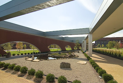
The Joan & Joseph Lipic Cloister Walk on the campus of the Edward A. Doisy Research Center at St. Louis University gets most everyone’s attention. The Research Center itself is the star attraction (see pages 4-6 of this pdf), as its tall, shiny and unique. It has a prime location, LEEDs certification and the best of intentions. I like the building, though I enjoyed watching it go up more than the final result. But in my opinion, it causes no harm or embarrassment, and entertains me in an Off-Broadway musical kind of way.

But its the brick “tail” of the building, snaking diagonally to the southeast across the campus, that thrills me the most. And it is this promenade connector that has elicited positive comments from everyone I’ve been with as we passed by. I’m talking unsolicited and unprompted comments by people who normally don’t notice these types of things, especially when it’s a low-lying, secondary feature of a major building situated far from the street. One has to make the slightest of efforts to notice it, and when they do, they instantly love it!

There definitely exists a snobbish line of thought among architects and designers that if the uninformed masses like something, it must be intentionally pandering to the cheap seats. This imperious manner is sometimes worn as a protective shield by those who design buildings and objects, and the fewer number of people who “get it” confirms its success to the creator.

I can buy into that aesthetic, but I also firmly believe that when it comes to buildings, the context, the purpose and the people it was created for deeply matters, and when the uninformed masses react apathetically or negatively to a new building it is because the creators failed on one or more of these fronts.

For instance, a Frank Gehry building is a dramatic and dynamic thing, but when it sends snow and ice flows crashing onto heads or blinds the neighbors on a sunny day, then form murdered function. The benefactors’ got a glorious trophy building while the inhabitants in and around it got shafted.

So, the Cloister Walk gets the attention and admiration of the St. Louis masses. The form pleases every eye. It looks intriguing but how does it function? It was time to investigate up close.

The Research Center comes courtesy of Cannon Design, and because the Cloister Walk shows up in their concept drawings, I’m assuming they designed it as well, even though no one has bothered to single out that fact. Again, the Research Center is the star, while the Walk is a bit player used to advance the plot, a way to get from one point to another in a formal and protective way.

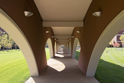
It is a true pleasure to walk near and in this place. It mimics and facilitates movement in a low key manner, which is quite the accomplishment when it has so much going on. A Zen garden, and wild vegetation and babbling brooks go on in and around it, but it works as intended. The flanking rows of arcing ellipses create frames for the ever-changing scenes as you walk on, so the experience is both peaceful and invigorating. Its form is thoroughly modern urban, its intent is old fashioned and the result is a friendly addition to time and space.

The Walk is a private structure intended for people using the Research Center and the medical school complex it connects to, but no signs or efforts indicate that the public is not allowed to experience it. Because of where it’s situated, one does have to make a concerted effort to drive into and navigate the complex, which is full of paid parking lots and pass-only parking garages. But there’s free street parking to be found, and those who have business there truly don’t seem to mind the presence of those who don’t.

People were using it constantly, with folks even lounging on the benches and soaking up the sun by the fountain at the southern end of the Walk (which resolves a bit awkwardly; it evokes a hippo or dragon). So its function is good: it facilitates, accommodates and inspires additional uses.

It’s form looks good and feels even better, to the eye and the soul. I can see this becoming a popular place for photography students, especially for black & white assignments; it just keeps on giving and creating arresting still lifes, with intense plays of light and shadow.

It is joyous to have something that has captured so many’s attention from afar be even better up close. And it feels odd (but good) to finally be able to thank St. Louis University for a truly worthy and enjoyable architectural contribution in the 21st century.

SIDE NOTE One of the greatest views from this campus is the old Peveley complex across the intersection. I love all the contrasts of the Research tower against the Peveley smokestack, the boldly modern in concert with the contentedly industrial. The Pevely building is now for sale, and as the article points out, it is a significant plot of land in a prime city location. Which is why I’m worried. Please, oh please, let it find a new use that allows it to remain essentially intact. Fingers crossed.

Must See: Birth of the Cool

Birth of the Cool: California Art, Design & Culture at Midcentury
Mildred Lane Kemper Art Museum
Washington University Campus until January 5, 2009
Birth of the Cool is an absolutely amazing exhibit about the heart of MCM. For fans and connoisseurs of the style, it is longings come to life, iconic images in books and magazines standing before you more breathtaking than imagined.

For the unknowing, it is a concise and compelling text book. For the unconvinced, it is casual persuasion of respect for the style. In keeping with the economy of shape and form that is MCM, the exhibit is not an overload of things but rather an economical gathering of precise items for maximum impact.

Within 6 galleries, music, design, art, culture, housing, furniture and politics mingle to create understanding of why the style evolved and why it endures as a romantic American ideal. I could gush on for paragraphs about the contents (like the above chair display, in the only photograph I took before being told to stop), but I’ll spare you the frenzied adjectives and cut right to the most extraordinary part.

Julius Shulman is a photographic god who still walks and shoots on this earth. Birth of the Cool has a heaping tablespoon of his black & white and color prints. The only reason this is not the personal highlight is because I have had the humble privilege of seeing most of these prints at exhibits in St. Louis and Palm Springs, California. But in the spirit of “it’s not what you got but how you use it”…

One gallery is all about Pierre Koenig’s Case Study House #22. In the middle of the room, encased in glass is a wooden architectural model of the home (gasp). Along the walls are Shulman’s omnipotent photos of such, images I’ve seen countless times. But when they are gathered in one place and put in context with a 3D replica, the effect is the most awe-inspiring feeling to have short of being invited into the actual house. The curator achieves maximum impact with a minimum of objects, exemplifying the aesthetic with two architectural artists who embodied it.

The ultimate moment of this exhibit will come on November 22nd, 2008 with a screening of the new documentary Visual Acoustics: The Modernism of Julius Shulman. Watching the trailer gets me misty eyed, so I’ll save this topic for a date closer to the event. But do mark it on your calendar.

From an interest level of passing curiosity through to full blown fanatic, Birth of the Cool is a must-see. The gallery is easily accessible (location and time-wise), and it is free. There are no excuses, only priceless results.

StL Hills Remodel: The Retirement Center


6543 Chippewa
St. Louis, MO
The St. Louis Hills Retirement Center got new owners last year and is now deep into the projected $5.5 million renovation (story here). An addition goes up on the east side (looks like the size of an elevator) while they replace all the windows, floor by floor.

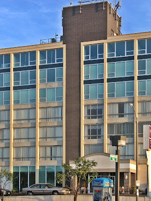
This is one of several mid-century buildings in the immediate Chippewa/Watson section of St. Louis Hills; the St. Louis Hills Office Center is a close pal. Built in 1964, the former retirement center is only 6 years younger than the office center.

I am thrilled by the emerging new face. It’s one of those buildings that never offended nor commanded my attention. But now that the owner’s have applied some sharp aesthetic thought to the revamp, I think it looks as cool and lovely as Jean Shrimpton.


The black window frames with green tinted glass (so Lever House, don’t you think?) provides the backbone of contrast for the white concrete window wells and dark brown brick verticals to properly pop. I’d love to see them erect a more appropriate front entrance canopy, maybe taking a cue from the back balcony of the fabulous house right behind this building, to the east (Rob Powers photo). But it is a senior living community, so hip is probably not the goal, though those replacement windows belie otherwise.

A slightly younger building of the same vintage being remodeled nearby should be good news for the St. Louis Hills Office Center, still standing in a truncated state, awaiting its own revamp. But there’s motion from 3 sides that communications have wilted and that St. Louis Hills residents may have soured on any renovation for the entire plot of land surrounding the Office Center.

Can we safely assume the Retirement Center renovation was approved because it’s a smart idea? As one of the co-owners said in a press release: “We are excited to be part of the history and re-investment in the St. Louis Hills neighborhood.” To outsiders, exploring something similar for the Office Center seems plausible, yet there’s another snag. So, Provision Living setting a nearby example of appropriate remodeling (remember, the greenest building is the one already built) is the stylish poster child for possibility, and underscores St. Louis Hills’ mid-century heritage, which is something to be proud of.

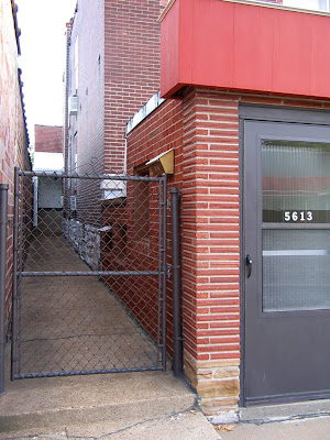
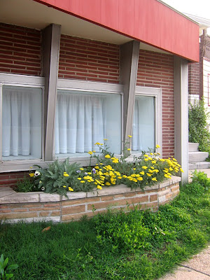
Gravois Store Front Addition

5613 Gravois, near Bates
South St. Louis, MO
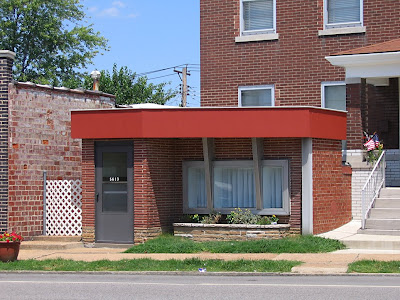
In the category of storefront additions, this one is my favorite in both aesthetics and neatness. It’s also a queer building in that not only did they add the compact MCM to the front, but tacked on two additions to the back.

City records are real confused about this site, maybe because there’s so much going on. Yet nothing happens at all, except meticulous upkeep of the appendages to the main building. The 2-family flat easily fits into the time period of the buildings directly around it: 1900 – 1920.

The storefront addition popped up in 1958 and has a distinct beauty shop feel to it. City directories confirm that hunch; Boris Beauty Salon worked the spot until the late 1980s, when Juls Gifts and Flowers took over. Since becoming aware of it in the mid-1990s, I have never seen it open and active, only well-groomed and resting.

I’m intrigued by how it’s attached to the 2-family flat; all the stair stepping, window insertions and roofing options. The hand of an architect is apparent because everything is so precise, which makes this addition a rarity in the category. Part of the charm of the others is the ramshackle vibe, while Boris Beauty is in a class of its own.