
Watson Road from Elm to Watson Industrial Park
Crestwood, MO
If you head west on Watson Road out to St. Louis County, and cross the Elm/Rock Hill intersection, look to the right for some relatively untouched mid-century goodness tucked in among the ever evolving retail in Crestwood. The building above may not catch the eye while speeding by, but take a closer look at what it reveals.

This building dates from 1961 and was built for Knoll Florist Shop. It’s undulating roof line and concrete walk always reminded me of a clam shell, but upon learning whom it was built for, it becomes clear that it may have been intended to represent the petals of a daisy. And check out how the iron railing follows the curves of the concrete; one of those kinds of details common back in the heady days of the Suburban Boom, and sadly missing now due to design and construction budgets, and the temporary nature of a revolving door of tenants.

Note how they directed customers to the curved, tiered steps, looking like a wedding cake. This view makes one take in the scalloped roof line and the tiny, multi-aqua ceramic tiles, all intended to create a whimsical environment that puts one in the mood to browse flowers. Maximum (but subdued) glamor for what is, essentially, a cinderblock building. Love it!
Summer 2012 Update

Turns out this building was done by architect Erwin Knoesel & Associates. We learned this while visiting his son, Richard, who still lives in the house designed by his father in the 1930s. His father’s original drawing, above, is one of thousands of architectural documents that he retains. Another Erwin Knoesel building that you may know is Tropicana Bowling Lanes.
A different floral shop moved out in 2006, and is now inhabited by some type of cash establishment, who has made no exterior changes, so bully for them. Now, take a look at the building in the right background in the photo above.

The back half of this building is a 1960 creation for Bond Cleaners. The steep chevron pattern along the side of the building makes me wonder if it had also originally been along the front, because they wouldn’t typically get this creative on the sides of a building alone when googie architecture was all about catching a motorists eye. Then again, it was next door to a Howard Johnson’s (on the spot where Steak n’ Shake is now), so providing eye candy for sherbert-saturated diners may not have been such a bad idea.
The above photo shows the beginning of construction of a new entry portico in 2006. I refer to this place as The Endless Build, because from this point till the summer of 2009, they went to town on this new section.

Month after month, year after year, they kept adding more plywood, more EFIS, and more goo-gaws. Just when I thought they had to be done, they’d add another layer of bric-a-brac. I have a whole series of progress shots of the gawdy from the spring and summer of 2009. I stopped this only when a man working on it got a tad hostile with me early in the morning, wondering why I was photographing it. He begrudgingly answered my question of what this was going to be: a restaurant. That encounter – and this photo – was from August of 2009. It still looks like this (so at least the embellishment has stopped) and it’s still vacant.
And now back to westward Watson…

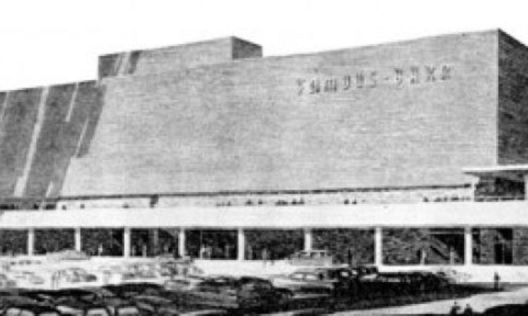
Cross Grant Rd (home of the glorious Ridgewood subdivision just over the hill), dip down into the valley, and as you head up the hill toward Crestwood Plaza, you’ll see the 9109 Building. Built in 1965-66, it strives for executive seriousness with a dash of style. And those stainless steel address numbers on the elevator tower make good on the saying “Larger than life is just the right size.”
Original tenants included Bond Men Inc. insurance company, Glennon-Rogers Insurance Agency (why did businesses stop using such a great word as “agency”?), John Tierny (an insurance agent), and Kummer Construction Co.

Why I find this building beautiful includes: the stark contrast between dark brown brick inside a (bet ya it was originally) white rib cage; how it appears like a giant block with geometric pieces cut out of it to create dynamics and visually call out the different uses of the building, from offices above to retail on the ground floor front. It’s both imposing and welcoming at the same time.

Because it’s built into a hill, there are stairs that run along the west side of the building. Note the minimalist detail of a stair rail that would see minimal use. Details mattered back then. Also note the view to the right.

It’s the Sappington Cemetery, established in 1811, when Crestwood was an agricultural paradise. Then Crestwood grew by 10,000 people between 1950 and 1960, with retail, business and homes rapidly carving up the land around the tiny cemetery. Because it was in a prime location, I can imagine the fights that took place to preserve it. And walking through it is quite an odd sensation, very bucolic despite the location. Keep walking through tombstones rendered unreadable with time and you come to an ungodly tall tie wall…

…with this building below it. One can catch a glimpse of this sleek puppy if you look right down the street Watson Industrial Park while on Watson. The first few times I saw it I thought I was seeing things; how could such a handsome building exist in such a “remote” location? These are the kind of buildings that more typically were put in prominent places so they could show off their post-war prosperity and progressive power.

But in 1960, they erected this building down in the valley, before a creek, for companies that weren’t seeking maximum traffic. Some of the original occupants were Peters Marketing Research, Thelma Williamson Mail Service, Lawson Power Products, Rawbach Casket Co. and a rubber goods manufacturer, Fabreeha Products Co. How wonderful it must have been to walk into this hidden jewel of a building 5 days a week.
Unlike the other few buildings in this Park, the current owners have not marred the exterior of the building (though they really need to trim those shrubs that are blocking the ultra cool window treatment), which is amazing in and of itself.

These are just 3 examples of some original atomic age buildings along Watson Road. Stay alert and you’ll find many more that reveal how excited people once were about having buildings that reflected their burgeoning new society in a positive and artful way.
RELATED
Mid-Century Modern Subdivision Crestwood Hills
Crestwood Remuddle: Creston Center
My Favorite Walgreens


