And Now For Some Good News
The entry below was first posted on June 6, 2006. The beguiling uniqueness of this home prompted a piece in the September/October 2006 issue of St. Louis At Home. That article was seen by the people who were selling the house, and they found their way to my blog entry about it. They got angry and wanted my piece removed from cyberspace. A debate about propriety took place between realtors, culminating in the seller threatening my friend’s livelihood. After much confusion and incredulity, I removed the entry because my friend is far more important than a blog. But this was a temporary situation, as we vowed that once the fate of the house was known, its “memorial” would be revived.
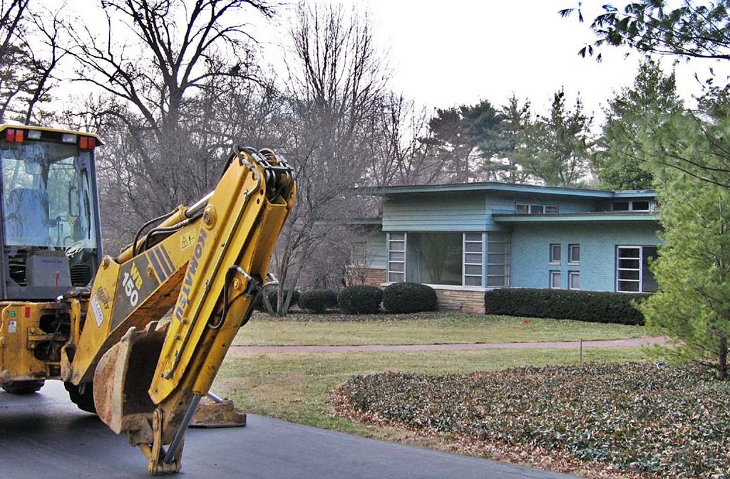
So, the entry disappeared, and surprisingly, I got quite a few inquiries as to where it went. While the piece was mothballing, the developer who had the house and its land under contract let it go when, reportedly, Sunset Hills would not approve his intentions for the land.
Earlier this year, I got an e-mail from a man asking if I knew any further details about the Brinkop house in Sunset Hills, and specifically, any more info about its architect? He ended the message by saying he had just bought the place, so all information would be appreciated.
HE BOUGHT THE PLACE ?!
Yes, he bought the place, and the first round of repairs and renovations had just begun. He loved all of its idiosyncrasies, and planned to keep as much of the original fiber as possible.
AND HE LOVES IT AS IS ?!
This man – only the second family to ever live in this house – is truly godlike.
The uncompromising customization of this mid-century modern home is one of the things that marked its doom. That, and all that land it sat on in a premium location, location, location. Every single person who came to know of this house was certain that it was a goner, simply based on modern realty practices. This house had begun the Bataan Death March.
WE WERE ALL WRONG!!!!!
It’s alive and well and loved. It feels odd, though, because I’ve never experienced MCM homes that should be saved actually being saved. But my gratitude is boundless and I hope more of us can follow the awe-inspiring example set by the new owners.
And over a year later, I am pleased to welcome back….
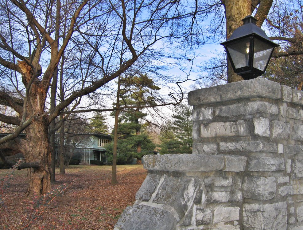
 Maret Drive
Sunset Hills, MO
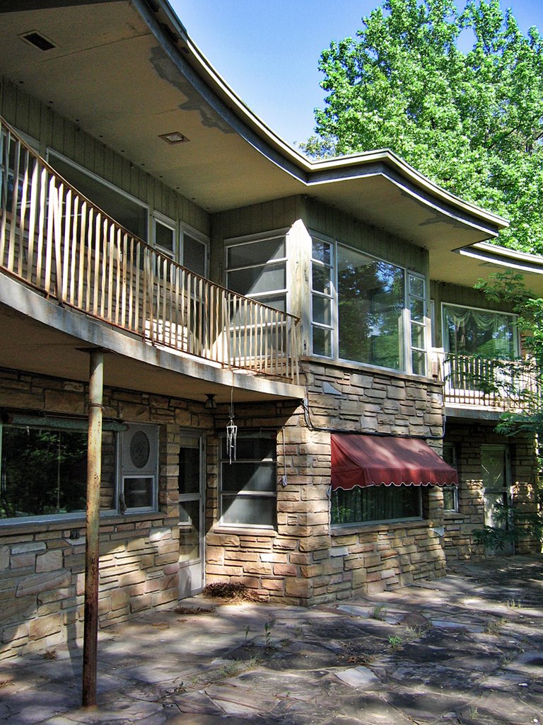
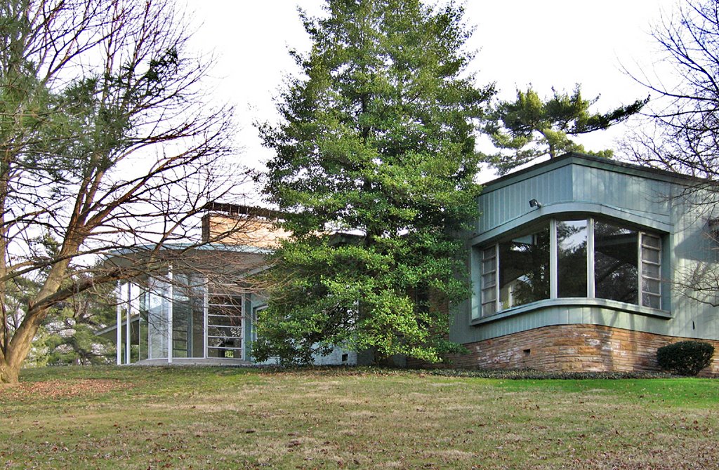
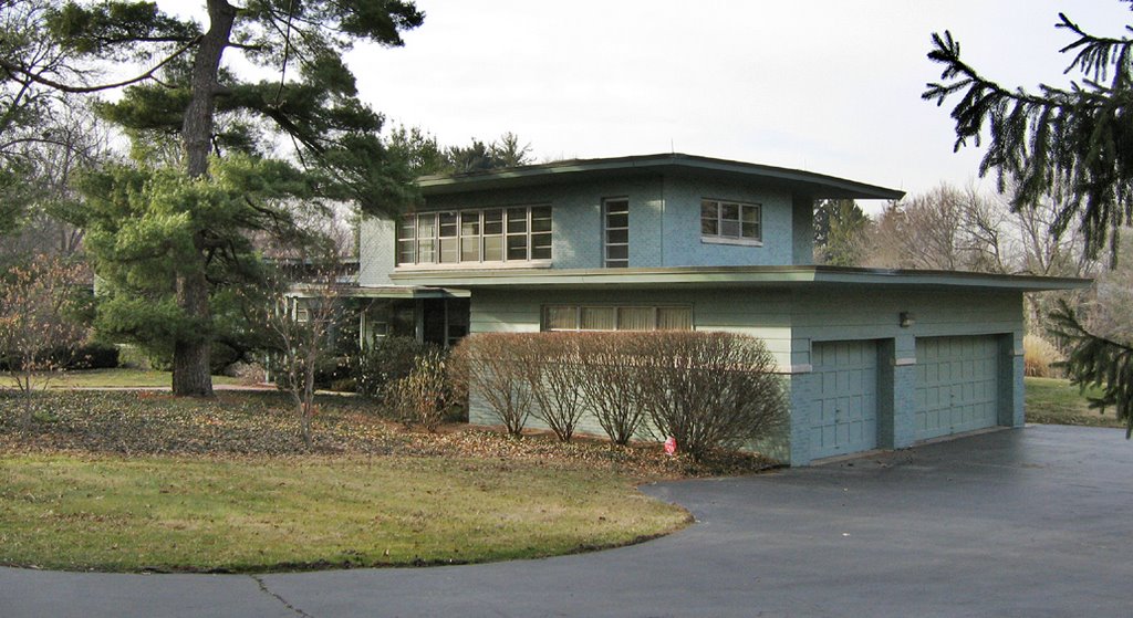
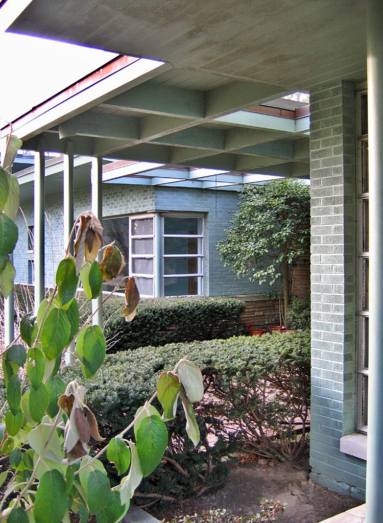
Ted Hindes made a brilliant find, and was so cool as to share the news and links about it. The real estate listing shows only a few shots of the backyard that backs to Laumier Park, because “currently there is a single home on the property which will be torn down.” I was saddened and shocked to see it blatantly listed as a teardown. How do you control this particular epidemic when everyone from homeowners to developers to real estate agents are in bed together? (Above, keep this fenestrated turret in mind.)
 A progressive, modernist friend of mine is also a realtor, and since she was just as shocked and intrigued about it as I was, she waved her magic wand, and the next thing you know, we were touring the house. And we were instantly enchanted. (Above, right side, the turret is the fireplace chimney.)
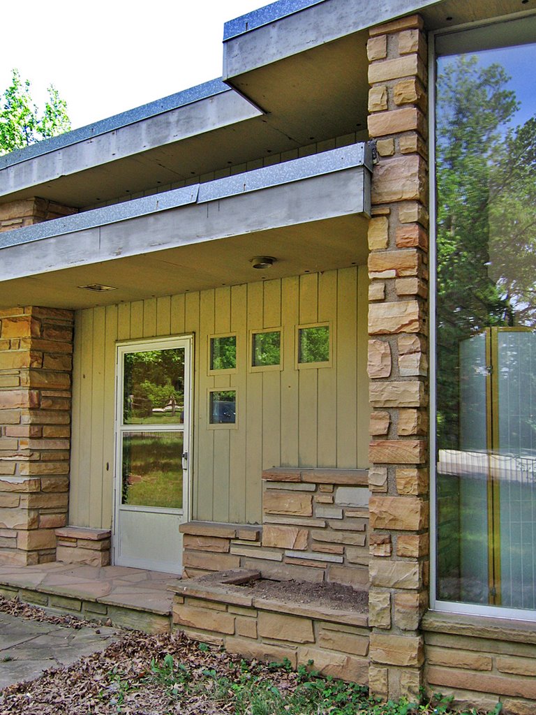
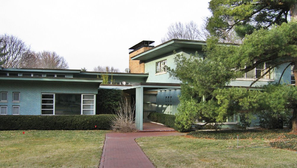
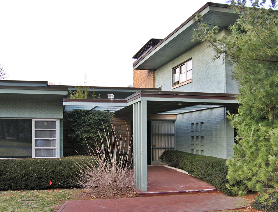
 Built in 1950, this 2860 s.f. house was designed by Harold Brinkop for he and his wife, Erma. From 1939 to 1950, Harry designed and developed Hampton Village, creating the first auto-centric shopping center in the city, and pioneering a retail concept that would wildly thrive in new suburbia just a few years later. (Above, the front entry, and what looks like a newer set of doors, as they lack the distinct character of the rest of the house.)
 As I snapped most every inch of the place, my friend chatted up the people across the street. They had been neighbors with The Brinkop’s for almost 20 years, and provided all kinds of answers to the questions raised by being in the house. (Above, built-in planters to the right of the front entrance.)
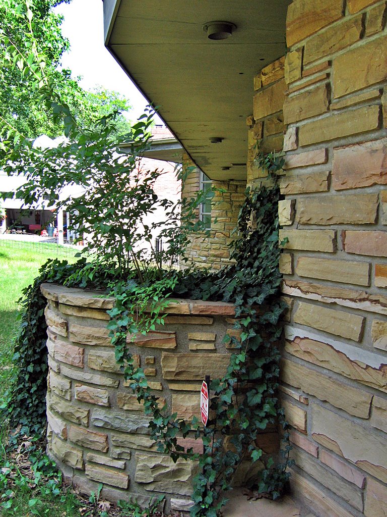
 The Brinkops lived on South Grand, near the Osceloa intersection, up until they moved into this house that architect Harry designed specifically for them. They were childless (which probably explains why it’s in such meticulous shape, despite the recent neglect), and the house was put together to accommodate the private and social lives of a couple who entertained frequently. (Above, looking southeast, the flagstone zig zags toward the turret.)
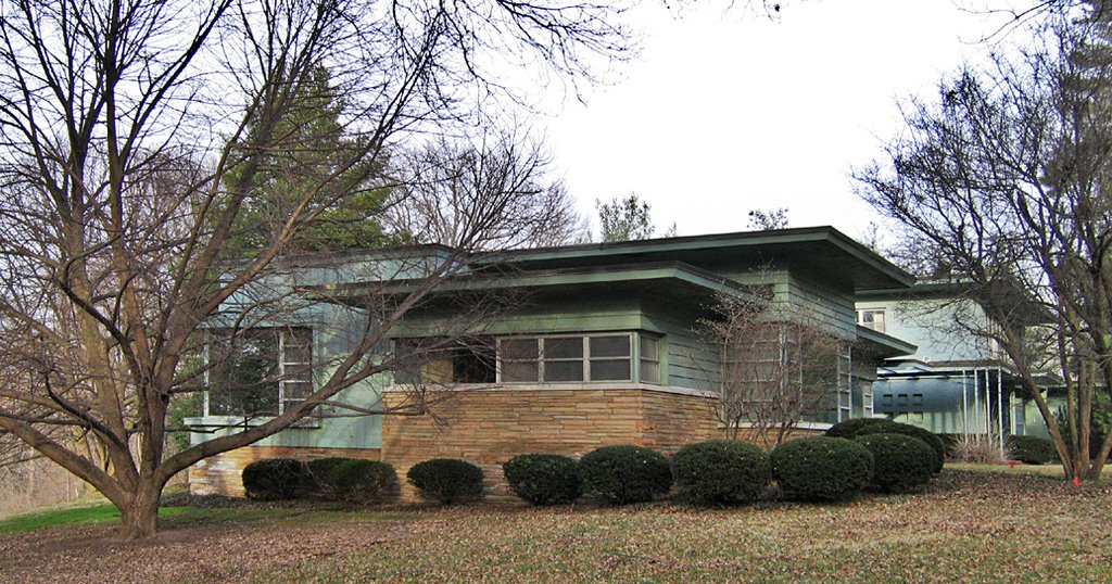
 (Above, the zig zags are a series of windows with textured glass, letting in light while maintaining privacy.) The year of Harold’s death is not known, but Erma continued to live in the house until her own death, about 5 or 6 years ago. Her will bequeathed the house to her physician, Dr. Charles Kilo. He sat on the vacant property until putting it up for sale with a list price of $720,000.
The listing states: “This home is being sold with adjoining lot (12531 Maret) totaling 2.9 acres. This home is either a total rehab or a teardown. The value is in the 2 lots which back to Laumeier Sculpture Park in Sunset Hills. There is a very good possibility that more than 2 lots can be made out of this total acreage. This is beautiful wooded ground and this opportunity does not come along very often! Location, location, location!”
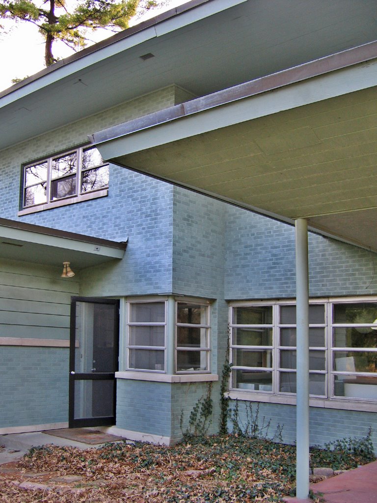
 Above, the northwest end of the house rolls down a level to the 2-car garage and what reveals itself as the fully realized lower level of the house. To the right is an outdoor, screened pavilion with a tiny kitchenette.
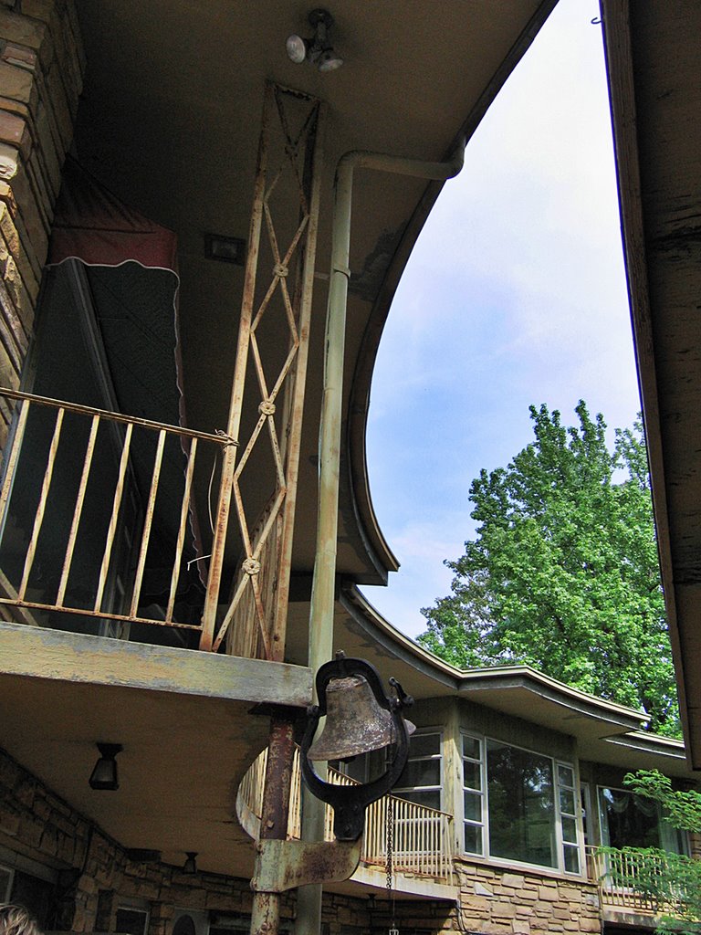
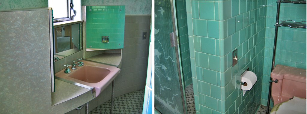
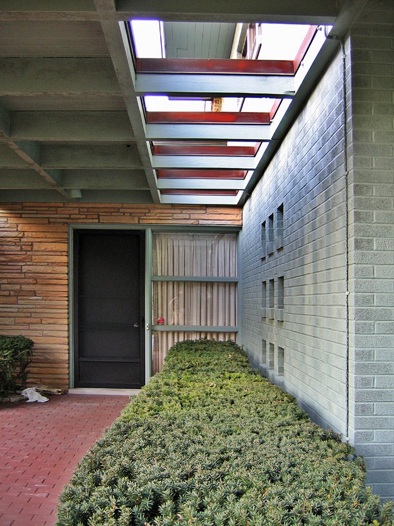
 The entrance to the back courtyard is marked with an electronically operated school bell (above). I only know it’s electronic because there is a precise list of what all the fuses control still taped to the electric box inside the house. And The Brinkop’s really liked bells. We found a button on the upstairs kitchen wall that sounded a bell in the basement kitchen. Rather than yell like hoosiers out the windows or down the stairs, they installed their own “dinner’s ready” network.
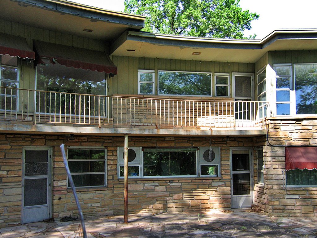
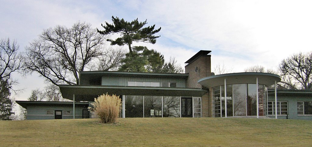
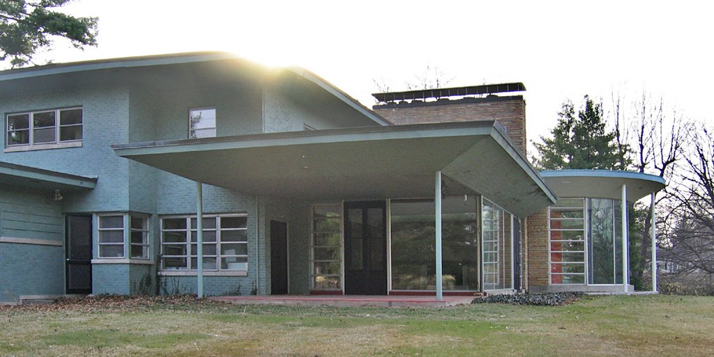
 While the front of the house is angles and circles, the backside (above) is broadly curved and takes on a decidedly southern feel with its veranda, awnings, half walls, lamp posts, bird bath and planters. The back yard is a long, gently sloping hill littered with concrete deer statues, birdhouses, mature trees and the last remnants of flower beds. The property ends at a bank of trees separating it from Laumier Park, which can probably only be seen when the trees are bare for winter.
 The door shown above, left, leads into a full basement kitchen (which still has a vintage 1950s Philco refrigerator), while the door above, right, is for Harry’s work room. One of his old ball caps still rests on a belt sander, their old Christmas decorations peek out of some abandoned boxes.
 The burgundy awning (above) covers the picture window in the downstairs family room, where a framed portrait of gallivanting deer still lights up. The curtains are straight out of 1965. I got the impression that the downstairs was a masculine domain, whereas the upstairs is feminine.
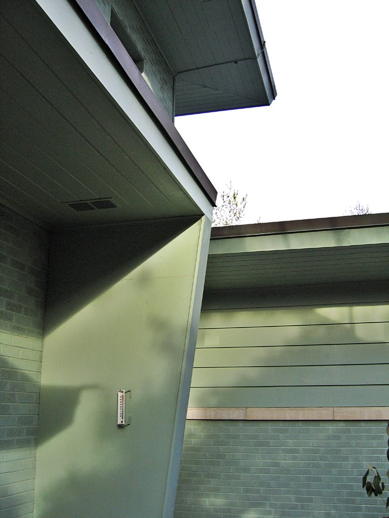
The picture window on the top level belongs to what the electric box labeled as the “multipurpose room.”
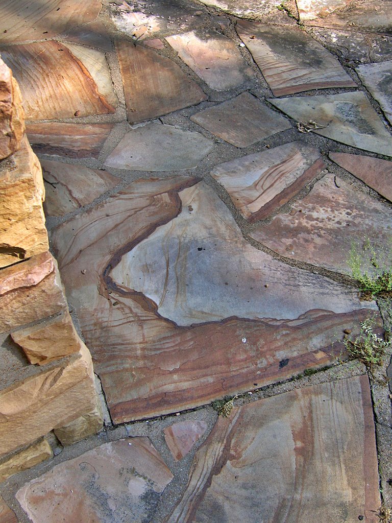
 The generous patio area is laid with Tennessee sandstone (above), which had to be rather pricey, even in 1950. Actually, when noting all the finishes in this house, money was not an issue for The Brinkop’s. But rather than ostentatiously deck out their dream home, they chose solid and consistent materials that have endured, intact, to this day. If this house must come down, I hope someone has the good sense to cart off and re-use the materials, as it’s primo stuff. Actually, if a developer takes the property, they could save a bundle on the new matchstick house they’ll build in its place if they clad it in the flagstone… but do I really want to help this company save money while employing some semblance of good taste? That idea; strike it from the record.
 A small fountain with a birdbath (above) is a quarter way down the backyard. The awnings on the top left side of the building cover the living room windows. And it’s now time to go inside the house.
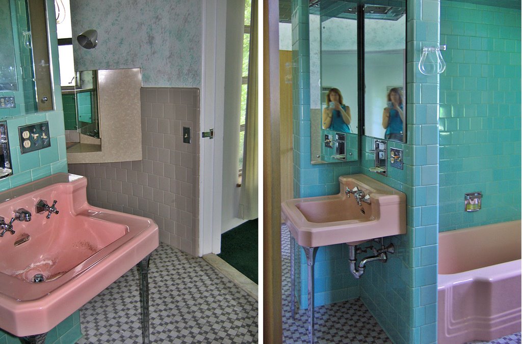
 The current owner of the property obviously doesn’t take people for interior tours, because upon entering through the basement kitchen door, my friend walked through some major cobwebs. The basement kitchen was already half-dismantled, but the bathroom (above) was still complete, and fabulous. The dark burgundy wall tile and the bathing beauty on the shower door confirms the masculine bent of the basement… though a raspberry porcelain sink does show a feminine touch.
 Heading up the stairs (which, still bears the original carpet, I swear) brings one into the kitchen, and here’s where we started losing it. This. Kitchen. Is. Pristine. Please click on the above photos to get a large view, and confirm how immaculate this kitchen is. Aside from some very recent pockmarks on the dish washer (above, top), every appliance and metal cabinet looks like it just left the show room where it was purchased. Every piece of chrome and stainless steel is spotless and shiny; you wouldn’t need to wash the Formica countertops before preparing food on them. The kitchen looks like a museum installation. It’s so retro that it’s modern. To replicate this look today would be an easy $100,000.
Oh, yeah, the view out the kitchen window is superb.
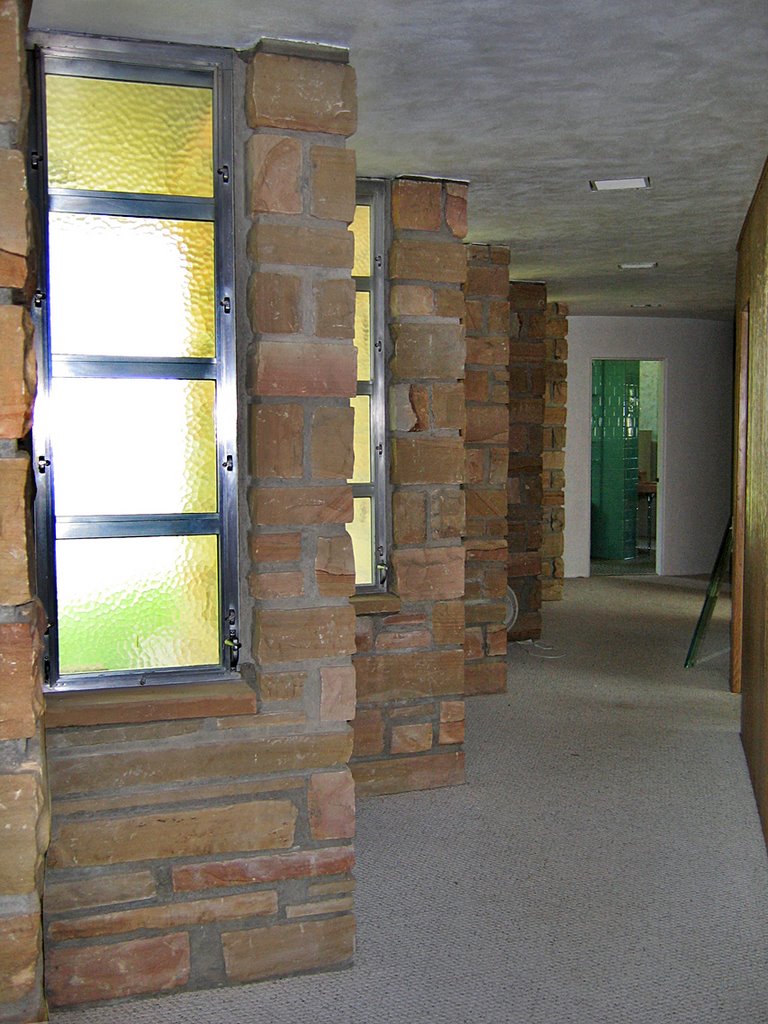
 The next feature that made us frantic with joy is the hallway that lines the front side of the house (above). That zig zag flagstone line on the exterior cuts through to the interior. Looking down the hall towards the front door…
 …and the opposite direction view (above), looking towards “The Bathroom.” But before we go there, let’s review the guest bathroom, opposite the zig zag hall.
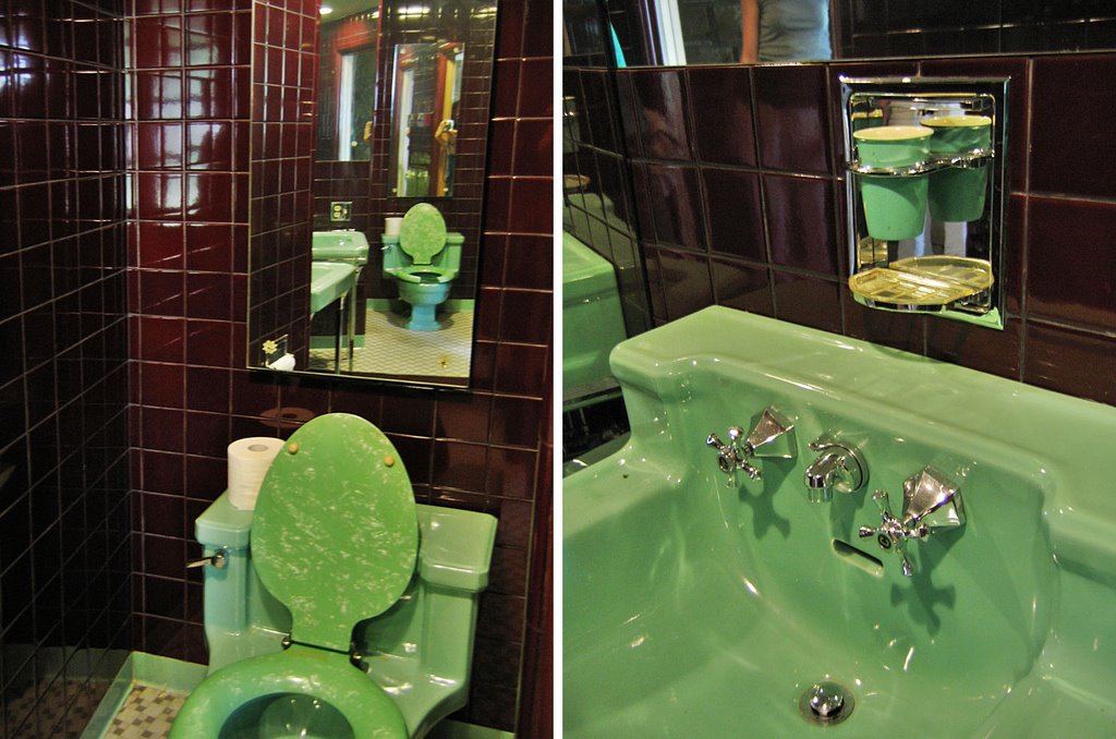
 The guest bathroom makes quite the bold statement (“1980s gay club,” was my friend’s immediate take), with dark, eggplant ceramic tile and atomic green toilet and sink. The sink (above, right) is the same make and model as the basement bathroom, and note the toothbrush and cup holder above it. It’s a revolving platform, so that when not in use, it spins around and seals up to leave only a shiny, stainless steel panel on the wall. The original cup is still in place, and, naturally, matches the sink. And it, like everything else in here, is cleaner than my own bathroom. The copious use of mirrors makes the tiny space seem much larger, and the color scheme is absolutely Hollywood.
But this bathroom ain’t jack bird turd when compared too…
 THE BATHROOM!
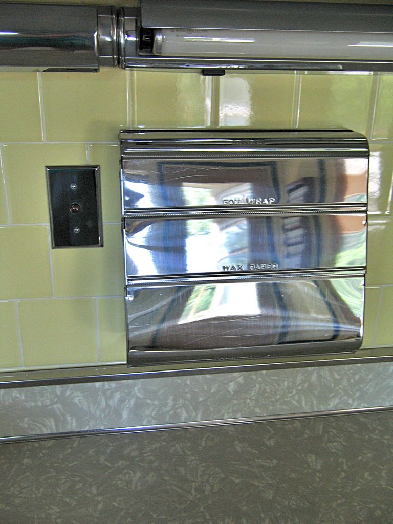
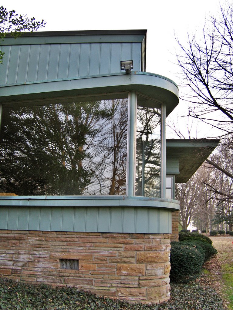
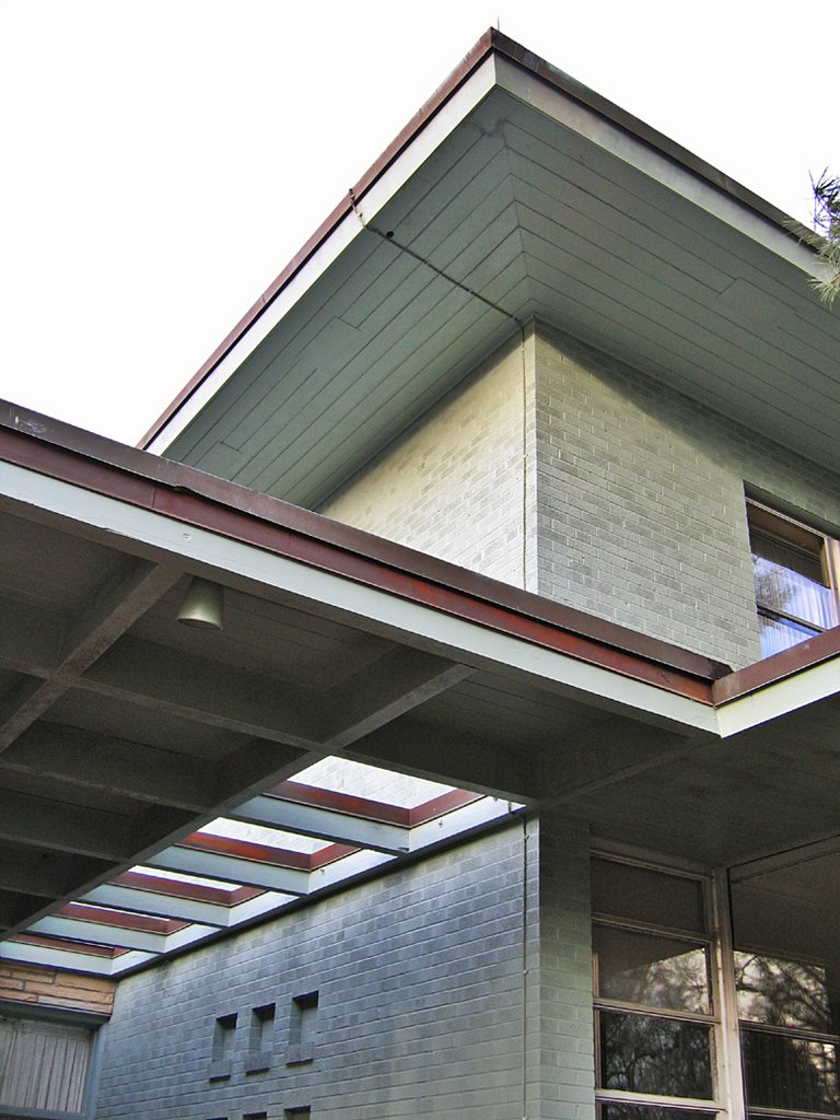
Please review the first photo of this post. The fenestrated turret? It houses the main bathroom. Even with the widest-angle lens possible, and a dictionary of adjectives, it would be impossible to convey the magnitude of innovation and cool that is The Bathroom.
The space is perfectly round and about 12 feet tall. 5 slender, vertical metal frame windows (that still open with hand cranks) provide an even glow throughout the room. Imagine looking down on the floor plan, and in the middle of the circle is a square. That square would be the “roof” of what can only be described as a “fixture island.” This square – which is only about 7 feet tall, total – is divided into 4 green-tiled sections, with each section housing a bathroom component. The “roof” holds all the lighting and electrical equipment.
Above, left, I’m standing in the doorway from the hall, looking towards the door to the master bedroom. Above, right, the coral pink toilet. Yes, the “fixture island” is dark seafoam green and coral pink (’twas 1950), and the ceramic tiles are perfect. Even the grout is immaculate. How could anyone keep anything so clean for so long?
 Revolving through the bathroom, counterclockwise, it’s the same sink (above, left) as in the other bathrooms, including the rotating toothbrush holder. Behind that area is the bathtub (above, right).
 Across from the bathtub (above, left) is a built in sink and vanity with 3 mirrors, 2 of them serving as medicine cabinets. Cone-shaped metal lamps on the wall and a window, light this area. Around the next bend is the shower stall, and that brings us back to doe (above, right).
Four people could be in this bathroom at the same time and never see each other. There has never been a more dramatic or efficient bathroom as this one. It almost feels as if Harry Brinkop first designed the ultimate bathroom, and then created the rest of the house behind it. No matter where I went in the house, I kept coming back to marvel at this feat of indoor plumbing ingenuity.
Speaking of ingenuity… we saw no heating vents or duct work in the house, so how was it heated? Turns out that under this bathroom, in the basement, is the room (round, of course) housing the massive boiler for the under-floor radiant heat system. There are 11 separate valves, allowing them to heat (or not heat) each individual room. It’s a very impressive – and progressive – set-up.
 Leaving the most magical bathroom ever, we head into the master bedroom (above, left). A wall of sliding doors reveals a cedar-lined closet with a built-in chest of drawers. The view out the back window is superb, but a glance to the right (above, right) reveals a breathtaking angle on the rear of the house.
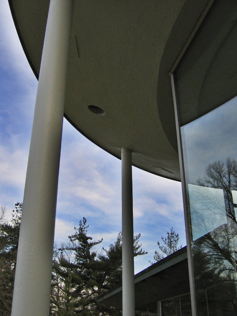
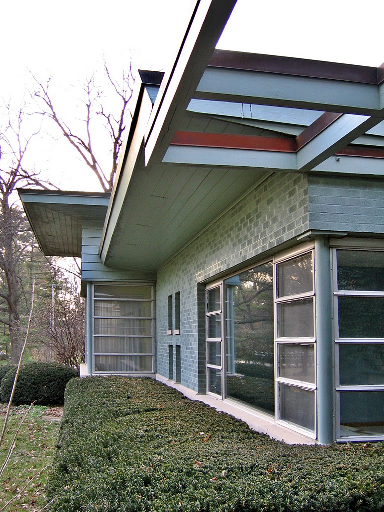
 The same thing happens (above) when looking out the living room windows on the other end of the house, and looking left towards the rest of the building. I’m guessing this gallery was mainly for looks, as the only door leading out to this shallow balcony is in the kitchen, and then one would only be able to use the southeast veranda. Useable or not, it’s a nice touch.
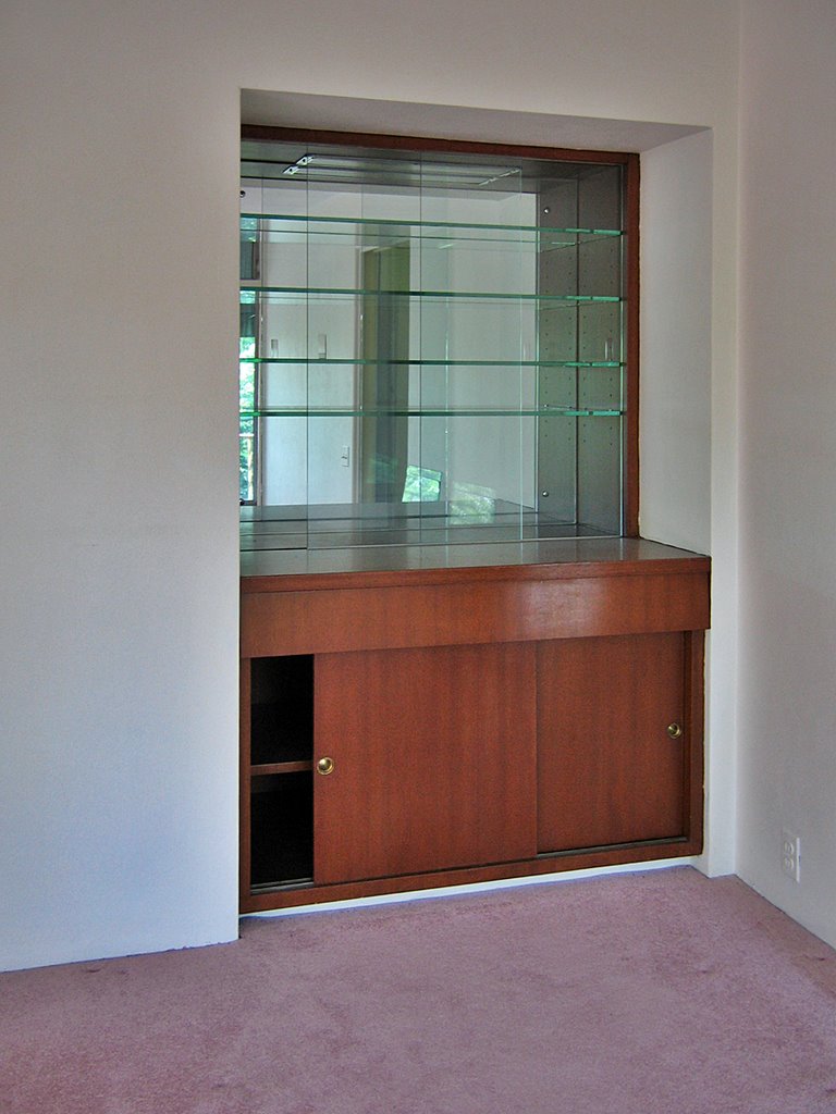
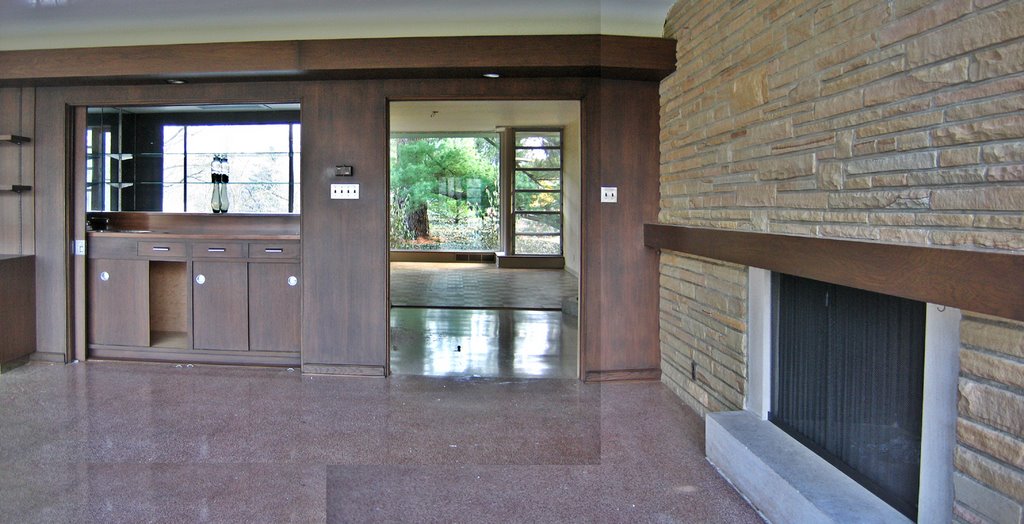
 Across from these living room windows – and right off the kitchen – is the inset bar (above).
 Here’s an overview of the living room (above), looking towards the back of the house. On the right is one of several air-conditioning units used to cool the house (the Westinghouse unit in the multi-purpose room is of early ’60s vintage, and is so striking as to be an art installation). The large panes of glass are fixed, and surrounded by plenty of operable windows, providing a clever solution for both expansive views and fresh air.
 Directly across the room is the massive fireplace (above), made of the same stone as on the outside of the house. Two vents under the mantle pushed heat from the fire out into the room. 4 towering strips of windows flank either side of the fireplace. If you review the 2nd photo of this post, be reminded that the chimney outside is round, so the tile surround on the floor is mimicking the shape.
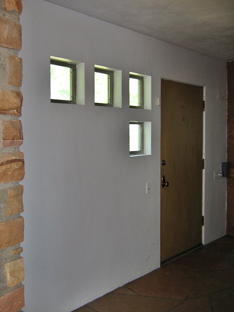
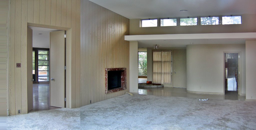
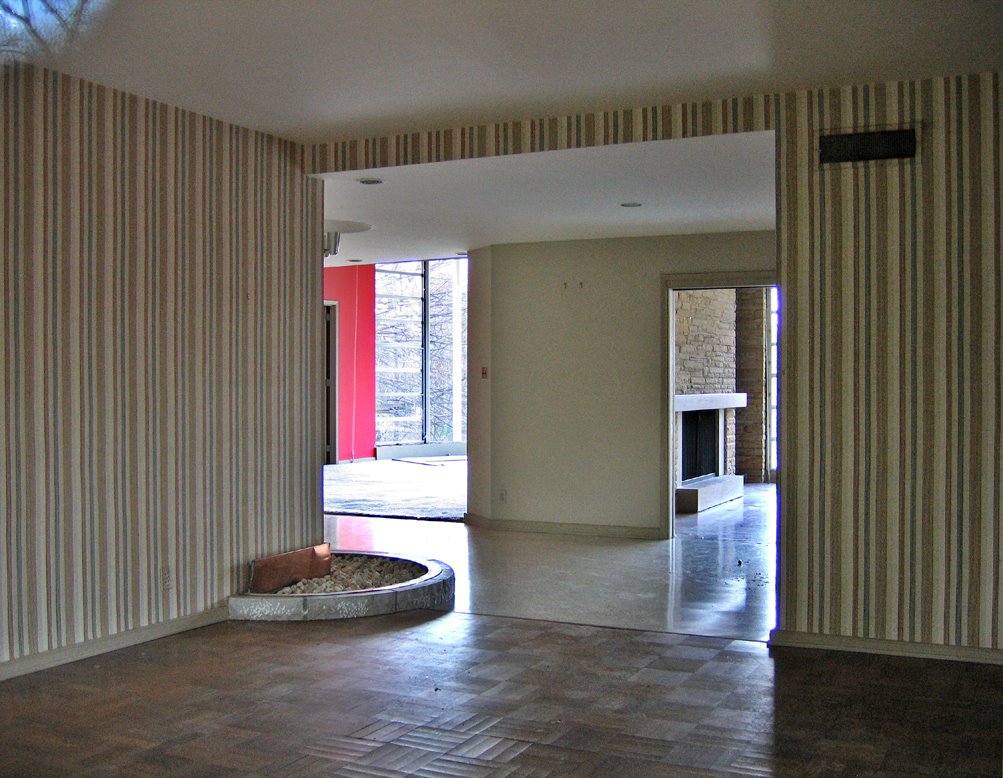
 To the right of the living room is the front entry hall (above), with the same stone flooring as on the fireplace surround. The glass block is a deft touch and that replacement door is even more inappropriate on the interior than it was outside.
 And there’s one last interesting piece of the house; the elevator! We’d have never discovered if not for the neighbor’s mentioning it, because it’s hidden behind a sliding wood door in the basement kitchen (above, left), and is part of the pantry in the upstairs kitchen. We marveled at its shiny, wooden beauty while it was docked in the basement. It then scared the crap out of us when we pressed a button in the upstairs kitchen and “va-whooosh” rumbled below us… It Still Works!
The note taped to the right of the rotary phone (above, right) is Erma’s short list of phone numbers, including: “When Oxygen Runs Low – 911.”
In the short time spent in the house, Erma & Harry came back to life, and their house is a strong, handsome and unique place. On one hand, it does bear out what the marketplace claims about modern houses: the resale is difficult. This house was highly customized for its owners.
 On the other hand, here are some of the other mid-century modern homes on the same, short street (above). Together, these 3 houses appear to be the first homes on the street. The rest are large, contemporary variations on traditional, “between the wars” residential architecture. And then there are 2 brand new “Hummer Houses” shining like bright pennies on the plots of land they overtook. But these MCM homes were the original intent of the street, and are not some anachronistic oddities blighting the neighborhood.
What distresses me is that there are people out there with a real appreciation for a house like The Brinkop’s, and some of them even have the extra $100,000 it would take to both update (central air, oh yes) and repair parts of the house. But when realtors’ and developers effectively sweep a house under the rug, how do these people find them?
My friend and I mulled over the possibilities… What if it was turned into a private “hotel,” say, for folks visiting nearby Laumier Park? Or for out-of-town parents visiting their children at the nearby Thomas Jefferson boarding school?
These are pipe dreams within the realm of possibility, but the reality is that someone will pay more money to get their steroidal, just-add-water mansion on this spot, and not even blink in the dust of all the demolished flagstone.
And as it was before, I almost wish I’d never seen this house, because I’m tired of having my heart broken.


 RELATED