Happy Birthday, Oscar

It was a pleasant shock to learn that modernist architect Oscar Niemeyer just turned 100, because I naturally assumed he was dead! Much like reading Dr. Suess, Oscar’s buildings are the most spacey fantasies gracing a mortal earth, and I figured an artist as fluid and singular as that high-tailed it onto a higher plain long ago. But it is comforting to know that he’s still here and still working. And that he’s not alone, because one of his contemporaries is still with us, as well.

I keep close tabs on Julius Shulman, the photographer I consider godhead, and was pleased that he had a 97th birthday. Considering Oscar, I fully expect 3 more birthdays for Julius, who is still alert, organized and unwavering in his passion for modern design.

It’s inspiring to know that an eye and heart for progressive, modern architecture can contribute to a long and productive life.

The latest edition of the St. Louis Suburban Journals featured Trautwein’s Shoe Store in a photo quiz, but also gave some valuable information that bears repeating in the proper forum.

The building and its remaining inventory (as seen above) are now for sale, and being aware of the beauty of the original neon sign, the seller will work with anyone wanting to preserve it. The seller is Lily Ann Crocker (a relative of the Trautwein brothers), and she can be reached at 314.496.9292 about any of these matters.

Absurd Mansard in Sunset Hills

Intersection of Gravois & South Lindbergh
Sunset Hills, MO
In the late 1960s through to the 1970s, suburban apartment architecture went crazy with a bastard form of the mansard roof. I lived in just such an apartment complex, so was ultra sensitive to their unseemly popularity. At this website, the author even refers to it as “revenge of the Mansard.”

So the building shown above really really grinds my teeth. It is nothing but mansard!

As seen from the rear, this was once a normal building. Built in 1960, it was originally a full-service gas station. Today it is a pool supply company. Not sure when it was decided that pulling the roof down to the pavement was a cool idea, but someone bears the karmic scars of this aesthetic assault.

Or maybe they just had a sly sense of humor, and erected an asphalt shingle monument to…

Cousin Itt. Seriously, don’t the two share a striking resemblance?

Top of the Towers

Chambers Road & Hwy 367
Moline Acres, MO
The Lewis & Clark Tower still stands as a slightly-raggedy reminder of the brief moment when North County was progressively modern and willing to create the image of glamorous new suburban frontiers. That’s the impression it still gives off to those of us who were stuck with a babysitter so our parents could party here, but childhood impressions are not always reality.

While reading the newspaper at the end of August, the picture of the man shown above caught my eye. He had a real Rat Pack “ring-a-ding-ding” air about him, so I read the obituary. Impression and reality heartily clinked martini glasses when revealed that this man, Bud Dallavis, was the developer of the Lewis & Clark Towers and its iconic, spinning Top of the Tower Restaurant.

Development is listed as beginning in 1963, county records put 1964 as the birth date of the complex, and in 1965 architect George J. Gaza is listed as the only full-time commercial resident. That he stayed until 1967 while the complex was completed begs the question: was he the Tower architect?

In 1966, the place was 100% jumping with at least 7 floors of wedge-shaped residential apartments (now condominiums,) each with two sliding doors out to the continuous balcony, with its own swimming pool and gym in the basement. Businesses on the first two floors of the Tower included Alpha Interior Designer, Donton & Sons Tile Co., Figure Trim Reducing, King’s Tower Pharmacy and a Missouri State License office.

Shooting off the Tower is a strip of retail facing Hwy 367, long-anchored by Stelmacki Supermarket, a rare, independent grocer still unaffected by the continuous grocery wars. The site slopes down to the West, creating a lower 2nd level building which held the Towers Bowling Lanes and the Lewis & Clark Theater (shown below). Occupancy for the complex was robust for 10 years, with an influx of dentists and doctors filling tower spots when others moved out. The Courtesy Sandwich Shop even had a storefront for a bit. The Tower didn’t show any longterm vacancies until the late 1970s.

The remaining claim to fame of the Tower is the long-closed restaurant at its top, Rizzo’s Top of the Tower Restaurant, “the revolving restaurant… a landmark for many years where diners could view the downtown St. Louis and Clayton skylines, as well as the Alton river bluffs.” Considering how popular it once was, and how its myth still lingers, there’s surprisingly little information to be found about it. Internet searches only turned up a fuzzy photo of someone’s matchbook collection which includes a Rizzo’s cover, and entertainer Tony Viviano, who seems a natural to have performed in the joint.

While visiting with my father, Rich and his wife, Ann, I asked if they ever ate at the Top of the Tower Restaurant, which became a rapid fire series of memories of the place, starting with Rich saying, “You know there were supposed to be 2 towers, right? Which is why it’s plural Towers.”

No, I didn’t know that, but that does explain why the building ends the way it does (shown above) and why the land closest to Chambers Road has remained vacant all these decades. So what happened to the other tower? Rich says that the company who originally owned it ran into some problems of partners stealing from each other, which left no money.

I tell him about the obituary for the developer whose name I couldn’t remember, and Rich asks, “Was it Bud Dallavis? He was the public face of the Towers, head of Quick Realty,” which the obit later confirmed as correct. I countered that the man pictured was really good looking, to which Rich says, “Yeah, that has to be him,” and to which Ann responds, “We were ALL really good looking at the time. We were a handsome group of people.”

She was not bragging, just stating fact. This was suburbia in the mid-1960s, post-JFK assassination, mid-Beatles revolution. Rich and Ann were a part of the World War 2 and Korean War vets who left North St. Louis city in the late 1950s for the greener (and whiter) lands of burgeoning North County. Watch Mad Men to know exactly how they dressed during the work day, how they gussied up for frequent evenings out.

And Rizzo’s Top of the Towers was a popular, happening spot for them. The restaurant was turned out in the finest china and table linens, the food good. Was it expensive? Indicative of the times, Ann responds, “I have no idea what the bill came to at the end of the night. Women never saw the bill because we never paid.”

To which Rich tells tales of the endless rounds of free cocktails courtesy of Dick Grace, the Towers bartender commonly called “Buttsey.” Buttsey had perfected a way to look like he was taking money and putting it in the cash register, but it usually went into his pockets, and lingering guilt led to lots of rounds of “on the house.” Mr. Grace was found dead in his bed in the Towers apartments in the mid-1980s, a fatal heart attack at the age of 49, all those cuisines, cocktails and cigarettes catching up to him. By that time, the Towers and surrounding area were pretty much ate up by neglect, with all the original pioneers heading ever-further away.

The rest of their memories just further cemented the vibe the building gives off to this day. Even though well-past its glory, it’s still in service. Most of the store fronts (shown above right) are occupied, and the Tower balconies are dotted with an endless series of satellite dishes, BBQ grills and plants. Heading out in any direction from the Tower reveals dozens of commercial buildings that followed its modern lead, now-shabby ghosts standing in the shadow of the Lewis & Clark Towers. May they all remain until the time they are brought back to life as proof that just once, for a short space in time, we had fabulous optimism for the future.

RELATED
North County Modern

South Big Bend Art Deco

1200 South Big Bend at Warner Avenue
Richmond Heights, MO
I would call this a truly iconic modern building in St. Louis. Because of its hillside location at Big Bend and Hwy 40, it can’t help but be seen. On a sunny day, it’s a beacon of light. And the look of the building seems to please everyone of any design bent.

For those who know of this architect’s work, it’s assumed to be a building by Harris Armstrong. The building above is from 1938, originally built for Dr. Samuel A Bassett. During that same time period, Armstrong was doing medical offices with this precise look.

But it’s not an Armstrong; it was designed by Edouard Mutrux, prior to forming his partnership with William A. Bernoudy (thank you to Kyrle Boldt for the info). But I do enjoy the vision of Dr. Bassett wanting a Missouri International Style Armstrong office, balking at the price (or maybe that Harris hit on his wife?) and finding someone willing to do an homage. Pure speculation, understand.

Until the 1980s, this workaday deco palace remained devoted to medical pursuits. By 1943, Dr. Bassett turned the building over to six different doctors’ offices, and considering how the large building crawls and expands up the hillside, there would have been plenty of room for everyone. But Bassett came back in 1949, kicked everyone out and went solo again until 1953 he partnered with Dr. Thomas A. Coates to form the Bassett – Coates Medical Clinic. Dr. Coates shared the building off and on until it was turned over to a now-defunct marketing firm called Money Marbles & Chalk. Currently it is filled with various lawyers and CPAs. Strange coincidence is that since 2000, the building is owned by Bassett Properties, sharing a surname with the doctor who originally had the place built.

From the angle shown above, the broadly curved front piece with its glass block windshield seems like a later addition to the adamant stack of rectangles.

But when seen from its parking lot on the Warner Avenue side, that protuberance is really an indicator of more curves to come. The double wiggle behind the main entry (above left) is a cheeky echo of its momma butting into the sidewalk below, which is actually a ship’s bow.

Because seeing the entirety of it’s north facade reveals a nautical theme lurking around the edges. This place has a lot going on, almost too much, yet it somehow finds a balance that keeps the eye enthralled. And by contemporary standards, it must be rather large and functional since it’s been in constant use and proper upkeep since inception.

1500 South Big Bend at Lindbergh Drive
Richmond Heights, MO
Oddly enough, just about a mile south of the deco ship is another fine example of a building unsullied and functional since birth. Built in 1952, it was a bit past the deco commercial trend, and the blond brick structure is all rectangles. But it was given the whimsical flourish of curving eaves with stainless steel fascia, which was just enough to earn it points for fluid grace.

The original sole occupant was G. H. Reich, Inc. a plumbing company that still exists in a modified current form right down the street. By 1955, the General Binding Corporation was listed as the sole tenant until 1963 when Reich Plumbing came back in, along with 6 other companies, including the State Board of Probation and Parole.

The building obviously subdivides with ease. By 1974, a little elbow room came with 8 businesses going down to 4. By 1986, the (renamed) Missouri State Probation Offices took over the entire building, and a little before that is when I first became intimately acquainted with the handsomeness and flexibility of the place.

About every 4 weeks I was required to visit a probation officer, whose particle board office did have a window overlooking the steep parking lot that climbs up the building’s north side. It was on that very same parking lot that I was late to an appointment as I sat in my car, dumbstruck, at the news that David Lee Roth had left Van Halen to be replaced by… did he say Sammy Hagar? No way! Seriously?! By the look on my face, the probation officer was expecting the worst. Well, it was the worst news, just not what she was expecting.

Every time I pass this place, I think of that horrible moment in April 1985. And here we are some 22 years later: me with a ticket to the Van Halen reunion show and the building still just as handsome as ever, giving home to various health and beauty establishments. “And I say rock on!”

An Editorial Cartoon


This cartoon appears in today’s print issue of the St. Louis Post-Dispatch. I completely overlooked the gist of it because of the line of buildings depicted on the right side of the drawing.

The intersection shown is Olive and 7th Street. From the far right edge of the drawing and heading back into the distance there is:
1. Famous-Barr (now Macy’s) building
2. The Sullivan-Adler building at 705 Olive, with the original facade on its first 2 floors
3. The Chemical Building (soon to be… whatever useless name they’ve given it)
4. The Old Post Office

The buildings shown in the left side foreground are long gone, replaced by a parking garage.

I got all excited about the above, and then got around to the humorous, editorial point of it all. Which proves, conclusively, what a building geek I am.

I’m OK with that… I think.

Overland, MO Mid-Century Modern

Lately, Overland is notorious as the township with the deluded, egoistic mayor who refuses to relinquish the burning castle. Aside from City Hall ineptitudes that have inspired so many of its citizens to blog, Overland is a nice town; completely suburban, yet old enough to have been formed to urban standards. There is a formal downtown nucleus that spreads out into little tract homes, and at Christmas the main drags are festooned with the exact same lighted decorations decade after decade. Overland retains so much of its original fabric that it often feels like touring a museum of post-World War 2 Baby Boom suburban expansion. Yet the place is alive, feisty and curious in a low-key manner, which keeps it off the hipsters and aggressive developers radars.

These photos are a fair sampling of the commercial buildings along Lackland Road, right in the immediate vicinity of Skeeter’s Frozen Custard. Generally, they were all built between the end of World War 2 and 1955.

This particular building has changed hands many times (it was an upholstery shop for the longest time), with each new owner never feeling the need to radically alter its appearance. And I’ve noticed that about this entire stretch of road: the commercial buildings don’t stay vacant for very long and they seldom get radically remodeled. Some may say that a lack of apparent progress is the sign of a stagnant city, but I see Overland’s constant, gentle ripples as a city finely balanced.

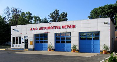
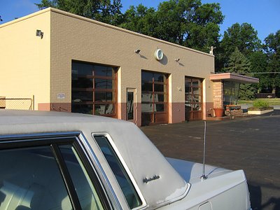
One of my favorite examples of Overland being satisfied with its resources is the above service station. Walking onto the parking lot is like swooshing back in time, with that time being kept by the very same clock that’s graced the building since it went up in 1954.

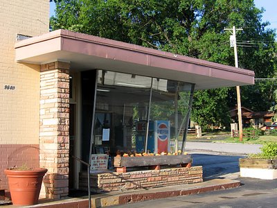
The only major change the decades have wrought is the removal of the gas pumps. Other than that, it’s business as usual, utterly neat and tidy and friendly.

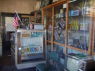
What year was this photo taken? The only thing that betrays 21st century is a package of blue M&Ms and Skittles in what is most likely the exact same vending machine the original owners plopped into that office 53 years ago.

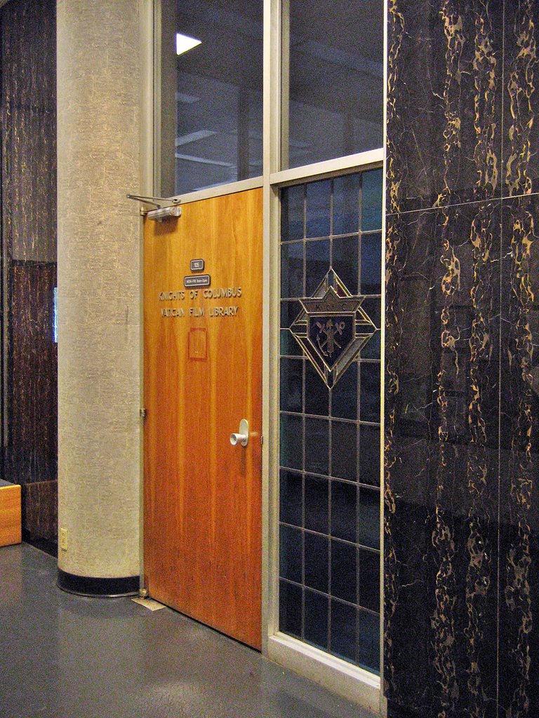
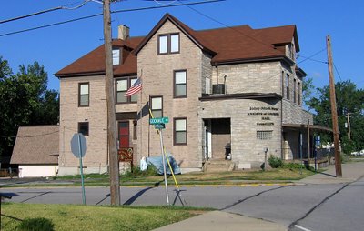
Heading east on Lackland and crossing over Woodson Road (the city’s main drag), one can see the most curious of buildings. Some portion of the Knights of Columbus Hall was built in 1930, and dusty new additions have been plopped into the mix over the decades. The place is now massive, and appears dead to the world, but its ramshackle appearance always stays exactly the same (indicating regular upkeep), and its website shows a full roster of activities.

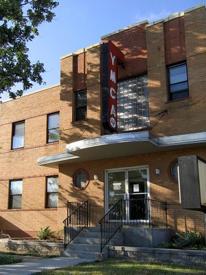
Just up the street, the YMCA sports the Deco Moderate look that was popular in new suburbs of the late 1940s. It gave new public buildings a sense of the modern urbanity but without all the drama. This style holds up well, as it never looks too dated (for those who require contemporary) or too radical (for those who like quaint). This YMCA building went up in 1948, is still in use, and still looks fabulous.

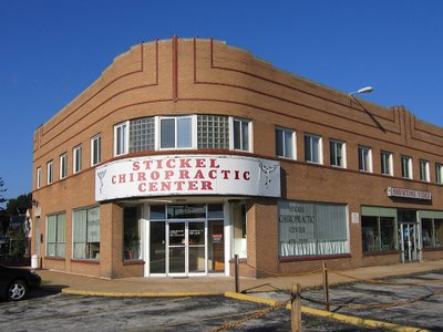
At the intersection of Lackland & Brown Road is this simple and handsome building, built in 1945. The curving corner, a ribbon of tiny windows and the dark brick pinstripes of the second floor give it a bit of a Steamliner Deco feel. There is always another business ready to take over any vacancies in this building, and it’s been this way since I first “met” the building in 1984. This intersection has businesses on 3 sides, but it’s a bit disconnected from the main commercial drags by houses. Meaning, it would have been a natural for this building – this intersection – to decay from natural suburban aging. But it hasn’t. What does Overland have going on that similar towns don’t?

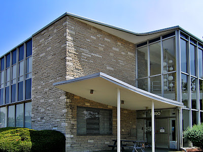
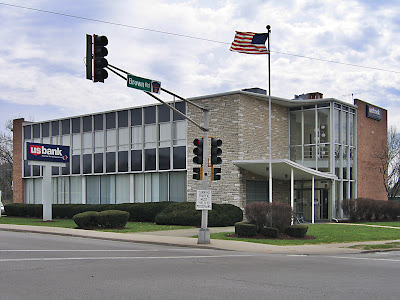
Directly across the street is a building that always tickles me. I mentally refer to it as Googie Van Der Rohe because it looks like a Chicago Mies building accented with a Southern California roadside motel lobby. It was built in 1957 as a bank and remains so, and it looks like that!

The SoCal Googie looby was, obviously, the main entrance, meant to be accessed by foot, bus or car from the intersection. But in 1967 they moved the entrance to the opposite end of the building when they expanded that parking lot. The “new” entrance still has that afterthought look, and feels cramped because of the makeshift drive-through lanes crowding its scene.

I love that a bench was placed under the canopy, so that employees can lunch and smoke in Jetsons splendor, and that they have to walk quite a ways to get to it, as that door has a chain on it to make sure it stays shut.

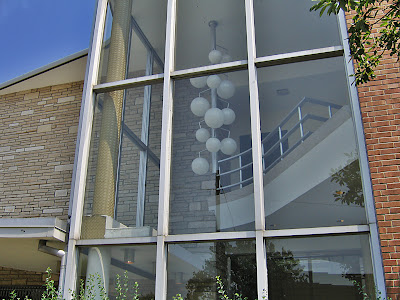
So, the entrance is now useless as such, yet they’ve left it completely intact, with the “crazy man, crazy” light fixture hanging like it’s suspended in prehistoric amber. It’s such a queer thing to have so many different banks move in and out of this building, reconfiguring its guts and alley as banking needs change, yet they leave the essential Mod-ness of it alone. Is it a case of “out of sight, out of mind?” Or that no one bank is ever inside long enough to invest in remodeling the non-essential parts? Or does it cast some sort of 77 Sunset Strip spell over all inhabitants, rendering those who would vinyl side incapable of doing so?

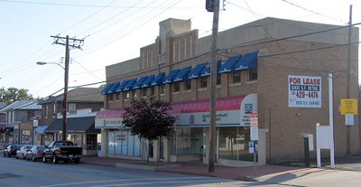
By hanging a U-ey at Lackland & Brown, we drive back toward Woodson Road, hang a right and head straight into the thick of old fashioned Downtown Overland. And it really does seem to have gone out of its way to be old-fashioned from inception. County records show that most of this dense strip of buildings went up in the 10 years directly after WW2, so they built quickly during those last moments in time when pedestrian traffic still influenced how a commercial district was laid out.

The downtown strip has a few stalwart businesses, remainders from the old days. But, again, each time a storefront becomes available, it gets filled much quicker than these types of commercial districts usually do. And by quicker than usual, I mean that we can cruise the central commercial strips of, say, Normandy or Baden or Glasgow Village and see a chain of vacant storefronts. But not in Overland.

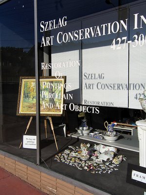
And they have never really had the room to renovate for expanded parking. Sure, they’ve taken down a building or 2 to squeeze in some blacktop spots, but overall, its street parking, and those spots are always filled and there’s always commerce taking place.

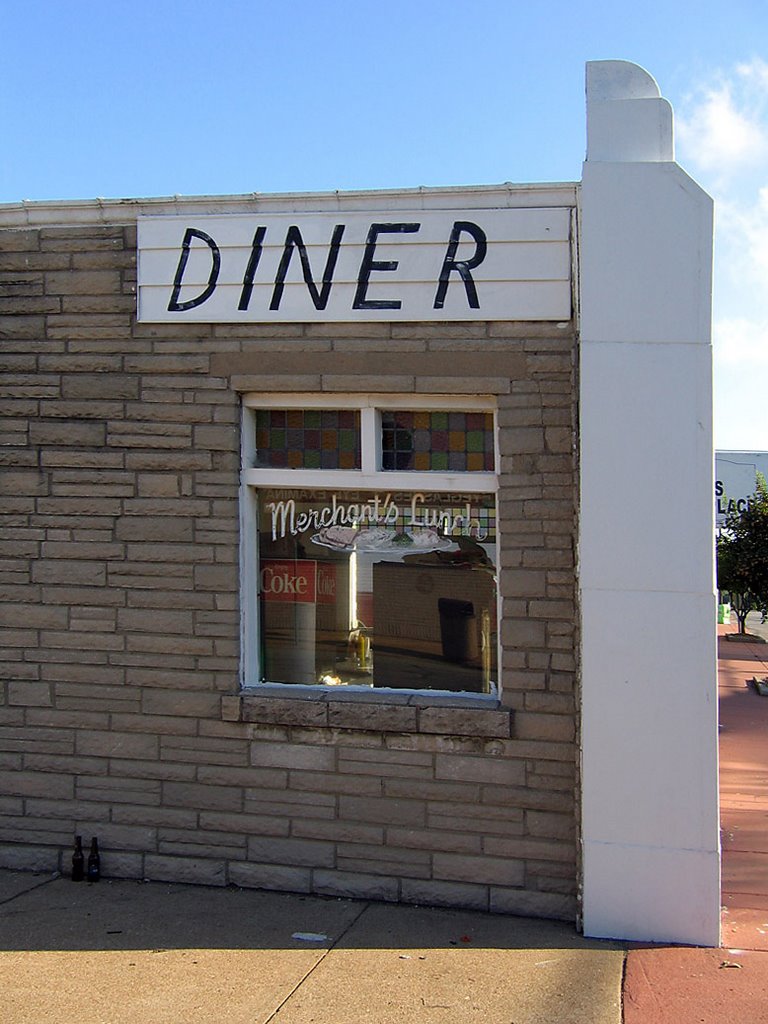
One of the liveliest spots in downtown is the diner, above. By keeping it tiny (572 square feet being a good definition of such) they were able to push the building up against the sidewalk and use the leftover space for parking, which was quickly becoming a bigger concern when the place was built in 1957.

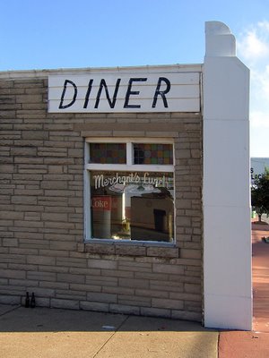
Half of the building is decked out in Pseudo Deco, vaguely reminiscent of White Castles, while the other half is standard Corner Tavern Stone facade. That they were able to cram 2 distinct looks onto so little wall is most impressive.

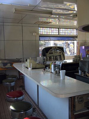
And the interior has barely changed in 50 years.
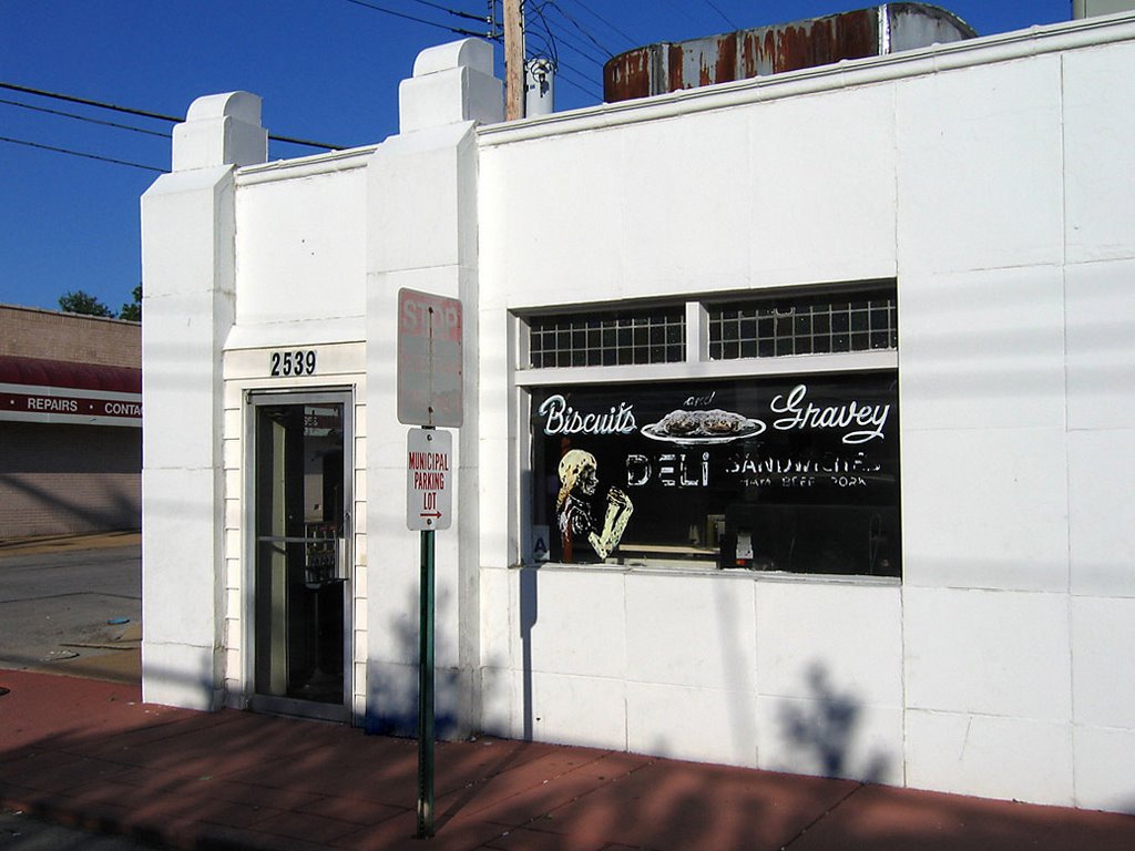
What kills me is that one can easily walk from Paul Bros. service station (4th picture from the top of this entry) to this diner in about 10 minutes and somehow remain in a Leave It To Beaver world, untouched by the uglier aspects of modern time. And we’re not talking some retro homage; it’s the entire genuine article, unfussy and unconcerned that the diner reeks of decades worth of grease. It’s probably those ancient grease odors that makes the biscuits and gravey (spelled, my lord, with an “ey”) so damn great.

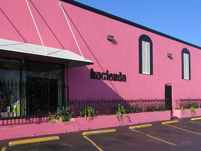
The Hacienda Mexican restaurant has long been a popular staple in the downtown strip, but it hasn’t always been this pink. It used to have a more traditional Northwest County Adobe look. I feel they updated the color to Flamingo Pink to better coordinate with the establishment behind it…

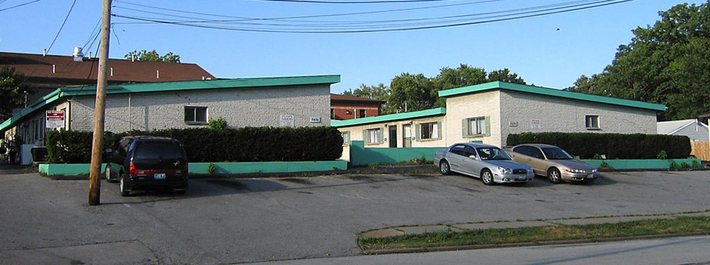
…which has spruced up its Lyndon B. Johnson congressional motel look with some hot sea foam green trim. Built in 1965, they were billed as “garden apartments,” for all doors faced into a central courtyard, much like in Southern California.

Every good downtown needs a dollop of seediness, so this place has become rather transient, in the most romantic sense of the word. The set-up is actually quite nice, but I couldn’t get in any closer for better shots, as the working girls crossing the tiny parking lot were real uptight about someone taking pictures of their place so early on a Saturday morning. I respect free enterprise, so I respectfully moved on.

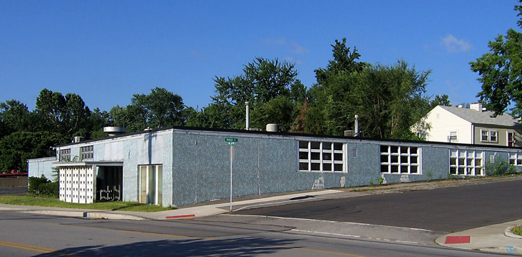
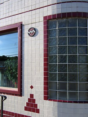
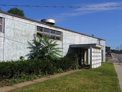
Leaving downtown proper, we head back up Woodson Road, a couple of blocks south of Page Avenue, to one of my favorite buried MCM treasures. Overland is rather hilly, and note how this gem (above) plays with the topography by tapering a rectangle into the hillside. I love the feel of the windows melting into the ground, and the shades of blue springing out of green grass and blacktop.

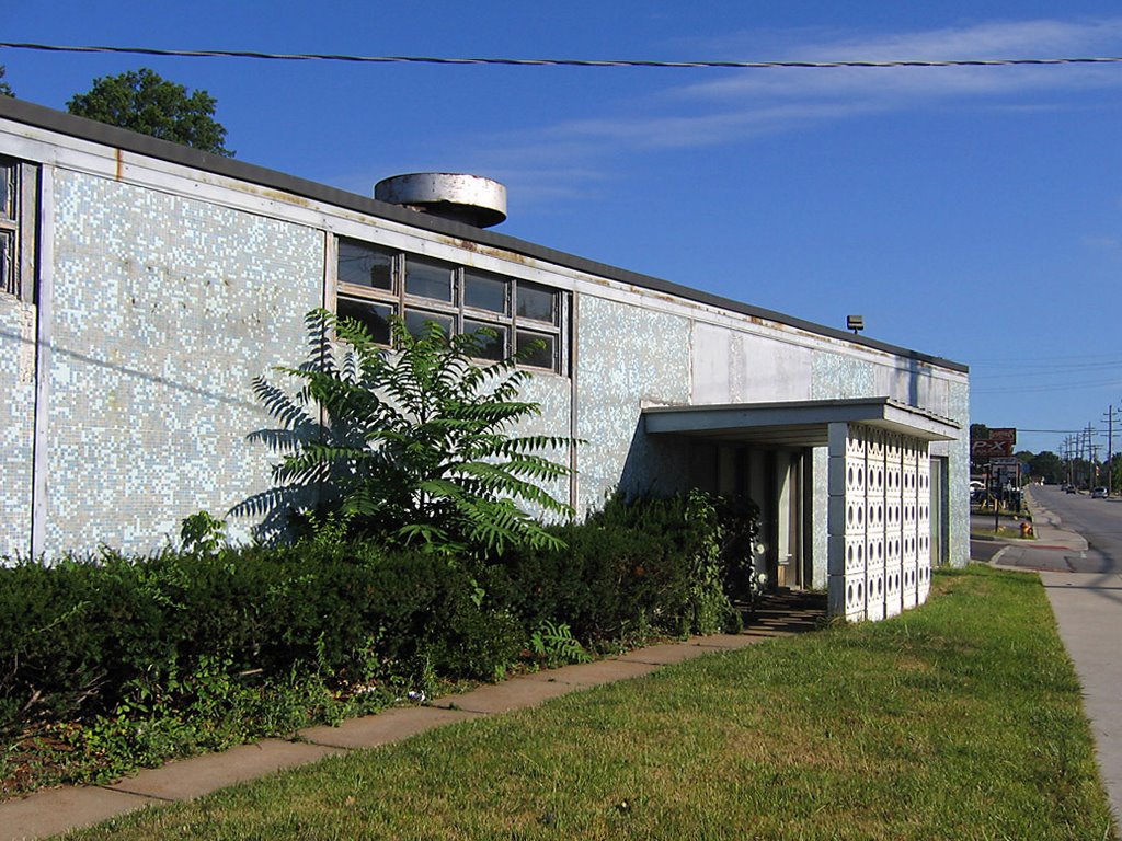
This place was built in 1958, and it’s a perfect model of that year’s modern aesthetic. Tiny tiles of aquatic blues, the concrete block sun screen that throws polka dots amid the shadows, simple planes low to the ground, cool geometry in service to manufacturing prowess. If this building could have been erected next to the Googie Van Der Rohe bank, the story of 1950s American Progress would have been perfectly told in microcosm.

U.S Band & Orchestra Supplies now manufactures and wholesales instruments, and the building serves them well enough that they don’t think about it’s condition. This building needs some help. A good start would be to trim the hedges and kill the weeds, some waterproofing and paint on the faded surfaces.

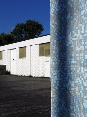
Each time I pass this faded beauty, I have to fight the overwhelming urge to have at the tile with a bucket of Spic & Span and a water hose. Just imagine how those tiles gleam when clean, how this building must have impressed when it first came to the neighborhood. And it could do that once again, but the immediate commercial strip in which this building sits is heading toward the kind of decay that invites future developers to go for Big Box infiltration. Should this ever be the case, the one building that just might save the above gem is…

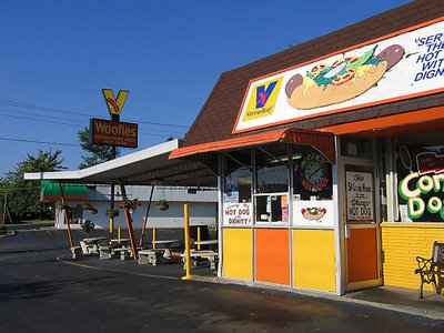
WOOFIE’S! Serving what has been called “the hot dog of the gods,” the building went up in 1955 and is only a dozen square feet bigger than the diner shown above. But this building was dedicated to the car from its inception, so the inside can now concentrate on being a tiny “shrine to the all-beef frankfurter.” It’s clean and bright, and on a brilliant sunny day, Woofie’s contrasted with my blue tile geo gem next door is a sight to break my heart. It speaks to me of all that’s good about America’s mid-century aspirations, and makes me proud that such a unique town like Overland is here for you and me.
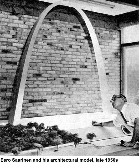
Brad Pitt & The Fountainhead

Brad Pitt & Angelina Jolie visit Falling Water on Thursday, and by Friday afternoon, we’re told about it, and given the classic photo op (above). They took a two-hour tour which ended with a private birthday (his) celebration afterward in the living room.

This isn’t a case of the media finding out and letting us know. This is clearly a case of Brad and His People making a concerted effort to get this photo and press release out. There are two points that Brad wants in the public consciousness.

#1: “Brad said he had a visual sense of Falling Water but experiencing it in person, hearing the sound of the waterfall cascading under the house and smelling the wood from the fireplace, was better than anything he could have imagined.”

#2: “Brad said he had wanted to experience Falling Water ever since he took an architectural history course in college,” said curator Cara Armstrong. “He and I talked quite a bit about design and art. He was incredibly well-informed about architecture.”

Point # 1 amuses me. How nice of Brad to share poetic thoughts on his Falling Water experience. It’s almost like enjoying his vacation photos over a glass of cabernet, isn’t it? Such a warm and fuzzy feeling.

Point # 2 slightly disturbs me. It’s that bit about wanting to see Falling Water ever since he took an architectural history course in college, which was well over 20 years ago.

Mr. Pitt has spent the last several years making sure that we know he loves architecture. We’ve heard details of how he personally re-designed the interior of a Hollywood home (and how it left Jennifer Aniston so unimpressed that she didn’t even want the place in the divorce). He’s gone out of his way to repeatedly insert his name into the star glow surrounding his favorite architect, Frank Gehry. And he’s been so successful at representing himself as a design-driven creature that what clothing accessories he prefers bears mentioning.

At first, I was enamored with Brad’s architectural bent. “Gee, he’s such a huge and handsome star, yet he spends his spare time immersed in architecture… he’s so smart.” But in reality, I know that stars of his magnitude only release that kind of information for precise purposes. And that’s what disturbs me.

He’s spent years rolling out this architectural image of himself, but other than the remodeled house that Aniston hated, nothing’s come of it. So, when he makes this latest concerted effort to share his Falling Water experience, I get concerned because it could indicate that his architectural id will finally manifest into the physical.

I picture him financing a public building that he designed himself, or donating money to expand an architectural wing of a university in his name, or designing and building an entire village in one of those countries that his girlfriend adopts children from. I also know I’m lending him way more architectural gravitas than he actually has. He’s a movie star, an actor who enjoys acting like an architect…

Then the mailman delivers my current Netflix selection, The Fountainhead. Gary Cooper as a barely-disguised Frank Lloyd Wright antagonized by his secret patron/love interest Patricia Neal. The movie was just finally released on DVD, which I consider a big deal. Brad Pitt probably does, too.

And then it hits me!
Mr. Pitt wants a Fountainhead remake with him and Jolie!
Rather than having to make good on all his publicly-declared architectural aspirations, he can just act like the ultimate architect. So, he trots his girlfriend/co-star out into the snowy woods across from Falling Water for the photo op, sends out the press release, and in a few weeks he’ll be in the executive office of a major movie studio getting the financial green light for this project.

This idea would be the perfect resolution to his “I want to be an architect” desires, as well as a brilliant career move. Plus, I’d much rather he re-do The Fountainhead than actually foist upon the world a building he designed. So, here’s hoping for the win/win.

Pius XII Library, St. Louis University

3650 Lindell Blvd., St. Louis University Campus
St. Louis City, MO
The Pius XII Memorial Library is something I’d have never known about if not for Claire Nowak-Boyd getting a job there, and taking us for an all-access tour of the building.

Though it has a vintage of 1958, my jaundice eye caused by self-absorbed SLU built-environment activities expected a bunch of bland nothingness. Upon entering, I first saw the Founder’s Wall (above). While impressive with both the name dropping (the by-gone days of Stix, Baer & Fuller, Granite City Steel Corporation) and immense sheets of arresting marble, I still only registered a typical collegiate vibe.

The ground floor southern wall of the library is nothing but glass (above), creating that wispy hint of a wall idea that was so novel, so liberating in late ’50s architecture. A librarian came over to chat with Claire, and wound up giving us an instant history lesson of the place.

The middle of this glass wall used to be the main entrance when there was an actual street running in front of it. Once SLU reconfigured the street grid for campus greenery, the entrance was glassed in, and one now enters only from Lindell.

He also confirmed what was becoming apparent; this building’s interior remains virtually untouched since it opened in 1958. It’s rare that anything on this campus remains untouched. It was hinted that some remodeling may be in its future.

Behind the ground floor’s main room are some offices and amenities. The black and gold marble (above) against a modern take on stained glass has a curious tension to it.

Then I look at the wall opposite (above) and I’m transported back to the set of The Apartment. This is just like a hallway at C.C. Baxter’s place of employment, Consolidated Life, all sleek and generously stretched, professional and showy at the same time.

Come off the elevator on the 2nd floor, and it’s instant nostalgia for a time never personally experienced, but man, did it look great. Seemed so much more civilized to use a phone booth (above). The remaining ones should be rechristened Cell Booths, and those who scream into their cells should be strongly encouraged to use them.

The black metal, thick wood doors (note the subtle offset of the knob to the key plate) and ceiling-to-floor reach is carried throughout the entire building, never missing a step. The same font (a heavier Lever House) is used to label every door (even the janitor’s closet). This consistency of detail lends an air of authority and grace.

Turn the corner (above) and some new elements are added to the palette . A slab wall of narrow-course brick tilts up against the uniform door, and a wall of glass completes the frame. Further down this brick wall, the rose-colored marble from the ground floor rejoins the concert in progress. With a subtle touch, the mood went from Manhattan to Los Angeles. I saw The Beverly Hillbillies Mr. Drysdale striding out the door.

After leaving the office areas, one is hit with the vertical immensity of the main library space (above). A perfectly Grecian line of columns rings all perimeter walls, with slender windows matching them foot-for-foot. The brick hinted at outside Mr. Drysdale office makes its own chain of columns. Note the patterns of the lights recessed into the metal acoustical tile; it holds throughout the entire building and adds a whimsical touch to what could be a cold, austere space. All that height! And the “room” is just as wide as it is tall – just vast and airy. But it feels warm.

The copious amounts of natural light streaming through banks of simple white sheers create warmth, as do endless rows of what the building was made for: books.

Endless volume is bisected with a 3rd floor balcony within the center of the space. Stainless steel banisters top a platform that serves as ceiling for below, a floor for above, and also conveniently houses duct work, using the air vents as a decorative element. The rows of books are in a low-slung cozy space under the platform. The study of those books takes place in the surrounding gallery of light and air.

Note Claire in the above photo. Note what she’s sitting on. Know that most all of the furniture and fixtures are the original late ’50s vintage. Know that I almost passed out from too much bliss.

Here’s where the study gallery turned into the set of a Doris Day movie!
The 1″x1″ wall of tiles (various blues, with beige, white & black accents) is repeated throughout the entire building. It is like the grass from which all elements grow. Up against a completely uninterrupted wall of this, steel blue-gray leather slipper chairs and a simple, bi-level coffee table float above the blue-gray carpet. It literally looks like something Doris Day’s interior decorator character in Pillow Talk would have pulled off for a corporate client.

This is, literally, a round table meeting. A spontaneous circle among the rectangles was a nice touch, as are the blue cloth-covered slipper chairs in the far-ground (above). Again, it must be noted that all of this original furniture is in exquisite condition. Considering it’s a campus library in service for almost 50 years, there’s nowhere near the amount of use-marks that would be expected. Does it not get used as much as I think it should? Or have all generations of SLU students been overly respectful to the chairs and tables? But I’m so grateful for this oddity.

Private study stalls (above) have matching display cases throughout the building. Danish Modern in shape, they also share a wood grain with all the office doors, which once again shows the scope of repetitive detail. The designers considered every inch of this building, and treated them all with a subtle hand.

Still on the second floor, the periodical section (above) takes on a slightly different flavor. The wood chairs are positively Eames-like; the tilted wood counter is Amish Modern.

Massive, modern artwork (above, left & right) hangs from the brick column walls, and from the look of it, it was all created and procured within 5 years of the building’s erection. That’s artwork placed…

…and then there’s artwork found. Peering over the edge of the 3rd floor balcony (above), the banks of file cabinets and card catalogs are a 3-D cubist painting.

Even the utility stairwells are a work of art. That same tile covers all of the stairwell walls, and taffy-pulled steel rails and banisters snake above white, granite-look tile flooring. These stairwells feels like an upscale dining room in a 1950s downtown department store; the kind of restaurant where Ladies Who Lunched had cucumber finger sandwiches and extra dry martinis while a water fountain trickled seductively in the middle of the room. This may be the only stairwell to ever evoke such strong images in my head, and I could happily camp on these landings for days.

New sections were added to the library in the early 1980s, and while the materials were downgraded to drywall and pine, they stayed true to the sparseness of line and the generosity of scale. The dramatic circular staircase (above) disappearing into a circular mass is a particularly cool touch. On first glance, I assumed it was original, but it’s part of the new additions. A round of applause goes to the remodeling architects for such a sensitive homage to the rest of the building.

Every single bathroom in the building has a completely different color scheme. The men’s room shown above is all Playboy Club bright, while other versions (of either gender) have powder blue, coral or burgundy stalls against complimentary shades of wall tile. I imagine the original designers having to storyboard all the bathrooms, to make sure they didn’t repeat themselves, and that commitment to that level of detail brings a tear to my eye.

No matter where your eye lands, there are underplayed but sophisticated details that have remained largely undisturbed. It was built on a grand scale, but pays attention to how humans will use it, right down to the countless vintage hand-crank pencil sharpeners that blend in to the surfaces. The sky blue metal bookshelf (above) is utilitarian, but has details that harmonize with its immediate surroundings. The entire space is a symphony.

As strange as this may sound, the above space reminded me of a Palladio villa; the scale, the symmetry, the quiet quality of light and sound harnessed by a soaring column. It’s both classic and modern. This library building is a jewel, and I pray to the architectural gods that Father Biondi overlooks this gem for several more years.

We Brick This City

Since St. Louis is tearing down modern Busch Stadium for a big brick ball park, viagra then it makes perfect sense to brick up a modern downtown apartment tower built around the same time, right?

Obviously, St. Louisans live in fear of modern architecture, because a project architect for Gentry’s Landing said, “What we are trying to do is humanize the building, and make it seem more approachable and more pleasant.” Local developers feel this can only be accomplished with brick, brick and then some more brick.

It was the World War 2 generation that instituted Urban Renewal, which translated into most major cities erasing thousands of acres of Victorian buildings in order to erect thoroughly modern commercial shrines to a progressive space age future.

In St. Louis, a notorious chunk of Urban Renewal failed miserably, but after the blacks and the Chinese (sorta) recovered from the trauma of being so abruptly displaced, the area that is now the Gateway Arch, Pet, Inc., Mansion House, Gentry’s Landing, KMOX and Busch Stadium has worked pretty well for the last 40 years or so.

Now a younger generation begins to erase the initial erasure, and, naturally, nothing makes as unique and contemporary a statement as brick. So, down comes the white, arched concrete of Busch Stadium for a wide pile of bricks . Hide the large expanses of Gentry’s Landing glass behind a tall pile of bricks. And if we’re lucky, they’ll tamp down all that shiny stainless steel and brick up The Arch!*

*An architect pal said that what ultimately protects the Arch is that it’s nearly impossible to lay bricks in a catenary curve. Antonio Gaudi could do it, but he’s long dead and gone. Whew!

Harris Armstrong, South Side

Because of this report, viagra I got to tour this house!

After posting photos and a review of an Armstrong house for sale in Kirkwood, the current owner of the above house simultaneously contacted BELT and architect Andrew Raimist. She invited us over for a delightful afternoon of architectural euphoria and info sharing.

Before processing any of my surroundings, I immediately ran up to the second floor and out onto the deck (below, left & right. Click on all photos for a larger view).

I’ve spent years gazing up at this house on the hill, imagining myself on that terrace, calmly gazing out at the city below me… And here I finally stood.
And it was good.
And I threw up my arms in victory, squealed, “Yessss!” and waved to any of the people driving down Chippewa who just might have glanced up and noticed a deliriously happy gal dancing atop the house.


(Above, left & right) The backyard of the former Deffaa Residence (where the tombstone of their beloved pet Nuki still resides) is surprisingly large and lush, with the newest owner adding copious greenery accented with whimsical details throughout. There’s even a secret gate at the end of the yard that lets you walk down to the public sidewalk below.

Most all of its original details remain in place (above, right).
While the house is wildly different in style than its neighbors (above left), it gracefully fits in, serving as an exclamation point for the immediate neighborhood.

And one of those neighbors was the gal who now lives inside. Living down the street, she had long coveted the house, and the minute a For Sale sign went up, she knocked on the door to ask for a tour. The owner let her inside, and as she stood in the entry quickly surveying the first floor, she said, “I want to make an offer.”
The owner said, “Uh, don’t you want to see the rest of the place, first?”
Of course, she did, but she already knew she wanted it.
Before financial common sense could kick in, she turned in contracts to the realtor. Immediately after that, major panic set in. But her architectural destiny was this house, and she’s deliriously happy as the Lady Of The House (LOTH).

The top level of the house is the master and 2nd bedroom (above, left & right, respectively), and both have doors that lead onto the outdoor terrace. There is a generous amount of light pouring in because of all the windows, and trees frame every view from the house. The view from the upstairs bathroom window is especially sweet, as it peeks down into the riot of green in the backyard. Note, also, that the master bedroom windows will be mirrored in the exact position on the first floor (coming up, below).

By today’s standards, the bedrooms would be considered small. But, respectfully, I disagree with today’s square footage standards. How big does a bedroom really need to be? If a bedroom also serves as a home gym, office and closet wing, then I suppose it needs to be huge. But if you merely wish to store your clothing and sleep, then a bedroom doesn’t require excessive s.f. The Deffaa House bedrooms are filled with LOTH’s essentials without any sense of clutter or cramp; both rooms feel comfortable and airy, due to all the windows, the wood floors and access to the deck. In the end, how a room feels and functions is much more important than s.f. stats.

The stairwell (above) leading down to ground level is simply breathtaking. So much drama and light in a transitory space.
Every facet of the 68 year old house is in exceptional condition because LOTH has taken great pains to restore and improve as needed. The stairs are a delicious golden honey shade, and a work of fine sculpture in and of themselves.


The front entry (above) summarizes the theme of yards of glass welcoming in the daylight. We arrived in the late afternoon of a cloudy day, and without a single light on, the entire first floor was bathed in light from all sides.

The living room (above) features a gas fireplace recently installed into a space that was formerly a recessed bookcase. Upon reviewing Armstrong’s original floor plans, Raimist discovered that a fireplace was always intended to go in that spot. Meaning, LOTH has an intuitive sense of what’s right for the space!

When experiencing modern homes, it goes one of 3 ways:
#1: The owners stay so authentic to the original aesthetic that the place becomes a sterile museum.
#2: Their inappropriate furnishings have nothing to do with the surroundings and it becomes a tragic waste of space.
#3: They find a way to balance appropriate aesthetics and their lifestyle without breaking the bank or their comfort.
LOTH has achieved #3 in a large way. She told of her previous home’s gothic furnishing not working in the new place, and of her adventures in whittling down, trading over and incorporating old favorites into a new mix. She has the utmost respect and understanding of the lines and feel of the home, but she has not compromised her comfort or personality. The raw physicality of the house has geometric grace and light built in, but the owner – through color, texture and intelligence – has transformed it into a wholly inviting home. Everything about the place feels exactly right.

The stairwell leading up to the 2nd story (above, left) and the dining room as viewed from the entry (above, right). I was pleasantly surprised to find my original portrait of the house on the dining room window sill. Much like sending a fan letter to your favorite star, I mailed a letter with an extra print to the previous owners, just because. They had sent me a thank you card and invited me over for a tour, but it never came about.

Turns out that person had started a scrapbook on the house, which was passed on to LOTH. My original fan letter and photo are part of the contents, which includes a 1986 Suburban Journal article, brief histories of the architect and snapshots of the house throughout the decades and seasons (the house is locally renowned for the simplicity of a lit tree on its balcony at Christmas time). Raimist – who is working on a book about Armstrong – gave LOTH a poster-size print of the house at the time it was built, as well as mountains of detailed information to add to the evolving history of the house.

The galley kitchen (above) is pristine and highly efficient, with another gorgeous view to the backyard. Across from the sink is an entry that leads to the garage and basement. The finished basement contains a laundry, bath and guest bedroom, as well as a small office space. So, in effect, it’s a 3-story house, working efficient square footage in a gorgeous, modern package.
For years, I yearned to see this house, and it was more awesome and inspiring than imagined. Both the owner and the house are a South Side jewel.